'Embrace a bit of mess': Having a home that is both stylish and kid-friendly
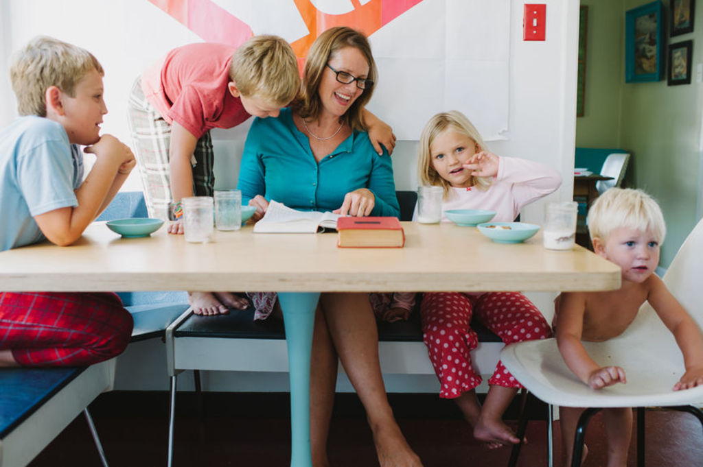
There’s nothing quite like the patter of tiny feet, unless those tiny feet are running down the hallway and have just kicked over your favourite and most expensive vase.
Can you strike a balance so a home is practical and kid-friendly but also super stylish?
For ex-Block contestant and Design School founder Jenna Densten, it’s absolutely possible but involves a little compromise.
“The reality is, if you have kids, they’re going to trash the house,” she says. “There’s no way around it and you kind of need to embrace it.”
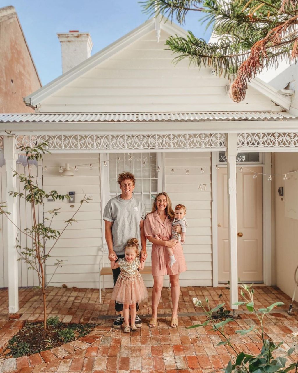
The North Melbourne home she shares with husband Josh and two daughters, Freddie, 3, and Story, 1, always looks immaculate in Instagram posts, with a carefully considered colour palette that doesn’t shy away from light, neutral tones.
For some style-conscious parents, living with a plethora of plastic toys and baby items in bold colours and patterns is the stuff of technicolour nightmares, but there are now plenty of brands that cater to those keen on a softer aesthetic, with barely a primary colour in sight.
While these items might look good in the home, in photographs and on our Instagram feed, does it actually have any impact on a child’s development? It doesn’t, says Dr Wendy Saeme Lee, a lecturer in early childhood education at The University of Sydney.
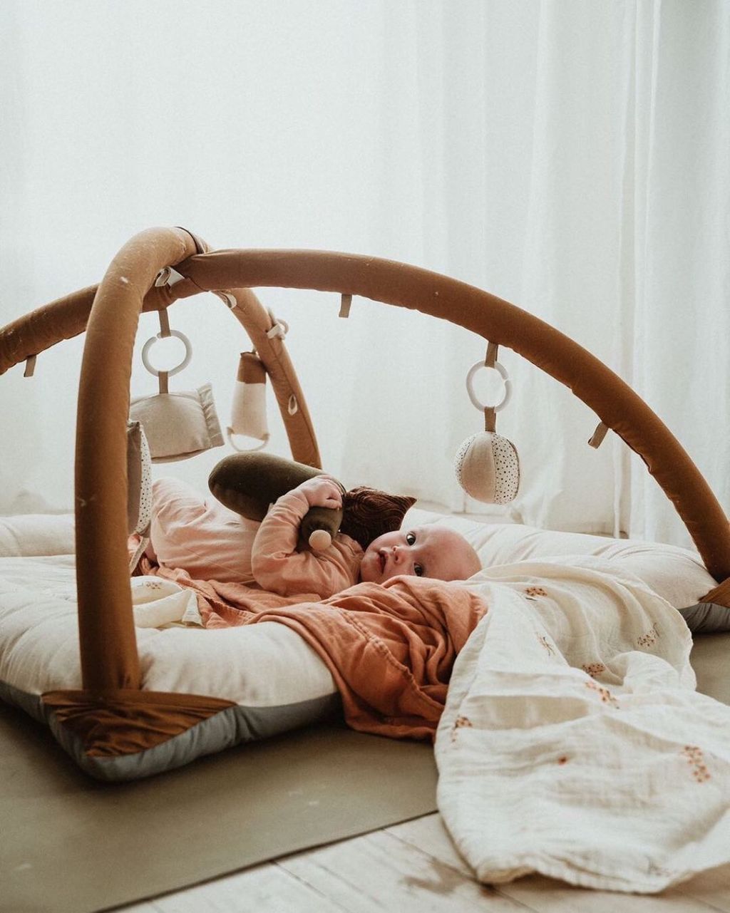
“It is often a misconception that children need to be in an environment that is comprised of primary and bright bursts of colours,” she says. “However, colours can and do affect a child’s emotions, their restfulness, restlessness, how children interact with the environment, with others, mood and overall behaviour.
“I am not arguing that bold and bright colours are necessarily ‘bad’ for children, but we need to be mindful that this is not necessarily what children will always be drawn to.
“Like adults, children will have their preference for colours. Adults may think children will be attracted to bold, bright colours but this is not always the case and there is a big push to explore the neutral tones for children in the early years. In early childhood educational settings – long daycare centres, preschools – promoting a ‘home-like’ environment for children is a hot topic. Neutral tones and colours such as light brown, ivory, etc, can promote a very calming, soothing and cozy effect.”
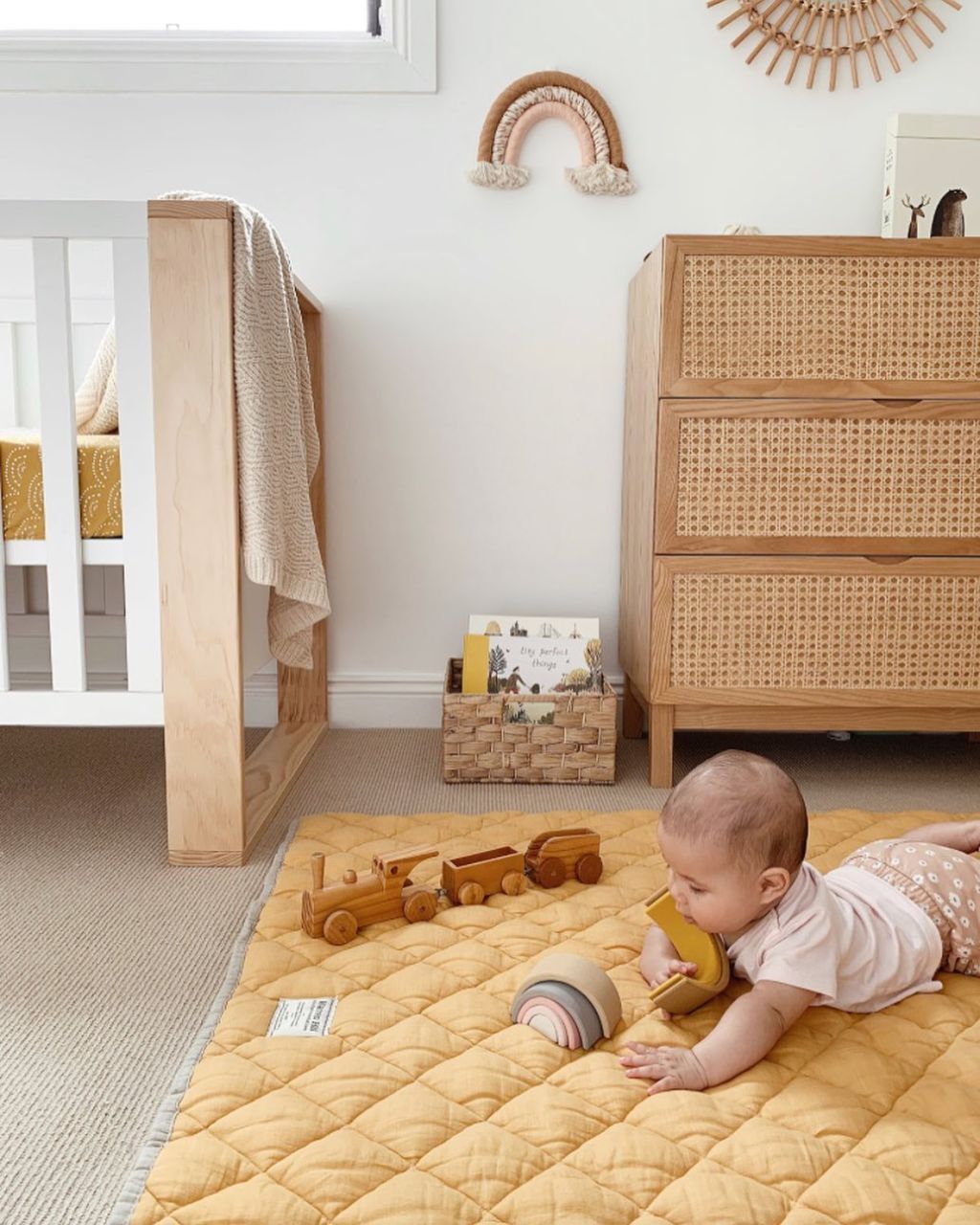
Dentsen says a lot of people would be able to say when they had their first “You’re depriving your child of colour” moment, “but trust me, I’ve got plenty of bright-coloured toys and playmats – they’re just the ones in the storage baskets.
“It’s a balance. You can have those nice toys, timber toys, and there’s a place for them, but there’s also a place for the disgustingly bright, colourful toys,” she adds.
How to have a stylish and child-friendly home
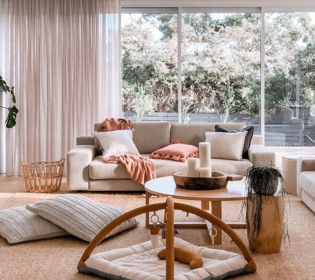
Strategic storage is key
“Having an area in every room for kids’ stuff is definitely one of the most important things,” Densten says, “because you cannot keep them contained to just a playroom, if that’s what you have in your house.”
“If you can have built-in storage that suits the aesthetic of your home so everything is behind a closed door, fabulous, but if you can’t, loose baskets are super-easy and affordable.”
Consider the practicalities
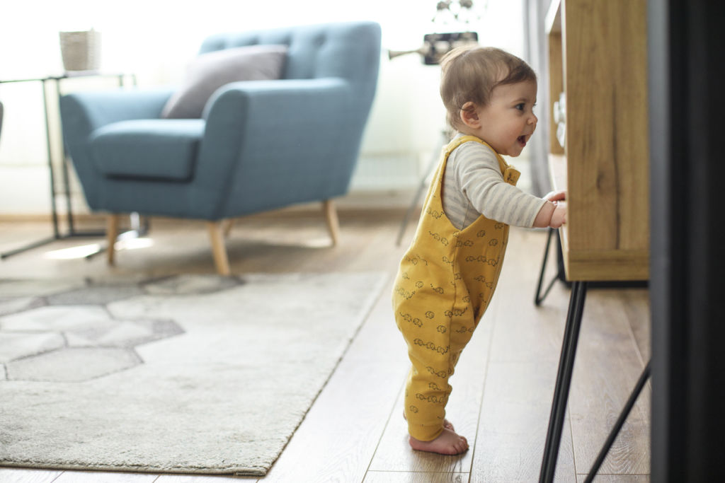
“Depending on the child’s developmental stage, you need to consider other factors such as the texture of the floor,” Dr Lee says.
“Prior to that, children need ample opportunities to crawl and practice standing. Are there sufficient space, sturdy furniture and non-slippery floors for children to practice these gross motor skills?”
Josh and Jenna lived in their North Melbourne cottage with their first child Freddie, and Jenna admits the brick flooring was not ideal for a growing toddler starting to crawl. When planning the build for their next home at the rear of the block, the couple were more conscious of who was living in the space, and how they were going to live.
“You live and you learn,” she says. “We’ve [now] got engineered floorboards and they’re fabulous for the kids as they’re so easy to clean. We’ve used a waterproof venetian plaster in the bathroom, which means you don’t have to clean grout lines.
“We originally had a decking area between the cottage and the back part of the house but it just wasn’t practical for the kids to run around barefoot.” They’ve since covered the area in artificial turf and Densten says it’s been “a game-changer”.
She says they also have white painted walls “and they’re filthy, but you can just wipe them down”.
“You can’t have anything too precious with kids but that doesn’t mean it has to look bad. It just means you have to do a bit more research in the maintenance and the durability and, kids or no kids, you want all of your materials to last.”
Embrace shelving
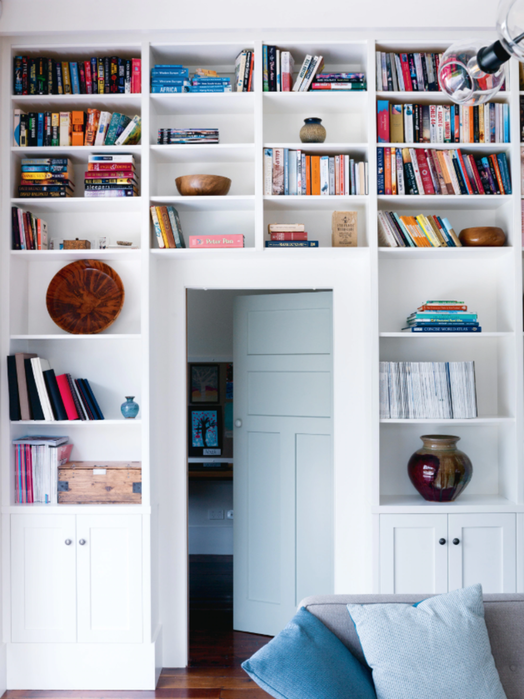
Densten says she generally tries to display sentimental items up higher and out of reach of little inquisitive hands.
“You can’t have your pretty things or breakables down low while you’ve got toddlers running around the place, but that doesn’t mean you can’t have your shelves that are up a little higher styled beautifully.”
Densten also suggests keeping the coffee table clear and styling only with books “just while they’re young”.
“Don’t try to fight it,” she adds.
Avoid sharp corners
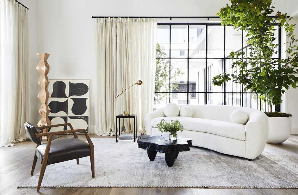
Save yourself the worry and angst of an injured child and avoid sharp corners on coffee tables and benches – anything at eye or head height.
“We’ve opted for curves and soft edges everywhere. They soften the space but are also super-practical,” Densten says.
She also says to avoid glass if you can (obviously windows are the exception) as it will save you a heck of a lot of cleaning time.
We recommend
We thought you might like
States
Capital Cities
Capital Cities - Rentals
Popular Areas
Allhomes
More
