Mix and match: How to make clashing prints work in your home
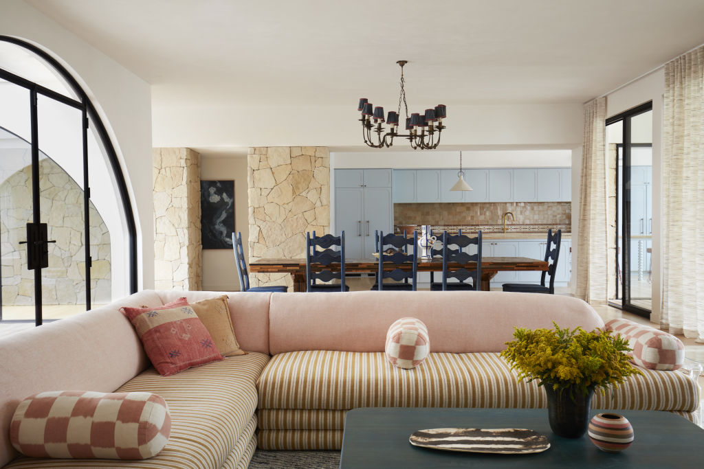
Bold, delicate and painterly prints are integral to a warm, characterful interior. Whether it’s fantastical florals, punchy palm trees or sunny geometrics, a mix-and-match approach is an impactful way to form a dynamic space.
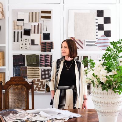
“Clashing prints bring a unique perspective to a room,” says leading Perth textile designer Liz Casella, who is based in Los Angeles. “They tell a story and immerse your senses, so choose what you love and let it lead you.”
From the bold to the beautiful, prints can be expressed in classic and surprising colour combinations. “It’s an exciting time for prints,” Casella says. “The trends are broad, and fashion and interior brands are taking risks and opting for big patterns, exaggerated scales and bolder designs.”
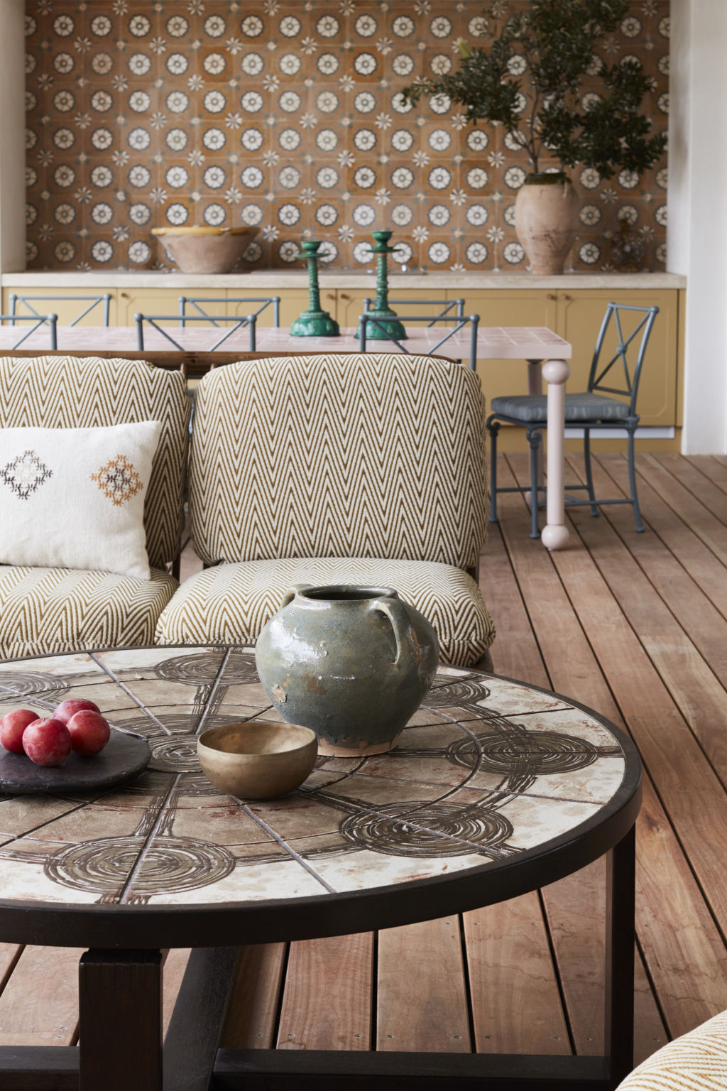
While recent times saw us crave tranquil interiors, now a sense of joy and vigour prevails.
“A friend has coined her renovation, “Project: No Beige!” laughs Casella. “I’m seeing a strong move towards colour, fun and playfulness, and a more artistic approach to dressing a house.”
Mix master
For many designers, prints are the starting point when creating an interior theme. “I pull digital mood boards together to develop an overall scheme, then visit fabric stores and pull materials out on the table to make a story,” says designer Jase Sullivan.
Colour is key to a cohesive clash, says Casella, who chooses a hue to link her prints. “One pattern might be predominantly green, while the other has just a pop of the same shade that ties the two together,” she says.
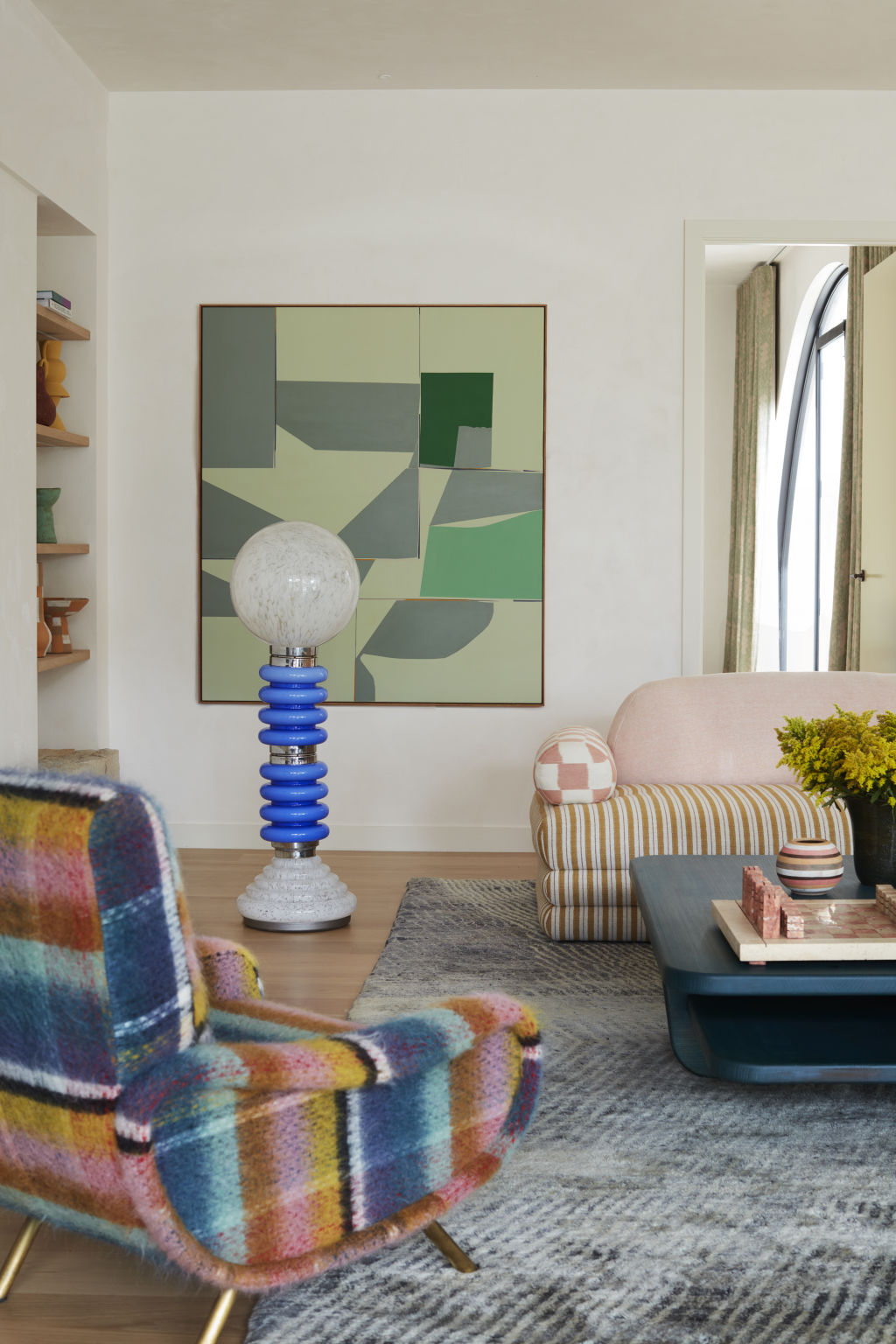
Curating an eclectic print palette calls for experimentation. “Aim for random boldness, then take prints away until the combination sings in harmony,” suggests designer Justine Hugh-Jones from Hugh-Jones Mackintosh.
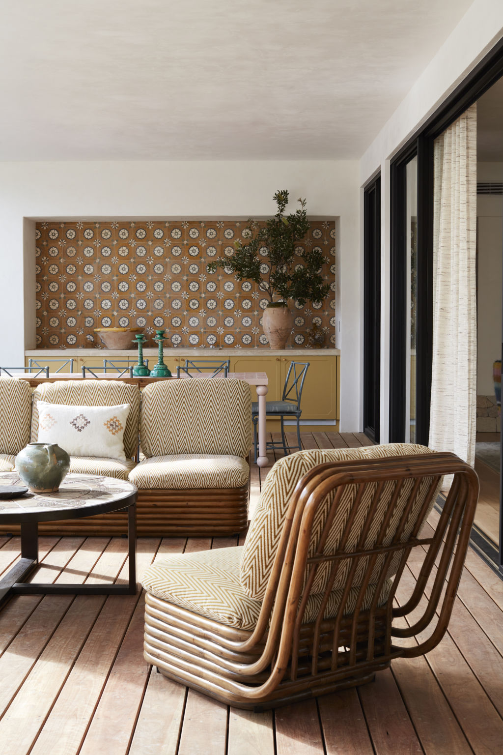
Prints formed the basis for Sullivan’s riff on 1970s Mediterranean style in his Clarks Beach project in Byron Bay. “I used vibrant yet muted fabrics, like the sun-bleached versions seen in vacation spots like Saint-Tropez,” he says. “Blue, pink, green and neutral shades link the prints together.”
Textural prints
Integrating texture into printed soft furnishings provides visual interplay between materials. “We often layer clashing prints with similar textures, so there is a connection between the weight of the fabrics,” explains Katrina Mackintosh from Hugh-Jones Mackintosh.
Printed rugs and textiles in flat weaves, brocades, velvets and tufted finishes create a sense of depth and warmth. Integrate a beautiful trim or piping to camouflage the seam, which is more prevalent in plush fabrics, and give definition to your print.
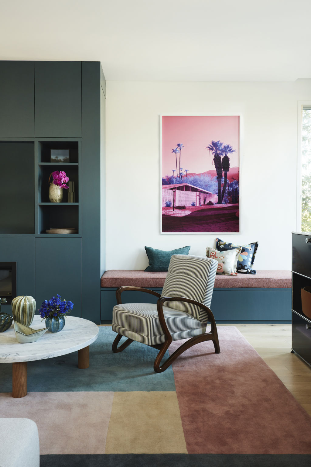
Casella has a penchant for mixing fabrications, such as velvets and cotton satins, and says texture provides prints with restraint. “You can overdo clashing prints, and pops of solid colour or textured fabrics break things up,” she says. “There must be some breathing room among the chaos.”
For his Clarks Beach project, Sullivan used tadelakt, a plaster surface used in Moroccan architecture, to temper his print selection and imbue texture and movement into the spaces. “I introduced some stack stone and wallpapers in the guest rooms, and along with the clashing prints and colours on the walls, it helped create a unique space,” he says.
Size and scale
A print palette should include variously sized patterns to ensure perfect balance. “I’m seeing lots of stripes, small geometrics and foulards mixed with vintage florals,” Casella says. “Variety in scale ensures your prints are not overwhelming. Larger prints are more immersive, but smaller repetitive designs work beautifully in small spaces like the bathroom.”
Furniture’s size and shape also dictate the size and scale of its print, so consider how the print wraps around its form and whether it complements or detracts from its shape. “Large prints make a statement, so if you want a feature chair to stand out, cover it in a bold print,” recommends Sullivan.
Unlikely spaces
Use floors, walls and ceilings as opportunities to express lively print combinations, from botanical wallpapers and dynamic rugs to delicate mosaics. “I love playing with tiles and matching them with colourful walls and wallpaper,” says Brisbane designer Aude Charmetant. “Add prints where you might not expect them; ceilings especially are the perfect place for prints.”
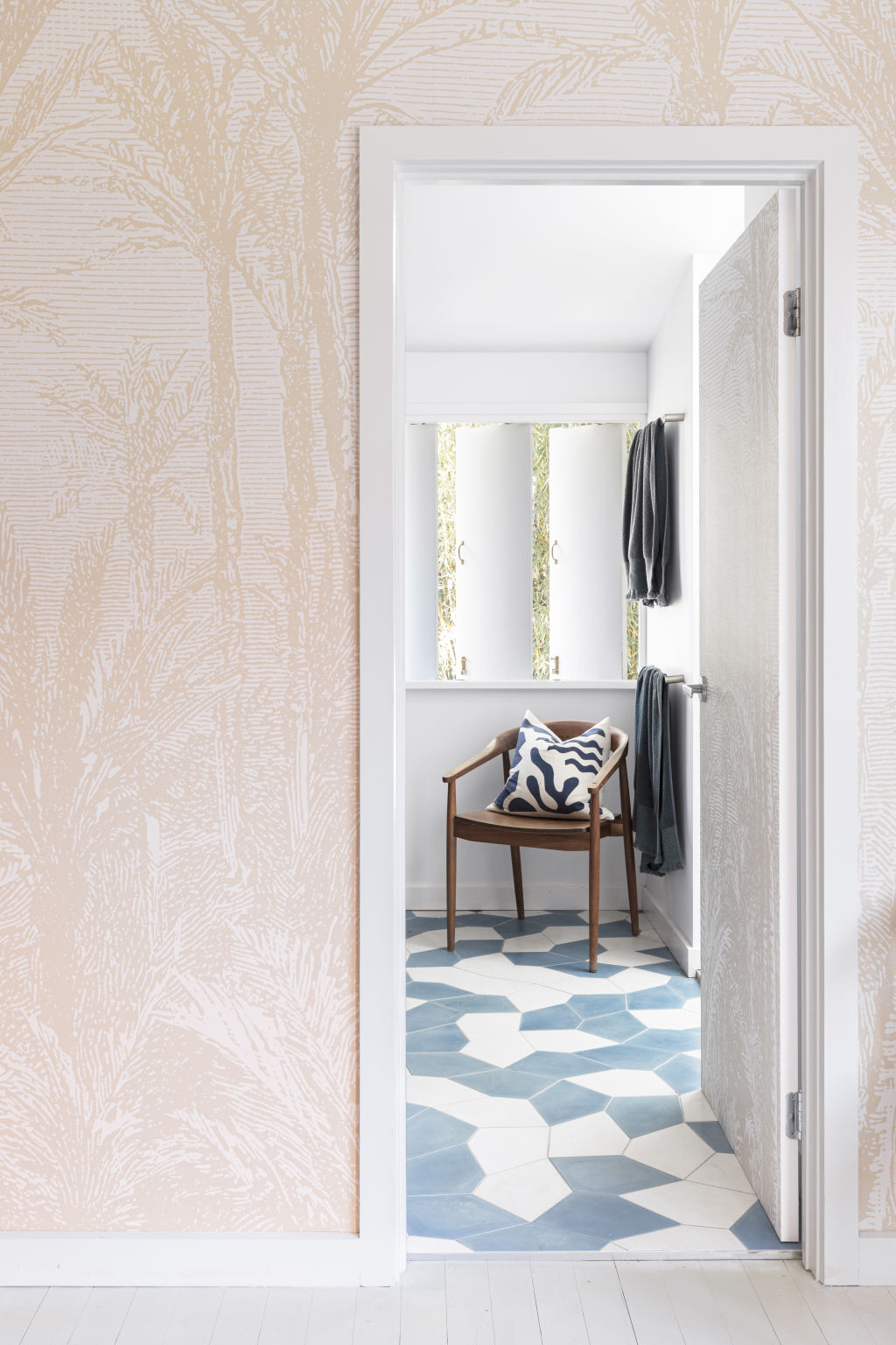
The floor is often considered the fifth wall, and colourful rugs add personality to a room. Prints can also be expressed using hard materials like timbers and tiles. “How you lay out tiles creates endless pattern opportunities,” Hugh-Jones says.
“Change the direction of a tile or a timber board to create a pattern within an inset area of the floor. Under a dining table, for example, some parquetry provides a visual difference from the rest of the room.”
Patterned carpet is not for the faint-hearted but looks spectacular with a contrasting wall mural or wallpaper, Casella says. “If this is for home, you need to feel comfortable living with it, but in a commercial space, the more print, the better!”
We recommend
We thought you might like
States
Capital Cities
Capital Cities - Rentals
Popular Areas
Allhomes
More
- © 2025, CoStar Group Inc.
