Design experts share their top tips on how to maximise a small space

No matter whether you are a first-home buyer or downsizing for retirement, many of us are getting used to the idea that we are going to be living in smaller homes.
But this doesn’t mean we have to compromise good design aesthetics – if anything, good design becomes even more important to maximise the space.
There are no “rules” about interior design these days, but there’s no doubt a cluttered approach won’t do a small space any favours.
Designer Bridget Foley says anything that draws the eye upwards is beneficial. This can include full-height bookcases. “If you choose curtains, use a floaty fabric and hang them as close to the ceiling as possible. Hang curtains to the side of the windows or doors to make them appear wider. Or just use simple roller blinds that keep the windows clear and uncluttered.”
A small space should not equate to small furniture items. “Really small furniture can just look twee,” says Foley, who also warns against overcrowding. The designer is a fan of transparent furniture, including pieces by Kartell from Backhouse Interiors.
During a visit to Auckland late last year, The Block Australia judge Neale Whitaker spoke about the tiny living room in his own city apartment. “I have filled it with overscale furniture pieces, and it looks amazing,” he says. “I always tell people to use large sofas and chairs in a small space. Small chairs will just make a small room seem even smaller.”
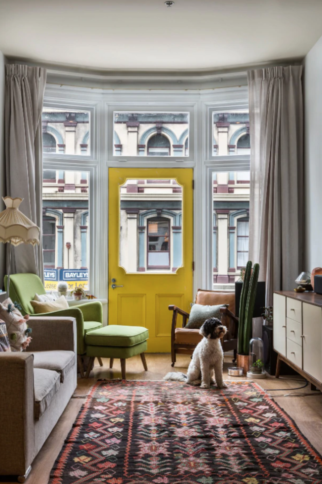
Interior designer Sonya Cotter agrees: “Spaces can cope with a lot more furniture than you think. But there are some tricks you can employ. For example, having legs on your sofas will open up the space and make it feel a lot bigger. Similarly, finer legs on dining furniture helps retain volume in the room.”
Cotter is also a fan of large murals, so long as they are light coloured,”soft”, and abstract. “A panoramic mural will have the opposite effect, making a space seem enclosed.”
The designer says the way we arrange our furniture makes a difference. “Putting a bench seat right up against the back of a sofa in the middle of an open-plan space, with the dining table right there, creates a ‘furniture island’ that helps to enhance the sense of space. Pulling furniture in, so it is not sitting around the walls also helps.
“And monolithic coffee tables are a thing of the past. The trend now is to not have a central coffee table, but to have smaller side tables beside sofas and chairs. These can be moved around as needed. This leaves the centre of the room for people to move through.”
Cotter also suggests a swivel chair beside a window can fulfil two functions – it can be a reading nook beside the view, or it can be turned around to be part of the “conversation” in the living room.
Modern cabinetry is increasingly accommodating our need to maximise space. Pocket doors hide TVs when not in use, and sleek cabinets keep the clutter out of sight.
Mirrors are also invaluable – the larger, the better – because they effectively double the perceived size of a room. “I like to use antiqued glass in metal frames. They are not to look in, but to reflect light back into the room and create a sense of space,” says Foley, who suggests mirrors look best hanging vertically, rather than horizontally, again to draw the eye up.
Similarly, using other materials that reflect the light makes a space seem larger, as will a skylight.
“Don’t be afraid of pendants in small rooms, either,” the designer says. “Reflective, clear pendants add interest and can trick the eye that the room is bigger than it really is.”
Large artworks make a strong design statement that often works better than a lot of smaller artworks in a small space.
Foley says light colours, both on furniture and walls, make a room look bigger, with Resene Half Bianca a favourite. “Conversely dark walls, such as Resene Bokara Grey, can add depth.”
The designer recommends a timber floor, with walls, skirtings and architraves all painted in the same shade to help maximise the space.
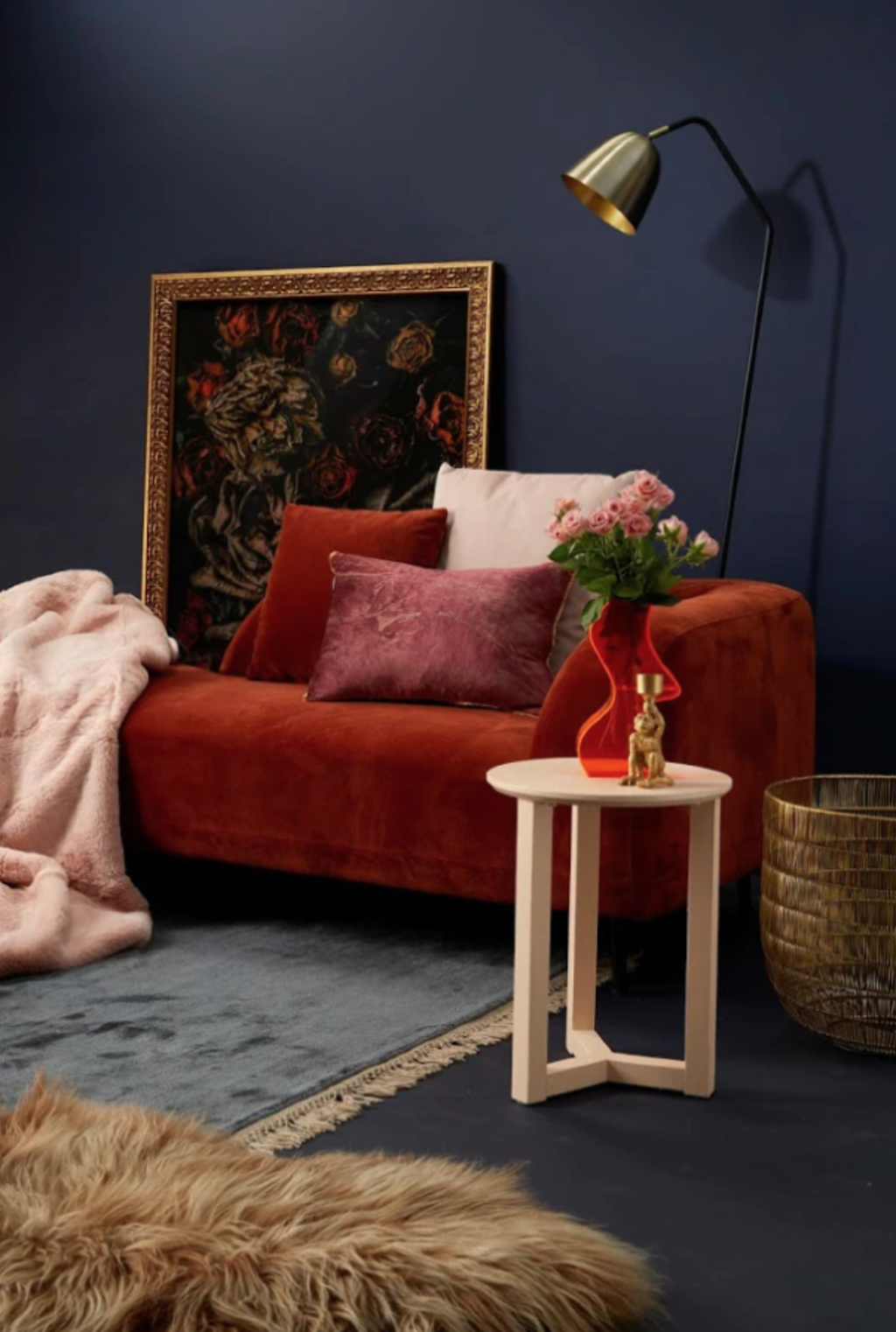
Resene colour consultant Nikki Morris also says darker shades can work well in smaller spaces, but she suggests sticking to neutral darks such as blacks, charcoals, navy blues, chocolate browns and plums. “Reds, greens and mid-tone blues can call too much attention to the walls, making a room feel smaller.
“Accessorise with blankets, artwork, rugs and furniture in similar colour tones but with textural differences, and include pops of bright colour with cushions, lamps and candles.”
- This story originally appeared on stuff.co.nz
We recommend
We thought you might like
States
Capital Cities
Capital Cities - Rentals
Popular Areas
Allhomes
More


