10 steps to refreshing your kitchen when you can't do a full renovation

Who hasn’t stared at their kitchen and wished HGTV could sweep in and update it? Short a television show’s budget and ability to bring in contractors, the next best thing might be talking to people who have decorated for TV: Orlando Soria, who is launching his own HGTV show in the fall called “Unspouse My House,” and Karin Bennett, who was a lead designer for a season of “Property Brothers.”
But first take some advice from professional organiser Jeanie Engelbach, founder and owner of apartmentjeanie, a lifestyle service provider in New York. “Organisation of any space in the home is the foundation,” she says. “The kitchen should be the cleanest room in the home; however, it is often the most highly trafficked, congested and forgotten space.”
Clear out the clutter, put things back purposefully, pick a project or two, and you could have a new kitchen in a weekend.
1. Get rid of excess
Go through everything in your kitchen and set aside tools or appliances you don’t use. “If you’re not making fantastic-looking fruit salads all the time, you can let go of the melon baller,” Engelbach says.
If you find later that you do use the waffle maker quite often, you can put it back on the counter. Toss that collection of mismatched glassware, too.
2. Put everything in a logical place
When you put things back onto your shelves and into your drawers, organise for the way you use your kitchen. Put knives near cutting boards close to the sink. Gather coffee supplies together on a tray. For one of her clients, Engelbach made a station for the school-age kids to put their lunches together, with drawers for snacks and containers.
3. Paint something big
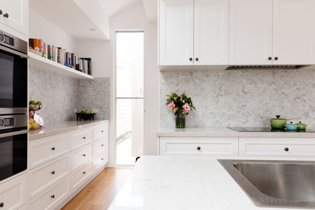
If you can’t stomach the work or don’t have time to paint cabinets, paint some walls. One bold accent wall might require only a couple of litres of paint and an afternoon of work, says Bennett.
Or paint your floor. “If you have a wood floor but you hate the wood’s colour, you can paint it white,” she says. With the right paint, you can also paint tile flooring or a backsplash.
4. Update hardware
Both Bennett and Soria suggest installing new cabinet hardware. “One of the most common questions clients ask is whether all of the metals have to match,” says Soria. “But I think you can really mix it up.”
He says that black finish looks good with brass finish, or even with nickel zinc. Mix up shapes, too. Try knobs on the upper cabinets and pulls on the lowers, a strategy Bennett employed for her own kitchen.
For even less money, you can spray-paint your existing hardware. “I am a spray-paint queen,” Bennett says. “Unscrew those knobs and take them out to your garage.” She suggests matte or brushed gold.
5. Change out light fixtures
Updating fixtures may seem like a project only for homeowners, but Soria was able to change out the lights in his rental with his landlord’s approval.
When choosing a new fixture, consider how much light you want. In a dark kitchen, Bennett says, the lampshades should be translucent or glass. “Then you’ll get a lot more light and not just directional light” shining downward.
6. Accessorise well
“Even just the type or amount of accessories you have in your kitchen can completely change the look,” Bennett says. With a classic white kitchen and black countertops, she’d add natural wood in cutting boards leaning against a backsplash or wooden bowls on a shelf.
“A copper or terra-cotta plant pot looks amazing,” she says.
If you’re looking for more vibrantly coloured accessories, Bennett says to use the colour in no more than three accessories. Think, too, of how those appliances on your countertop can be accessories in their own right. Engelbach says Smeg’s appliances in particular are attractive, and adds that even a new kettle and toaster can re-energise a kitchen.
7. Put down a washable throw rug
“They’re making some really good washable rugs for the kitchen now,” Soria says. Try a small foot rug in front of the sink or a runner down a long kitchen. It adds “softness and colour,” he says. “And you want a washable rug because, in a kitchen, there are sauces flying everywhere.”
8. Hang art
“Something you don’t see all the time is putting up art,” Soria says. “I’ve put up art on my backsplash using self-adhesive foam tape.” He says it can help anchor those organised stations, making them look visually united. Engelbach agrees.
“I think it’s nice to have fabulous artwork,” she says. “For people who have open floor plans and open kitchens, they need to be cognisant of the fact that the kitchen is part of the living space.” If you can see a kitchen wall while you’re sitting on your living room sofa, you’ll want it to be aesthetically pleasing.
9. Try removable wallpaper and tile
For renters and non-renters alike, Engelbach recommends temporary wallpaper. Engelbach says that while many of her clients are in rented apartments, even those who aren’t don’t know if they want to commit to the expense of fully adhesive wallpaper.
For a “very-budget update” for a backsplash, Soria suggests self-adhesive penny tile, easy enough to find on Amazon, at Home Depot or at Bed Bath & Beyond. “If you don’t have the time or the money to actually tile, you can actually use this wall detail.”
10. Change out a window treatment
Soria just finished his parents’ kitchen remodel and added a patterned Roman shade. “It’s a small update that you can do,” he says. To save even more, Bennett suggests, sew the shade yourself with remnants or going-out-of-stock fabric.
We recommend
States
Capital Cities
Capital Cities - Rentals
Popular Areas
Allhomes
More
