How to style your home for sale: Eight staging tips to prepare your property

You’ve decided to sell your place – and now you’re ready to throw yourself into fix-up mode to get it ready for market.
Here are eight home-staging tricks you can use to get your house looking sharp – although they might make it look so good you no longer want to.
1. Real plants in every room
“Even in the toilet,” says Kate Alexander interior stylist and home stager of Places and Graces.
“Plants require care and attention, if there are alive and healthy plants in every room it gives a signal that the house too is lived in and cared for.”
Flowers are lovely, she says, but they die faster than plants, “you’ll go broke buying fresh bunches every week.”
2. Furniture placement
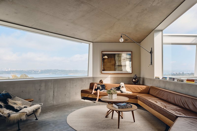
Generally, we want to make a room feel larger instead of smaller, and furniture placement is a key element that affects this.
- Related: Experts are calling this plant the fiddle-leaf fig of 2018
- Related: The surprising addition that made my house a home
- Related: Increase the value of your home in one weekend
People normally scan a room from left to right. If you place the tallest piece of furniture in the far left corner of a room, the room will appear larger.
3. Views
Alexander recommends walking around the house and pausing where people are likely to stop. At these points look at what they would be focussing on, and if it’s not pleasing to the eye, move it or change it up.
For example, the front door is the first place you’d want to do this she says, “what will they see when they enter and how will this affect how they view the rest of the house?”
4. Stash the TV
Television screens are getting bigger and bigger and can look like a big black hole in your living room. They also occupy valuable wall space and often make rooms appear smaller. Try finding a clever way to incorporate it into your decor, maybe it can be hidden behind a screen.
5. Beds
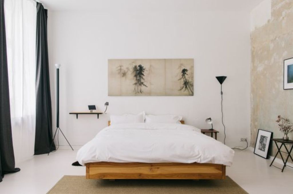
“Don’t make your bed like a hotel, but do make it a little bit nicer than you would on a normal day,” says Alexander.
Make sure you have a few euro pillows, normal pillows, extra cushions and at least one throw.
“Beds are a good way to pick up colour in a room, so try to match with colours in a piece of art,” says Alexander.
6. Diversion theory
This, says Alexander, is something she employs in most of the houses she styles. “If there’s something you can’t easily fix, then you need to divert the eye somewhere else. When you try and cover some up or hide it, it can usually become obvious what you’re trying to do.”
Instead, she says place a beautiful or interesting object somewhere else in the room.
7. Cohesion
“The overall feeling should be one of balance and consistency,” she says.
Start with the entry, as this is where people first enter, and make sure the theme is carried all the way through. It may be the case of needing to add more colour (you can do this through throws, cushions and art) or taking away from a room that’s “completely out there.”
8. Paint the fence dark
“This is a fail-safe way to improve your backyard,” says Alexander.
The dark colour acts as a spotlight for the garden planted in front of it. “A dark fence essentially turns invisible, it’s less obvious so all the attention is focussed on the lovely, lush green plants. They will really pop.”
We recommend
We thought you might like
States
Capital Cities
Capital Cities - Rentals
Popular Areas
Allhomes
More


