How two young architects revived their tired 1970s Melbourne home
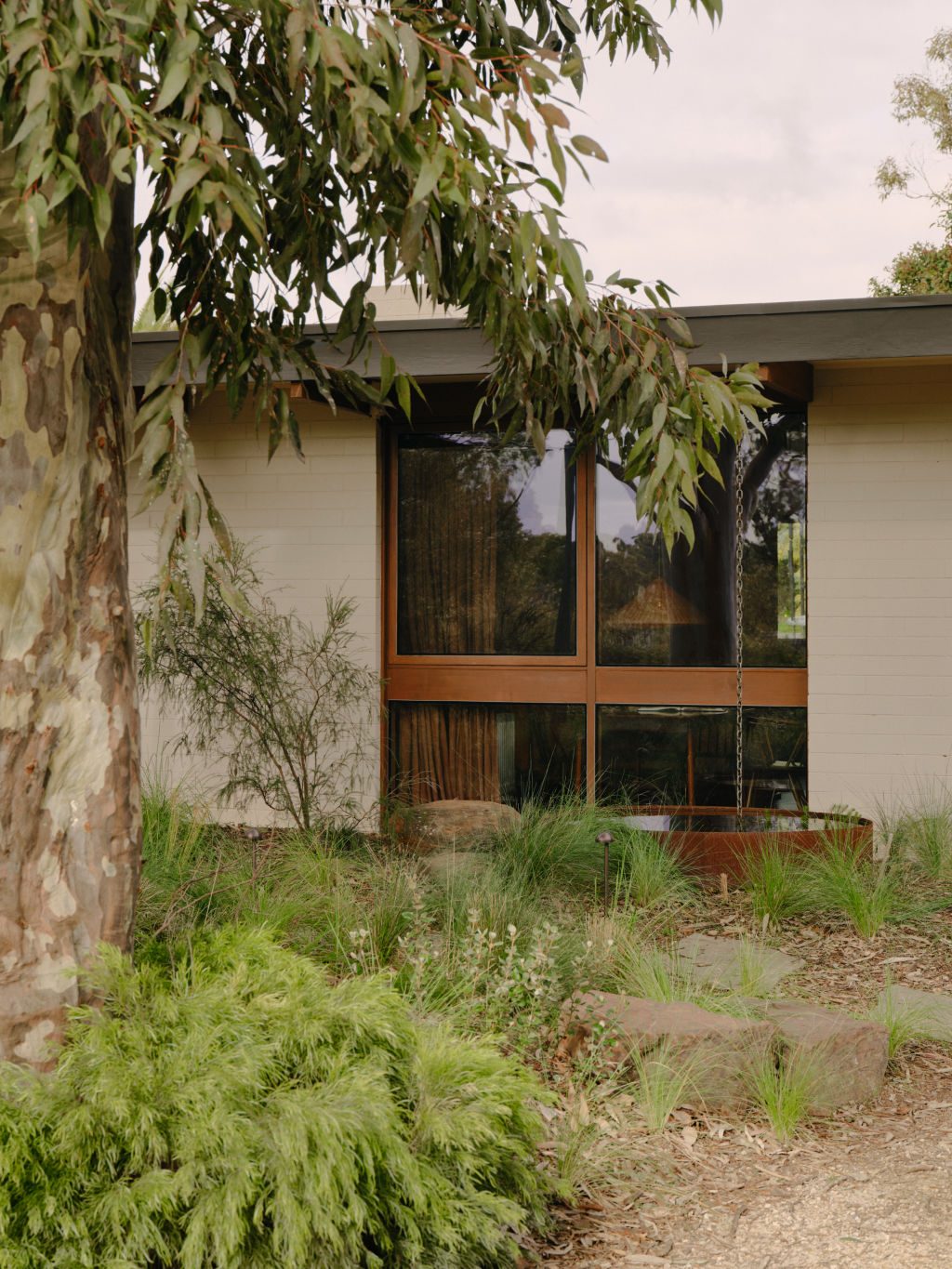
In the quiet suburbs of Melbourne, nestled beneath the sheltering arms of ancient gum trees, lies an example of the architectural rebellion of the ’70s, born in search of an affordable modern Australian home of its time.
This is where young architects Brad Mitchell and Kerli Valk of Nuud Studio embarked on a mission – to breathe new life into Monty Sibbel, a tired relic of the era bearing the mark of its original makers, Sibbel Builders.
Completed in 2022, the project aimed to restore and reimagine the essence of the home. Intended initially as minor updates, the plan soon evolved into a full-scale renovation upon realising the home’s inefficiencies.
“The house is our own, which we purchased just over four years ago,” Mitchell explains. “After living in it for some time and experiencing how cold it was in winter, we set out to improve its efficiency along with elevating the design of the house.”
The vision extended beyond mere restoration; it was a quest to revive the soul of the home, concealed beneath layers of neglect and misguided renovations.
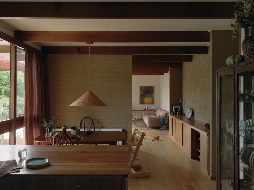
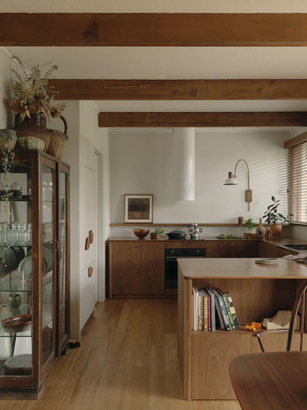
Mitchell continues, “Previous owners had painted over a lot of the beautiful solid timber beams and windows, and white laminate joinery had likely replaced the original timber joinery, so reviving this richness was a big ambition for us.”
Central to their endeavour was preserving the home’s original features – the sturdy Oregon beams and the crafted joinery that whispered old tales.
“The remaining original features of the house became a key design driver for us – simple and solid Oregon beams, and the main bedroom joinery floating from the wall with beautiful, crafted handles,” Mitchell says.
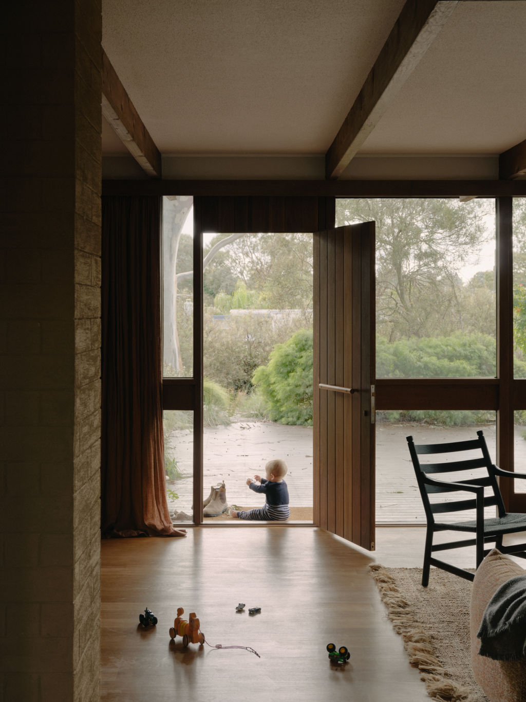
Drawing inspiration from these elements, Nuud Studio devised a congruent narrative.
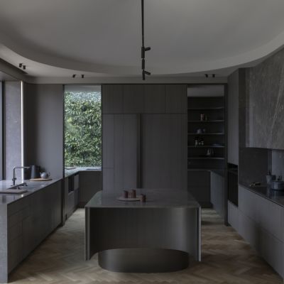
“Our newly designed insertions drew upon this language but developed it further to bring a softness through weathered, rounded edges and celebrated local native timbers,” Mitchell says.
Beyond structural enhancements, attention was paid to every detail, from the choice of furniture to the selection of fittings and finishes.
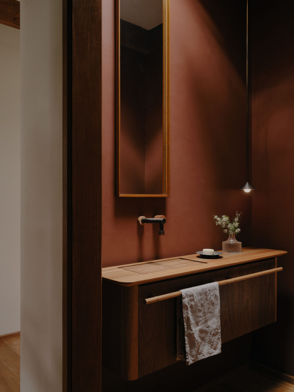
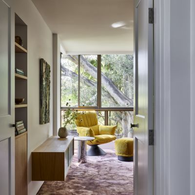
“The furniture was selected to compliment the approach to the joinery in form and tone,” Mitchell says. “Organic forms and natural finishes were important.”
Weathered brass fittings were chosen to infuse a sense of character and timelessness, while handmade pieces like Lindsey Wherrett’s basin in the main bathroom added a touch of artisanal elegance.
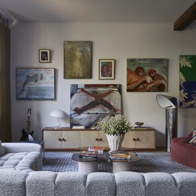
Art pieces add a personal touch to the interior. “We have collected a few art pieces over time, and we see this as a slow process as we discover ones that have significance to us,” he says, singling out the large painting in the living room by a local artist, Michael Mark, who creates his work by rubbing and moving the paint across the canvas by hand.
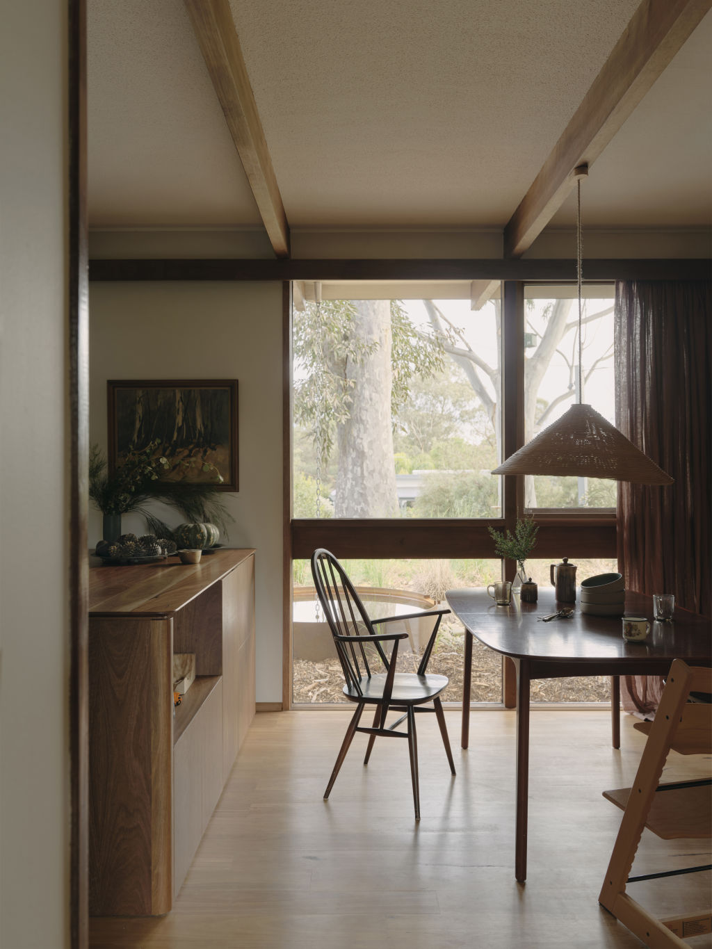
Amidst the triumphs of this restoration, challenges loomed large. Mitchell recalled the gruelling journey of preserving the old windows and beams, a decision met with scepticism.
“It certainly wasn’t a straightforward approach, and some trades commented it would be easier to remove them and start again,” he says. “But you couldn’t disagree more when you see the character and richness within the restored timber.”
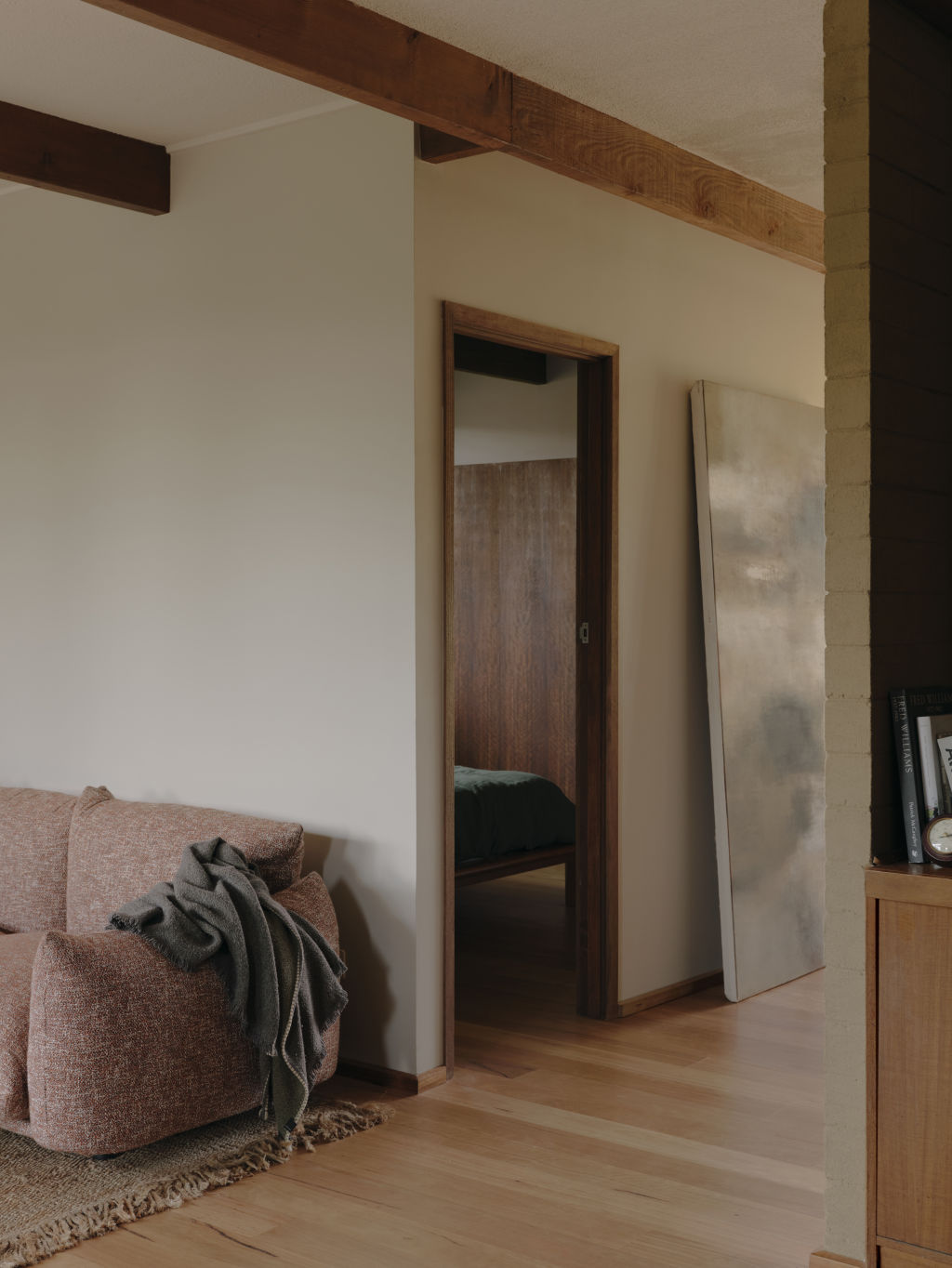
Reflecting on the project, Mitchell acknowledged the lessons learned and suggested areas for improvement in hindsight.
“If we had our time again, we might have restored a few other elements, such as the central credenza,” he muses, highlighting the iterative nature of design and renovation.
Nuud Studio’s personal endeavour speaks to the transformative power of thoughtful renovation and repair. This project revitalises an architectural relic, honouring its rich legacy while weaving a new chapter in its future story.
We recommend
We thought you might like
States
Capital Cities
Capital Cities - Rentals
Popular Areas
Allhomes
More
