Ingenious redesign: How sleeping pods transformed an artist's studio
Author: Victoria Harrison
When Tom Scott first bought this unusual home in west London, the layout was less than ideal. The space had been converted from an artist’s studio in the 1980s and the open-plan house was cluttered and cramped. Scott could see the potential in the quirky building though, so he brought in an architect and construction company to completely redesign the space and convert it into a clever and airy home.

Houzz at a Glance
Who lives here: Tom Scott, a surveyor, his girlfriend and their baby daughter
Location: Shepherd’s Bush, west London, UK
Property: A detached former artist’s studio built in the early to mid-19th century
Size: 2 bedrooms, 2 bathrooms; approx 65 square metres
Architect: Paper House Project
Construction company: Thomas West Property Services
Project duration: June-Oct 2015
Cost: £125,000 (AU$206,678)
Photos by Ignas Jermosenka

A former artist’s studio, this unusual property had previously been converted in the 1980s into a one-bed apartment with two open mezzanine floors (this photo shows the original “bedroom” mezzanine). When Tom Scott bought the apartment, he wanted to make better use of the space, as well as create a second bedroom, but he was keen not to lose any of the natural light.
Based on recommendations, Scott hired Paper House Project architects and Thomas West Property Services construction company to help him transform the space.
James Davies and John Weir of Paper House Project were happy to take on the design. “We’re really keen on highlighting the second life of buildings and enjoy bringing an interesting property back into use,” says Davies. “We also specialise in getting the most out of small spaces.”
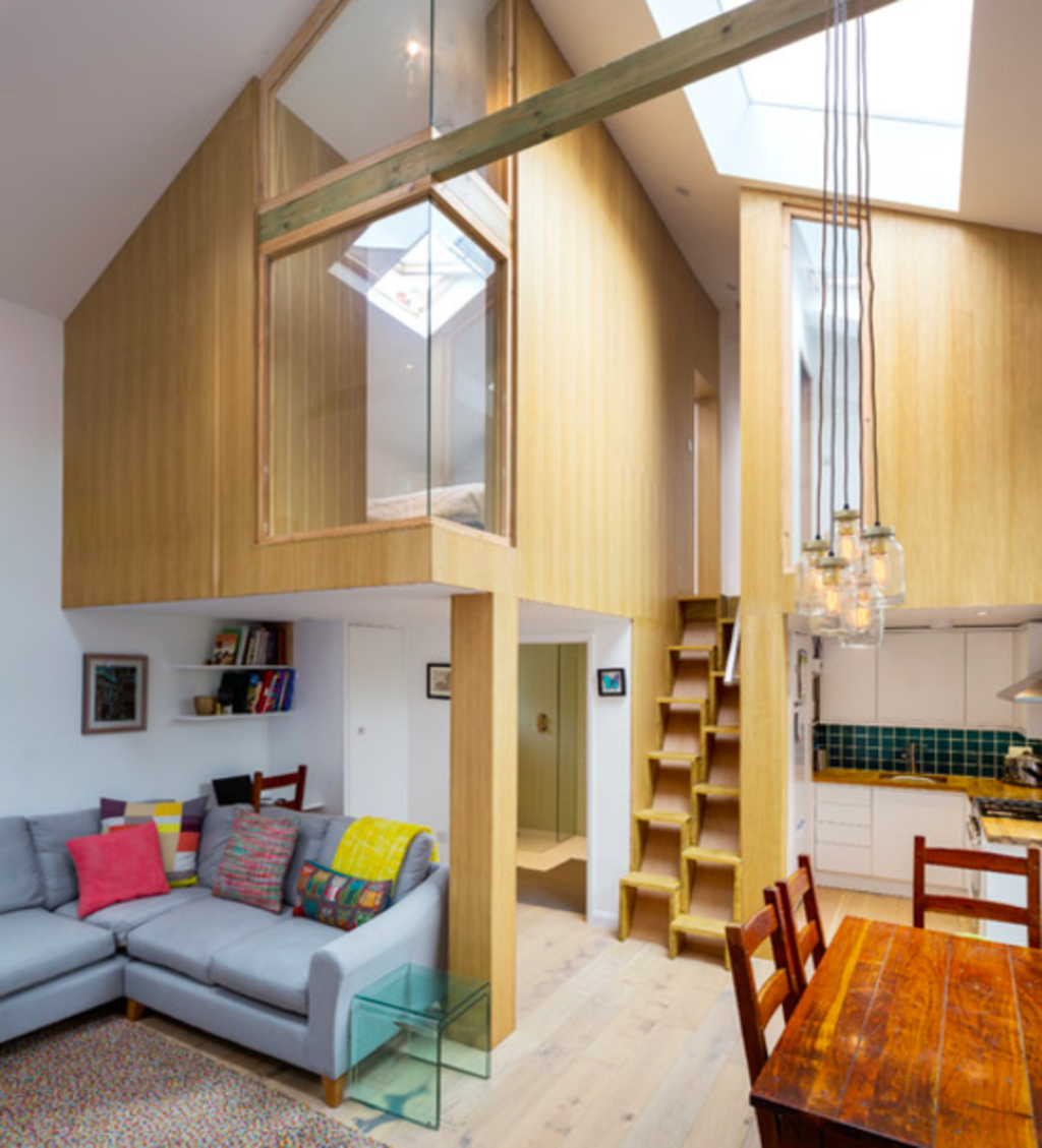
A key part of the transformation was the creation of the two ‘floating boxes’ with large windows, each one housing a bedroom.
“Having an enclosed mezzanine would have been too oppressive,” says Davies, “but any smaller and it wouldn’t have been useable for them.” So the architects had to try to strike a balance between respecting the original building and making the most of its original features, and creating a practical, safe space.

This photo shows the original mezzanine floor, where the new sleeping pods are now.
The pods were clad in oak veneer to bring warmth and texture into the space, as well as providing the privacy that was lacking before. “The oak panelling is probably my favourite thing about the house,” says Scott.
To ensure each room was flooded with light, large glazed panels were also designed into each pod. “I didn’t want the bedrooms to feel too closed in,” says Scott.
The large, north-facing window in the dining area hints at the building’s previous life as an artist’s studio. It was covered in heavy curtains originally (see previous photo), but stripping those away and leaving it open allows as much light as possible into the space.

Sofa: Laura Ashley; pendant light: Jam Jar Lights
The project wasn’t all smooth sailing, though. Before the team could get to work on the interior space, they discovered the building itself was in need of some serious structural work. The roof had started to leak and, because of this, the walls were leaning.
To counter this, the team at Thomas West Property Services strengthened the walls, replaced the roof and replaced all of the internal floors. They also added new windows and skylights. A small extension was also added to the rear of the property to house an ensuite bathroom for the master bedroom.
Under the staircase, the architects planned in lots of bespoke storage cupboards, as well as squeezing in a fridge-freezer. A small kitchen was tucked next to the staircase underneath the second bedroom. “It was a bit tricky to fit everything in, but we eventually found a fridge-freezer that could fit under the stairs,” says Scott.
Because of the steep pitch, the new staircase needed to be a space-saving one, hence the unusual staggered-step design. “You get used to it very quickly,” says Scott. “We can run up and down it now!”
The soaring ceiling is a key part of the design and one that Scott was eager to retain. “Trying to preserve the high ceiling was a key part of the brief I gave to the architects,” he explains. “It’s a small space and there’s not much you can do to change the footprint, but I wanted to make sure it felt as light and bright as possible. On a sunny day, it feels like a very big, very bright space.”
The shower room downstairs is sleek and modern thanks to a glass-screen, walk-in shower and a contemporary wall-hung basin.

Upstairs, the bedrooms are simple, calm and bright. Integrated storage, factored in at the design stage, makes the most of the limited space.
Large glazed panels connect the upstairs rooms with the downstairs living area. “Because it’s such a small space, it was really important to maintain sightlines from the front to the back of the property,” explains Davies. “If the rooms are visually connected, it makes the space feel larger, and diagonal sightlines in particular are key for making spaces feel bigger.”
“Having an architect onboard transformed this build,” says Scott. “There are many elements of the design that seem simple now they’re done, but I just wouldn’t have thought of them without an architect.”
Possibly the most surprising thing about this project, though, is the timeframe – the entire renovation was completed in just three months. It was an impressive feat, precipitated by the news that the couple were expecting their first child, so needed a home to move into fast.
“We rented a house around the corner while the work was being undertaken,” says Scott, “so I was able to be involved with the project on a day-to-day basis. There were a few strategic issues to navigate. The building is surrounded by neighbours on three sides, so access was tricky at times.”
Nonetheless, the work was completed on schedule and, in October 2015, the couple moved in, just in time for the birth of their daughter.
See what tricks we’ve learned from Tiny Homes Around the Globe.
We recommend
We thought you might like
States
Capital Cities
Capital Cities - Rentals
Popular Areas
Allhomes
More
