The elegance of extreme restraint: The townhouse with only a single door

In making his own unambiguously refined Malvern townhouse, Paul Conrad indulged a preference for “formality, the rigours of geometry, and the sense of restraint and calm that comes from their very simple expression”.
He gained an appreciation for these qualities while working as an architect in London. “They were my formative years,” he says. “And I loved the classical architecture of those tall, formal (West End) Georgian and Victorian houses.”
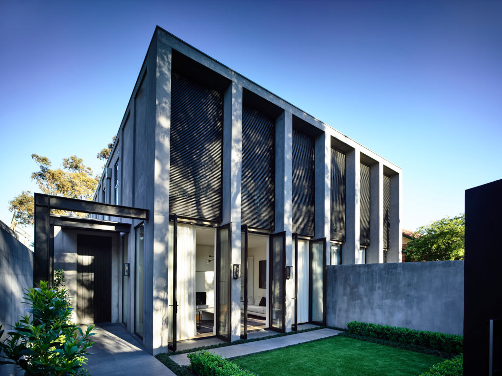
The principal of Conrad Architects believes few clients would have allowed him to pursue these ideas in a contemporary build in quite the degree of purity he has demonstrated here. “But I had the chance to explore them and to control the floor plan, which took a lot of work to reduce to its simplest form.”
The townhouse pair he developed – one of four bedrooms that sold off the plan, and his own of three bedrooms – began from a foundation of a powerfully vertical exterior composition, with series of tall columns divided by high, black-framed French doors.
“So, it’s a rhythm of column, French door, column, French door. A classical rhythm,” he says. On the upper floor, the west-facing master bedroom is screened in horizontal battens.
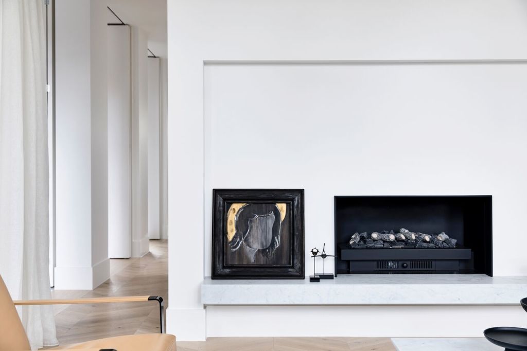
Made of thick, rendered concrete block-work, the columns are “far thicker than they need to be, because we wanted them to be substantial, solid and to have a presence the opposite of flimsy and cheap”.
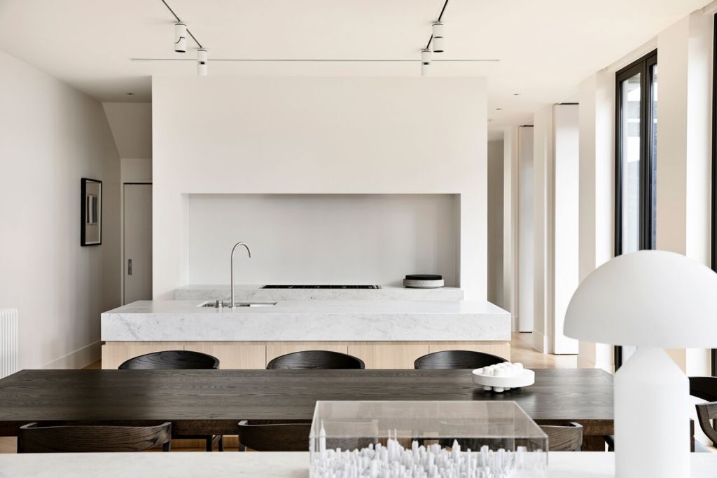
Such substance, the generous scaling and the uncompromising quality of a cultivated material palette – Carrara marble, oak cabinetry and parquetry laid in chevrons, white walls and fine linen curtaining – sees the discipline carried throughout the interior, which has bedrooms upstairs and the ground floor entirely dedicated to living.
The smaller formal front and larger informal rear living-kitchen-dining spaces are subdivided by a solid central element that is the services block of butler’s pantry, powder room and laundry. There is only one door, and that’s to the laundry.
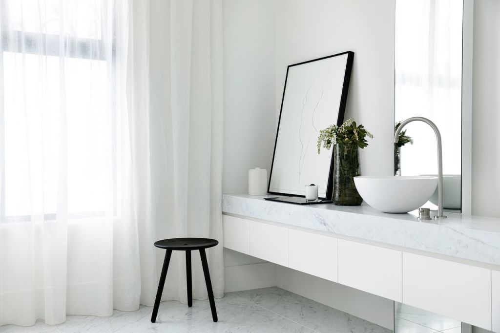
It means you can always glimpse the next space or look along light-infused through-views, and always see how everything serves the verticality, “even the mirrors in the en suite”.
“The ideas are repeated everywhere, which goes back to our aim of reducing everything to its simplest.”
The movable furnishings are 20th century modern classics – “contemporary classic elements,” says Conrad. Even the trees planted in the front courtyard align perfectly with the doors “to emphasise more axial views”.
The townhouse pair is a new introduction in an expensive period street. Because they’ve been made with such restraint and quiet authority, Conrad hopes he’s designed a building that will abide.
“I hope it will sit here comfortably and in dignity for the next 100 years.”
We recommend
We thought you might like
States
Capital Cities
Capital Cities - Rentals
Popular Areas
Allhomes
More

