Innovation: Unwavering commitment to creative design
When David Seeley first showed me his concept sketch for the roof of a detached new wing on an olive grove near Kyneton, my response was: “Yeah sure. Like that’s gonna happen”.
When the clients reviewed the construction costs for the sensational canopied construction over the two-bedroom, elongated building, for one wavering moment she proposed a conventional flat roof. Being a supporter of lost skills and crafts, Seeley says, “he however, wanted a house with an artisanal quality.”
So this fantastical structure went ahead.
“When the carpenters viewed the waveform drawings, they were quietly freaking out”, Seeley says. “They were thinking it was laborious. But in fact, it was very straightforward”.
The glazier was consulted early about whether clerestory windows could become the border between the walls and finely profiled, timber-lined ceiling, both on the edges and throughout the house, and “he was up for the challenge. He said, ‘yes, he could curve the top of the glass'”.
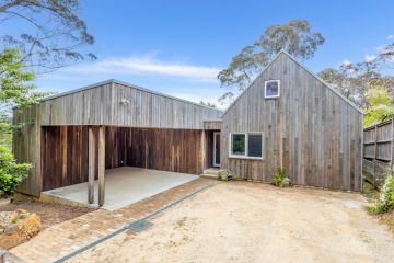
So there she stands; a house with a roofscape born in response to what the architect saw as a hilly, “voluptuous setting”. Yet it is also practical. “Because there’s no water supply on site we needed to catch rainwater, so all the water is captured and stored”.
With a landscape more imposing than just picturesque, the insects are a problem, so a central entry and mud room where boots and jackets are divested was given wire screening and a French flagstone-style tiled bluestone floor to become an alfresco sitting space and the divide between the bedroom end at the east, and the public living spaces where the lounge rests on a cantilever and runs through to a six metre by eight metre canopied deck at the west.
The most conventional area is the kitchen, set in a low, square alcove projecting off one side. As with most of the interiors that aren’t looking out, or up through glass, the kitchen walls are lavishly lined in recycled messmate, which is another localised response because “the whole of the Trentham-Wombat Forest area is a messmate forest”.
While the timber is highly figured, in the doors under the kitchen bench and the three large custom-made screens in the living area behind which is the entertainment equipment and storage cabinetry, the messmate has been crafted into thin dowels that splay out in the centre to create a pattern almost as intriguing as that of roof.
Seeley is keen to explain how easily that crafted effect was created by using copper and brass tubing. He’s just as enthused to explain why the making of the roof was more simple that it’s shape suggests: “It looks complex but the south and north other edges are on curved steel angles that are mogul-shaped but everything else is straight. The peaks (at 3.5 metres) match the troughs (2.7 metres)” …
Although he continued talking, he lost me at “… curved timber battens …rebates in edge boards … slight splaying”, etc.
Simple or no, it’s a tour de force element and, with the clerestory glazing looking up and out, it fulfils a Seeley preference for “sightlines that aren’t constrained.
“There’s a whole world of excitement out there with clouds and trees and the sky and the moon. Inside, it’s a very calm building. And I still haven’t got my head around why that’s so.”
We recommend
We thought you might like
States
Capital Cities
Capital Cities - Rentals
Popular Areas
Allhomes
More
- © 2025, CoStar Group Inc.
