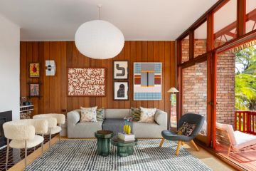
In his own home, Michael Christensen, one of Brisbane’s leading architects, has played a radical hand.
In 1997, when newly married, he bought an affordable starter house in Milton and, loving the area, stuck with it for two decades, tweaking the floor plan in small, successive renovations that occurred as money became available.
“This is our lifetime house,” says the director of m3 Architecture. “We’ve done it up in tiny, pragmatic stages. In terms of construction, we’re up to stage-six.”

What an old fashioned idea: a house that evolves in response to need and accessible funds.
And more especially, how odd is sticking with a small, detached house circa 1900 on 252 square metres, at a time of over-scaled living spaces and statement-architecture designed to stop traffic?
Surely when the two children arrived and when they became teenagers, a bigger place was in order?

“For a while, the children wanted a house in the suburbs with a big backyard, but now they love the convenience,” he says.
The house has become a three-bedroom home with a small front study (2001), just enough space in the carport for a small car, with an attic main suite and a small pool in a battle-axe backyard subdivision (2014).
Christensen explains that as he contemplated the renovation of living, kitchen and bathroom (2004), he decided to pull up the entire ground floor.

Just then, his immediate neighbour decided to sell, and the Christensens bought the property next door as a potential future home for grandparents.
While the progressive projects have added up to a charming totality, being a working class Queenslander, there are many canny details that reflect the foresight of an architect extracting the most from a cottage-scale home.
The bathroom looks out through glass to palms and has a perforated floor under the showerhead covering a sunken bath. A sliding wall opens the bathroom to the living room.

“The whole room is the shower,” says Christensen. “And when it’s not being used as a bathroom we make it part of the living room.”
Demonstrating another aspect of multi-functionality, the table moves around the floor plan.
The living room proper steps straight up from the shallow front yard and has a window seat in an attractive bay. The table is often in this space but when moved out the room easily caters “for stand-up parties of 30-50”.

But wouldn’t it have been easier to follow everyone else in the street and lift the house to put a whole set of bigger, better rooms beneath?
“That’s a common response. But we wanted to leave it as it was and keep our living room on the ground level so we could use the backyard without having to go downstairs,” Christensen explains. “Lifting [Queenslanders] can blow out the proportions. We’ve been able to upgrade this house without really changing its basic elements.”
