Interior design predictions for 2018: What's in and what is out
Terrazzo, brown and … the 1980s? Even the most dedicated interior enthusiasts might be surprised to learn what’s on the cards trend-wise in 2018.
We asked some leading industry names what trends they predict will be in (and out) for next year.
What’s in:
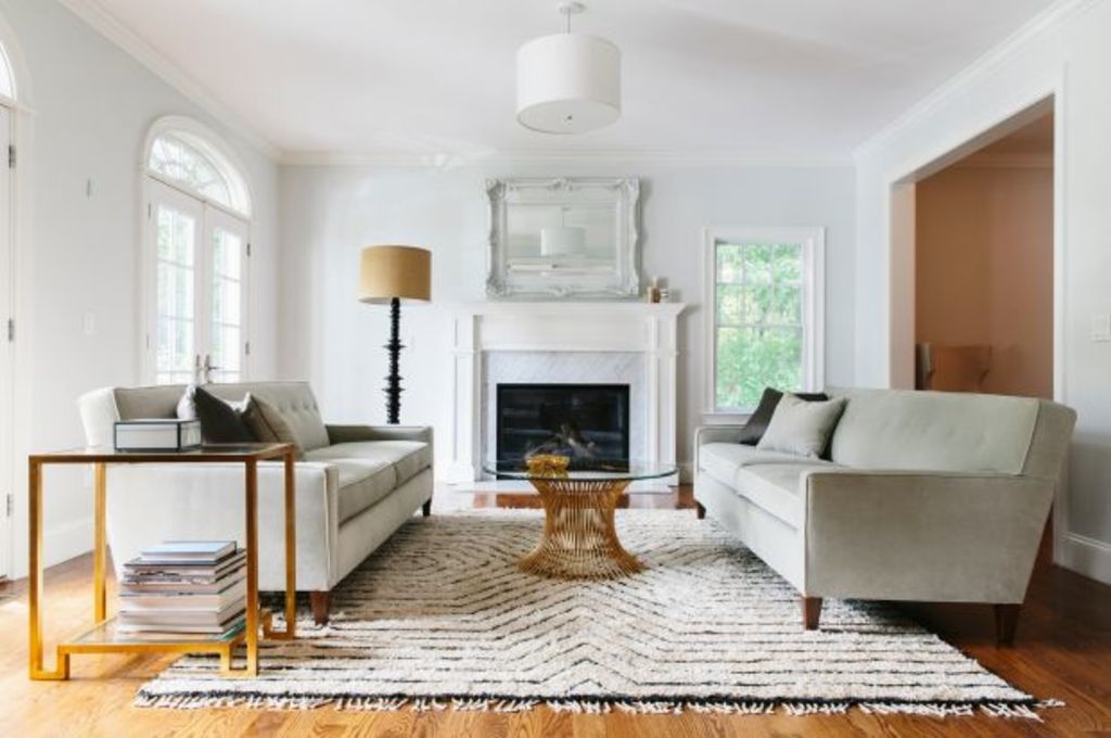
Brown

Design by Sisalla Interior Design. Photo: Eve Wilson
In line with the return of 1970s tones to interiors, industry insiders say the new go-to colour for 2018 will be brown.
“It may seem hard to accept, but brown is coming … brown is warm, welcoming and inviting, which makes it a long-awaited change from cold and depressing grey,” Lauren Li of Sisällä Interior Design says.
Because of its versatility, brown is predicted to be used across a number of popular decorating themes in 2018, such as boho and rustic interior stories.
Popular shades will be on the earthier side of the spectrum – think cognac, almond and beige – instead of chocolate or mission brown.
“Brown can be introduced with wicker furniture, natural leather and various timbers or, if you’re wanting to feel totally cocooned, a paint colour … it’s safe, classic and timeless,” Li says.
New nudes

Photo: Temple & Webster
A series of earthy red and pink shades are also set to become fashionable neutral colours in 2018.
The more vibrant reds in this family are likely to be used on accessories, whereas lighter dusty pinks will be used more generously as paint colours on walls.
“Pink finally will be seen as a neutral. Paired with leathers and dark moody accents to ground it, the sugar-puff millennial pink version of it will make way for an earthier, more sophisticated hue,” says Jessica Bellef, Temple & Webster’s senior stylist.
“It is a friendly, collaborative colour that plays well with shades like mustard, tan, navy, teal … it will be seen in subtle highlights rather than a loud statement piece.”
Terrazzo

Design by Studio Tate. Photo: Sharyn Cairns
Without a doubt, the new “it” material replacing marble and concrete in 2018 is terrazzo.
Most commonly seen on tiles, this ancient material is now making its way into furniture, like side tables, and providing inspiration for accessories such as planters and rugs.
Popular terrazzo images on Pinterest showcase a range of colours and applications from pink kitchen benches to earthy toned bathrooms.
Rich colour

Design by Kate Challis Interiors
After years of monochrome, pastel and Scandi-themed homes, rich colour is finally making a comeback to kitchens, living rooms and bathrooms.
“Clients are becoming more open to braver choices as we guide them towards a more dynamic aesthetic; still timeless, yet perhaps more adventurous than pastels that have defined recent times,” says Alex Hopkins, Studio Tate principal.
Accentuating this trend will be a bolder use of contrasting materials and textures.
“Overly co-ordinated colour schemes are on their way out. By sticking to a strict palette you run the risk of losing all personality,” Hopkins says.
“We’re seeing contrasting tiles, soothing timbers and statement tapware.”
- Related: Most beautiful interiors revealed at Top 50 Rooms Awards
- Related: Tiling tips for a stylish bathroom
- Related: All organised people have this in their bathrooms
Sanctuary bathrooms

Design by Studio Tate. Photo: Sharyn Cairns
Homeowners are increasingly bringing hotel-style extravagance into their own bathrooms with once luxury extras now becoming must-have features.
“The idea of creating a sanctuary at home is becoming more prevalent. This is taking shape in the form of luxurious bathrooms that offer a spa at home experience,” Hopkins says.
Walk-in wardrobes, custom dressing tables and makeup stations are among the once indulgent requests becoming standard interior inclusions.
“These touches enhance the feeling of a private retreat and bring a layer of luxury to the everyday experience and everyday rituals,” Hopkins says.
1980s hangover

Image by Temple & Webster.
The combination of muted romantic colour palettes and clean lines in residential interiors evokes “1990s minimalism, with a slight 1980s hangover”, Bellef says.
A number of looks from this period are making a resurgence, such as bold-coloured carpet, corner bathtubs and shower curtains.
“Soft mauve, faded indigos and peachy terracotta will feature, as will tubular steel furniture and exaggerated sculptural decor. Bonus points for soft-focus lighting,” Bellef says.
WHAT’S OUT
All-white rooms
Given the multiple trend predictions involving colour this coming year, it comes as little surprise that the all-white look is set to go. In fact, nearly every expert we spoke to was quick to proclaim the end of all-white bathrooms and kitchens.
“We’ve lived with white kitchens for a while now in the belief that white is safe and doesn’t date. But they’ve left us feeling nothing, so now we’re craving some warmth and colour,” Li says.
“Even just a small amount of colour can make an impact, such as coloured tiles to the splashback or just the lower cabinets under the benches in a colour.”
All-grey kitchens and bathrooms are predicted to suffer a similar fate.
“Whether it be a grey sofa or grey walls, just because the Pinterest images look so chic, living with grey is another matter. Grey leaves us feeling nothing so we are starting to crave colour,” Li says.
Downlights
Say goodbye to a uniform use of downlights in 2018.
“Overuse of downlights is a thing of the past,” Hopkins says. “Lighting is essential for creating ambience and an intelligent approach to design draws on multiple light sources to achieve the desired effect.”
Instead of downlights throughout the entire home, consider a varied approach to lighting in living areas and bedrooms.
“Floor and table lamps, pendants, wall sconces and sculptural lighting have both functional and aesthetic impact far greater than anything downlights can achieve,” Hopkins says.
Brass
In 2017, it was rose gold. In 2018, the material to avoid is brass.
“One trend which has reached its peak is the use of metals, especially copper and brass,” Kate Challis of Kate Challis Interiors says.
“I am cautioning my clients to stay away from brass – it is everywhere. It is the one material which will date-stamp a renovation to the 2010s.”
Speaking of metals, leave the industrial looking shades to your local cafe and stick to pendants that create softer, more widespread glow.
“The cage or wire pendant lights were originally designed to protect the glass globe on construction sites and this is where they should stay! The same goes for any light with concrete or copper,” Li says.
We recommend


We thought you might like


States
Capital Cities
Capital Cities - Rentals
Popular Areas
Allhomes
More
