Interior designer Danielle Brustman on how different colours can affect your mood
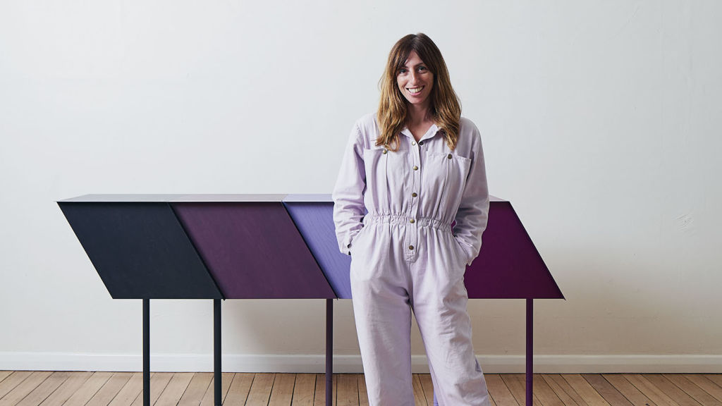
Colour in the hands of the right interior designer can inspire a mood and channel the good times all in the name of capturing more than just creativity.
But knowing how to curate it comes down to understanding colour as therapy.
Melbourne interior designer Danielle Brustman has long celebrated colour in her public and residential work.
She graduated from RMIT in 2002 and embarked on a colourful career in theatre set design before opening her practice in 2012. She’s all about juxtaposing colour to create a mood, where the subliminal is as purposeful as the visual.
Brustman is taking part in the National Gallery of Victoria’s Triennial exhibition, opening December 19. Her technicolour involvement is as much an intellectual quest as it is an exploration into how colour impacts mood. The answer is anything but black and white.
Brustman’s work at the NGV is designed to get us thinking about colour as therapy and it’s here she uses her interior design strategy to explore it via colour in carpeted walls, floors, balustrades and interior fixtures under Leonard French’s great stained glass ceiling in the NGV’s Great Hall.
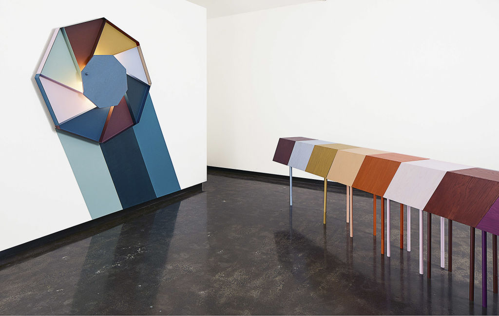
Inspired by Swiss-French architect Le Corbusier’s colour theory essay from 1931 titled Architectural Polychromy, Brustman uses his colour tool Clavierde Couleurs (colour keyboard) to create her own soundtrack within the NGV.
It’s a theory she applies to residential work too – where she likes to make connections between buildings, architecture and colour – because one informs and leans on the other.
“I have always been drawn to wild colour schemes ever since I was young,” says Brustman.
“The ’60s and ’70s design and art has always featured prominently for me and the bold pop artworks and fashion of that era – it’s long been a starting point for my love of colour.”
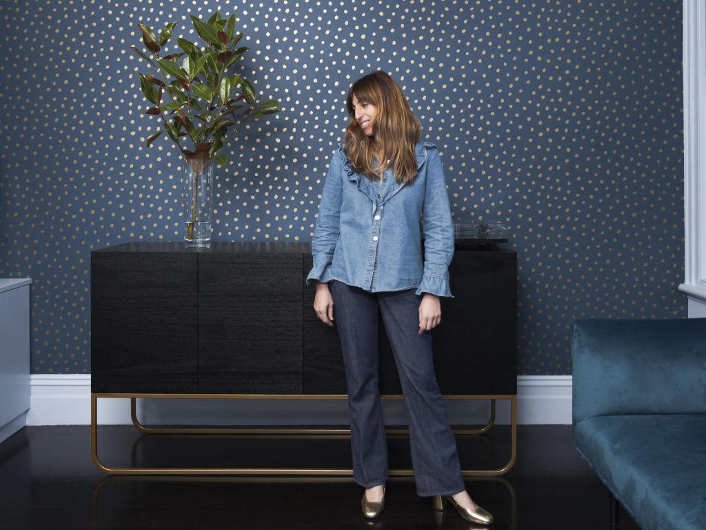
She recently designed a farm stay for a client where mustard walls dominate the home but sit in harmony with more mustard-coloured linen and a rug in the same tone for a ’60s ambience.
“I often bring a lot of colour into my residential interior design work because I see the home as a space of celebration, theatre and life,” Brustman says.
“Many of my clients aren’t scared of colour; it can add an element of fun and inspiration to a space. It’s very accessible and more people are being bolder in terms of bringing it into the home.”
The key to bringing colour in the home is about knowing how one speaks to the other.
“Paint is powerful regardless of what your budget is, and that’s what interests me, that it’s not an exclusive tool, it’s available to everybody,” Brustman says.
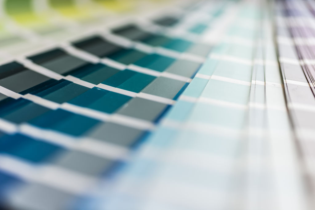
She’s a fan of blue and greens and says combinations that aren’t necessarily harmonious give her the biggest thrill.
“I like discordant colour combinations and the way that sets off some sort of electricity in a space,” Brustman says.
“I work intuitively, and usually throw in an off-colour to the mix of colours I find beautiful. It’s all about setting off some tension.”
At the NGV, Brustman’s coloured ambition is felt via an eight-metre long modular Chromatic Fantastic Cabinet 2020 and Chromatic Fantastic Wall Light 2020, while the installation Coloured in 2020 explores the functional and affective qualities of colour to shine light on its omnipresent role in shaping human experience.
“I use Le Corbusier’s colour keyboard in my interior practice, and it was a starting point for the NGV work too,” Brustman says.
Her colour choices respond to the art at the NGV and reflect off it too. It’s an approach that works in the home too.
“Sometimes the colour doesn’t have to be paint. It could be joinery, a strong colour in the kitchen, or a strong coloured carpet or strong coloured furniture,” says Brustman of replicating it at home.
An example of her love of colour is felt in the Matlock House project. It’s packed with a strong pastel palette throughout – the dining and living room appears in monochromatic tones of blue and green while a bedroom is monochromatic pink.
“I like to be playful and take colour to its maximum potential so you can put it everywhere,” she says.
Brustman’s epic 2018 Inner Terior Rigg Design Prize entry saw her create a part-stage/part-lounge room setting where an art deco aesthetic leans on a ’70s psychedelic verve. It’s proof that what might be destined for the stage can also work at home.
“This could easily work inside a home,” Brustman says.
“Inner Terior references residential interior design from 1970s; a time when it wasn’t unusual to have a home that was slightly sci-fi with sunken lounges and modular furniture. It’s about being bold, daring and willing to let colour take you on a trip.”
We recommend
States
Capital Cities
Capital Cities - Rentals
Popular Areas
Allhomes
More
- © 2025, CoStar Group Inc.
