Interior designer Jason Grant on how to interpret mid-century style today

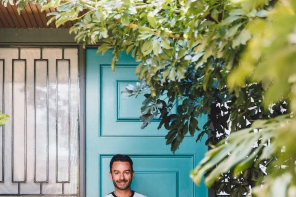
Jason Grant is one of Australia’s in-demand interior designers, and treasures the mid-century aesthetic. In this extract from his new book Modern Retro Home (Hardie Grant Books), he shares how to interpret the style for today.
Colour
Colour is one of the most important elements in styling your home. It has the power to establish a mood, to create an illusion of light and space or to make a room seem warm and cosy.
A strong, bold colour can focus the eye, or work as a backdrop for artwork and furniture. It can be a neutral that you are not really aware of or a colour that really leaps out. White and pale shades are often thought of as neutrals, but dark colours can be neutrals too.
Many of the colours used by mid-century designers were bright. In the late ’40s and ’50s primary colours of red, blue and yellow, as well as orange, citrus yellows and greens, aqua and teal became popular. And, of course, not to forget flamingo pink.
In the 1960s and ’70s, more earthy and autumnal shades were in vogue, with browns, russets, gold, mustard and various green shades commonly used – sometimes all of them together.
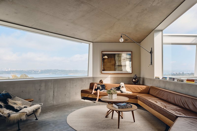
Classic black and tan featured with gleaming silver chrome in stylish leather chairs, and paler creams and beige – so well suited to Danish modern furniture – made their appearance, often with white as a backdrop.
- Related: Ingredients that make a tiny bathroom feel luxe
- Related: What to look for when buying indoor plants
- Related: The room you’ll really want in your home
Many paint companies have retro shades from the mid-century in their colour ranges if you are seeking an authentic period look.
Using colour
- Not everyone can be brave with colour – it can take time. If you’re not sure, start small by introducing strong colour in one or two elements.
- Live with a colour before you commit. See how it feels to have it in your space – paint a small section and see what you think.
- Use colour for a feature wall. An all-white room could have one bright yellow, orange or black wall.
- Use colour to zone an area, especially in a large space.
- If a room seems too bland, add a dash of colour (either on the walls, or with a piece of furniture, artwork or a rug) to lift it.
- If there’s a large area of colour that is too vibrant, tone it down with some more muted colour. Or try introducing accents of other colours to break it up.
- If using one colour in a room, use multiple shades of it to give depth.
- Know your warm and cool colours. Warm colours are in the red, orange, yellow spectrum while cool colours are on the blue, green side of the colour chart. A warm grey will have some red in it, a cool grey will have blue in it. Study colour charts to see the difference.
- Warm colours tend to be welcoming and especially good in social areas, such as dining rooms and kitchens. Cool colours are more soothing and can be effective for bedrooms or a separate study.
- Not all whites are equal. There are warm and cool shades, so check before painting a room icy white (unless that’s what you’re after).
- Colours are affected by other colours around them and by the light, both natural and artificial. Look at room colours at different times of day before making a final decision.
- Timber furniture and floors, rugs and floor coverings introduce other colours, so take these into account in the overall picture.
- Create a “mood board” with swatches of the different colours, fabrics and materials that you are planning to use together.
Shapes
Shapes play a role in how we perceive a room and even how welcoming that room can be.
Generally, our home and other constructed spaces have lots of straight lines, corners and sharp angles, which can be jarring to the eye. A simple trick to break up hard lines is to include more organic shapes in your interior.
Mid-century modern stylists were often masterful at creating this balance. While the modernist architecture might be streamlined and grid-like, furniture and light fittings introduced a whole range of striking, organic shapes: egg-shaped chairs, moulded fibreglass chairs on curved timber rockers, kidney-shaped coffee tables and fabulous, Sputnik-like light pendants and furniture with multiple angles.
As with texture and pattern, varying and balancing shapes adds an extra dimension to your rooms.
Using shapes
- A circle is one simple shape to introduce to a room to get away from the “squareness”. This could be a circular rug, round cushions or a round table.
- Consider a sculptural piece of furniture, either vintage or a modern replica, to break up the grid-like pattern of a room.
- Light fittings – pendant lights, table lamps and floor lamps – are other options and there are myriad shapes available, in both vintage and contemporary design interpretations.
- Cactus, and fig trees with their giant leaves, were often used in modernist interiors to contrast with the furniture. If you prefer a softer effect, try trailing ivy or leafy ferns.
- Shapes within patterns, such as on wallpaper or rugs, are another way of including shapes to change the dynamics in a room. You might opt for a strong geometric pattern or a tribal design.
This is an edited extract from Modern Retro Home by Jason Grant. Photography by Lauren Bamford. Published by Hardie Grant Books. RRP $49.99, available in stores nationally.
We recommend
We thought you might like
States
Capital Cities
Capital Cities - Rentals
Popular Areas
Allhomes
More


