Interior designers share their biggest design no-nos

In the age of Pinterest boards dedicated to interiors and Instagram accounts all about #homeinspiration it is unsurprising many feel confident in donning the hat of a DIY interior designer.
While style is all about personal expression, it still takes skill and a wealth of knowledge to transform a home from an everyday suburban dream to glossy magazine ready.
So, to help separate the good from the bad, we asked three interior experts to share their biggest styling no-nos.
Miscalculating the amount and size of furniture needed in a room is a crucial mistake of DIY decorators.
“Getting the proportion of the furniture right whatever the room’s size is key to creating a warm, liveable interior,” says Greg Natale, owner of Greg Natale Design.
“I have seen so many under-furnished rooms that I’ve become obsessed with getting the proportions right.”

A large space that demonstrates how “breakout areas” work in big rooms. Photo: Anson Smart
If large spaces don’t have enough furniture or use pieces that are too small, Natale says they can feel “cold and unfriendly”.
“Large interiors require a good amount of furniture to make them feel livable and welcoming, and sizeable pieces too.
“You could try using three-seater sofas, a pair of coffee tables, and even creating extra ‘breakout areas’ for separate groups of furniture, such as a side table and a couple of chairs, or a pair of ottomans.

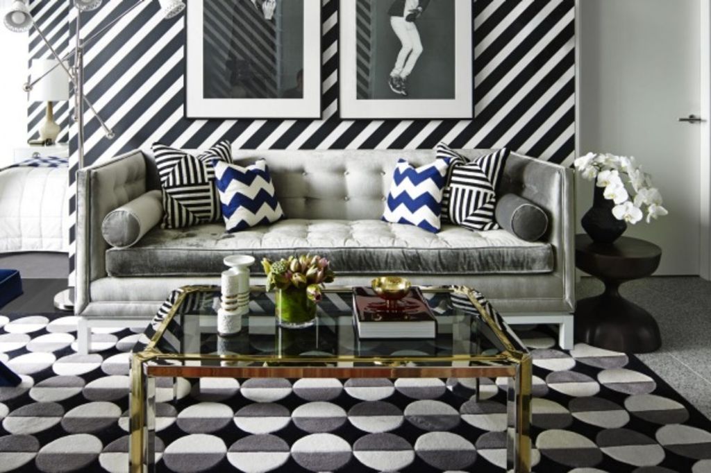
An apartment in Fitzroy, Melbourne designed and styled by Greg Natale to suit the small space. Photo: Anson Smart
“In smaller interiors, a common mistake is to stint on the furniture, which only serves to make the area appear unfinished and unwelcoming.
“In a limited space, you still need all the key pieces of furniture, but in a reduced scale.
“Try more petite pieces such as side tables instead of a coffee table, a low sofa with narrow arms, and single-drawer bedside tables.”
Like all good design projects, working with scale is essential to achieving a balanced result.
Interior stylist Julia Green, founder of Greenhouse Interiors, says “scale is super important for visual harmony”.
“Artwork that is too big or small for a space, or worse still, hung too high, drives me totally bonkers to the point of distraction.”
You might not have guessed it, but the humble rug is a common culprit of styling faux pas.

“My pet hate are rugs that are too small,” Green says.
If you have a rug, then your furniture must sit within its edges to avoid the room looking disconnected, she says.
“I want the rug to connect with the pieces within the room.”
Emma Hunting from Bloom Interiors shares a similar styling no-no.
“I am not a great fan of placing rugs on top of carpets, they look out of place and are not necessary layering for spaces.
“We see it often in clients homes and this is the first thing we tend to recommend to subtract from their spaces.”
If you’re considering painting a feature wall in your home, it might be worth reconsidering.

“As a design team we tend to not be keen on whole ‘feature wall colour’ movement,” Hunting says.
“It seems to create an unfinished feeling to space and is more striking if all room walls are painted.”
We recommend
We thought you might like
States
Capital Cities
Capital Cities - Rentals
Popular Areas
Allhomes
More


