Interior experts reveal the one thing they would never do in their own homes
Unleashing their creative energy on our homes, interior designers can transform dark, dated and dysfunctional spaces into light, contemporary and eminently liveable domains.
For, as many will agree, it’s that undeniably special yet easy synergy between form and function that produces a joyful result time and again.
Applying this principle to their own homes, the style experts have some definite “no’s”. So what is the cardinal sin that the interior mavens avoid like the decorating plague in their own abodes? And what do they do in its place?
Sylvanna Mitri, director of Austin Design Associates in Melbourne, doesn’t hesitate when asked to reveal her interior pet hate.
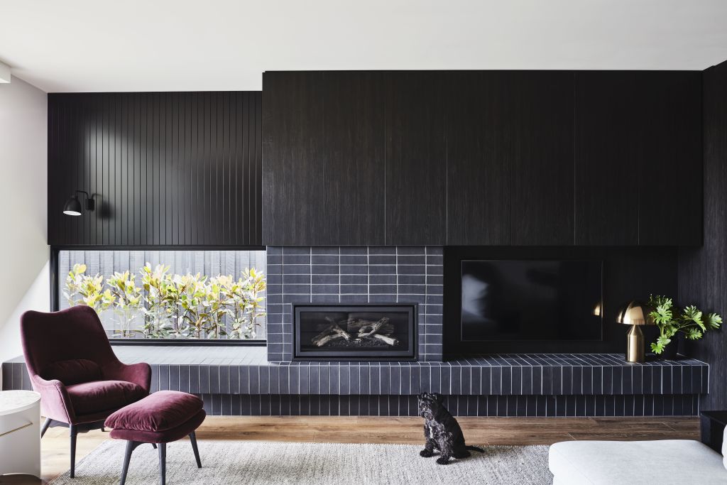
“Our biggest no-no is televisions over fireplaces,” she says. “We understand that occasionally there are space limitations. However, we do try to avoid it as much as possible.
“Our main reason is that the TV ends up hung too high when over a fireplace, which results in uncomfortable viewing. We also love an opportunity to make the chimney breast and the surround of a fireplace a feature, so putting a TV above it takes away the impact of the design or the cladding.”
Mitri offers a simple but effective solution.
“We put the TV to the side, and this asymmetrical design means the focal point is shared between enjoying the fire and television viewing,” she says. “In some cases, we may have a black or dark backdrop behind the TV, and this also aids in disguising the TV.”
Dita Nicholls of Dita Nicholls Interiors reveals her top decorating dislike is artwork that appears too small for a wall or room.
“People may have these beautiful big walls in their homes, but they’re afraid to oversize their choice of art,” she says.
“As a result, they may put a tiny artwork on the wall, which is all wrong in terms of scale. When space allows, be brave enough to select a large work of art, so that the art becomes a real feature – the hero piece – in the room.”
Indeed, bigger is certainly better when it comes to the most cherished artwork in Nicholls’ Sydney home.
“I have a huge 3 x 2.5-metre painting that has gone with me to every house we’ve lived in over the past 20 years,” she reveals with a smile. “I’ve been in love with the painting for so long, and have always made it work wherever we are. It currently hangs in my dining room, and I can’t imagine ever parting with it.”
That said, an eye-catching gallery wall featuring an array of smaller pieces can also reap style rewards.
“You can arrange a selection of paintings, prints or photographs together in the one space for a very dramatic result,” says Nicholls.
For Linda Habak of Linda Habak Design, there’s nothing worse from an interior design perspective than a poorly planned kitchen – one that suffers from both a dysfunctional layout and a lack of storage.
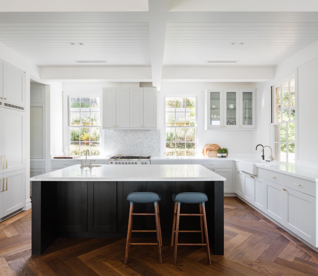
“Kitchens are the heart of the home, and the single biggest investment in your property,” says Habak.
“One of my pet peeves is when all of the most-used appliances are squashed in one area or corner of the kitchen. Having a good workflow – a good ‘kitchen triangle’ – is critical.”
Habak also says: “While we always want our kitchens to be picture-perfect, it’s far more important that we design spaces that facilitate the needs of the family. That’s crucial both for the functionality and visual appeal of any kitchen.”
It may reign supreme as the signature hue in countless homes around the nation but according to Melbourne interior designer Wendy Davey of Cranberry Design, white is not always right. For Davey, a home alive with colour and personality will always be warmer and more welcoming.
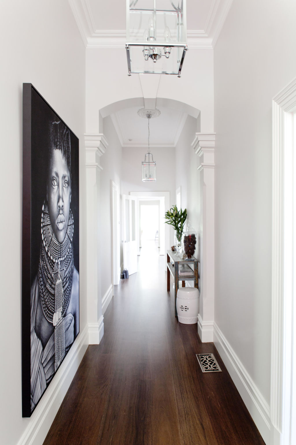
“The one thing I’d never do in my own home is have white walls everywhere, as it can be stark and cold,” says Davey. “Having the right colour on the walls makes a room.”
And to those who do have their heart set on an all-white house, Wendy has one final piece of advice.
“We always use a white with a little bit of softness to it,” she says. “It’s also lovely to have a contrast between the walls and the architectural details, so that they become a feature in their own right.”
We recommend
States
Capital Cities
Capital Cities - Rentals
Popular Areas
Allhomes
More

