Life is far from boring for this senior by the Bay
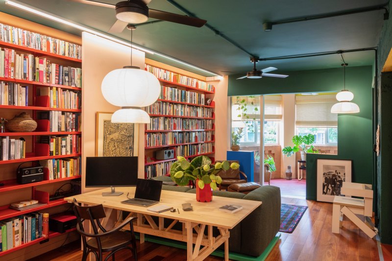
There is no rule that says you need to live with “safe and boring” when you reach a certain age – like wearing pilled cardigans and slippers.
A refurbished 1920s apartment designed especially for a man in his senior years in Sydney’s Elizabeth Bay is a case in point.
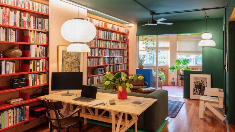
Created by Plus Minus Design with Lymesmith, it is a vibrant colour capsule, with numerous shades of teal, pinks and ochres, and bright red linoleum on some of the floors.
The apartment renovation was undertaken for Michael Dowe, a former food critic at The Sydney Morning Herald. The new design could easily have come from a hipster’s brief.
“Just because you reach a certain age doesn’t mean that you have to live in something ‘vanilla’,” says architect Phillip Arnold, director of Plus Minus Design, who worked closely with Lymesmith director and artist Sonia van de Haar on the project.
The duo were presented with a relatively bland apartment interior – a 90 square metre interior featuring two bedrooms, the second fitting a bed and little else. In contrast, the former kitchen had been extended to a point where Dowe thought he would need roller skates to get from one end to the other.
“Michael enjoys entertaining, but what he really needed was a smaller kitchen and a much larger dining area,” says Arnold, who removed a few walls and created more of a servery-style window between the reworked kitchen and the dining area.
While Dowe was not looking for a separate study, his design brief was for a generous library or lounge area that would include sufficient space for a desk and chair.
To accommodate his large collection of books, new built-in shelves extend across the entire living area, as well as the retreat, formerly the enclosed front terrace.
What was previously two bedrooms is now a one-bedroom apartment, with far greater emphasis on the spaces that are regularly used.
Where walls have been removed, the raw edge of the brickwork has been left exposed, allowing areas to merge.
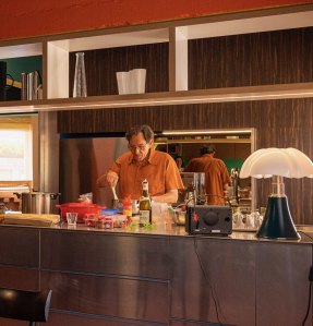
The kitchen is now considerably smaller, but still features a wide benchtop in mill-finished aluminium, which is also used in the large draws below.
“This finish will scratch and stain as though a Brillo steel wool soap pad had been dragged across it,” says Arnold, who contrasted the raw finish with a bronze mirror for the kitchen’s splashback. Other details in the apartment include exposed cabling in the dining and living areas.
Given the number of renovations to the Elizabeth Bay apartment over the decades, few, if any, period details are left.
“We were working with a relatively modest budget, so the less done, the better,” says van Haar, who knew that one of the ways the apartment could be transformed was through the use of colour.
Every space has at least two or three colours, including one with a deep marine blue extending from wall to ceiling.
However, there are still singular moments of colour, such as in the bathroom, which is painted in a soft shell-coloured pink to complement its terrazzo floors. The entry vestibule, painted in a dark teal green, is separated from the living area by a simple grey curtain.
As the apartment is for an older man, there are a few safety precautions, such as a grab rail in the bathroom that wraps around the space, instead of appearing clinical or institutional.
For both Arnold and van de Haar, getting older does not need to be boring. “The design captures the way Michael lives, and the spaces required for entertaining,” says van de Haar.
“People often make the mistake of thinking adventurous design is just the realm of the young, which certainly isn’t the case”, she says.
Van de Haar particularly enjoys how the colour in the apartment ties spaces together to create somewhat of a three-dimensional effect. “It’s not dissimilar to being in a landscape painting, but within a building, rather than outdoors,” she says.
We recommend
We thought you might like
States
Capital Cities
Capital Cities - Rentals
Popular Areas
Allhomes
More
