Light it up: Two architectural projects where the windows steal the show
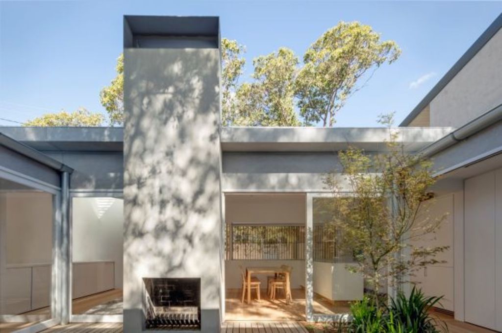
Since the mid-1950s, when modernists rethought house design to be genuinely suitable for Australian conditions, we’ve seen windows as a source of light rather than as devices for framing garden outlook.
This preoccupation has persisted and the further south you build or renovate, the more light you’ll be looking to bring into your domestic setting – especially in winter. Architects have become adept at working the angles to admit winter daylight, modify the high, hot summer sun, and to banish mood-flattening gloom.
They’ve become clever at custom-making skylights and finding clever placements for them in our houses.
The bright-hearted “Bolt Hole”
When Anita Panov and Andrew Scott, of Sydney practice Panovscott, entered a little, lane-fronting 1980s cottage of no particular charm – one their client wanted to alter to become an occasional city pad for his country-based mother – it was a mid-winter’s day.
“We stood inside the living space in the centre of the site and it was dark and cold, miserable and quarry tiled. Our reaction to the space was visceral and immediate: ‘This is horrible. This space must change’,” Scott says.
So what the architects did next was quite contrary. “We took the roof off,” Panov says.
“And then it flips the whole program of the house,” Scott says. “The tiny little living room becomes private open space with access to light.” As the core courtyard to the two-bedroom cottage, “it’s a beautiful little space and it animates all the rooms around it. And that’s magic”.
- Related: The home renovation completed by Airtaskers
- Related: The townhouse busting free of beige surrounds
- Related: The home where natural materials take centre stage
The bonus of this roof-razing move was not only encouraging daylight to dance directly into the new living and dining space that was shifted to the front of the building, but by retaining the chimney breast as an outdoor hearth they scored a working fireplace in the middle of Woolhara, Scott says.
Relocating the living spaces meant building new structure along the southern boundary of an already varietal laneway of modest dwellings, garages and other outbuildings belonging to the big houses on the front street.
Above a plinth of sandstone and using highly-speckled sandstock brick that the architects happily note over time “will gain a certain decrepitude and mould”, Panovscott conjured up a facade that looks like it might have been there for a long time. It also has what appears to be a fat chimney in one corner. It doesn’t.
That’s where a triangular skylight has been set into the roof to further illuminate a corner of the living space.
A sliding screen of wooden battens can open and close a long window in the new front wall. But even when closed it doesn’t compromise the delight of natural light which is streaming in from the courtyard or, as the architects see it, from “a wonderfully generous sky space”.
Not quite done with creating more opportunities for illumination, the bedroom scores a skylight and so does the shower, which gives every appearance of also having lost its roof. It hasn’t.
“A single large piece of glass above the shower reveals the melding of paperbark and hackberry limbs entwined far overhead.”
It’s another instance that depicts how many new uses there are in making more of what we used to know as windows. We’re now getting all sorts of novel outlooks and effects.
Looking up into the light
The 1800-millimetre oculus above the new circular staircase was, says architect Berit Barton, “another way to get light in and create more drama as you walk up into your own world”.
Barton, studio director with Melbourne’s Pleysier Perkins, led the practice’s return to a polished Armadale warehouse conversion they’d done back in 2006.
Although he looked far and wide, the client could find nothing that could better his two-level family home. However, the family did need more space so the default option was to stay put and add a third level as a whole beautiful main suite.
The first idea was to do a crane-on prefabricated structure “that might take a week to install” but council scuttled the ambition and, after an 18-month log-jam in planning and with lots of conditions and a height limit built into the permit, Pleysier Perkins found not only the need for a highly-engineered solution but also found Mark Weill, a commercial builder “who was up for a challenge like this”, Barton says.
A spiral stair was the most effective way to get from one level to another. It was built in a wardrobe space and next to an existing long-form skylight that gave a second-level hallway a gallery-like feel. When viewed from above, the oak treads suggest looking into a shell.
The architect was keen to preserve the slot of sky so a steel beam now crosses it but has been disguised by being encased in plaster.
The oculus and stair have the same diameter and deliver “a very graphic” experience for the adults as they ascend to a “calm, different world” that gives them privacy along with outlook over the surrounding rooftops to the distant city. “It’s a really light, quiet space.”
We recommend
We thought you might like
States
Capital Cities
Capital Cities - Rentals
Popular Areas
Allhomes
More


