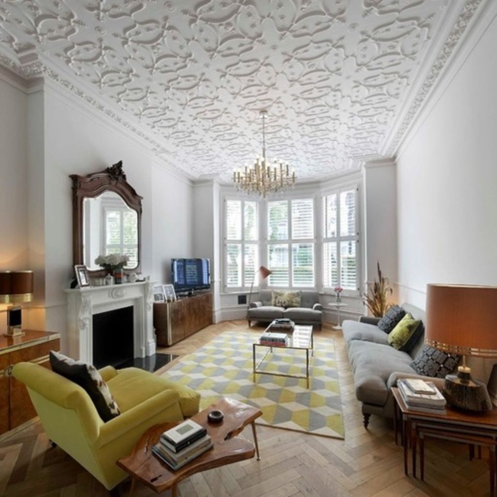
Make like Michelangelo and spruce up your ceiling

Transitional Living Room by Found Associates
Author: Sophie van Winden & Simone Gordon
These days, the ceiling is often ignored, and left plain and white, when so much thought has gone into the rest of the decoration. Between the 16th and 18th centuries, however, the ceiling was a main focal point (just think of the Sistine Chapel…). Since the (rather questionable) trend for polystyrene ceilings in the 1970s, though, we’ve had a tendency to ignore them. Here are some ideas to bring life back to your forgotten fifth wall.
Restore an original
If you’re lucky enough to have an original plastered ceiling, like the beautiful one in the living room above, you can have it restored to its original glory by a professional. Keeping it white means it doesn’t look too fussy, and teaming it with contemporary furniture is a great contrast, bringing it right up to date.

Trick the eye
If you have a tall but narrow space, like this bathroom, a dark ceiling will help to even out the proportions. Here, the homeowners have used a geometric wallpaper in deep, vibrant colours, which works beautifully against the pure white tiles.
You could paint a high ceiling in a dark grey or deep blue if you want a more subtle look.

Flirt with floral
Wallpaper isn’t just for walls. While the rest of this room is panelled and painted in a neutral shade, that floral ceiling softens the look and adds interest to the space without being overbearing. An Art Deco-inspired print would also work well for a slightly stronger look.

Make like a modern day Michelangelo
Have a favourite style of art? Commission an artist to paint your ceiling for a really personal and one-off look. This could be a traditional-style painting, a tattoo-inspired piece, a floral or woodland design, or your favourite comic character, as here.
Check out this comic book home

Try some texture
Why not add texture or a different material to your ceiling? Here, wooden slats create a modern but warm mood. The lights have been incorporated within the grooves, making this quite the feature ceiling, while still maintaining its minimal credentials.

Go for a shadow gap
If your ceiling is high enough, you could lower a section to create a shadow gap to add architectural interest. You can have the gap in the centre of your ceiling, as in this grand sitting room, or around the edges of the wall. Either way, it gives you the opportunity to hide LED lights, which further make a feature of your ceiling.

Beam in some colour
Exposed beams always look great, but why not accentuate them further by painting them a bright colour? It’s a clever way of lifting a minimalist room and adding a bold shade without it being too intense.
10 inspiring home office ideas
Highlight detail
Vaulted, double-height ceilings always make a room stand out. Whether you have an old vaulted ceiling or a new one, highlighting the architectural detail with hidden lighting will add another focal point to the room.
Keep colour flowing
Painting your ceiling the same colour as the walls can make a real impact. This trick particularly suits bedrooms, living rooms and bathrooms, as it can help to create a calm and unified space.
Bold bathrooms for the colour shy
Showcase exposed pipes
If you live in a converted warehouse or former factory building, spruce up and make a feature of copper pipes or galvanised trunking for that industrial feel. You could even consider painting some pipes, as seen in this kitchen, to make them more striking.
We recommend
We thought you might like
States
Capital Cities
Capital Cities - Rentals
Popular Areas
Allhomes
More
- © 2025, CoStar Group Inc.


