How to master open-plan living
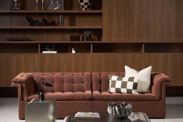
Scandinavian Home Design by Mailen Design
Author: Hugo Tugman
People are increasingly keen on the lifestyle possibilities offered by open-plan living, but many are frightened off by the idea of rattling around in a big, soulless space. To avoid an open-plan space looking dull and ‘flat’, the best designs incorporate interior devices that define different zones – playing with the degree of separation between areas, changes in floor level, finish, islands, furniture groupings, slots of daylight and so on. These deliberate layers can scale-up the perception of space as well as creating a more interesting room to be in.
Define your zones
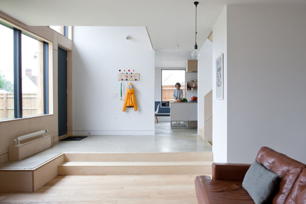
People often think that you either have separate rooms or open plan. The reality is not so black and white, as the relationship between different zones can be manipulated by varying degrees, to emphasise their separation or integration. Changes in floor level, floor finish, ceiling condition, furniture arrangement and many other devices can all contribute to this fine tuning.
In the example seen here, there is a strong sense that you are entering the living space when you come down the steps, despite the area being one open-plan space leading to the kitchen.
Check out more ways to define areas in an open-plan space

Create layered views
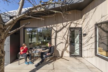
When thinking through ideas for opening up your interior, look for opportunities to set up views with ‘layers’. The home in this image illustrates the ‘layer’ idea well, as you can see across a dining area (layer one), through a kitchen area (layer two) to a garden beyond (layer three). These ‘layers’ gives an illusion of much greater space and depth than would otherwise be felt.

Go for visual separation
When adding to or altering a building, creating a clear visual separation between the new and existing elements of the building can really enhance the sense of extra space.
In this home, the extension is ‘held away’ – meaning it’s visually separated – from the original back wall of the house. The glass gap in the ceiling is also a visual highlight, doubling the effect. This really creates the sense that you’re passing from one space into another, and not just looking across a single unified area.
The room in this example is a generous size already, but in a much smaller house – say a Victorian terrace – visually separating the extension in a similar way could be even more dramatic.
Use daylight as a highlighter
Daylight is the most wonderful magnifier of interior space. If you can bring more natural light into your home, it will have a great effect in maximising the sense of space – and even in an already opened-up area, this is generally a benefit.
It does need to be done intelligently, however, as too much daylight flooding in – particularly too much direct sunlight – can be overwhelming, reducing overall contrast and bleaching everything out (and reducing the impact of all your carefully created layers). So try to use daylight to create highlight points among the layers, enhancing the visual separation and creating greater depth.
How to borrow light for dark areas of your house
Think about angles of light
As well as using daylight to create focal points, as previously described, another good tip is to think about the angle from which the light is coming and how it is illuminating the different spaces and zones in your views.
Daylight from a high angle is generally more intense and will reach further into an interior than from a low angle, so use roof lights and position windows and glazed doors as high to the ceiling as you can to maximise the airy feeling. Avoid heavy curtain pelmets above windows as these block out useful high-angle light.

Aim to ‘read’ spaces more than once
A great way to give the impression of more space is to set things up so that you see – or, in architectural terms, ‘read’ – the same space twice from different viewpoints within the house.
Here, the aim is not just to set up one layered view, as described earlier, but to set up several, which use the same spaces but are seen from different viewpoints.
This works particularly well in double-height spaces, where you see a space as you come in, then you see it again from the gallery or landing above.
Use an island to give purpose to individual spaces
Kitchen islands are probably the most common device for defining zones within an open-plan space, and this is one of the main reasons they are so popular (although many people do not realise that this is why).
By clearly signposting where the different zones within an open-plan space are, you get the benefits of the openness and daylight penetration while retaining a comfortable domestic scale.
Well defined zones are not just functional, they also help people feel more comfortable in a space. In a room with a kitchen island, for example, a visitor will subliminally be aware that as long as they stay away from the ‘kitchen side’ of the island, they are not in the way of the cook, their place being on the ‘coffee side’.

But in really small spaces, blur your zones…
Having described the importance of defining zones, it might seem contrary to talk about blurring the boundaries between them. In smaller homes, however, we will sometimes deliberately overlap these boundaries.
In this example, a kitchen which was previously a small box of a room, has been opened up by removing the wall (you can see the beam at the top of the photo showing the line where the wall used to be). With the wall gone, the kitchen has been allowed to expand out into the neighbouring dining area, giving not just an increased feeling of space, but a physically bigger kitchen, too. The additional daylight and depth also benefits the dining space, making it feel larger, too.
Here, a separating device, such as a kitchen island, would prevent the kitchen space spilling into the dining area, so the feeling of it being larger would be lost, which is why in this case, blurring the lines, or zones has enhanced the space.

…like this
Here is the same room seen from the opposite angle, showing how the kitchen and dining areas are merged.
Find architects in your area, browse portfolios and read reviews
We recommend


We thought you might like

States
Capital Cities
Capital Cities - Rentals
Popular Areas
Allhomes
More
