Milan Furniture Fair reveals the biggest design trends for 2018
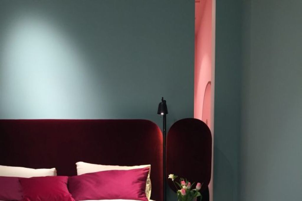
If you follow any interior designers on Instagram, you’ll no doubt have noticed photos from Milan Furniture Fair (Salone del Mobile Milan) dominating your feed in recent weeks.
This annual event, now in its 56th year, lures the biggest industry names from around the globe for the largest trade event of its kind.
Melbourne-based interior designer Lauren Li of Sisällä Interior Design attended this year’s fair to observe what’s next in the ever-changing world of home design.
“Some exhibitions don’t even show any furniture at all, such as the touchable white bubbles filled with a puff of smoke at the COS x Studio Swine show,” Li says.
“It can be a bit confusing as to what this has to do with renovating or decorating our own homes, but I’ve sifted and decoded it all to find what suits our homes in Australia.”
Keep an eye out for the following looks set to hit the Australian market in 2018.
Colour
An abundance of warm and earthy colours were on display at this year’s fair, replacing the more minimal palette of previous seasons.
“Tones of sienna, tan, terracotta through to stronger rust and russet were used all over on walls in rooms, as well as furniture and accent decor objects,” Li says.

Colour board by Vitra. Photo: Phillip Li
Popular accent colours on show were black forest, emerald green and watermelon red.
“[Watermelon red] was seen all over Milan including at the Dimore Gallery space, which was perhaps the most Instagrammed part of the fair,” Li says.
A standout experience at this year’s event was “The Visit” – a truly immersive experience into an early 1800s Milanese apartment where the current colour trends were played out in the most sophisticated and tangible way.
“Designed by Studiopepe, each room tells a story through the layers of furnishings, and shows how to mix terracotta, peach and pink with green in just the right amount,” Li says.
Kitchens
Marble continues to be the preferred material for kitchens, however, the look is now decidedly more discreet, with little Carrara seen this year.
“Instead we saw green and brown marble used. Gone is the 40 or 60mm thick stone bench. Marble benchtops were as thin as possible, often using a shark-nose profile to appear to float over the cabinets. Sometimes the edge wasn’t visible at all, with the bench sunken into the cabinetry,” Li says.
Another popular look is the all-black kitchen, which offers a contemporary and sophisticated look, especially when mixed in with plants.
“Black is the new white … Black was used in metal, painted wood and stone – even the kitchen sink is black,” Li says.

The all-black kitchen was a very popular look, especially when paired with indoor plants. Photo: Phillip Li
The trend of concealing storage and tableware was reversed this season, with plenty of freestanding cabinets with glass doors and open shelf racks for showing off crockery.
“The latest collection by Vincent Van Duysen for When Objects Work featured earthy colours in terracotta, glazed ceramic, glass and wood finishes. You would want to show them off,” Li says.
That being said, electronic appliances such as fridges, dishwashers and stovetops are increasingly hidden elements in kitchens.
“Cooktops are truly integrated into the kitchen with the gas element and knobs placed on the stone top without the stainless steel or glass plate at all,” Li says.
Living rooms
Wallpaper in the living spaces is back and here to stay.
“The key trends are either geometric or organic. Geometric designs take cues from the Memphis style with dashes and stripes like the Weft Collection at Texturae, (which are similar to Greg Natale for Porter’s Paints),” Li says.

Curved sofa Lune by Jaime Hayon. Photo: Phillip Li
Organic styles were seen with soft and watercolour markings, or paint splotches, such as the handmade wallpapers by Martyn Thompson.
“These tend to be easier to live with, as they form a softer backdrop than bold geometric designs. Stay away from floral or damask designs,” Li says.
Furniture
Milan showed a move towards comfort in couches, with many low, puffy, curved and plump shapes.
“A favourite was an interesting sofa Isla designed by Note for Sancal. It is almost like a daybed platform, with a backrest which divides the seating into three parts,” Li says.
Many designers took to showcasing fringing on furniture for a luxurious look with an edge.

The fair showed a move towards comfort in couches, with many curved and plump shapes. Photo: Phillip Li
“Referencing 1950s glamour, long fringing was used as a skirt on marble coffee tables and also running along the bottom of a red velvet sofa at Editions,” Li says.
“Try introducing fringing with a few cushions for a quick update.”
Homewares and styling
“On the topic of styling, it is ‘more is more’ at the moment, however an edited selection goes a long way,” Li says.
Popular styles and materials displayed on homewares at Milan include terrazzo, velvet, ottomans and side tables, lamps, brass objects, handmade glazed ceramics, mouth-blown coloured vases, wooden vases.
Indoor plants have been in our homes for a while now, and there was no indication of this changing anytime soon.

Textile wall hangings are still a strong trend, especially with a modern take. Photo: Phillip Li
“If you can’t commit to keeping a plant alive, then a single tree branch in a vase or a few large tree branches in a basket add a dose of life and greenery to the space. Your local florist should have a few branches of eucalyptus, and they last much longer than flowers do.”
In terms of decorative art, think outside the box. Textile wall hangings are still a strong trend, especially with a modern take.
“Studio Toogood designed wall quilts using a combination of sewed on fabric pieces and painted on colour to create organic shapes and markings,” Li says.
Bathrooms
The move towards colour is continuing in the bathroom, not only through tiles, but also basins and toilets.
“We saw colours such as soft plum, dusty blue, dark green, beige, brown and charcoal by Cielo,” Li says.

Solid stone bath from Agape. Photo: Phillip Li
These colours let a basin blend into a dark and moody bathroom, without the contrast of the usual white.
“If budget is no problem, then a bath cut entirely out of a slab of brown or black stone seen at Boffi and Agape is a knockout,” Li says.
The final verdict
What’s in: Warm colours, natural stone, cacti, curved shaped furniture, wicker, cordless lamps, black kitchens, portable lighting
What’s out: Florals, damask, polished glossy stone, white kitchens and bathrooms, copper and rose gold finishes, minimalism, shiny high-gloss finishes
What’s next: Suede, more designers collaborating with mass-produced furniture brands, Asian-inspired design, red accents
Visit the Sisällä Apartment (by appointment only) to shop key looks seen at Milan Furniture Fair 2017.
We recommend
States
Capital Cities
Capital Cities - Rentals
Popular Areas
Allhomes
More
