Neither novelty build nor fashion freak: A modern and elegant home
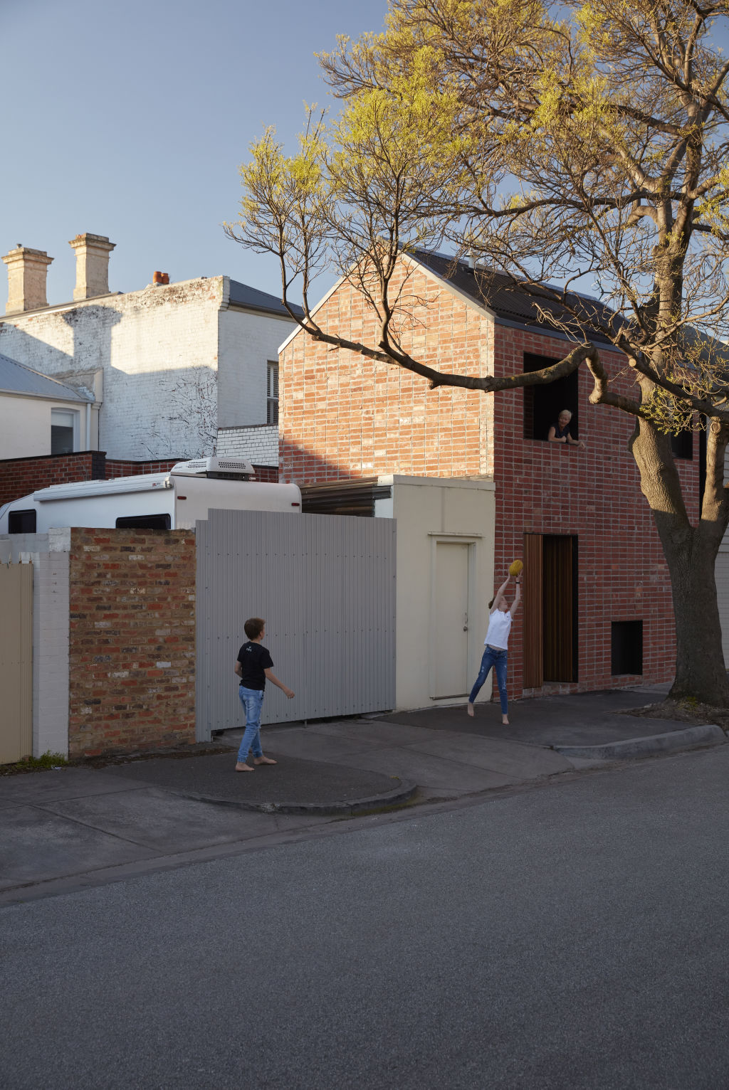
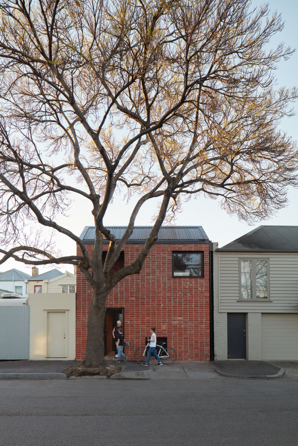
As a structure, Brick & Gable is the new kid on a Port Melbourne block. Yet proportionally, materially and in a shape that evokes an archetypal storybook house, it made every effort to meld into its heritage neighbourhood.
Although obviously a fresh object, it is neither novelty build nor fashion freak. “The stack bond, recycled red brick is a contemporary look,” says its architect Madeline Sewall from Breathe Architecture. “It’s such a humble, subtle, simple building yet it has a modern elegance.”
The double-level structure, that fronts a back street behind a Victorian terrace, is a separate building with downstairs laundry and workshop, and upstairs a “bonus room” that can be either a studio or guest room.
Listen to episode four of Domain’s new podcast Somewhere Else:
“It’s a free room that’s got a bed in it,” Sewall says. All through spring and summer the established deciduous pavement tree that is such a charming part of the external composition provides shade.
The building was constructed for Claire Scott, Luke O’Halloran and their two children. The family had once wanted a larger extension but, after a year of living in a one-bedroom apartment in Copenhagen, they “shrunk the brief”.
Scott, an urban planner, says they were inspired to “really scale back our ideas” and make their rebooted house and new studio “raw, honest and small, like the utilitarian outbuildings of old Victorian houses” because they’re passionate about sustainability “and because we’d really enjoyed living small”.
This intention perfectly aligns with the Breathe Architecture ethos that Sewall explains as “building no more than you need and being efficient and clever about spatial planning”.
For example, one of the “punched” openings in the facade’s upper level is unglazed as it’s the stairwell landing. “It’s open to provide connection to the park over the street and because it’s nice to have outdoor air circulation.”
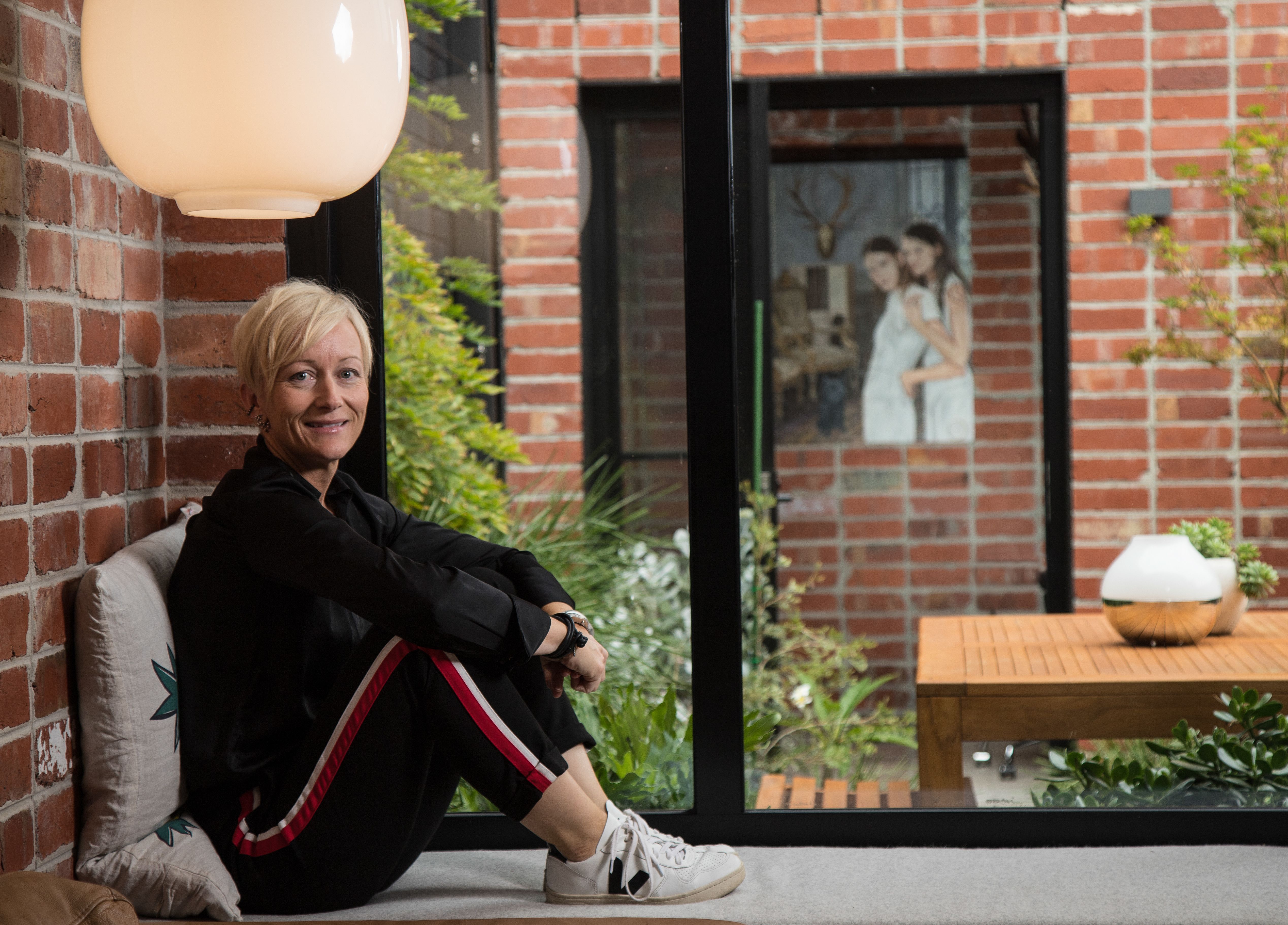
Across the private courtyard, a dark 1980s extension was replaced with a single level kitchen-dining room also built of stack-bond brick – “an honest, textured, variably-coloured material”, says Sewall – to become the studio’s bookend and complete “a suite of buildings that become an immersive experience”.
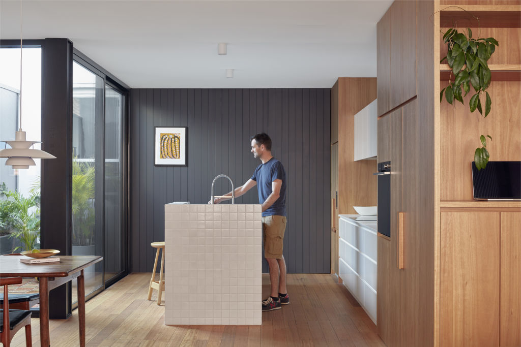
With substantial glazing allowing light into a neatly efficient kitchen with a Japanese tiled island bench, Tasmanian oak floorboards, blackbutt veneered or white cabinetry, plus attractive vertical timber cladding on one wall, Sewall says the kitchen was “simple in its design but complex in its texture”.
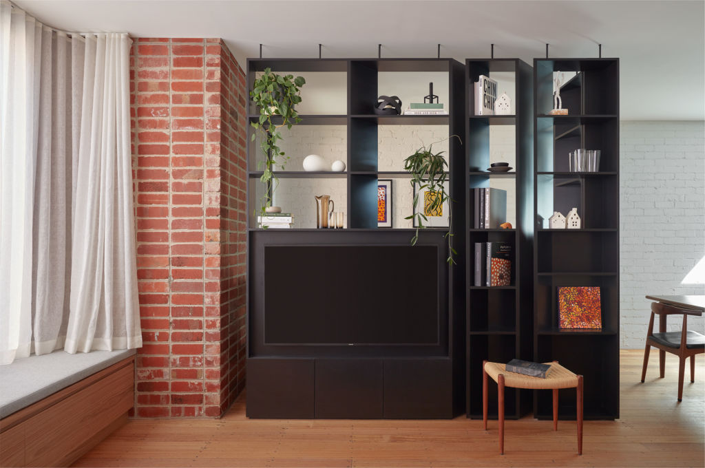
Within the room, a screening device between the entry and dining table is a clever installation. The L-shaped shelving unit designed with subtly-angled uprights doesn’t quite meet the ceiling or brick wall.
“We wanted it to feel delicate,” Sewall says. “If you run it to the ceiling, it can become heavy. We wanted it to give glimpses through, we wanted it to breathe.”
We recommend
States
Capital Cities
Capital Cities - Rentals
Popular Areas
Allhomes
More
