No more sage: How to make the most popular colour of the decade feel fresh again
In week one, as a Block contestant in 2014, I delivered a bedroom with sage green wardrobes. When I told one of the other contestants my plan to go green, she told me she’d thought to herself, “Oh brilliant, this will tank; we’re in with a chance.”
She later admitted to having to eat her words (or her thoughts in this case). The green 2pac satin cabinets were a hit in the context of this contemporary bedroom.
Ten years on, I still love green, but it’s become so popular in home design that I’m less excited to use it. I call it the new neutral. Clients still ask for it in their brief, and I often feel a bit tortured about it. I’d love to use a million other colours, but I’m also compelled to give them something they want, so I’m typically looking at ways to give green a fresh spin. Here are my tips to do just that.
No more sage
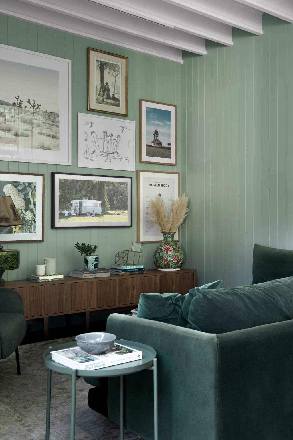
When designing our home in 2017, I went to town with the greens. Our media room included sage-green walls and an emerald-green sofa, and the main bedroom had the same sage-green walls with forest-green bedding. I did a similar combo in one of our vintage caravan renovations.
I don’t think there have ever been so many sage green kitchens around as we’ve seen in the past five years. But it’s time to shake things up. Let’s pivot from sage and consider yellow-based greens like pistachio, avocado and olive.
Also, the 90s revival means you should expect to see more teal and peacock shades resurfacing. These brighter, more saturated, jewel-like shades will make much more of a statement than the muted, earthy greens of recent years. These hues will change the tone of the interior to something that feels more edgy and dynamic.
Mix up your pairings
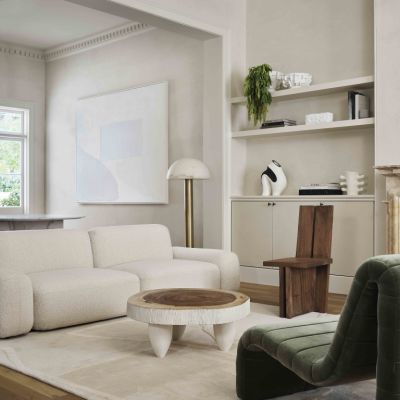
In recent years, we’ve seen many examples of earthy greens paired with rust and ochre and terracotta, as well as white and grey. Changing up the pairing can give your green a whole new life.
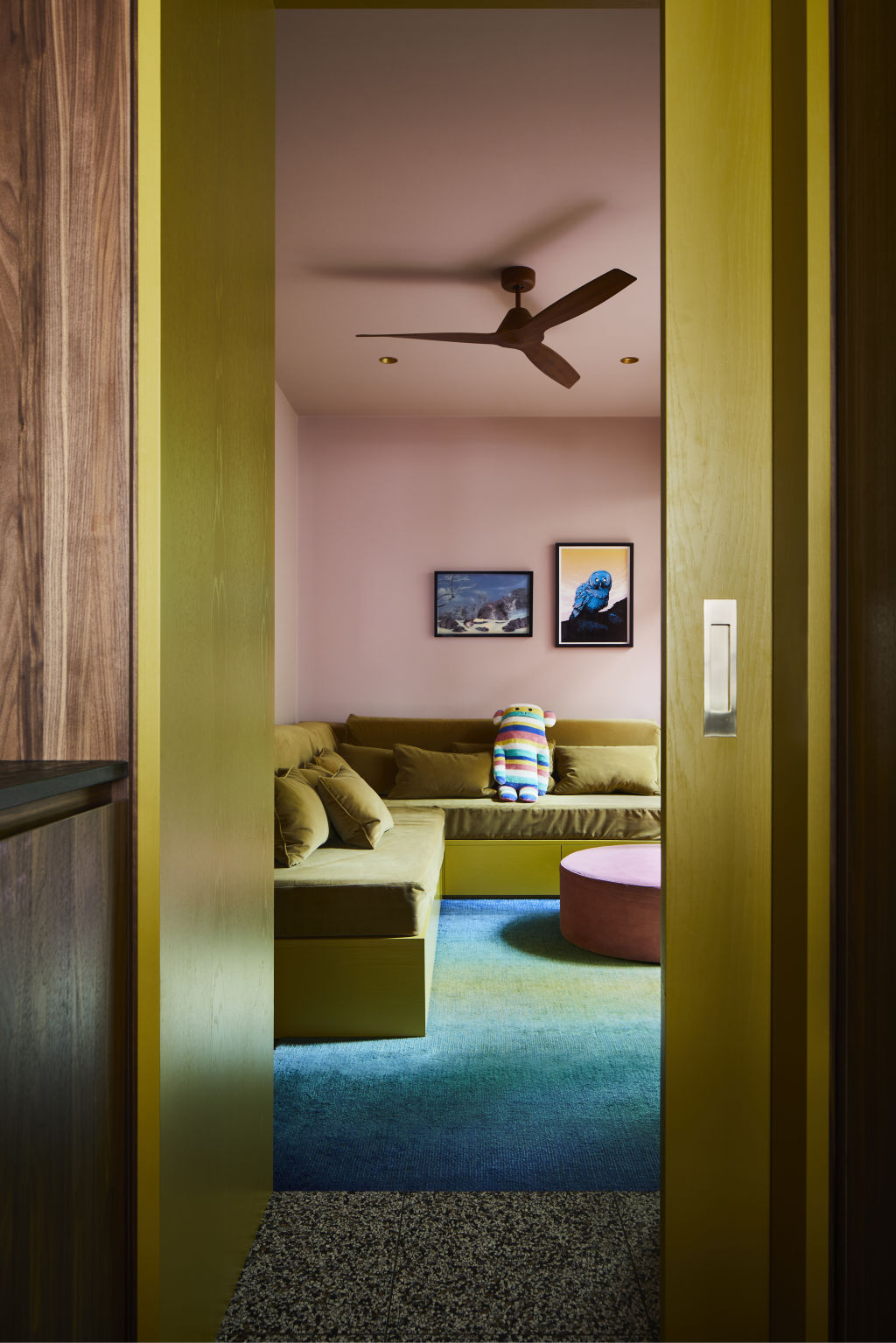
Consider pistachio-green kitchen cabinets with citrine leather bar stools, avocado-green walls with a peach-coloured sofa, or forest-green linen curtains with powder-blue trims. If you let your imagination run wild, the combinations are limitless.
Colour saturation
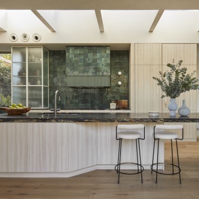
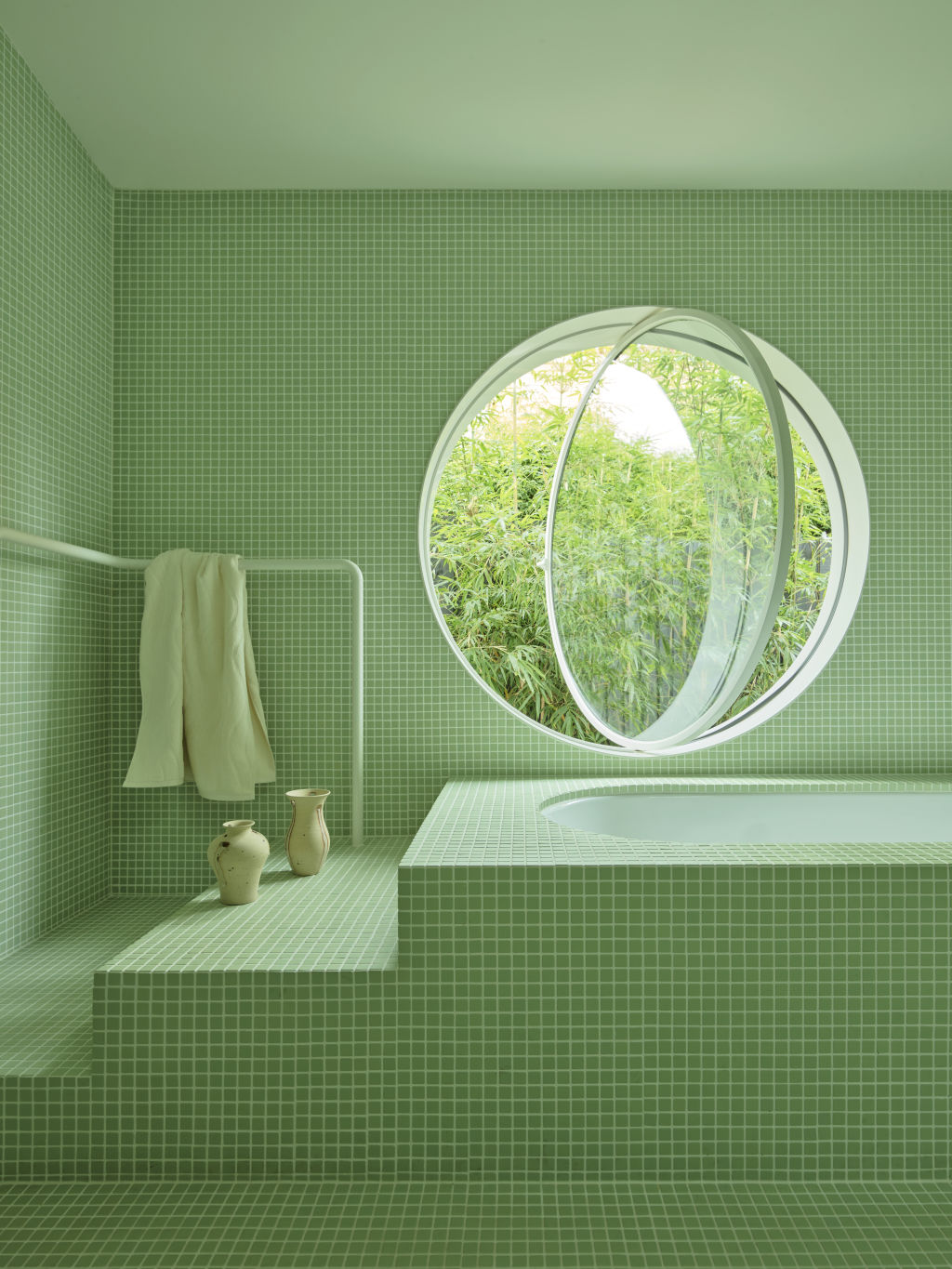
I’ve never been a fan of neutral spaces with pops of colour through accents. I’d much rather live in a space that feels cocooned, like I’m in a big colour hug. Committing to a colour and drenching the space in it creates a calmness and sophistication like nothing else can. It means painting all walls, trims, and ceilings the one colour and even committing to green on the joinery and benchtops.
It’s a joy to see designers using rich green natural stones like marble and terrazzo on benchtop surfaces. This is such a refreshing departure from the overused white and grey marbles that dominated home interiors over the past two decades.
We’re now even seeing coloured hardware like cabinet knobs, so you can really take your green all the way. You’ll feel like you’re about to overdo the colour, but keep going. It means you’re on the right track.
Make an impact with metals, appliances and lighting
If you haven’t seen the green Smeg floor-standing ovens, you are in for a treat. The colour is glorious. Their use in a home shows a deeper commitment to colour than just using green paint on your walls or opting for splashes of green in your soft furnishings.
Did you know you can even get green taps and spouts now? In the right space, this would be a real hero. I’ve often heard the notion of keeping the hard finishes neutral to have the freedom to mix up your soft furnishings, but, just quietly, I think this is a cover. In many cases, these spaces transpire out of fear, not practicality. Black steel-framed doors and shower screens became a “thing” a few years ago. Imagine the impact you could make with a spearmint green shower frame or apple green steel passage door.
Similarly, there is no excuse for boring lighting these days. Up until recently, the market offered a boring range of colours. Now, green is probably the most commonly offered colour in wall lights, lamps and pendants in various materials, including ceramic, porcelain and linen, and it can be just the wow your space needs.
We recommend
We thought you might like
States
Capital Cities
Capital Cities - Rentals
Popular Areas
Allhomes
More
