Pantone’s 2022 Colour of the Year: Interior designers weigh in on Very Peri
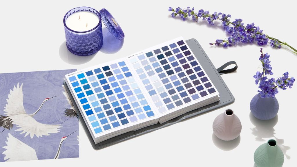
Last week, Pantone announced Very Peri as their colour of the year for 2022, and while the jury is officially in, the vote isn’t quite unanimous.
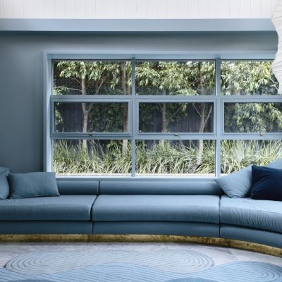
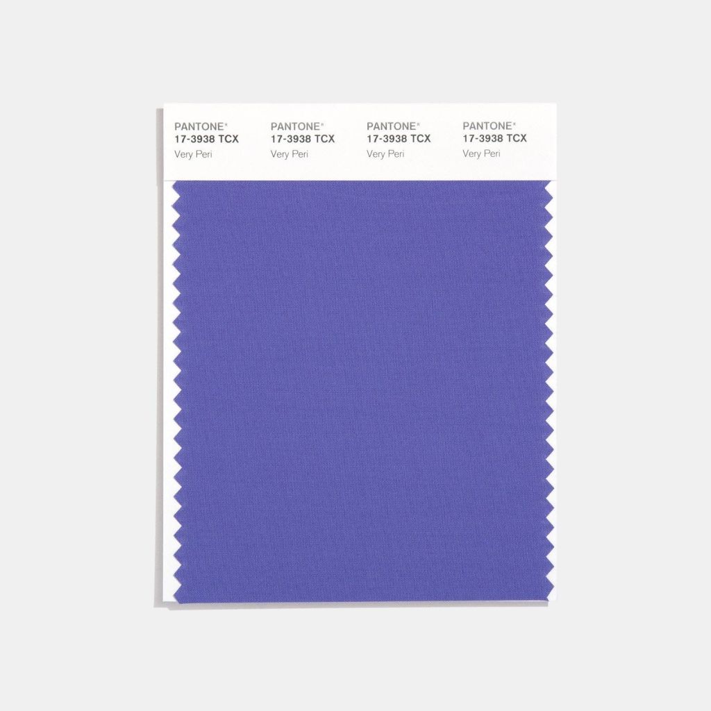
Described by Pantone as “a dynamic periwinkle blue hue with a vivifying violet red undertone [that] blends the faithfulness and constancy of blue with the energy and excitement of red,” the colour is said to embody and inspire confidence, curiosity and creativity.
The colour is a nod to the tumultuous and transformative past couple of years, as well as the ever-rising popularity of all things digital.
“Very Peri illustrates the fusion of modern life and how colour trends in the digital world are being manifested in the physical world and vice versa,” the Pantone website says.
So, how does a colour that fuses the digital and physical spaces translate to the interior design space?
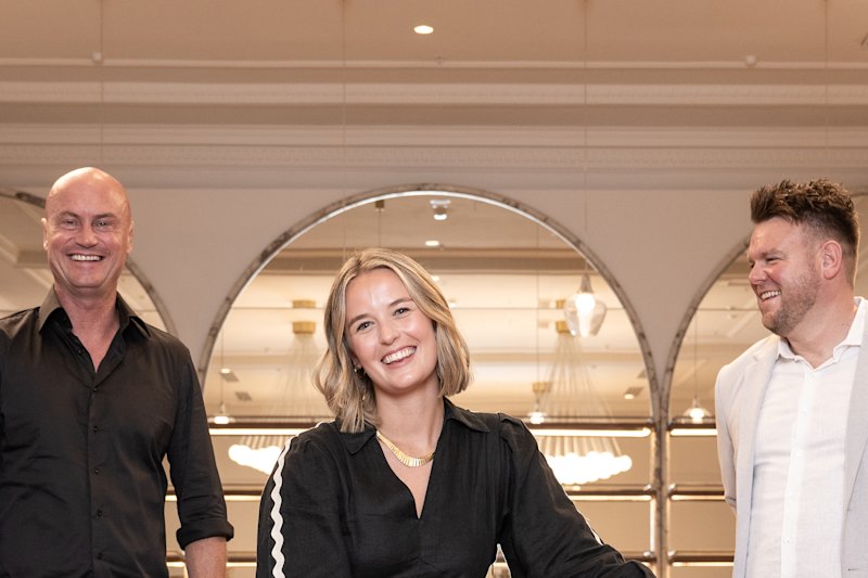
For Lauren Li, founder of Melbourne interior design studio, Sisällä, while Very Peri shines in disciplines such as fashion and branding, it may not necessarily translate well to home interiors. Deeper and more saturated than the once-omnipresent millennial pink, Very Peri may be tricky to pair with other colours.
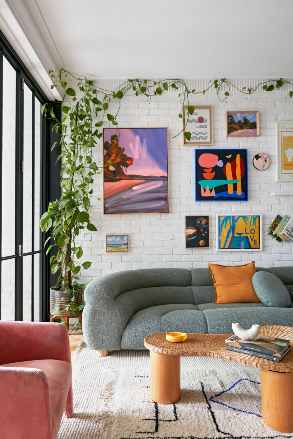
“This colour can take on a futuristic, fantasy vibe when combined with yellow, pink and turquoise, which will appeal to those that want their home to be a true escape. Think of it as a modern-day Memphis movement,” she says.
“You need to go ‘all in’ to make Very Peri work; after all, this is not a colour for the faint-hearted. Using Very Peri for a statement armchair, sofa or floor rug suits this bold colour as it’s not one to hide in the shadows.”
Interior designer Jono Fleming says he had already been introducing Very Peri into his styling without realising it. Rather than going for statement pieces, Fleming suggests starting small with decor such as candles or accent cushions to help you ease into the colour without making too big of an investment.
“A great thing with the Pantone colour of the year is that it can act as a guideline to trends – you can play around with shades and tones, you can always go lighter or darker,” he says
Every year, Pantone’s colour of the year shapes both design choices and purchasing decisions across a range of industries, not least the interior design space. And while designers’ opinions on the 2022 colour are divided, Very Peri has certainly already achieved one of its mission statements – inspiring people to think creatively.
While Claire Delmar from Sydney-based design company Studio CD imagines it won’t be for everyone, “introducing touches in a considered and balanced way can feel very empowering within a space”.
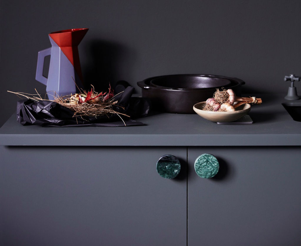
“It’s a very confident colour that I feel will be adopted in smaller, more intimate areas, like powder rooms, laundries and bedrooms,” she says.
“Colour makes you feel good and, after a couple of difficult years, I think the vibrancy of Very Peri symbolises that sense of freedom we’re all craving. Our mindsets have shifted so that we’re feeling more courageous and open to living in the now, so this brave colour will allow people to enjoy expressing their individuality, without taking it too seriously.”
We thought you might like
States
Capital Cities
Capital Cities - Rentals
Popular Areas
Allhomes
More
