Popular paint colours that aren't white
While universally adored for its perceived fail-proof ability to brighten and enlarge spaces, white often lacks the depth and personality a room craves.
“White is rarely right,” says designer Kate Challis. “Despite what people think, that ‘it will go with everything’, it can look bland and functional. For white to work, you must be skilled at layering its tones and textures, and very few people do it well.”
Designer Alessandra Smith agrees and says that, luckily, our confidence in using colour is improving. “The early 2000s saw the rise of the coloured feature wall, and this trend evolved into more audacious experimentation, immersing entire rooms in vibrant tones,” she says. “Selecting a non-white hue requires thoughtful consideration of the room’s function and the feeling you aim to create.”
We spoke to design experts about the colours they love that aren’t white, why they work, and how they can transform a space from blah to brilliant.
Go for gold
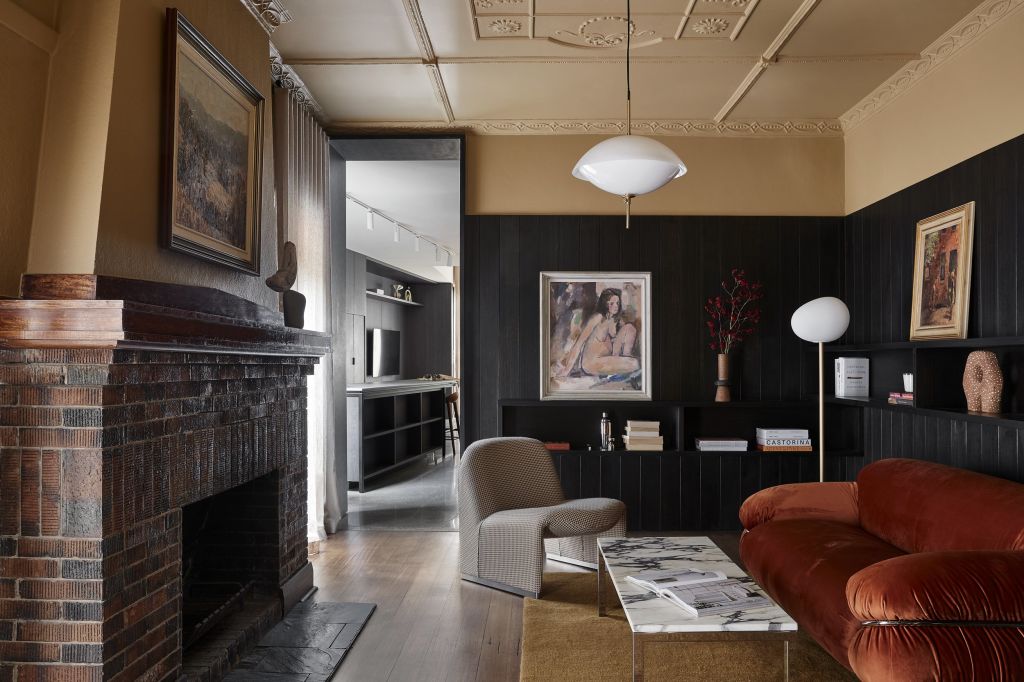
When choosing colours for a space, Smith considers its existing elements to craft a cohesive, harmonious environment – an approach she applied in a home in Elwood, Melbourne. Inspired by its art deco period details and contemporary extension, Smith infused a fresh, modern spirit by applying a rich, golden hue to connect the two eras. “With limited natural light, the room felt uninviting, so we leaned into its darkness to create a warm, moody space with a golden hue that enhances a sense of comfort,” she says.
For those hesitant to dive into colour, Smith suggests experimenting with a smaller space. “Try a bedroom where deep, soothing hues transform it into a serene retreat, which is more conducive to relaxation than stark white,” she says. “This approach allows you to gradually discover colour’s transformative power, enriching your home one room at a time.”
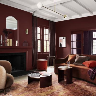
Bold blue
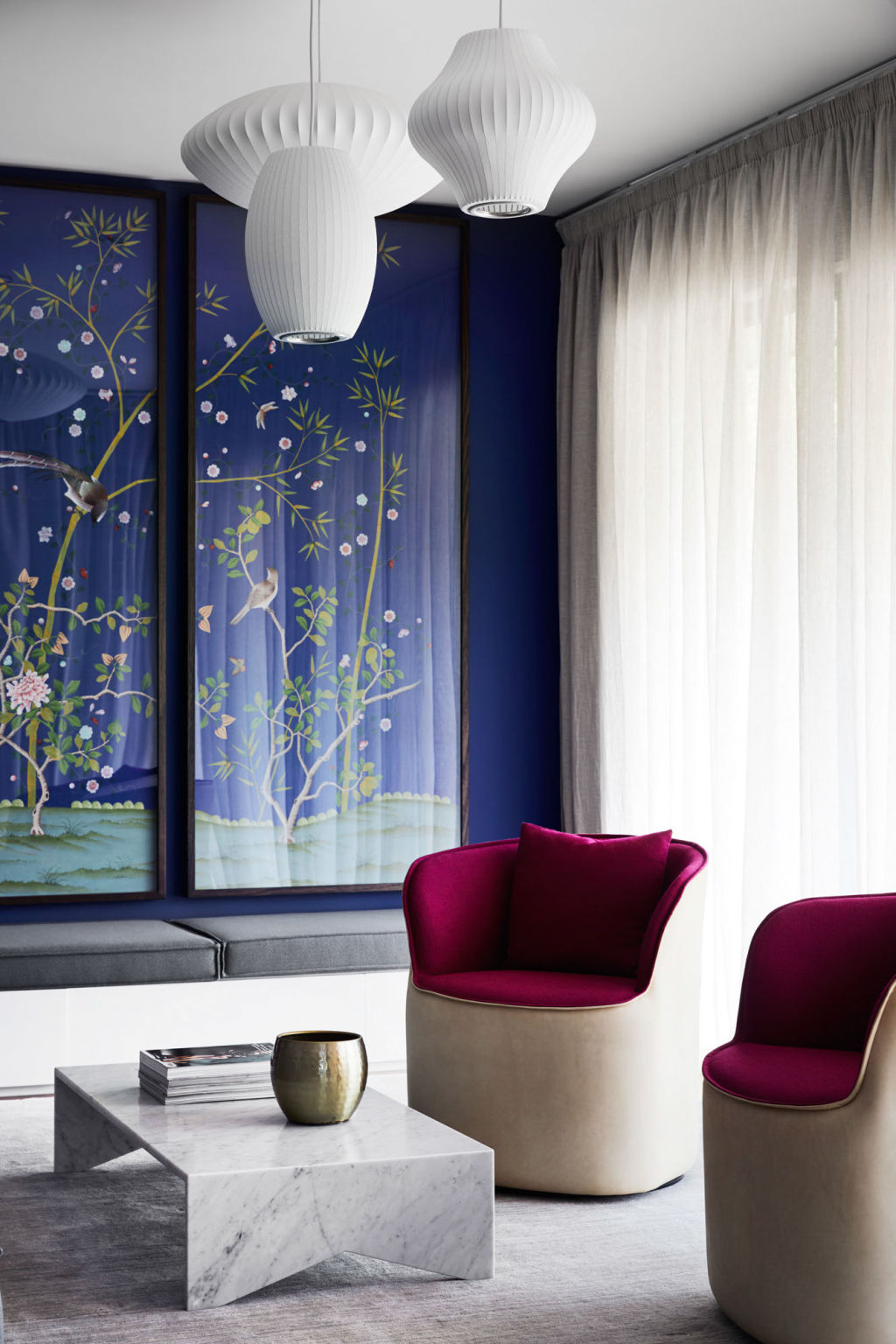
For a home in Brighton, Challis drew inspiration for her blue walls from a pair of hand-painted Chinese wallpaper panels. “The cavernous room was a 1990s extension which felt like an airport hanger, so we wanted to create atmosphere, sophistication, and uplighting,” she says. “The room is filled with light, and the deeply saturated colour absorbs the glare while keeping the space bright. At night, it feels cosy and intimate.”
Challis seeks colour inspiration everywhere – from art and fashion to nature and florals. “I restrict the palette and saturate the room, then throw in something contrasting; otherwise, it can look like an Early Learning Centre,” she says. “In this room, for example, we picked up on the pink and touches of green in the wallpaper for the furniture.”
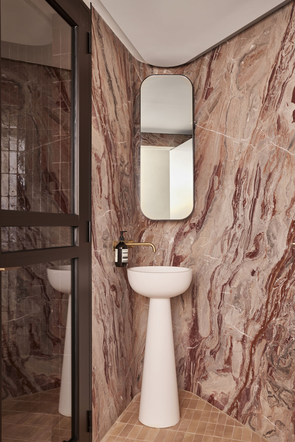
Racy red
White is a go-to for bathrooms, yet Cushla McFadden from Tom Mark Henry Studio wonders why. “It sometimes lacks the depth or character you wish to bring to a space, and it doesn’t complement all lighting, which is important in a bathroom,” she says. “Natural daylight can make white appear blue or grey, while artificial lighting can cause it to look yellowish. You have more control over this with a specific wall colour.”
Case in point: a Bronte Beach house steam room resplendent in shades of red and pink. “While the overall essence of this house is quiet luxury, for the wellness space, we wanted something different and energising,” explains McFadden. “We chose an interesting rosa marble and paired it with rich burgundy tiles. These strong shades evoke emotion, touches of brass elevate the space, and the white ceilings provide negative space for the room to breathe.”
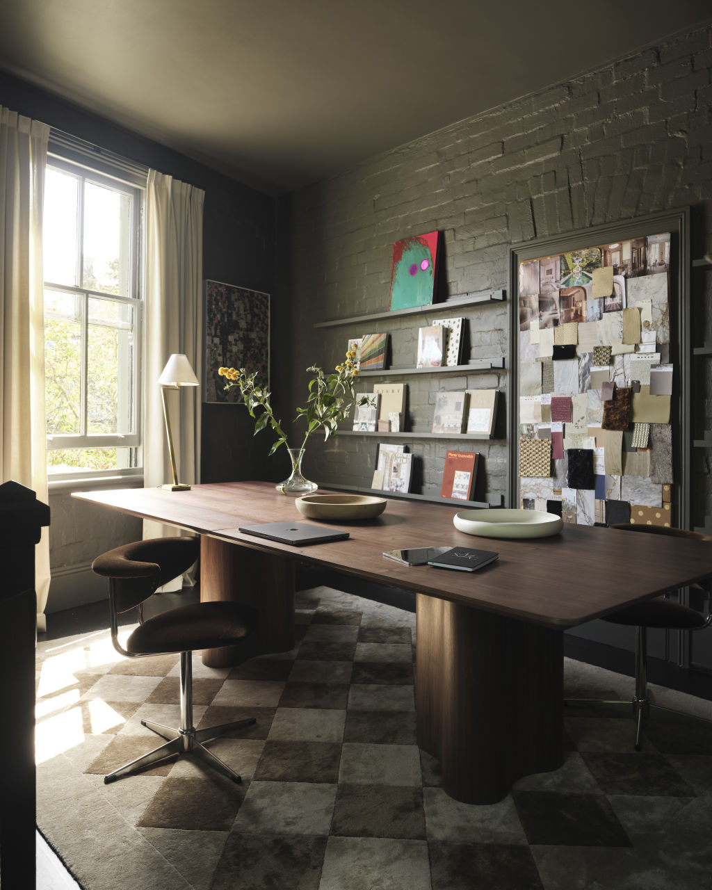
Classic khaki
Designer Shona McElroy from SMAC Studio says white can leave small, intimate spaces feeling cold and uninspired. ”There’s not much space for visual interest, and coloured paint is one of the best and cheapest ways to add personality, particularly in rooms that lack natural light,” she says.
For a chic home office, McElroy chose an unexpected shade of khaki green for its walls. “We wanted to demonstrate khaki can act as a great base neutral,” she says. “The light fittings, floor, timber furnishings and crisp white door act as layering pieces; khaki is such a great background to make other materials and colours speak without feeling overwhelming.”
Using colour takes confidence, and like any bold design move, in time, it will date. “People choose ‘classic’ and ’timeless’, justifying they will have it ‘forever’, but even the notion of what classic is changes,” Challis says.
“Colour is just a coat of paint and can be changed if you get sick of it, so get over ‘timeless’ and just do what makes you happy.”
We recommend


States
Capital Cities
Capital Cities - Rentals
Popular Areas
Allhomes
More
