Preserving heritage: A modern twist on the ’80s in Sydney's Double Bay
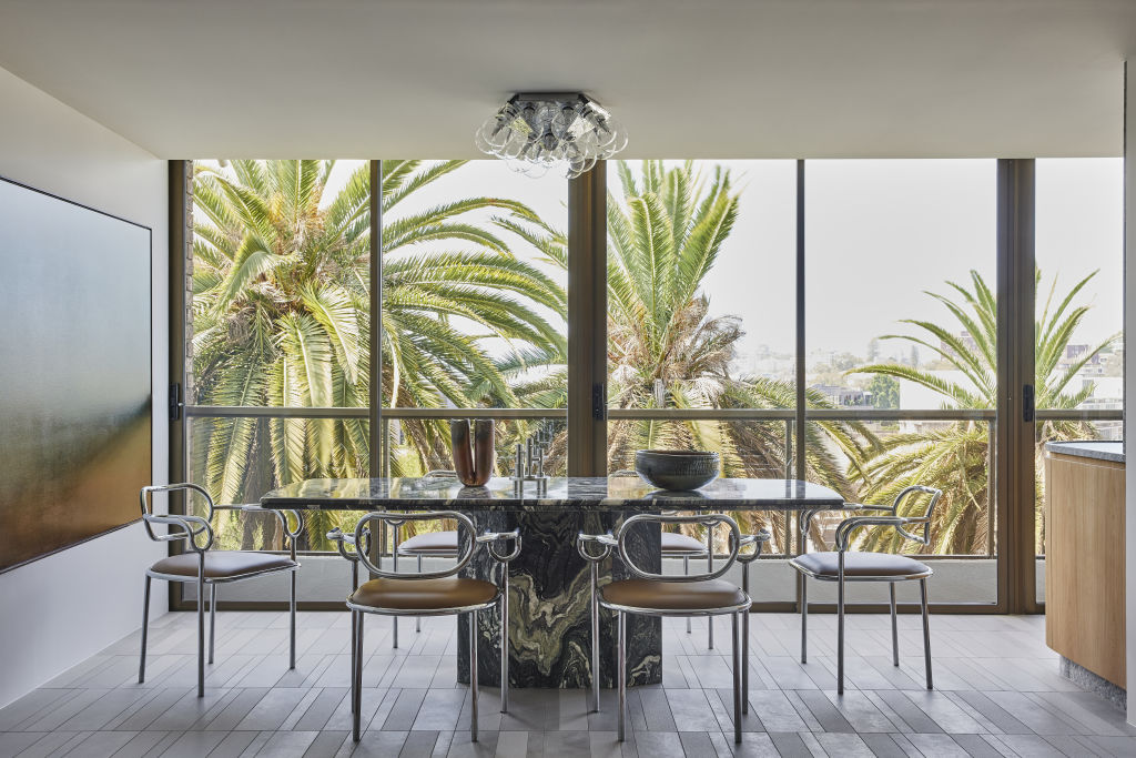
Architect George has completed a vibrant renovation of a late ‘70s-early ’80s apartment nestled within heritage-listed gardens in Sydney’s Double Bay for clients who have owned it since it was built.
“Our clients hadn’t changed anything, and the interior was immaculately cared for,” explains Dean Williams of Architect George.
“This apartment was the original developer display suite, and some of the furniture, including the incredible marble dining table from this era still remained.”
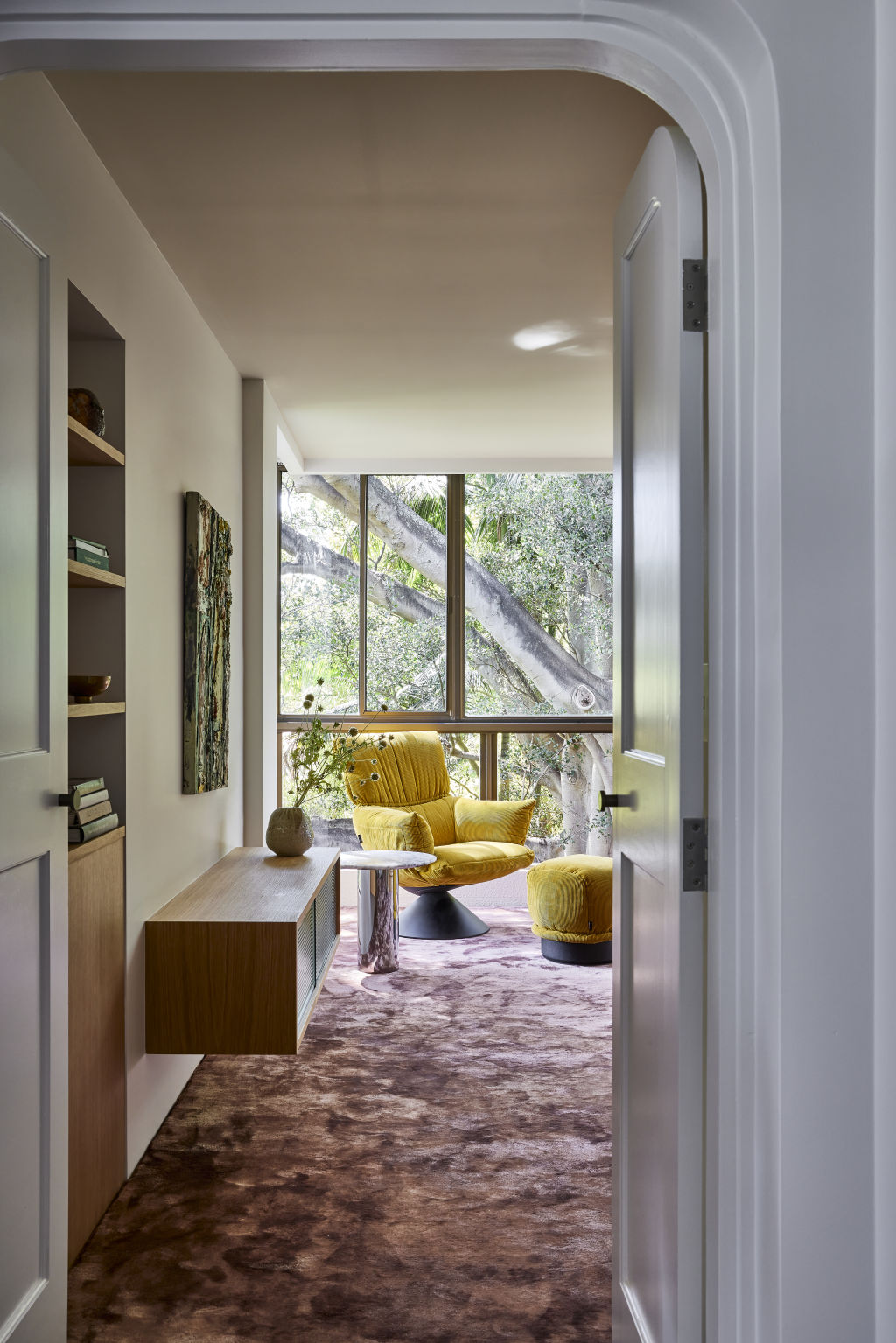
The project was a delicate balance between preserving the heritage and accommodating the modern lifestyle needs of its owners.
“Our clients wanted a contemporary apartment, but they didn’t want to lose all memory of the home they had loved for so long,” says Williams. “They needed several functional modifications and additional space to transition into an intergenerational home for their extended family.”
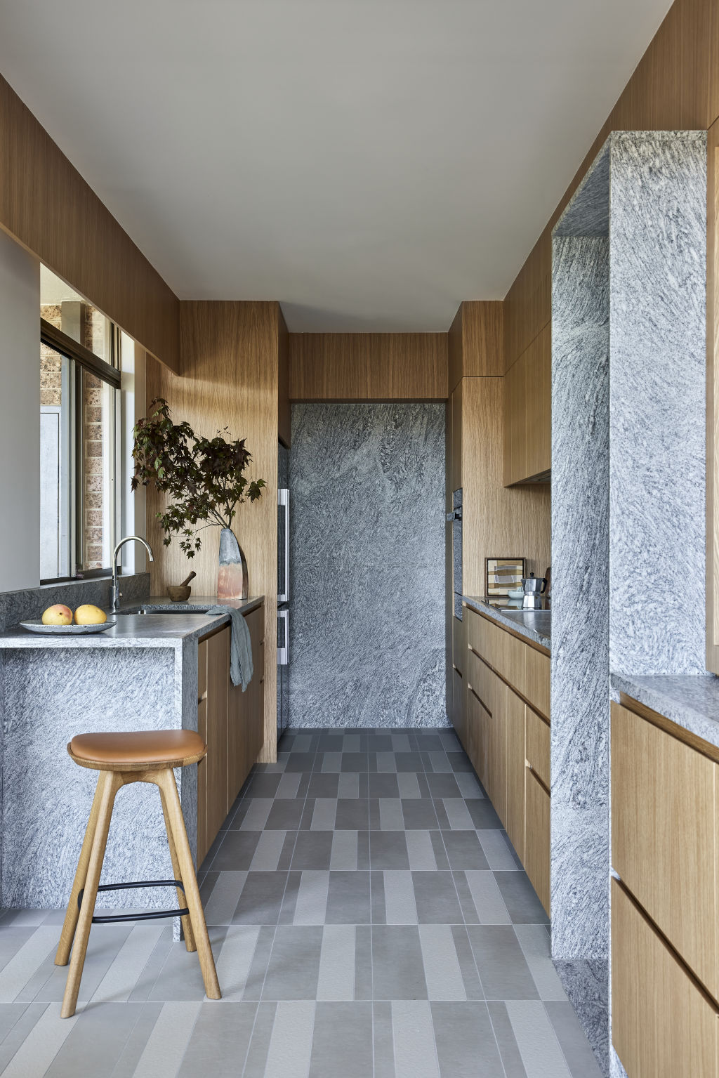
The renovation drew inspiration from ’80s architecture and furniture design, incorporating bold colours, chrome accents, and granite textures. Critical design interventions included removing non-structural walls to open the space and create better connections between rooms.
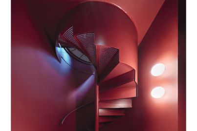
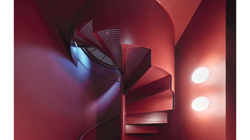
“We aimed to amplify the character of the existing residence rather than change it,” shares Williams. “Minimal interventions provided maximum effect, with non-structural walls removed to open up space and direct views towards the surrounding gardens.”
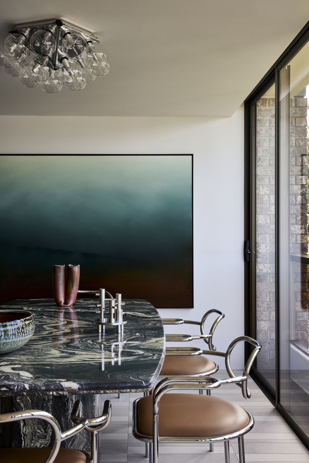
Enclosed balcony floors were raised to align with living room spaces, and floor surfaces were reconfigured to integrate different living areas seamlessly.
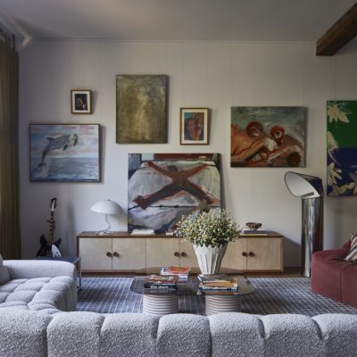
“We retained the clients’ original marble dining table, which served as a focal point in the space,” says Williams. “The selection of furniture pieces and finishes was guided by a desire to maintain a sense of familiarity while introducing modern elements.”
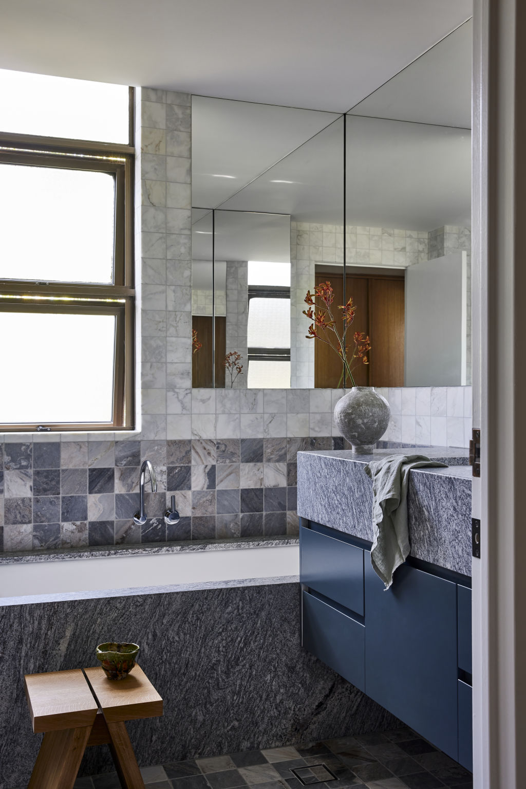
The renovation also prioritised personalised details, achieved through close collaboration with the clients. From curved pelmet lighting to deep granite thresholds, each element was carefully considered to enhance the overall aesthetic and functionality of the space.
“The curved pelmet lighting detail that wraps around the living room and the soft, subtle curved plaster details are inspired by all the arched doorways of the original apartment,” says Williams, who developed the detail in response to the client’s desire for a soft diffused light source to their living room.

“The curved pelmet also subtly links the height of the lower adjacent ceiling occupied by the enclosed verandah—a design tool to blur the edge between the dining and living functions.”
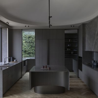
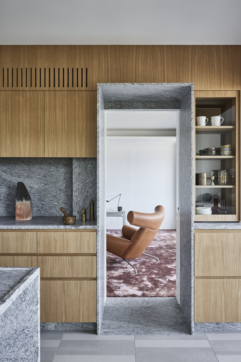
Another favourite element is the granite thresholds located at the entrance to every room, particularly the deep threshold connecting the kitchen to the living room. “It acts like an experiential, deep portal that emotionally separates the person from these two spaces,” he says.
Reflecting on the project, Williams expresses pride in the seamless integration of contemporary design with the apartment’s rich history.
And so he should – this project is a fine example of how heritage properties can be revitalised to meet the needs of modern living, serving as a reminder of the importance of embracing renewal without erasing the past.
We recommend
We thought you might like
States
Capital Cities
Capital Cities - Rentals
Popular Areas
Allhomes
More
