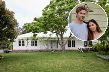
Quiet, please: The new South Yarra house that blends perfectly with its neighbours
During the preceeding decades and the rapid replacement of old residential stock with new, there has invariably been an element of architectural shock rippling along many streets.
The latest additions are inevitably seen as so very distinct from the standard they stand out like a sore thumb.
So when a new house is so subtle as to be almost shy, it’s something to be celebrated.
With a three-bedroom family home in a road of Victorian weatherboard cottages in South Yarra, architect Fiona Poon achieved exactly what she set out to do. “To create a frontage that sat comfortably in the street.”
How has the principal of po-co Architecture pulled off this trick of making what is a contemporary structure conform to important etiquette as the newcomer?
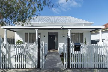
The white picket fence is a sweet start.
The facade of what is a narrow, two-level structure initially appears to be a tallish single-storey house.
The sole window, which gives the front study a street view, and the skinny wooden front door are simple, square-set and modern. Yet in their proportioning and placement, they are not out of kilter with the elevations of the bookending period homes.
The house is very quiet in its colourations of white-painted brick on the lower level and pale, limed timber cladding running in two directions on the upper level.
“The neighbouring houses were predominantly white, and the lime wash helps the house blend in as well as adding texture, in all seasons,” Poon says.
The facade is so reserved, the house has an air of being veiled. “I’ve always been drawn to more quiet architecture,” Poon says. “Here it was mainly about being neighbourly.”
That’s an interesting thing in itself, for the clients she designed the house for also owned the immediate north-side property and were just launching into their po-co Architecture authored renovation when the run-down and dank little cottage over the fence came up for sale.
They took the chance to buy it, slicing off a bit of backyard for their new home, and started again from scratch.
In short, they were the neighbours encouraging the neighbourly attitude. It was, says Poon, “about keeping with the rhythm of the street”.
But once inside the front door, the story of this house changes in sudden and surprising ways.
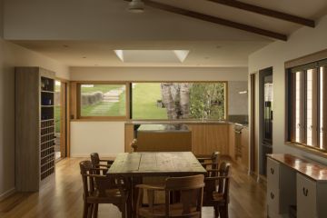
Immediately in lies a shallow entry hall beside the study, the head height jumps to the double-height of the building before compressing just as abruptly along a narrow hall that leads into the kitchen, dining and then living room, which again becomes about overhead volume and incredible visual access to sky, a courtyard and a low-level blue view to the pool.
The clients wanted a bit of a wow factor, says their architect. That was achieved not with anything more than vertical volume and unanticipated amounts of daylight.
On a 117-square metre footprint, it all seems so improbably roomy.
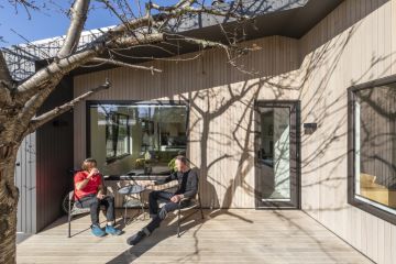
Fiona Poon thinks the way the kitchen and sitting room open to the long, north-facing deck is another part of that illusion, because “it all opens up to become one big circulation space”.
These are not massive areas, she says. The children’s bedrooms are flexible spaces with a large, sliding door that can open up to their corridor rumpus space upstairs. Yet the overall amenity, with its constant suite of materials and the battening theme that plays out across facades and widows, and the fact that the whole design that includes an interesting repetition of diagonals, was all in response to the available building envelope, is why it works so well.
“It just all fell into place”.
We thought you might like
States
Capital Cities
Capital Cities - Rentals
Popular Areas
Allhomes
More
