Rooms with a view: The Headland and The Range are a dynamic design duo
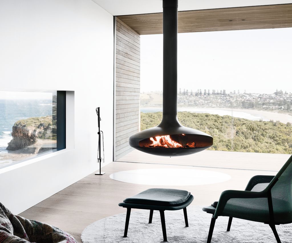
With an incredible 180-degree view onto rolling fields, rugged cliffs and sandy beaches, this site was always going to deliver on beautiful scenery.
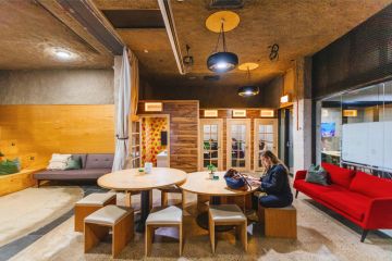
The owners of these two houses on a hill in Gerringong, 130 kilometres south of Sydney, had previously worked with architect Andy Carson on a completely different project – an adaptive re-use of a warehouse into a co-working space and design hub.
This brief was for two contemporary homes for family and guests that offered respite from their busy inner-city lives. The main home, The Headland, and the guest house, The Range, were designed as contemporary dwellings that not only offer an amazing holiday experience but also recede into and complement the landscape.
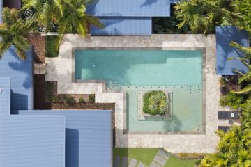
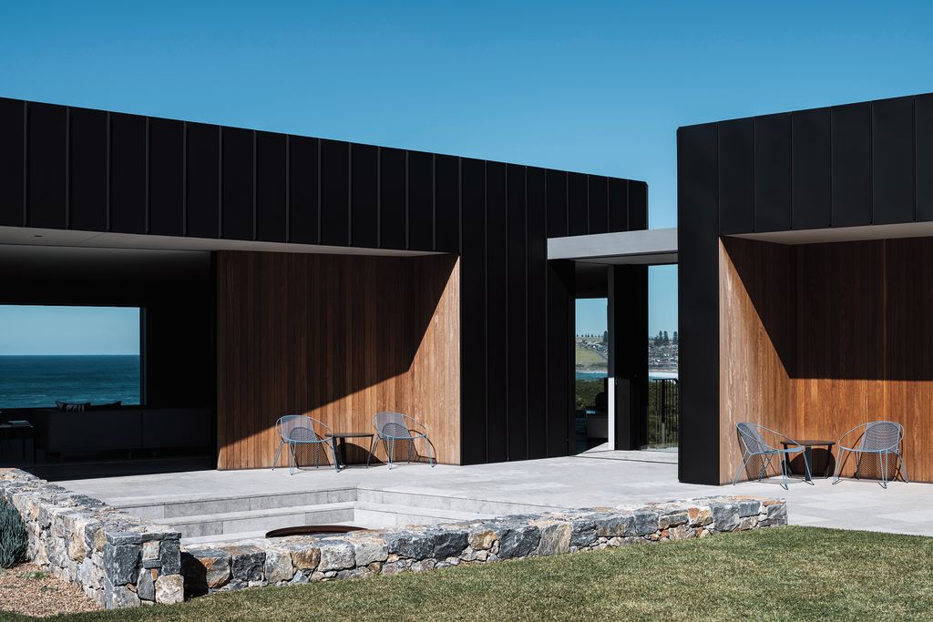
The Headland is formulated around a U shape, with three separate but interconnected pavilions positioned around a pool, lawn and deck. The courtyard form of the house is a direct response to the windy conditions of the site. The lounge and living pavilion, and the bedroom and bathroom pavilion, form the majority of the house, snaking through the landscape, clad in black aluminium. The third pavilion, housing the garage, is timber-clad. All three pavilions are linked by external stairs and large glass doors.
While the courtyard typology offers protection from the wind, the orientation and shape of each pavilion is also dictated by the elements – twisting and bending to protect against harsh sun and wind – as well as making the most of the views.
“It’s a little bit like a plant that grows towards the light or towards the water,” says Carson. “The building, in its exact position, responds to sun and wind and views in different ways. If it was moved 100 metres away and we had the same approach, the form of the building would be completely different, even in responding to those exact same things.’”
As you move through the house, each room offers incredible views across to the ocean, along the beach, over the property itself, and out to the Illawarra escarpment, which is 600 metres above sea level. In the main living space, a full-height glazed wall and balcony overlook Werri Beach.
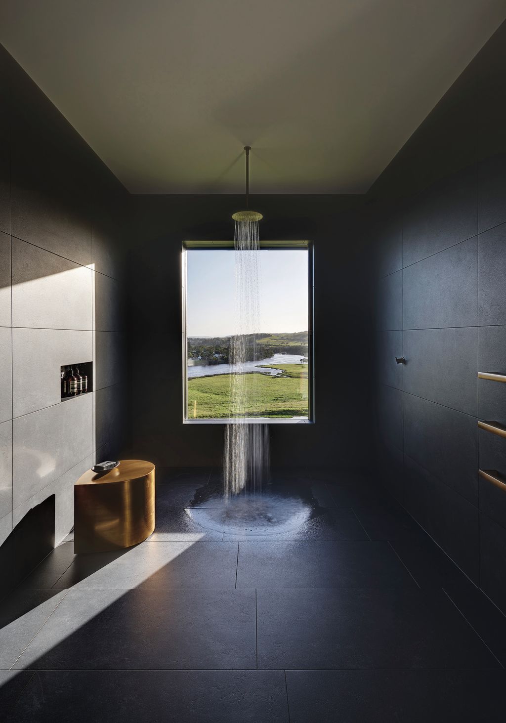
The house protrudes above the land in a cantilever supported by angled pillars, like an oversized picture-box window. Bedrooms and bathrooms feature oblique angles, each with a specific purpose and view. In each instance the view is framed purposely. The architect is acting not only as the designer of a building but also as a curator of stunning scenery.
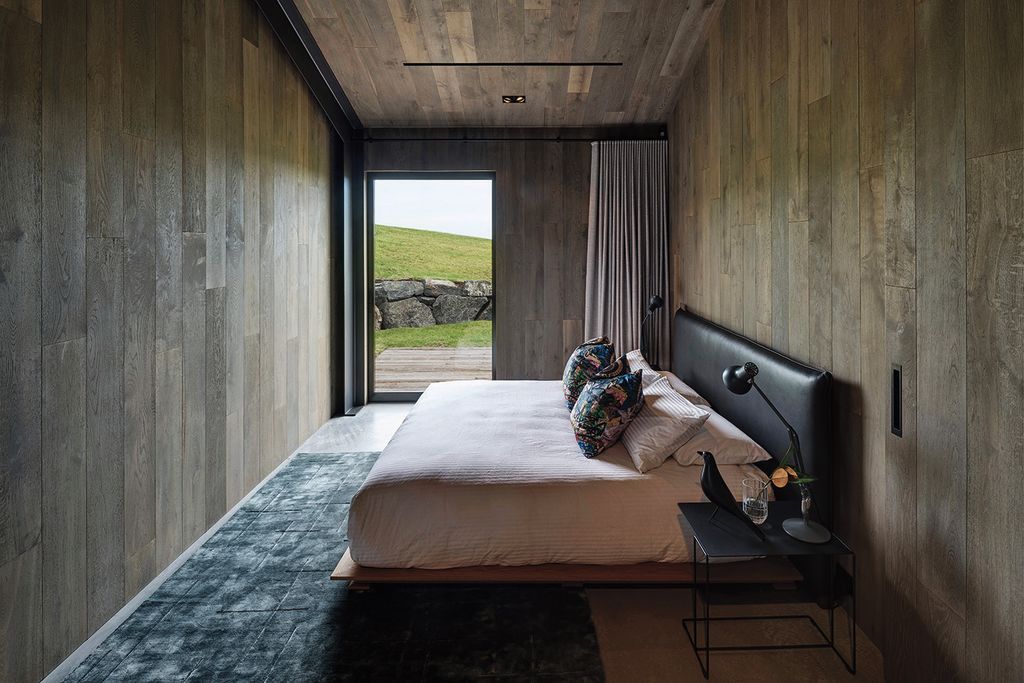
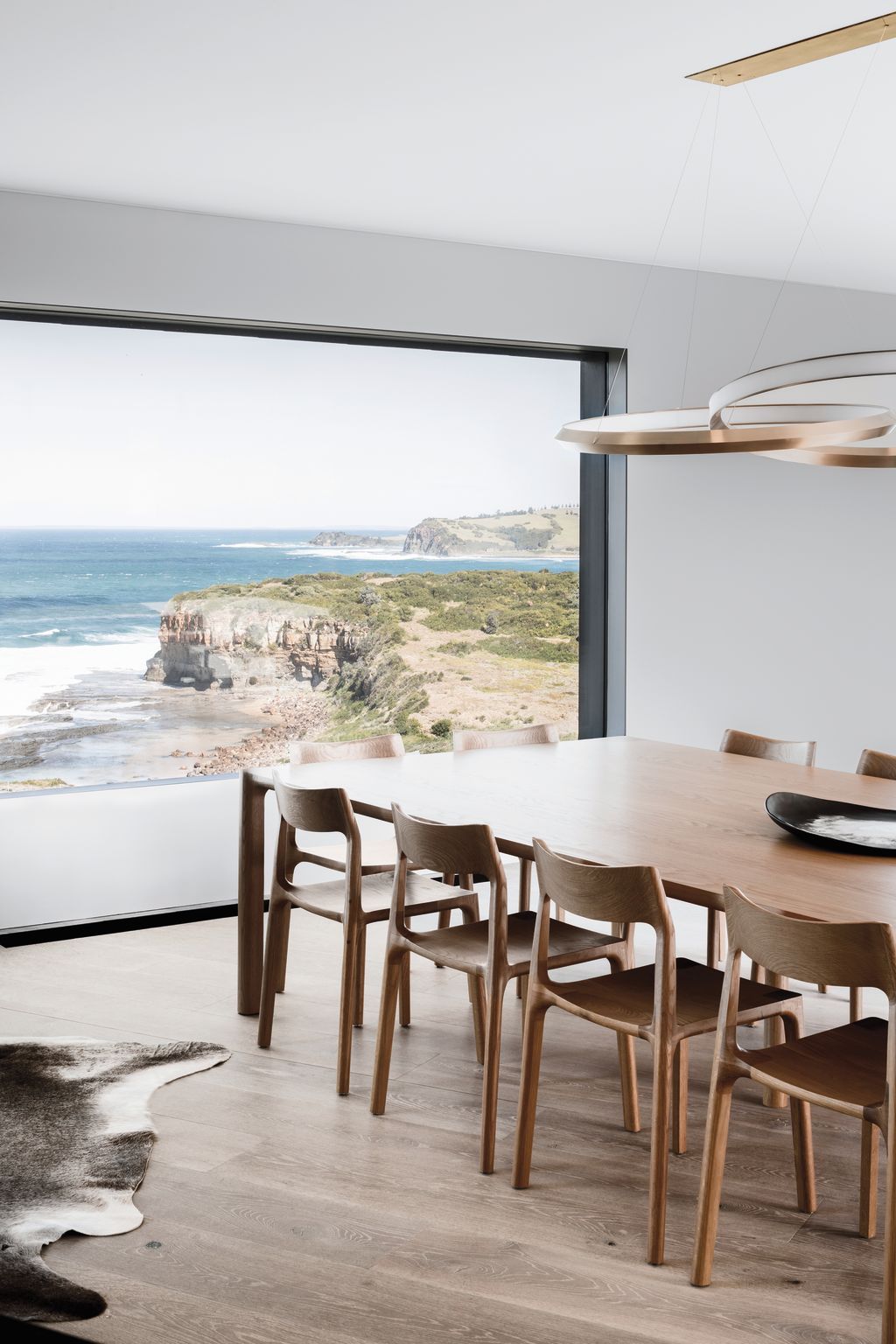
The rooms are generous, with muted timber floors and rimless windows. They are, at times, sparsely furnished, with armchairs and matching footstools positioned serenely before large windows. The Molloy table, by Adam Goodrum, seats 12 people in front of a stunning view of the headland. Simple and unobtrusive, its touchable timber materiality adds warmth to the space. (A second Molloy table is featured in The Range – this version is a 10-seater and is situated between the kitchen and the living room, capturing views out to both decks and beyond.)
The colour palette is neutral without overusing stark black or white, offering shades of tertiary colours combined with timber and metal, leather and upholstery.
The house is environmentally sustainable and includes a 140,000-litre rainwater tank buried into the hill that collects water from the roof and has UV filtration and treatment for drinking. All sewage is treated on site and the house is powered by supplementary solar power. Both houses offer a passive design with extra thick, highly insulated walls and double glazing with thermally broken window frames.
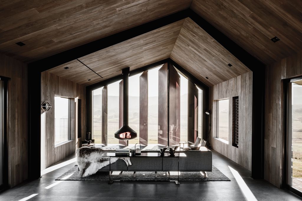
The Range is set slightly away from the main house and is simpler, more like a rectilinear farm house or agricultural building. Its plan is inspired by the classic north–south oriented buildings by Pritzker Architecture Prize–winner Glenn Murcutt.
Here, an asymmetrical roofline adds character and creates a vaulted ceiling, where the angles are clad in timber. Oversized manually operated lever blades at the end of the living space can be opened fully (to optimise the view), angled or closed, and create a striking design feature in copper.
While the exterior of this house is necessarily more exposed to the wind, it features both a north and a south deck, offering different options depending on the season and the weather. The interiors provide a simplicity that matches the plan of the house, with timber cladding wrapping walls and ceiling, and concrete floors, furniture and rugs used to separate the large living space into zones.
The challenge for any owner or architect considering building on an undeveloped site is to create a building (or buildings, in this case) that is respectful of the landscape and makes the most of incredible views from the site, without ruining it for everyone else. Here, the sloping land and the escarpment allow the buildings to blend in with the landscape, while the choice of materials and dark colours recede the building as much as possible from view.
This is an extract from Design Lives Here: Australian interiors, furniture and lighting by Penny Craswell published by Thames & Hudson $59.99
We recommend
We thought you might like
States
Capital Cities
Capital Cities - Rentals
Popular Areas
Allhomes
More
