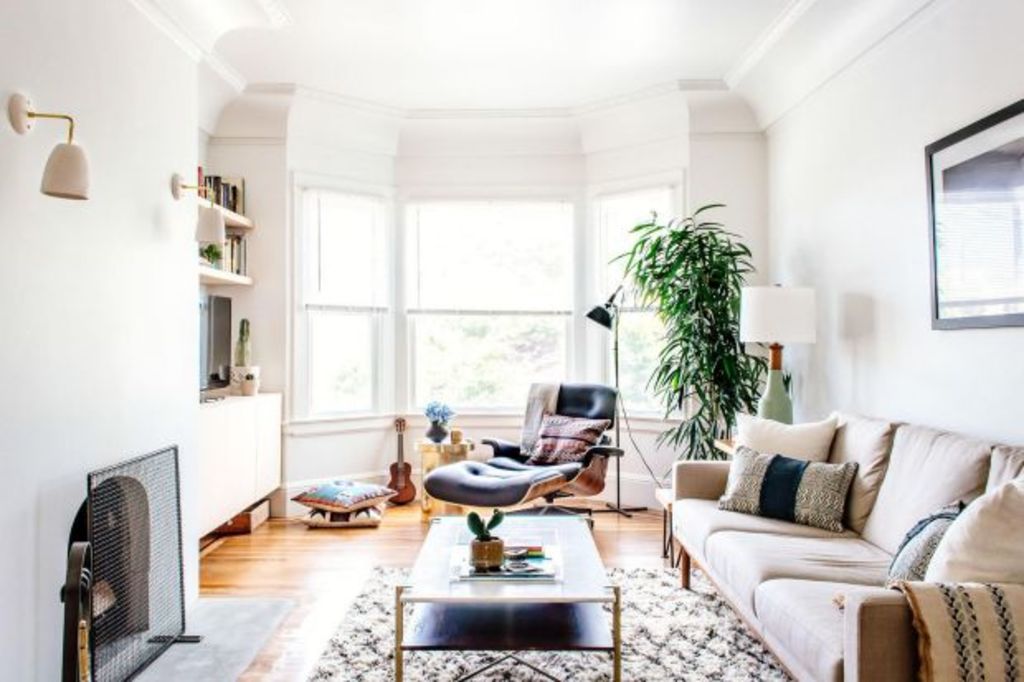
Six room layout mistakes that instantly cheapen your home

Deciding on the layout of a room can be a daunting task. After all, it’s one of the most important aspects of interior design. Misjudge the size of a space and it can feel cramped and cluttered; overlook function and risk blocking a walkway and restricting the flow.
“First, consider the main part of the space and where you and guests will spend most of the time. Is there a focal point like a fireplace or large window?” says Matthew Anderson, VP of visual merchandising at West Elm. “Once you’ve identified how you plan to use the space and what limitations or opportunities exist in a room, you can begin sketching out a floor plan.”
If you’ve already decided on a layout but feel like something is amiss, it’s not too late to change. “Don’t be afraid to move things around,” says interior designer Dan Mazzarini of BHDM Design. Ahead, we tapped Mazzarini, Anderson, and a host of interior design experts to find out which layout mistakes instantly cheapen and clutter a home – and, more important, how to fix them.
Mistake one: Purchasing furniture that’s too large
“Scale is key – if your pieces are too big for the space, it will feel cramped and small,” says Homepolish interior designer Ariel Okin. Unfortunately, it’s a tough issue to fix once you’ve purchased an oversize piece, so she stresses the importance of measuring every inch of your room first. “I always say measure twice, purchase once.”
When choosing large furniture, it’s also crucial to consider the flow of the room. “A too-large coffee table or chair placed at an awkward angle can impede the natural walking space around the furniture,” she says. “It’s always helpful to draw it out on a printed version of the floor plan and then draw a ‘flow plan’ of how people will walk in, sit down, get up, etc., to really visualise it.”
Mistake two: Blocking windows
One of the first layout mistakes Matthew Anderson notices when he enters a room is furniture that blocks windows and impedes natural light, but he says it’s easily fixed.
- Related: Decor items to ditch if you’re over 30
- Related: Avoid nasty surprises when buying online
- Related: Home flaws to stop feeling guilty about
“Leave space between the window and the sofa if the footprint absolutely requires it be in front of the window,” he says. Alternatively, layer furniture to create a clear vignette. “Using a small console behind the sofa with table lamps can help define the space and keep it from not blending into the window.”
Mistake three: Prioritising form over function
Most bedrooms follow a standard layout – one bed, two nightstands, and a dresser – but interior designer Dan Mazzarini says that formula isn’t suitable for every home. “People try to pack too much into their spaces, and sometimes a large bed, large headboard, or even matching nightstands are just too much,” he says. For that reason, Mazzarini’s team questions the function of each piece of furniture and ensures it works with the client’s needs.
“We often look at nightstands differently: What do you need in them, can you fit a light, do they need to match, do you even need two?” he says. Any unnecessary items will only add clutter.
Mistake four: Placing furniture only against walls
One of the most frequent mistakes people make when decorating an open-plan home is letting the floor plan dictate furniture placement. “A common mistake is placing furniture against walls only. If you do this, you lose valuable real estate in your room,” she says. Instead, Lawson recommends dividing the space by grouping furniture. “Depending on the size of the open-plan layout, I recommend creating more than one group of furniture to make the space multi-functional. Don’t be afraid to float your furniture in the middle of the room.”
Mistake five: Over-styling a room
Some of the most beautiful homes contain decor that’s been collected over a lifetime, but Homepolish interior designer Ana Claudia Schultz points out that there is a limit to how many items you should layer in a room.
“The most common mistake for a space to look cramped is selecting small-scale furniture and multiple pieces that break the consistency,” she says. Rather, she recommends choosing fewer, longer pieces to fake a bigger room. “If your space is small, then you should consider longer pieces that fit the whole wall, such as a credenza or sofa. This will create a visually larger space,” she says.
Mistake six: Under-utilising rugs
Another trick to laying out furniture in an open-plan space is utilising rugs. “I like to use a few different rugs in the room, but instead of matching, I like using different patterns on each one, while keeping the same colourway,” says Homepolish interior designer Olivia Stutz. “For example, if the dining room and living room are in the same open-plan space, I would do one black-and-white striped wool rug in the dining room, and a black-and-white Moroccan rug in the living room. This makes the whole space come together in a very thoughtful and chic way.”
– This story originally appeared on My Domaine Home
We recommend
We thought you might like
States
Capital Cities
Capital Cities - Rentals
Popular Areas
Allhomes
More


