Smart Design Studio's William Smart: On an architect's duty, and why he tries not to 'do fashion'
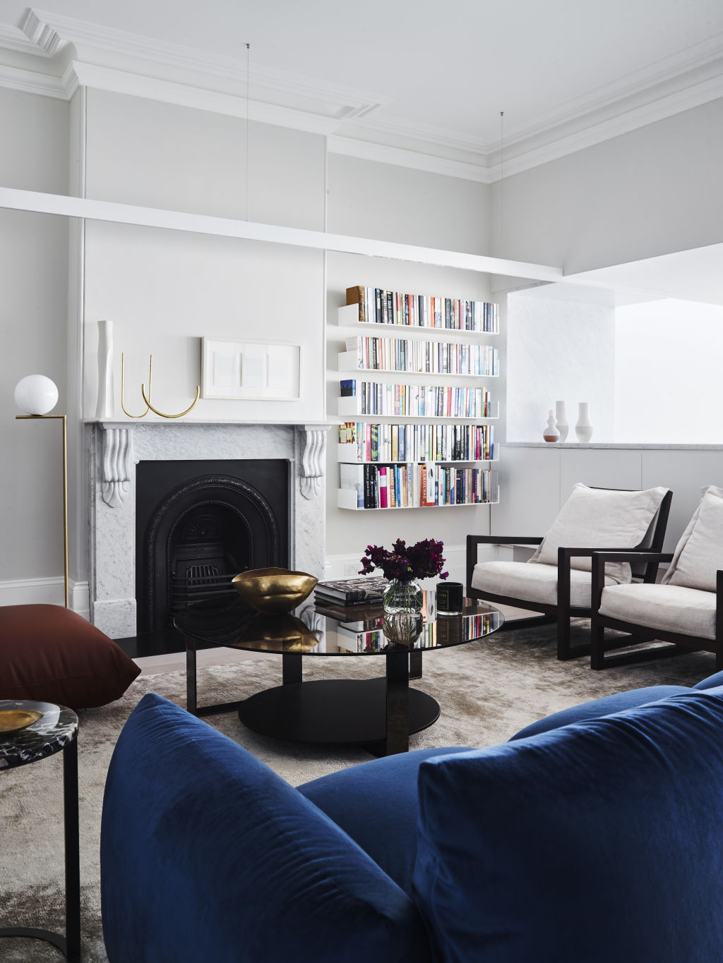
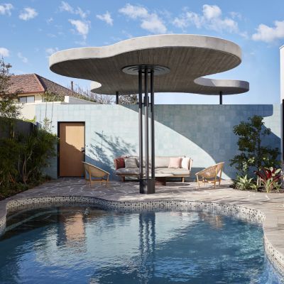
To William Smart, architect of some of Australia’s most exceptional contemporary houses (think Sydney’s multiple award-winning 2017 Indigo Slam), real luxury in residential accommodation isn’t defined by anything singular or showily expensive that demands immediate attention.
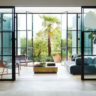
Rather, it’s built on a lot of subtle attributes that add up to a good and easy feeling; a sublime setting that feels calm and comfortable.
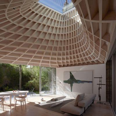
The quality of interior light is primary to Smart’s design philosophy. The correctness of the volume of a room is also vital.
So is the coherence between any old building substance and anything new that is introduced.
Smart is respectful but never subservient to heritage, believing that as an architect he is licensed “to add new history to a house”.
“I’ve always felt that as my duty,” he says.
But the changes and additions must be rigorously justified. “We only replace [the old] with something better,” he says.
Colour, texture and materiality absolutely must be apt. The director of the estimable Sydney practice Smart Design Studio says he always takes his time considering what a room wants to be.
He cross-examines his motives and those of his design colleagues, for doing what they want to do. “I try not to do fashion.”
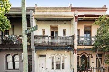
In the comprehensive updating of a Paddington terrace, the Regent Residence, those concepts were adopted. The result is a 19th-century row house that has been taken far into the future without any compromise of its original charms.
While the front room and hallway of the east-west oriented house “were intact and beautiful and only needed the restoration of cornices and skirtings” according to Smart, there was the usual story of dark mid-house formal rooms, and the inevitable series of unfortunate rear additions that required replacement.
This challenge gave the studio the chance to draw daylight deep in to the plan and to tailor the spaces to become effortlessly hospitable.
The effortless effect is an illusion but, to Smart, it is another hallmark of luxury. “You work hard to make it look so effortless.”
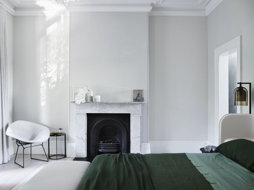
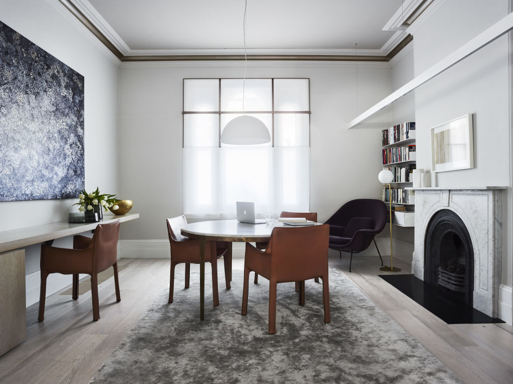
Pale grey paint that changed intensity slightly in every room took a lot of experimentation until it was just right for each space and to provide a backdrop to furnishings that bring in the big colour moments.
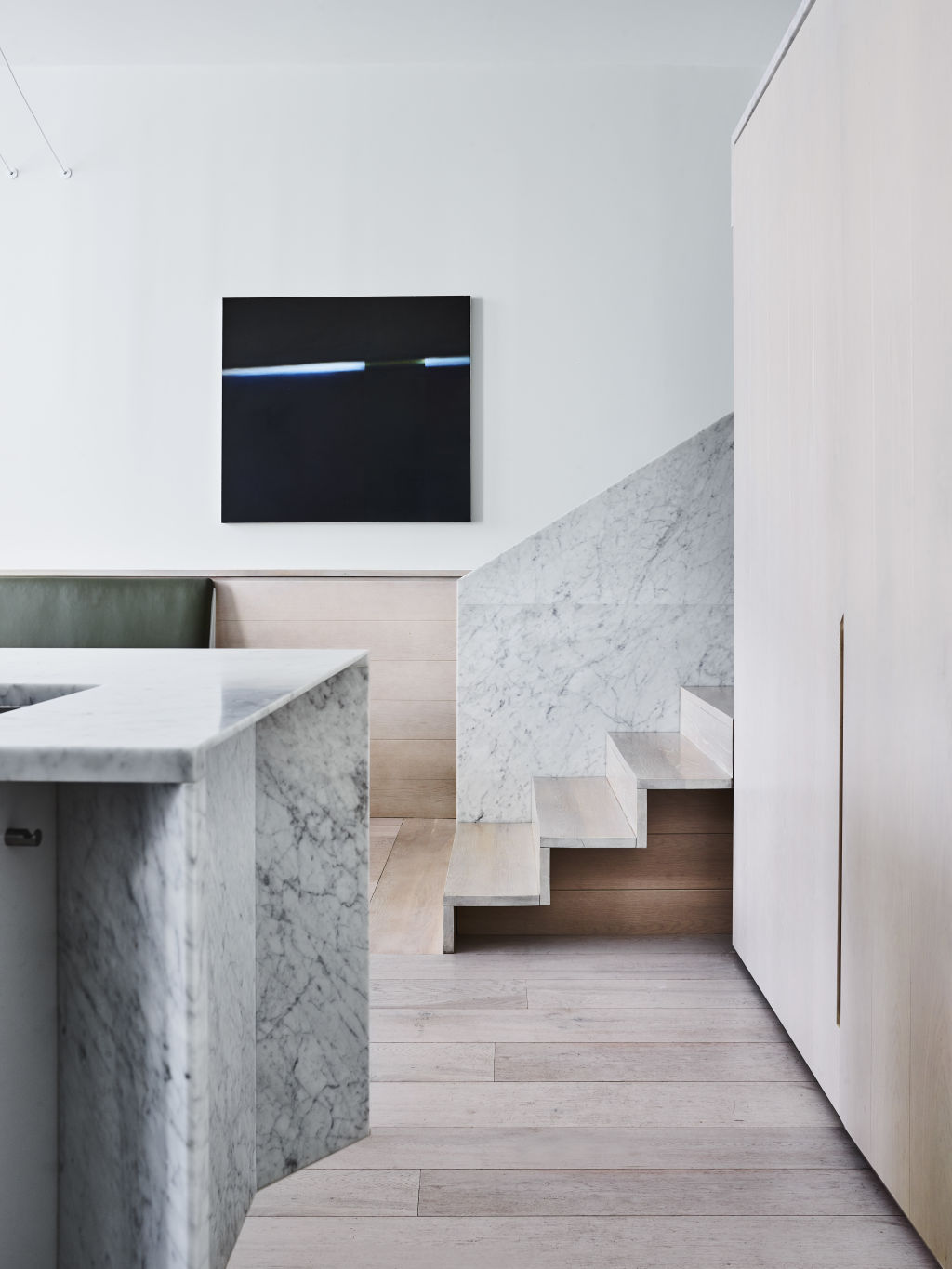
The middle sitting room with the retained Victorian staircase and period fireplace shows the expert skill-set in action. Smart calls it “the transitional place where we grafted old and new together”.
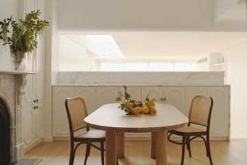
A new ceiling cornice – “with a curve that binds the space together” – sits above an essential “slot of light” before the room steps down into a new century represented in the new kitchen-living section that opens to the terrace.
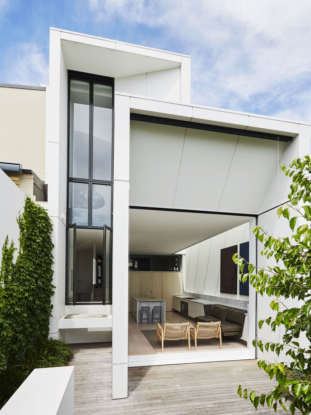
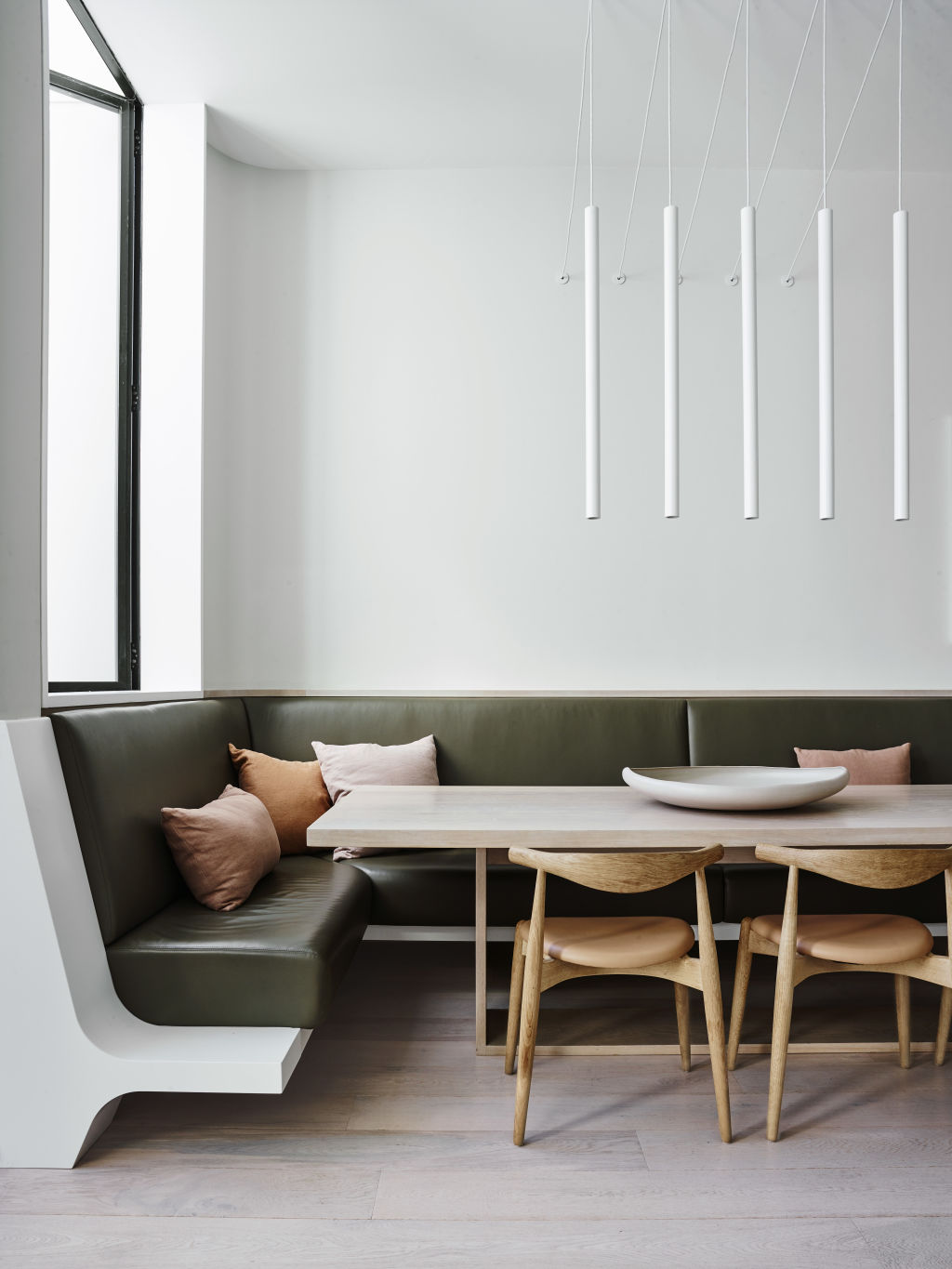
Luxury materials like Carrara marble, used in the balustrade and for the kitchen island, along with a built-in seating banquette covered in plush leather, establish modern character in a wholly modern rear extension. It has the form, Smart says, of “three stepping boxes set back from each other to reduce their bulk and marry them back to their neighbouring buildings”.
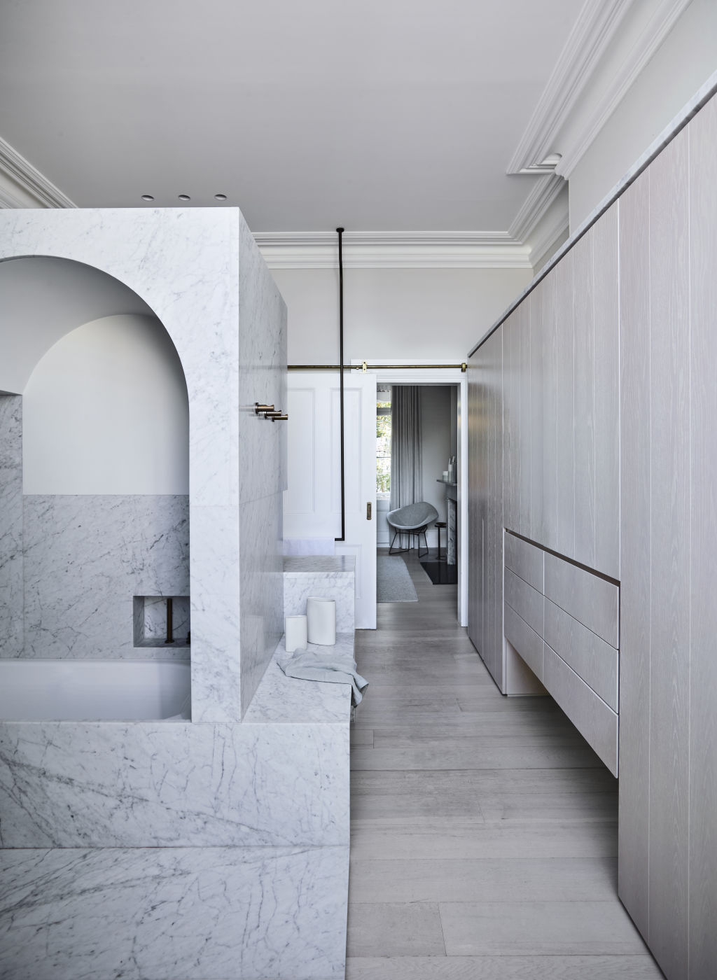
Elements like the pale oak floors, subtle joinery and pocket doors ensure “attention is not eroded by too much fussy detail”. Notably, the marble becomes monumental in the bathroom where it is used “as thick, edge-exposed stone”.
“It is only right to do high quality work in these old buildings,” says Smart.
We recommend
States
Capital Cities
Capital Cities - Rentals
Popular Areas
Allhomes
More
