Splash of cash: The hot new Sydney cafe that was modeled after old-fashioned banks
This cafe, perched on the lip of the nation’s financial epicentre, is designed to evoke the sombre opulence of an old-fashioned bank.
The 40-seat outlet was created for coffee brand Toby’s Estate on the ground floor of Lendlease’s Darling Square development in Darling Harbour, adjacent to Sydney’s central business district.
Alex Hopkins, design director at interior architecture practice Studio Tate, chose the moody palette and rich materials traditionally associated with the banking sector as her inspiration for the coffee bar, because the building’s anchor tenant was the Commonwealth Bank.
“We wanted to create something similar to an old-fashioned bank – timber-lined, with traditional lights, that might have a brass trim around it,” Hopkins explains.
“Those were the images we focused on, but we also wanted to put a contemporary spin on it.”
The finished project is the result of lengthy negotiations with a number of interested parties – not only Lendlease and Commonwealth Bank, but also the building’s architect Woods Bagot – in order to meet a strict regulatory process.
The creative starting point for the interior was the marble floor running from the lobby into the cafe, part of the original Woods Bagot design.
The floor – a staggered pattern of five types of marble in light grey, dark grey, brown, nude and white – is laid in such a way that the cooler colours dominating the lobby gradually move to the warmer end of the palette as one approaches the cafe’s service counter.
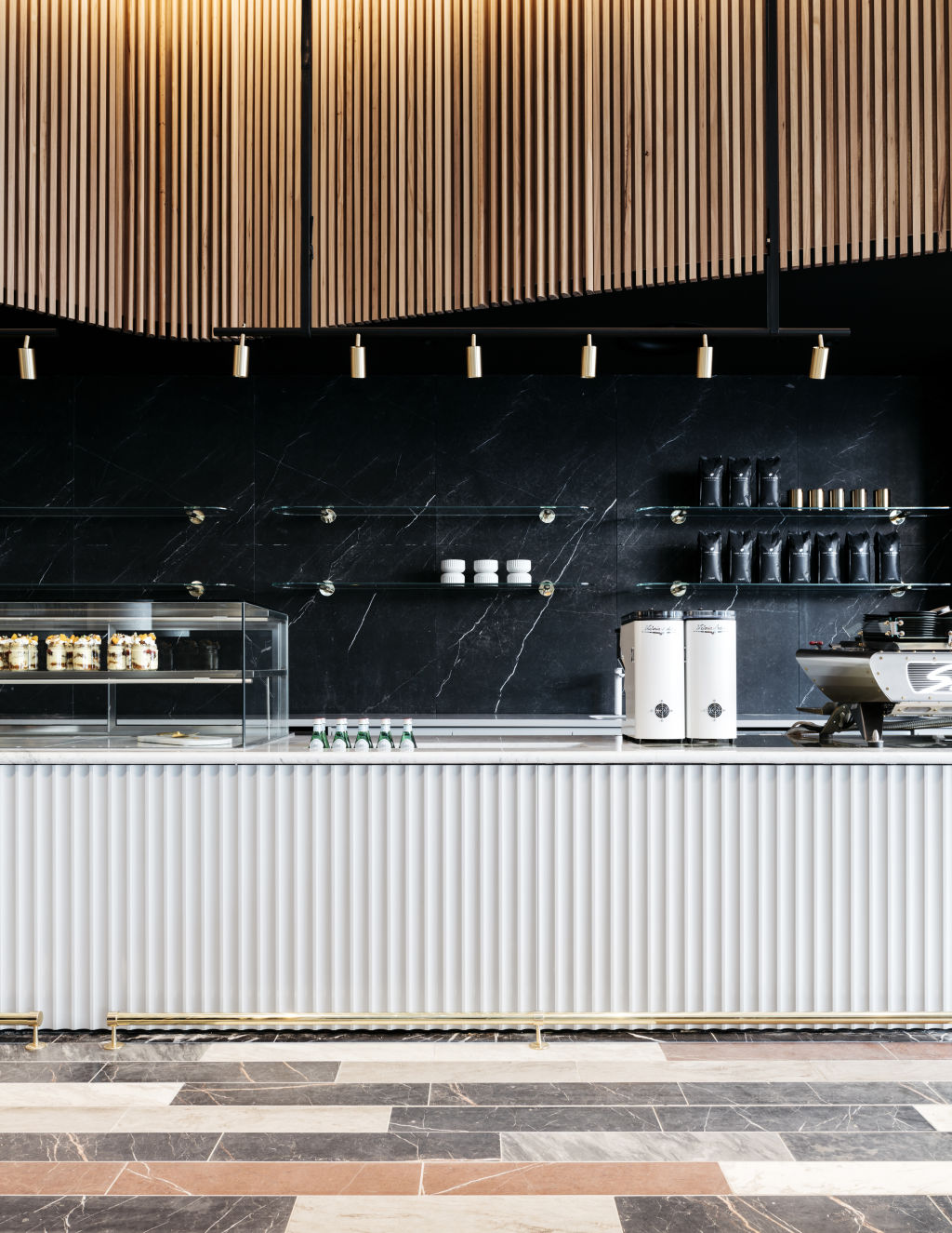
Hopkins took care to work around this feature so as to ensure the cafe’s interior did not become overly busy. The wall behind the bar, for example, is an understated expanse of black stone.
“We deliberately chose the darker stone for the splashback because there’s a lot going on with the floor; it’s a simple backdrop for everything else,” Hopkins says.
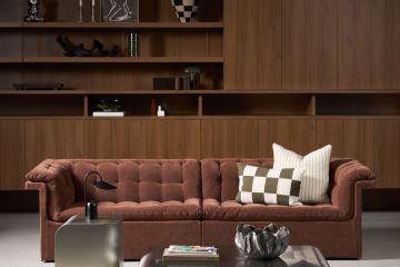
In keeping with the banking theme, Hopkins chose a palette of luxurious materials in warm, inviting tones, including timber, brass and natural stone in black, white and deep green.
The bullnose bar, with its brass kick-rail, enhances the vintage sensibility of the space. The undulating, fluted panelling that wraps around the section of wall above the bar is a subtle reference to the timber-lined walls of old-school banks.
Towards the entrance of the cafe, the pink velvet and vinyl banquette seating pays tribute to the art deco era with its semi-circular back rests.
We thought you might like
States
Capital Cities
Capital Cities - Rentals
Popular Areas
Allhomes
More
