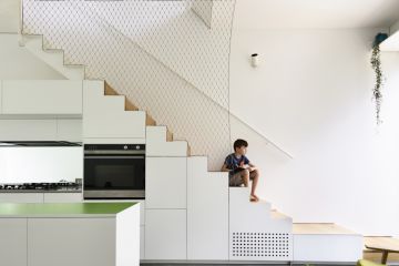
Step inside this modern ode to mid-century architecture in Beaumaris
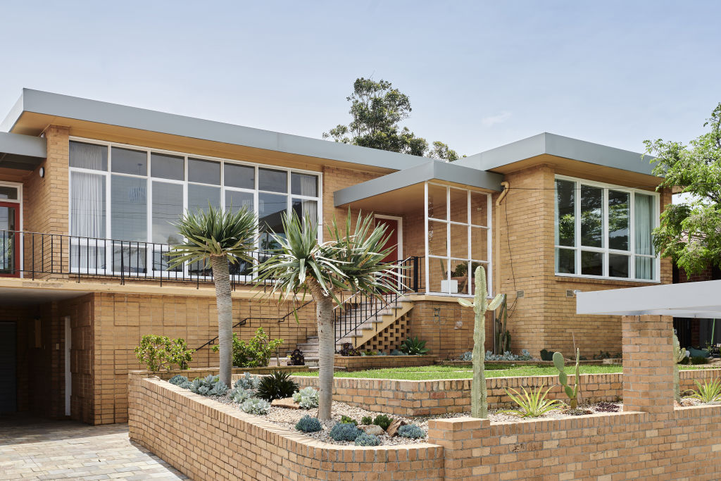
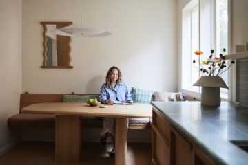
Who: Natashia Ting and Peter Rosser
What: A lovingly updated mid-century Beaumaris home
Where: Beaumaris, Melbourne
Natashia Ting and Peter Rosser went searching for a spacious home to buy in Melbourne’s bayside in 2018. They were initially disheartened with the properties on offer, described by Natashia as “mostly new-builds with the same big white kitchen, and an all-grey colour palette.
“After a day of house hunting, we’d often get confused over what we had seen because every house presented in the same way,” she says.
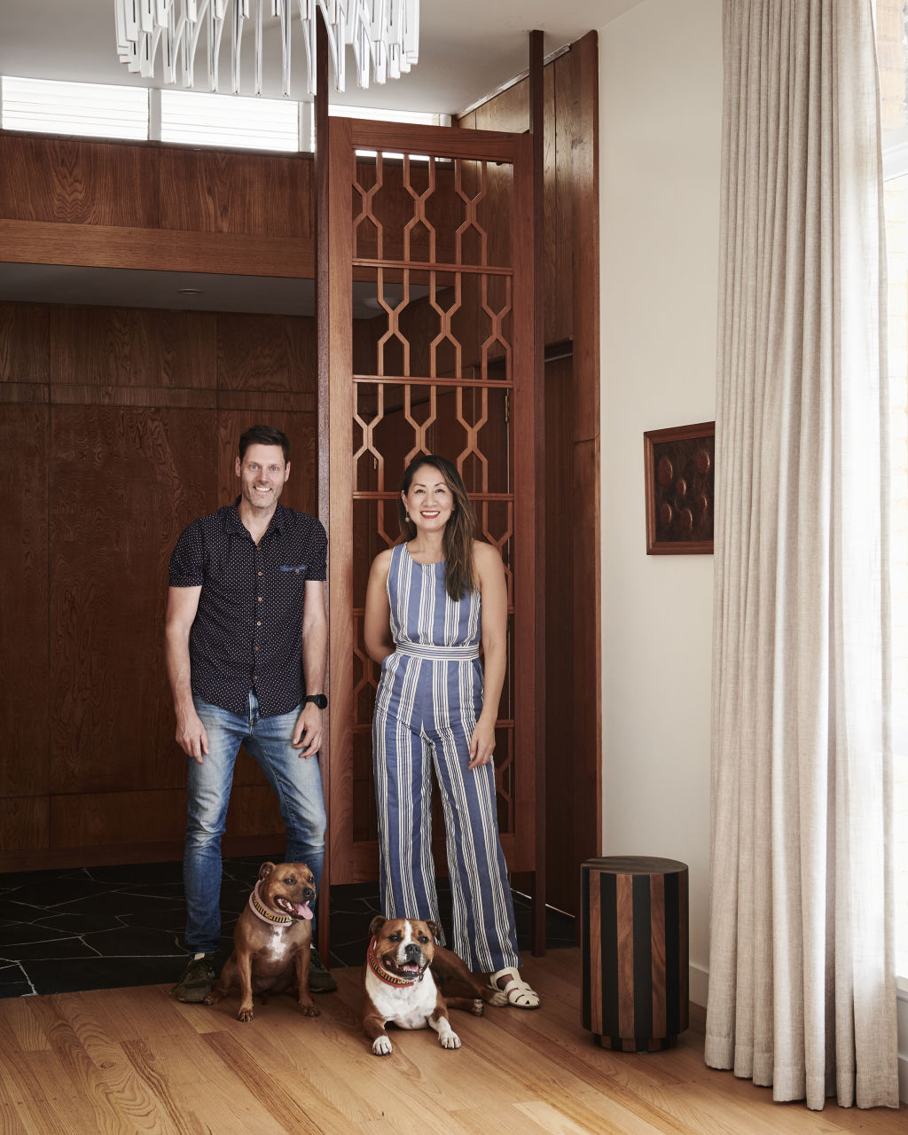
The couple expanded their search to Beaumaris, home to one of the greatest concentrations of mid-century houses in Australia, and a community of like-minded residents.
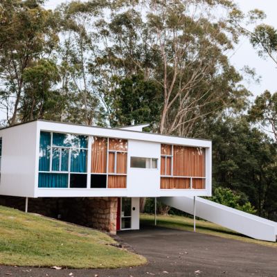
Here, Natasha and Peter finally came across the home they’d been searching for: a 1961 brick house with the retained character of its original design by architect-owner Jefferson Jones.
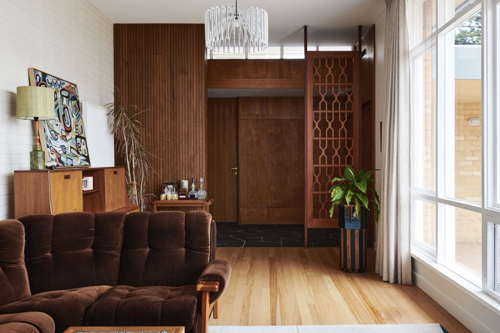
“As soon as we walked in, I think we both felt something special from the house,’ says Natashia. “We both smiled and looked at each other and agreed immediately that the house was amazing.
“We loved the huge windows at the front with the elevated viewpoint, the large balcony, the giant established tree in the backyard and the solid build.”
Recognising the home’s potential, Natashia and Peter put in an offer on the spot and moved in late in 2019.
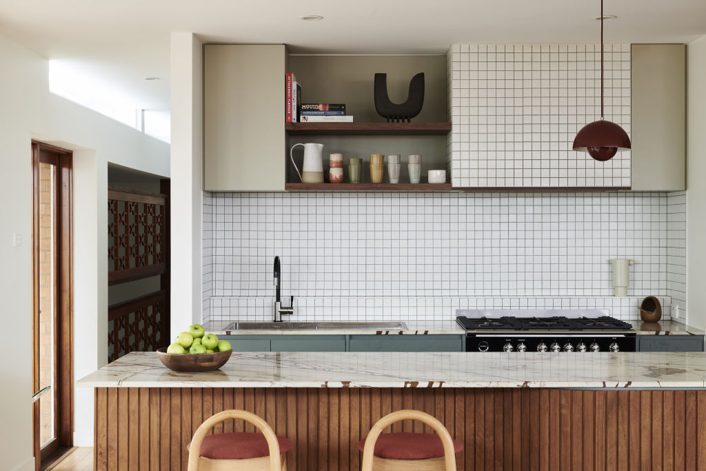
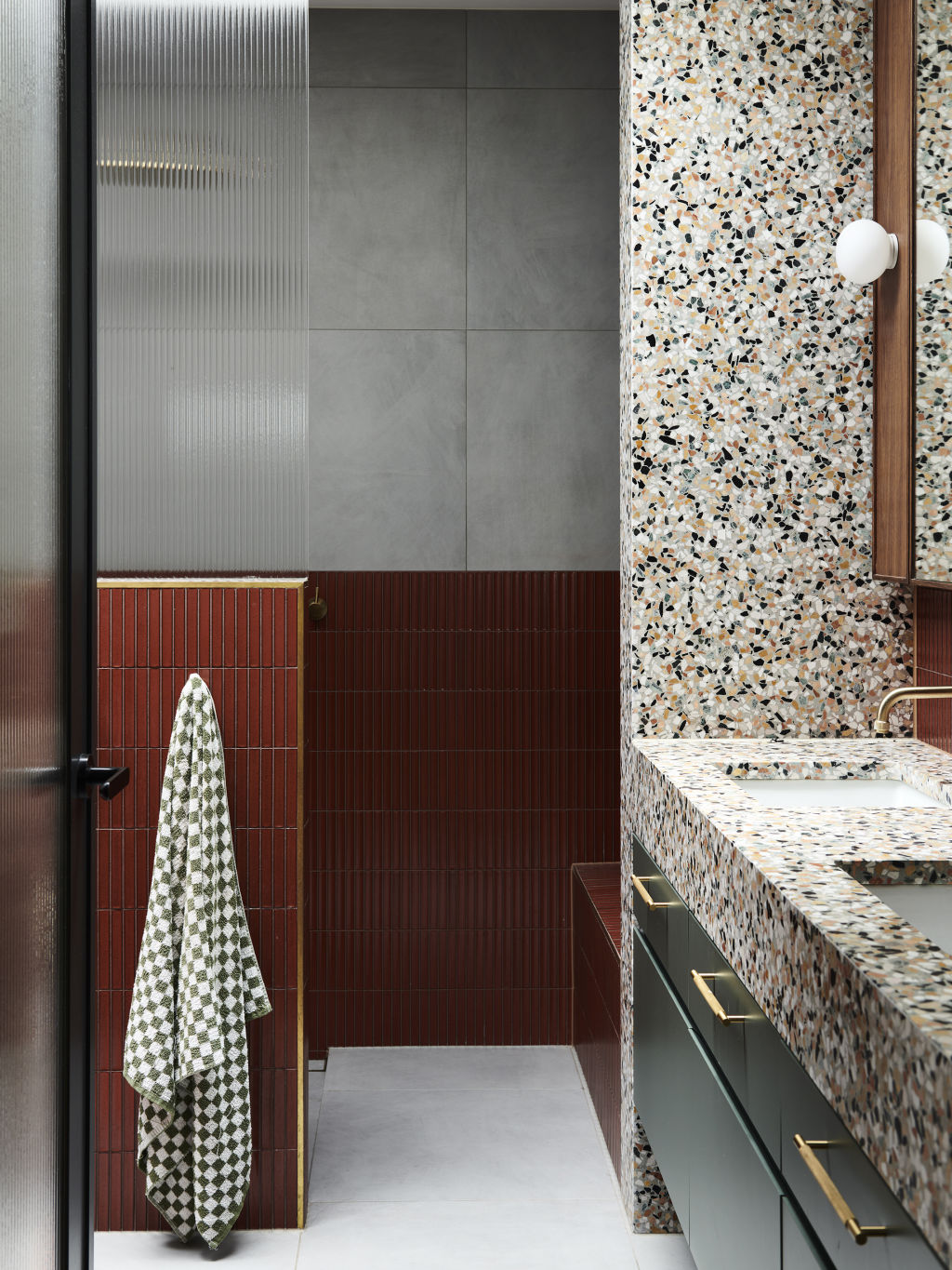
Since then, the couple have worked with Tecture architects and Beyond Form Building Group to sympathetically update the property. Its footprint remains unchanged, but the interiors have been given a major overhaul inclusive of a new kitchen and bathrooms.
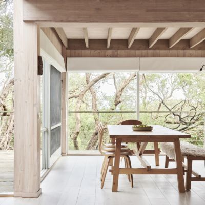
Natashia and Peter made a conscious effort to avoid grey in favour of warmer colours throughout to instil cosiness, comfort, and fun. “We wanted the house to feel homely and inviting, but not kitsch or high-end luxe,” says Natashia.
Tecture also helped to open up part of the floor plan, which was previously a “rabbit warren” of smaller rooms.
Peter and Natashia love their finished home, as does Beaumaris’ wider community of mid-century enthusiasts.
“Most of the long-time residents in the area know the house,” says Natashia. “When we were renovating and doing the front yard, many residents came by and said, ‘We are so glad you didn’t knock it down or change the outside!'”
“We are part of the Beaumaris Modern group, which has introduced us to lots of likeminded people who love and want to preserve the mid-century architecture in the area.”
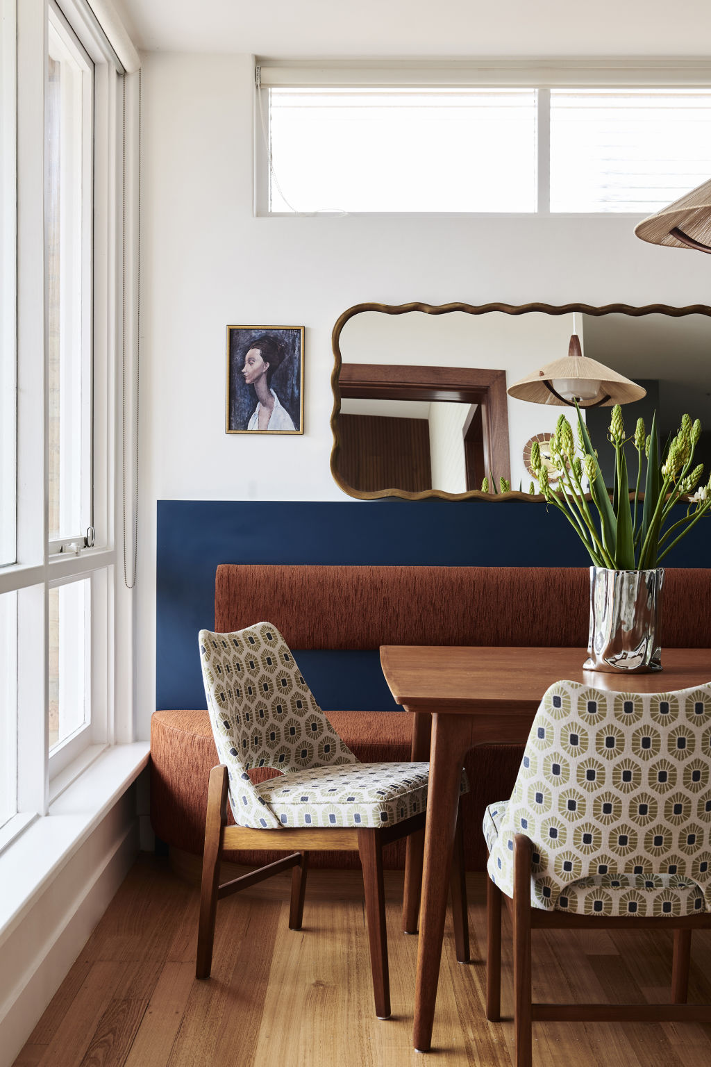
The pair have quickly adapted to the bayside lifestyle, enjoying drinks on the front porch, strolls along the nearby beach, and hosting regular parties.
As Natashia says, “Life is pretty good out here in Beauie.”
How to balance old and new
Whether you’re the owner of a grand heritage home, or perhaps a mid-century masterpiece, renovating or extending while retaining original design features is always a careful balance.
- Restore, don’t reproduce. Aim to retain and restore original features, but avoid mimicking or imitating traditional details (such as cornicing, ceiling roses or fireplaces).
- If demolishing old parts of the home, salvage and repurpose robust materials such as floorboards, windows or doors. Seek to use these old materials in new parts of the home where possible, to create a narrative between the old and new.
- When adding a new extension or addition to an old home, don’t be afraid of contrast. Materials don’t have to match. It’s OK for there to be a clear delineation between old and new.
- Decorating and styling can be more effective than major renovations in creating a home that feels cohesive. Decorate in layers – consider wall colour, then rugs and furniture, artwork and lastly soft furnishings, to add history and character to new spaces.
We recommend
We thought you might like
States
Capital Cities
Capital Cities - Rentals
Popular Areas
Allhomes
More
