Seven subtle design mistakes that instantly cheapen your bathroom
A spacious, well-organised bathroom is truly life-changing. Take it from someone who’s moved 10 times in 10 years and tested out all kinds of bathrooms to varying degrees of amazingness (or lack thereof).
A great bathroom should, of course, be visually pleasing, but most importantly, it should serve its purpose well: adequate storage for everything from bath products to towels, lighting that serves the tasks performed in a bathroom, and finishes that are resistant to humid environments.
Thankfully, we have interior designers who make it their life mission to be a resource for everything there is to know about designing a bathroom. Find out from the best, and learn their clever solutions, below.
1. Neglecting storage
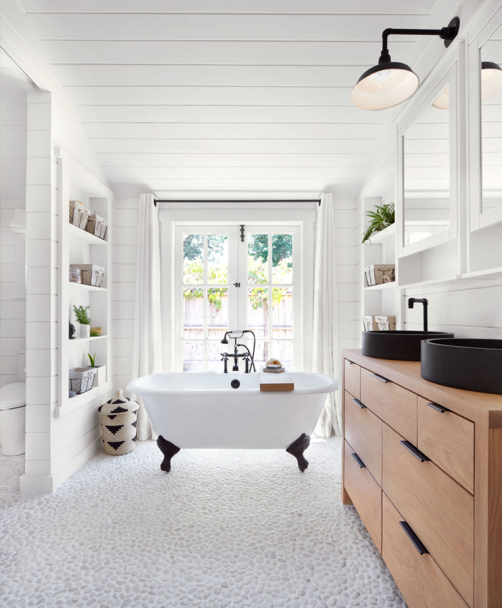
Every single designer agreed on one major mistake: not having enough storage. “You absolutely need as much storage as possible to ensure that your bathroom stays the most functional and uncluttered space,” says interior designer Tali Roth. “Medicine cabinets, although often harder to find attractive ones, are so, so useful for storing all those small items for everyday use. If you’re building from scratch, explore recessed wall cabinets and recessed shower shelves—they are clean and oh so useful!”
The designers at Studio Life.Style suggested focusing on the vanity. “Make sure to either custom make or purchase a vanity that has plenty of storage to hold things like your hair dryer and makeup. Also, make sure you have plenty of counter space if that’s something you like,” they say.
2. Overlooking lighting
The other main bathroom design offender: lighting. “There’s nothing worse than a poorly lit bathroom,” says Roth. “People often forget that they need multiple light sources and end up with a single dull sconce—which basically ensures you’ll leave the house with scary clown makeup. Try to incorporate both decorative and task lighting.”
3. Choosing too many finishes
Roth pointed out how messy designs can become when going crazy with finishes and patterns: “My theory is that in most circumstances, more than two finishes in a bathroom can look odd. Try to flow the materials in a digestible way—keep all the floor materials the same, and change up the walls. If you want a statement pattern or colour, use it on the floors, or tile the inside of a recessed shelf instead of putting it everywhere.”
4. Planning electrical too late
For designer Jane Abercrombie, the single biggest mistake when designing a bathroom is to plan the electrical components too late. “Remember: Electrical planning needs to be done very early in the process,” she says. “For example, a hardwired makeup mirror is great mounted on the wall, but you need to remember this in the early phase. It’s so wonderful to have outlets in drawers—for hair dryers and straightening irons so they can be tucked away quickly and neatly. If you forget to do this, you can have someone cut a grommet hole in the drawer and use an extension cord from the wall outlet. This is a game changer!”

5. Choosing slippery tiles
“A common mistake is using cool, decorative tile on their bathroom floors that aren’t made for getting wet, which can make it really easy to slip on,” explained the designers at Studio Life.Style. “This can be fixed by either making the flooring slip-resistant, which can be done with treatments, or making sure that the tile you choose is suitable for bathrooms.”
6. Forgetting personality
“People forget that bathrooms can have personality just like any other room in your house,” the designers at Massucco Warner Miller told us. The fix: “Add a fun and unexpected light fixture, chic art, or even wallpaper. Bathrooms are typically smaller spaces, so it doesn’t take much to really spice them up and make them cohesive with the decor of the rest of the house.”
7. Not considering humidity
Lastly, the designers at Studio Life.Style warned against the use of wallpaper: “We can all agree that adding wallpaper to any bathroom can immediately warm up a space. We love using wallpaper in all the bathrooms we design, but the biggest thing we always keep in mind is that the wallpaper needs to either be made for bathrooms (like a vinyl, for example), or the backsplash needs to be high enough so that the wallpaper won’t get damaged.”
We recommend
We thought you might like
States
Capital Cities
Capital Cities - Rentals
Popular Areas
Allhomes
More
