How to tackle the trickiest kitchen design problems

Author: Graeme Wilson
When it comes to kitchen planning, designers frequently face the same complaints from homeowners about what’s “wrong” or frustrating within their existing kitchen. Most of these recurring problems – and their resulting complaints – stem from a kitchen not having been designed with the owners’ needs in mind (often the case, of course, with inherited kitchens).
So if you hire a good designer, they’ll spend time asking you about how you live in your home, how you use – or would like to use – your kitchen, your lifestyle, your tastes and your habits. You could also get a head start by making a list of your kitchen likes and dislikes, frustrations and wishes, to help you swerve the issues outlined below.
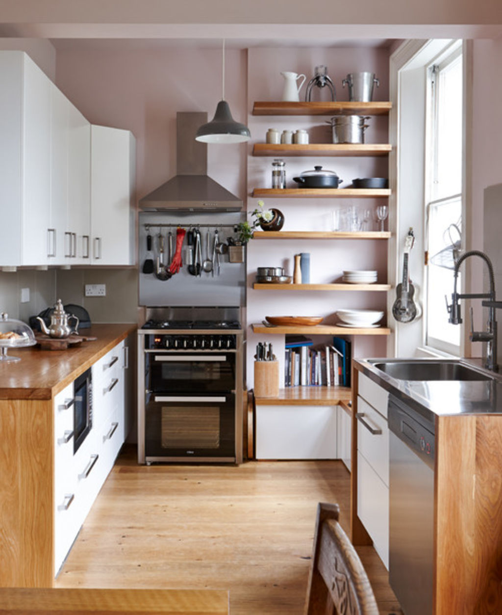
One of the most common kitchen design problems resulting from poor planning is insufficient storage. This can easily lead to clutter, mess and frustration. Yet even in really small kitchens, generous base and wall cabinets should be achievable – you just need careful and sometimes imaginative planning (as pictured) to fully maximise the space.
Kitchen corner units, for example, are excellent for making use of otherwise unused corner space, as they reach fully into the depths of the unit. Similarly, pan drawers offer more generous storage than cupboards, and are also easier to access. Another option for a small kitchen might be wall units that reach to the ceiling.
There are also lots of clever storage options to consider, such as secret drawers or hidden spice racks, and many kitchen storage options are specifically designed for the provision of smaller items, such as gadgets, hand-held appliances and utensils.
Carefully thinking about your storage needs from an early stage of the design process will ensure you include enough of it and, in the long term, make for a much happier kitchen environment.

A badly planned layout and workflow
A poor kitchen layout will impede the use of the kitchen, making you work much harder than necessary, and ultimately stopping you from enjoying it. Your kitchen should work specifically for you, with a workflow and layout designed to cater to your individual needs.
For this to happen, your designer must enquire about your lifestyle, habits and kitchen requirements, as well as how many people live in your house, who likes to cook and what your preferred cooking style is. All of this information should be used in the planning of your layout.
While a lot of designers still plan using the traditional kitchen triangle, I think defining separate areas or zones for prepping, washing and cooking can result in a more efficient and personalised design. This approach allows fluidity in the positioning of the different areas of the kitchen.
In addition, of course, as in the pictured example, your kitchen should look good too.
Keeping Kitchens Summer-Happy All Year Long

Not enough bench space where it’s needed
A lack of bench space, or benchtops not being positioned where you need them, is a common design problem. It can prove to be one of the most frustrating too, as your benchtop is needed for just about every activity you’ll carry out in your kitchen.
The benchtop forms part of the kitchen workflow, so this will help to determine where and how much of it you need. A common mistake is not leaving sufficient space next to or opposite a fridge or oven. With a fridge, this benchtop space is convenient, but having space next to or opposite an oven and stovetop, as seen in this scheme, is also important for safety – this way you shouldn’t find yourself carrying piping-hot food across your kitchen, looking for a benchtop on which to set it down.
During planning, it’s important to think about all the ways in which you currently use, or intend to use, your benchtops. For example, you might want space for more than one person to cook at once, or maybe an area where your partner can sit and chat to you while you cook, or else it might be important to include somewhere for the kids to do their homework.

Traffic through your working area
As suggested, you might want enough benchtop space for more than one person to operate in your kitchen at once. However, you need to consider how to achieve this so users don’t get under one another’s feet while both trying to reach the fridge, oven or sink.
Similarly, if you have children, you might want to ensure they won’t come charging past as you’re carrying hot food or working with sharp knives. Both of these are examples of how “traffic” can become a problem in a kitchen’s working area – but it is preventable through careful planning.
This might mean setting up two separate and spaced out “prep zones”, or ensuring there’s only one kitchen entry point, so you can easily see who’s coming or going (as pictured). You can also ensure frequently used appliances, such as the fridge, are on the periphery of your kitchen, so other household members can still get things out of them without having to fully enter the kitchen (also illustrated here).
Badly spaced units and appliances
It’s important that units and appliances, while well-positioned for easy use, are also well-spaced. For example, there should be sufficient space (typically a minimum of 900 millimetres) between opposing units and appliances, so doors and drawers can open clear of each other (as pictured).
Similarly, they shouldn’t be too far apart: for the sake of a smooth workflow, you shouldn’t have to take more steps between appliances than is necessary. Similarly, it’s important not to place wall ovens and microwaves so high that you can’t safely remove hot food from them.
Think also about which way your unit and appliance doors open. For maximum ease of use, and where it’s possible, these should also be handed to the left or right according to the surrounding kitchen space.

Poor ventilation and extraction
Appropriate extraction – such as the ceiling extractor pictured – allows the removal of grease, steam and cooking smells. These can otherwise linger on you, your clothes or any furniture, which is especially unpleasant in open-plan spaces.
Choose the best-quality model you can afford, and ensure you pick the right size of ducting to fit your chosen extractor model. This should make for quieter, more effective extraction that’s also more energy-efficient and less likely to break and need repair in the future. Consider, too, how much noise your potential extractor will make – another common mistake is not choosing a model with a reduced noise level motor.
This is particularly relevant if your kitchen is part of an open-plan living space, or is big enough that everyone frequently gathers in it. They should comfortably be able to have a conversation or hear the TV while someone else is cooking.
Not enough provision for rubbish and recycling
Including sufficient bin space to suit a household’s needs is something that’s often overlooked.
Often a bin is present, and fits neatly within an internal drawer, so it maintains the kitchen’s clean aesthetic (and conceals smells), but the reality is the bin is too small and so fills up quickly, meaning constant emptying. Or another common problem is there’s no provision made for separating and storing recyclables.
As with many of the other design problems covered here, this one usually comes about because the designer hasn’t understood the homeowners’ requirements, dictated by how many people are in the house, how often they cook, their style of cooking, and whether recycling is important to them.
Fitting a bin with larger capacity, a bin with separate provisions (as pictured), and/or the inclusion of a kitchen waste disposal unit are all effective solutions to consider.

Insufficient task lighting
Another common complaint is not having enough task lighting. This kind of lighting is important, as it focuses direct light onto specific sites. These are mainly areas where you’re preparing and cooking food, such as the benchtop, stove and sink area.
Benchtops used for food preparation are often positioned directly under wall units, so without additional lighting here these cabinets can easily cast shadows and darken the surface, making cutting, slicing and other food preparation more challenging than it should be, or even potentially dangerous.
Yet again, this one is easily avoidable. Solutions include spotlights recessed into the underside of wall cabinets, or cabinet lighting to let you easily see the full contents of your cupboards. You might also make a focal point of your task lighting, such as fitting statement pendants over an island, successfully combining practicality with high visual impact.
15 Pendant Lights to Showcase Your Kitchen Island
Poorly planned sockets and switches
Finding that switches and sockets aren’t where you need them is so often only realised after a kitchen is finished.
We all use our kitchens differently and your designer should be led by your unique requirements when positioning these electrical points, rather than working to any kind of convention, so don’t be nervous about insisting on what you want.
Similarly, if you’d like additional sockets, or a particular finish for the socket plate other than the standard white, this needs to be established during the planning stage.
Of course, there are some restrictions governed by regulations and safety, such as you must have a clearance of 150 millimetres between socket and benchtop. Similarly, sockets should be a minimum distance of 300 millimetres (measured horizontally) from the edge of a high-level oven, stove, sink or draining board.
These recommendations are something on which your designer should be able to advise you during planning.
Irreversible trend-led design choices
Finally, a trap that no homeowner wants to fall into is over-designing their kitchen, or succumbing to “of the moment” design trends that may not last.
That’s not to say you shouldn’t include your favourite trend or unusual feature, but consider adding these in the form of accessories and furnishings, which are easier and far less costly to change at a later date than fixed furniture, fittings and benchtops.
For example, in this picture, the playful lighting draws the eye and creates a real statement within this all-white kitchen, but it would be easy and inexpensive to remove if the owner wanted to change it or move it to another room later on.
While everyone wants an impressive look, most people also want a kitchen that will stand the test of time, so always look ahead and consider whether you’ll still be happy with your design five, 10 or 15 years from now.
We recommend
We thought you might like
States
Capital Cities
Capital Cities - Rentals
Popular Areas
Allhomes
More


