Wavy mirrors, velvet lounges and textured walls: '70s decor is back in a big way
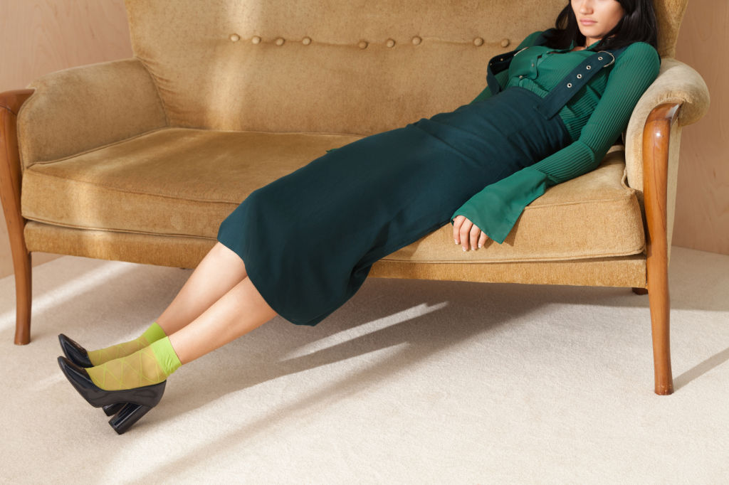
For those tired of the clean lines of mid-century modern, there’s one decade surreptitiously seeping into interiors and injecting a dose of intrigue – and that’s the 1970s.
Rather than a singular movement or look, the era is characterised by pieces that are instantly recognisable and spaces designed with comfort and lounging in mind, says Sydney-based designer and founder of The Make Haus Dani Dean.
“The return of the ’70s is a welcome change to the minimalist look everyone has been navigating the past decade. Still whites, sleek finishes are now been flipped for deeper, decadent textures,” Dean says.
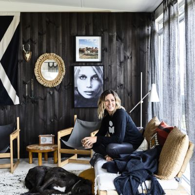
The ’70s were bold, conversational and open to really big, beautiful statement furniture, Dean says, adding, “Tub lounges, velvets, shag, joinery for showcasing our wares. It was a fabulous era, which just needs to be reimagined for the modern day.”
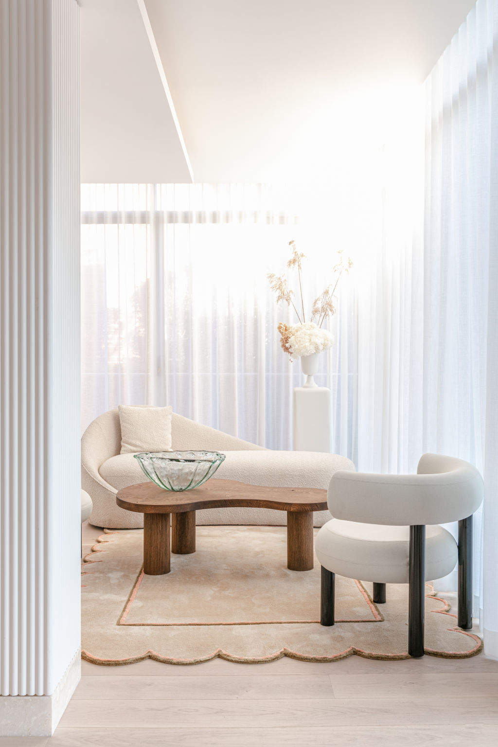
Consumption was certainly conspicuous. While people weren’t buying with the intention to keep forever, there are some who probably wish they had, with a number of iconic pieces holding their own today.
Chrome lamps, wall tapestries, travertine flooring, curved furniture and brutalist wall lighting are all at home in 2020, with many pieces fetching a fair price among those searching for an authentic look.
“The ’70s were great at having fun with shape and form and many of those designs can seamlessly blend into our contemporary Australian aesthetic,” says stylist and decorator Claudia Stephenson.
“The sculptural chairs were a standout. There’s a resurgence of the iconic ’70s-designed sofas like the Ligne Roset Togo and the De Sede Terrazza lounge, which both lend themselves to a more bohemian, relaxed vibe. People are trying to create a haven and these are the foundational pieces that set the mood.”
Melbourne-based interior designer Meredith Lee says now more than ever the ’70s is an appealing decade for mood boarding.
“The throwback offers comfort and warmth in an uncertain world. It was a decade about taking a stand as a community,” says Lee.
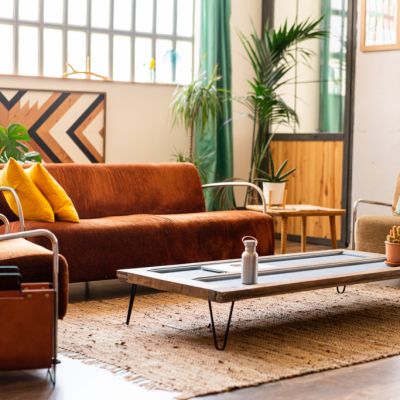
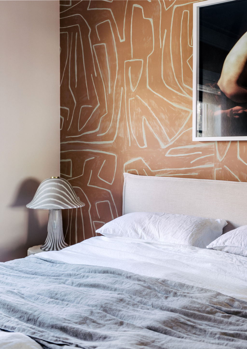
“Colour is probably what most people think of; warm oranges, yellows, browns. Really just boldness in every aspect of the interior. Patterns were also big with prints bold and geometric.”
If you’re not ready for a retro relapse, making updates to smaller homewares like cushions, dinnerware and accessories will be the most cost-effective and easiest way of injecting some ’70s energy into your home.
“I would suggest checking out Sarah Ellison’s range of velvet and boucle seating. A very playful collection, which is big in proportion and very comfortable. Littala also have a great range of coloured glassware, as do Dinosaur Designs who offer a ’70s palette in their resin pieces,” says Dean.
Layering warm colours is also key to achieving the look. Terracottas combined with softer pinks are a modern take on the ’70s, so too are burnt oranges with rich reds and burnished brass, cooled down with fresh whites or lighter blues.
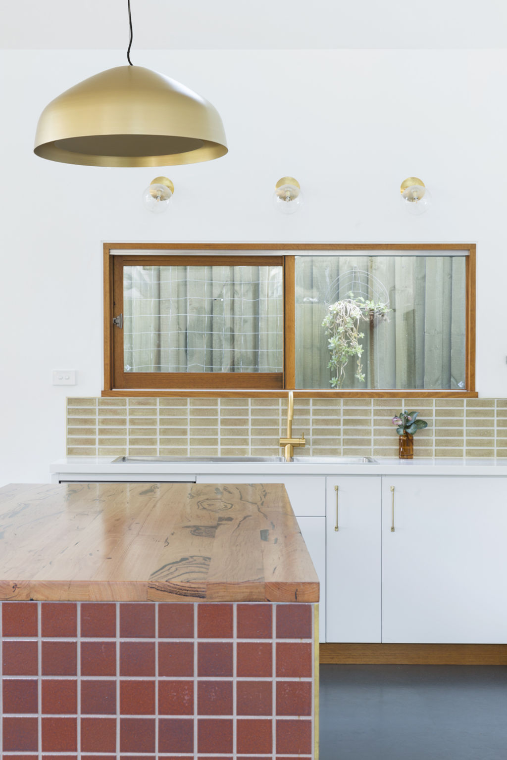
“This time around we’ve seen it play out in a more subdued palette, with shades of terracotta, tobacco, ochre and burnished brass. Browns are starting to return in softer ways to replace what has been predominately white, grey and black over the past five years,” Lee says.
Colour aside, there was also no limit in the application of wallpaper in the ’70s.
“While I wouldn’t recommend having a new print in every room, consider wallpaper for a dining room, kid’s room or powder room as a fun way to reinvent a space,” Dean says.
Before you get started, though, Stephenson has one last piece of advice: “There’s good ’70s and bad ’70s. Taking eras too literally is where people make mistakes. Anchor pieces with a more contemporary backdrop – think less full brick walls and more hints of this trend.”
We recommend
We thought you might like
States
Capital Cities
Capital Cities - Rentals
Popular Areas
Allhomes
More
- © 2025, CoStar Group Inc.
