The best and worst rooms in The Block's history, according to the judges
From paint-splattered walls to gush-worthy kids’ bedrooms, the past seasons of The Block have given us the best of home design and the worst.
“The highs are high, and the lows are low,” says long-time judge Neale Whitaker who has critiqued over 1000 rooms and officially stepped down this year, handing the reins to real estate agent Marty Fox.
“If styling to sell was the sole focus, the houses would be bland and generic. Finding that sweet spot between creating personality, jeopardy and highest price is what creates the memorable moments.”
With the show’s 20th season well underway, we take you back in time to look at some of the show’s most memorable moments, from the brilliant and wacky to the most significant design crimes.
The worst rooms in Block history
Matt and Kim’s crime scene room (2013)
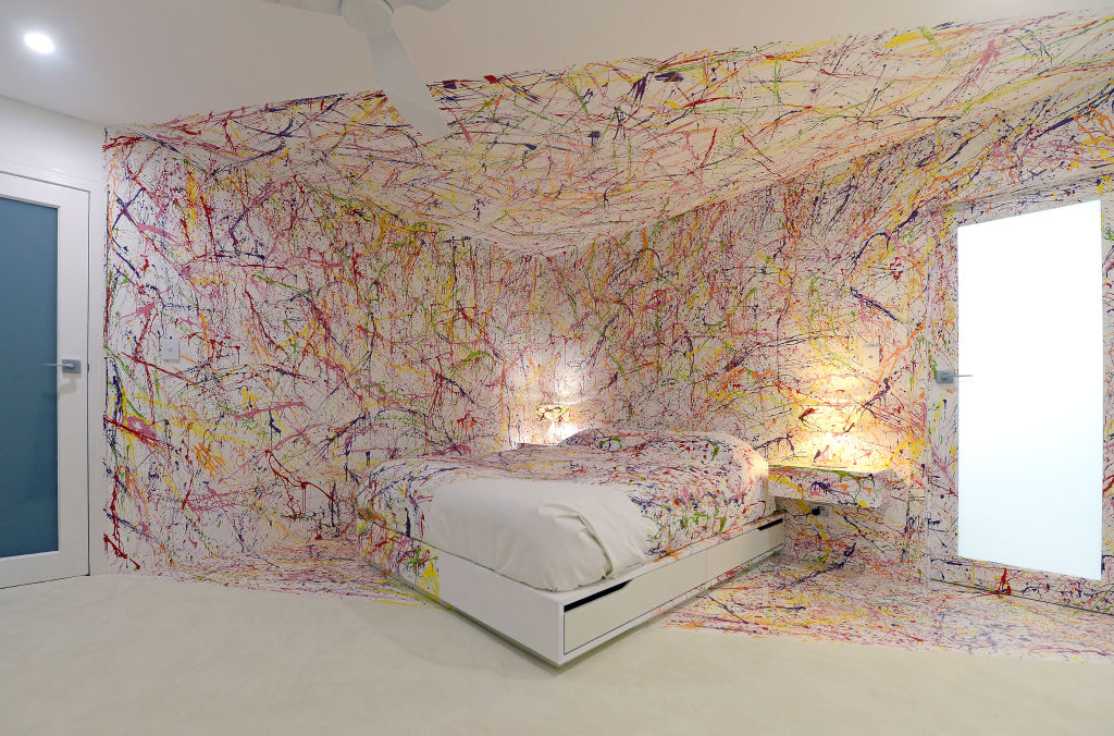
Finding inspiration in the abstract works of artist Jackson Pollock, Matt and Kim splattered paint across half the bedroom, for a space Whitaker described at the time as a “crime scene”.
“It was more installation than an actual bedroom but was neither a love nor hate from me,” he tells Domain. “To me, the worst rooms are sloppily done. This was done to a high degree; it was just inappropriate. No buyer in their right mind would buy that house with that room.”
Fellow judge Darren Palmer, who has overseen 15 seasons of the show, agrees and says it was the “gold standard of what not to do”. “I judge on design, planning, inclusions like decor, execution and market appropriateness,” he says. “Only gasoline and a match could have saved this room.”
Norm and Jess’ ‘tonsil’ fireplace (2018)
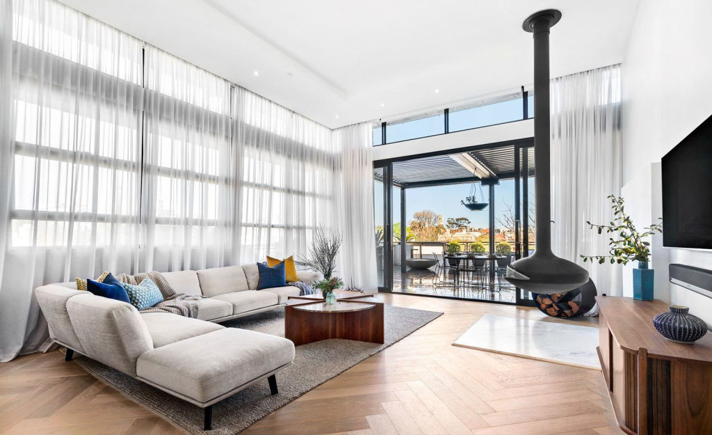
“This was a classic example of when judges are not of one mind,” says Whitaker of the couple’s controversial fireplace. “Shaynna Blaze had strong views, but I loved it so much I bought one!”
Palmer believes the sculptural suspended piece, a relatively new product at the time, was the right choice, in the wrong place. “Shaynna thought its location was physically and visually obstructive but relocating it to a corner made a huge difference. It’s still a beautiful contemporary piece now. I wish I had the right space for one!”
Kerrie and Spence’s graffiti mural (2018)
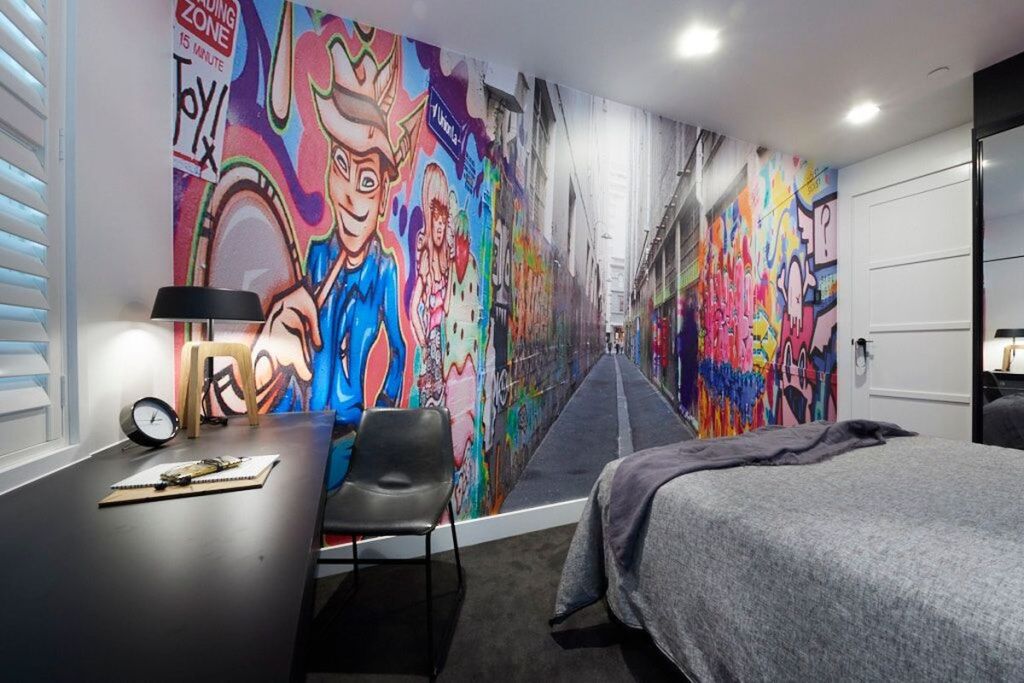
Calling the couple’s bedroom graffiti mural “the worst Block room of all time”, Palmer still shudders when recalling it today. “There are subconscious cues we take from a space, so the mood you feel in a room is created by what’s in it,” he says. “This mural was so inappropriate for a bedroom it literally gave me vertigo.”
Taking risks can result in an exciting room, but Palmer says there’s a place and time. “It’s riskier to be bland than it is to create excitement,” he says. “The difference between creating a home to sell and one to live in is understanding the difference between meeting a market while still using your own flair.”
While the couple’s choice of imagery was wrong, Palmer concedes their intentions were commendable. “They were trying to create a sense of depth, colour and pattern whilst culturally referencing Melbourne, which was logical,” he says. “Unfortunately their execution was mind-bending.”
Hayden and Sara’s gold bathtub (2018)
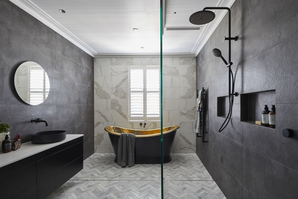
“It was ugly. I hated it,” says Whitaker of the couple’s polarising gold soaker. “I thought it was vulgar and a classic example of contestants thinking a controversial choice will win them the room.”
At an eye-watering $8000, the brass bath was acquired overseas and air-freighted in. Stealing a large portion of the couple’s budget, the $75,000 bathroom is the most expensive in Block history.
“I wouldn’t choose it, but it didn’t ruin the bathroom’s appeal,” Palmer says. “A great piece of art or fireplace is a big-ticket item that can help sell a house. This tub is one of those.”
Mitch and Mark’s confusing wine cellar / media room (2021)
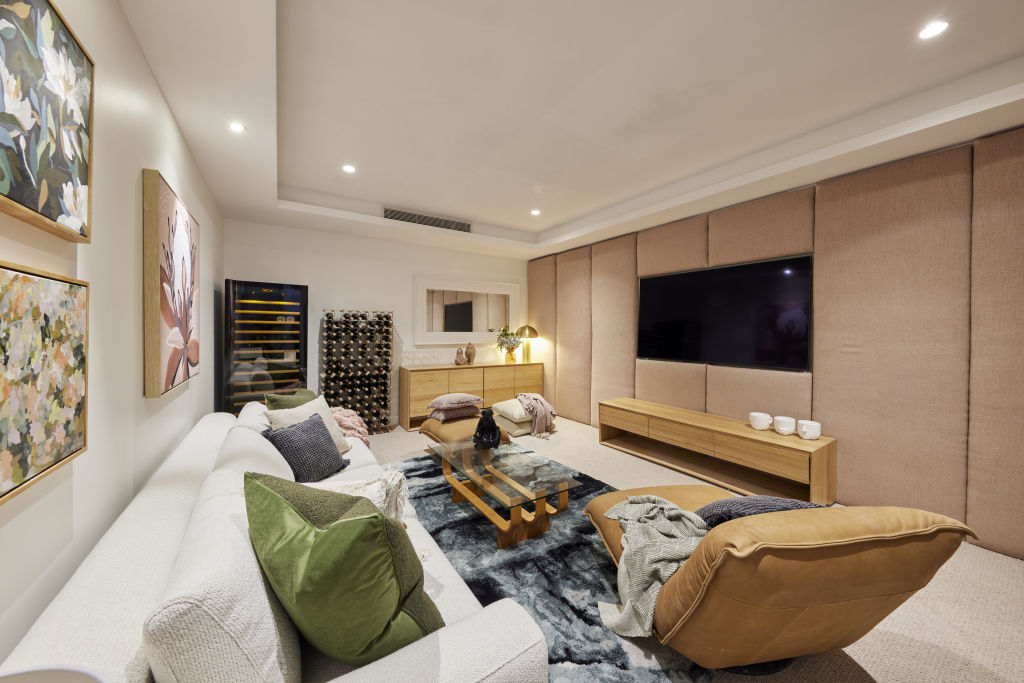
While other teams created dedicated cinemas in the basements of their Hampton homes, Mitch and Mark chose to deliver a media room and wine cellar in one.
The judges were far from impressed with the result, with Whitaker describing the room as “very, very cluttered”.
“The expectation was high as their day spa room next to it was a 10, it was absolute heaven, but this room had no idea what it wanted to be,” says Shaynna Blaze.
“A fridge and wine fridge plonked on the carpet, the decor lacked consistency and it felt like a uni student flop house. It really had me scratching my head.”
Ankur and Sharon’s ‘horrible’ hallway (2022)
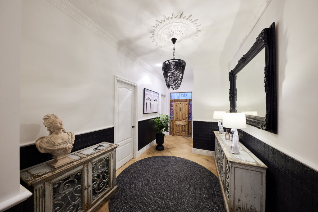
When Shaynna first stepped into the hallway of Ankur and Sharon’s Gisborne house, she described it as “horrible” and “like a cheap film set”.
The space featured black pressed tin detailing on the walls, a black chandelier, and twin jaguar lamps.
“It was heavy, over-detailed, stripped of all of its original period details and had no connection to the rooms that led off it,” Shaynna says. “I really had a strong reaction that was not positive.”
The best rooms in Block history
Deanne and Darren’s Glasshouse exterior (2014)
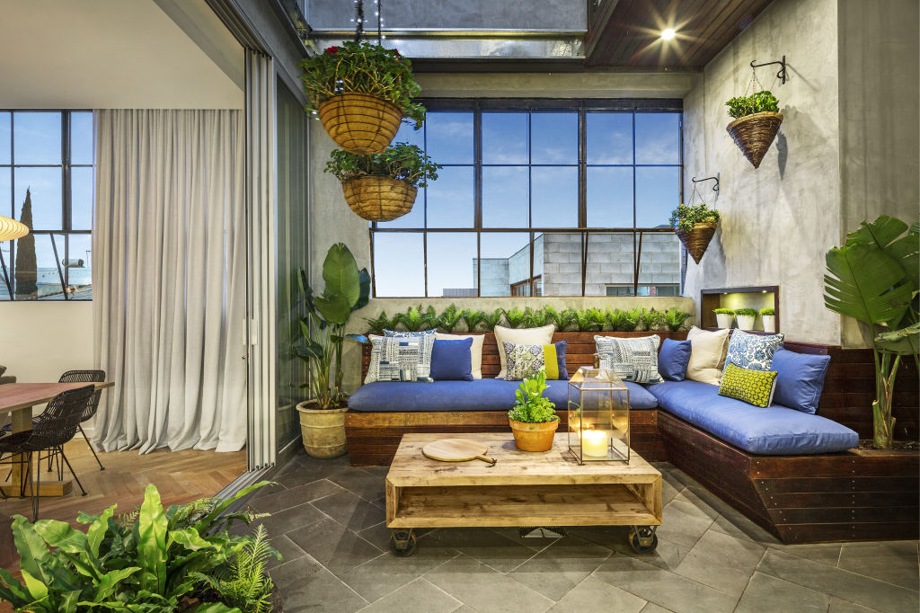
A glassed-in mezzanine layered with plants, lights, timber and city views earned Dea and Darren’s glasshouse terrace top honours. “Dea was polarising and as a couple, they were controversial, yet they always delivered excellent rooms,” says Whitaker. “This was a good example of the calibre of space they could deliver.”
Designing a sophisticated space for a high-end market, Palmer describes it as “whimsical, super cute and elegant”.
“They had an eye for design but importantly knew what their market wanted,” he says. “A sense of whimsy gets people excited about a property. If it grabs potential buyers by the heartstrings, they can pay more than they usually will for a property.”
Shannon and Simon’s wooden bathtub (2014)
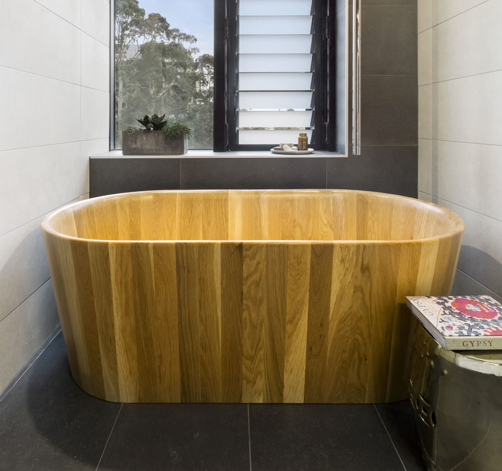
A deep soaker tub crafted of American white oak nabbed the brothers best bathroom, not only for its aesthetic but also for their forward-thinking.
“It was the first time we’d seen a wooden bathtub,” Palmer recalls. “The boys were ahead of their time. The Japandi trend (a fusion of Japanese and Scandinavian style) has been around for years now, so their bold choice, even years later, is still on the money. It was a risky move that paid off.”
Ronnie and Georgia’s guest bedroom (2017)
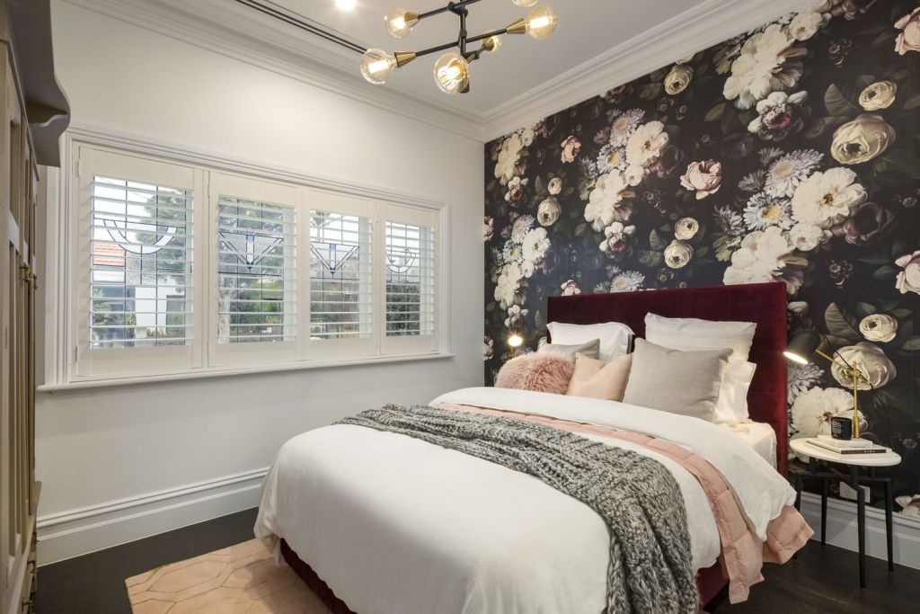
A romantic wall decal, dusty palette and sumptuous red velvet bedhead got the judge’s tick of approval for best guest bedroom.
“This was a great room at the time,” says Palmer. “It’s still lovely but looks and feels like 2017.”
Creating a room that won’t date means avoiding current trends and choosing classic finishes. “It prevents time-stamping your space,” says Palmer. ” Ronnie and Georgia’s inclusions were on-trend, so they’re not enduring but they can be updated easily.”
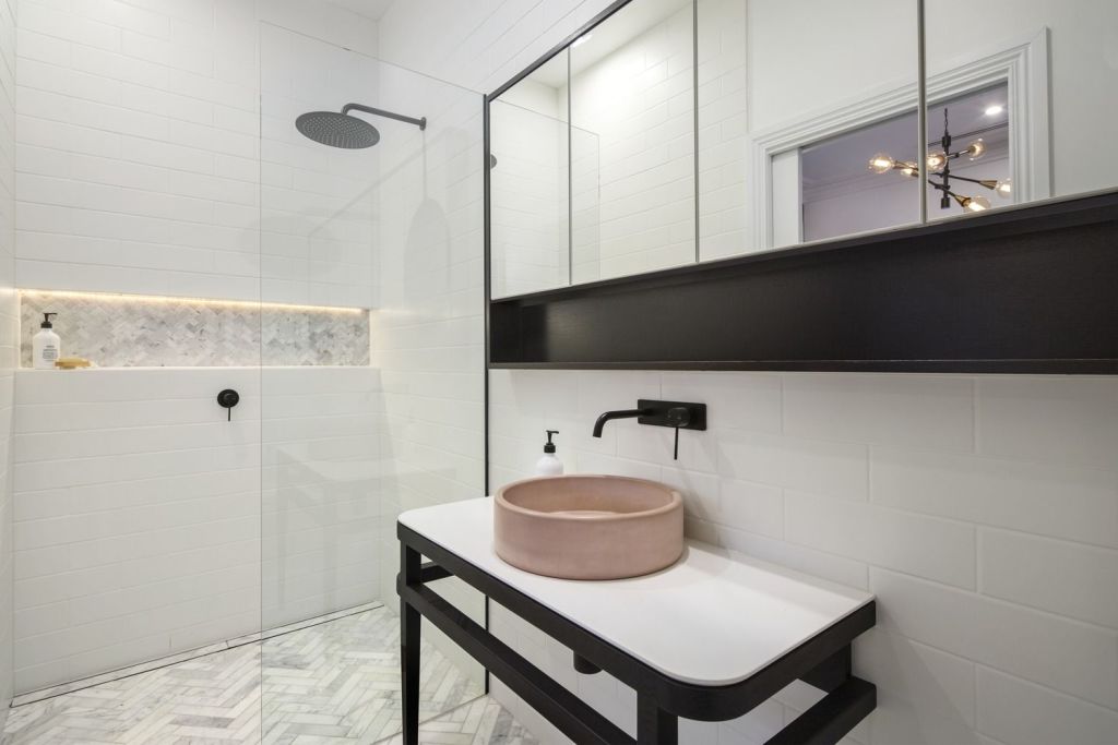
Palmer commends the room’s en suite, complete with a pink sink and herringbone tiles. “The only update is as simple as changing the sink when it ages and the bedhead and wallpaper for a brand new room.”
Jimmy and Tam’s front garden (2020)
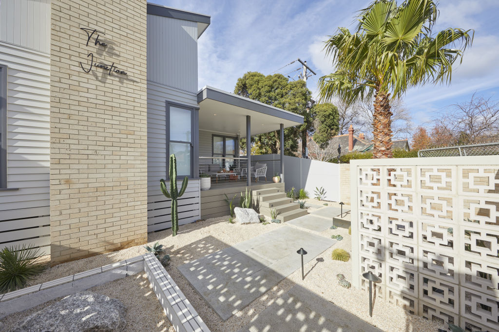
White gravel, breeze blocks and cactus might seem unusual for a front garden, but Palmer liked it. “It suited the period and exterior of the house and the palm tree (named the Darren Palmer) provided an anchor point,” he says. “You can’t be all things to all people, and the same goes for a property. Potential buyers viewing it are looking at a quirky house. It’s a narrower maker, but if they fall for it, they’ll buy it.”
Steph and Gian’s ‘chic’ kids’ bedrooms (2023)
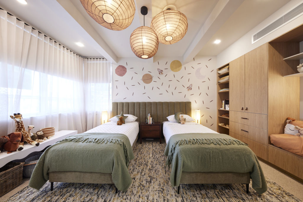
Season 19 winners Steph and Gian scored perfect 10s from all three judges for their kids’ bedrooms, with Marty Fox exclaiming “What a room” and Palmer describing it as “chic”.
The two rooms reflected their signature Japandi style, with paper lanterns, earthy tones, timber beams, playful wallpaper and clever styling.
For Blaze, they were “perfection”. “The details in styling, the colour palette, the layout and the precision of the build team really did produce a room to gush over.”


We recommend
We thought you might like
States
Capital Cities
Capital Cities - Rentals
Popular Areas
Allhomes
More


