The Block 2019: Interior designers react to courtyard reveals
Creating the ideal outdoor space is more than utilising a verandah or unused spot in the garden. It’s the opportunity to increase your home’s square meterage with the ultimate space for relaxation and entertaining.
Last week on The Block, the couples embarked on renovating their courtyards. Here’s how they fared:
Deb and Andy
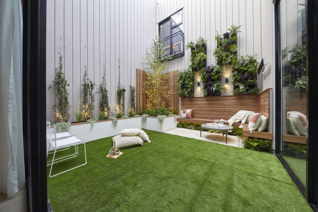
Layout: “I love this – they’ve packed a lot in,” says Sally Satriani from Beautiful Home Renovations.
“The artificial lawn provides a real family backyard vibe, and I like the scale of the planted wall and climbers. It makes it feel expansive while also hugging the space.”
Materials: “The natural timber cladding and seats provide a homely feel,” she says. “Basic cement pavers beautifully complement the clean lines of the wall cladding and the planter boxes.”
Lighting: Satriani awards the couple full points for their well-considered lighting plan. “There’s a beautiful warm glow from every angle, and I love they have under-lit the floating seats.”
Tess and Luke
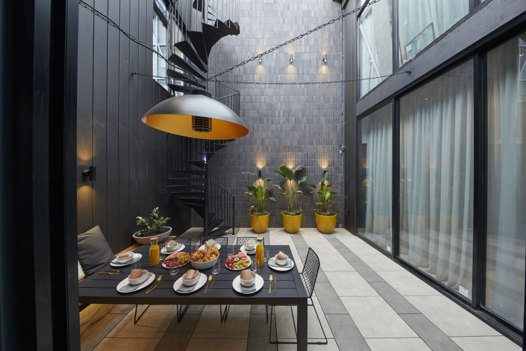
Layout: Satriani says the space overall feels under-utilised. “They had challenges with the location of the windows, doors and the spiral staircase,” she says. “A barbecue, lounge area and longer table would have worked well here also.”
Materials: “The black vertical bricks make a strong statement, and it took good planning to pre-wire the lights,” she says. “My favourite element is the climber sculpture for adding scale through height. It will look even better over time as it gets taller.”
Styling: Satriani says Tess and Luke have set the mood beautifully. “I love the table setting, and the Giant Strelitzia palms add height to the other wall.”
Jesse and Mel (Winners)
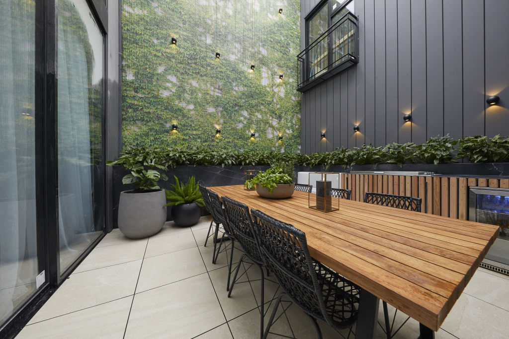
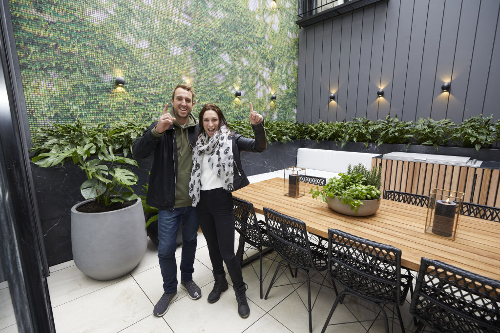
Finishes: “This courtyard has everything you need!” says Lauren Li from Sisalla. “I love how they have integrated the bar fridge and barbecue so well into the design.”
Lighting: “The wall lighting will look dramatic at night when it illuminates the upper parts of the courtyard,” says Li. “It is also a practical way to light up the space.”
Styling: “Their styling is almost invisible – which is a positive!” says Li. “It doesn’t distract from the overall space, and there is no fussiness.”
Mitch and Mark
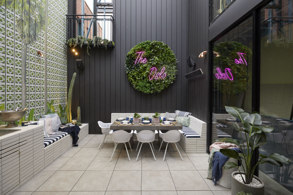
Lighting: “There is some ambient lighting here but not enough functional [lighting],” Li says. “Some cordless table lamps or lighting over the dining table will definitely be needed for the evenings.”
Fittings: “The white dining chairs have a soft curved form that softens their straight lines,” she says. “The round fake plant artwork with neon lights is fun, but it’s too commercial for a home. It is more suited for a cafe.”
Styling: While Li commends the boys for their theming, she says they haven’t quite nailed it this week. “The fabric selections for the cushions and bench seating are gorgeous and follow through with the ‘Palm Springs’ theme,” says Li. “Overall, it doesn’t quite live up to expectations, though. Some vast potted palms, real lattice screens and a chevron outdoor rug are needed here. The picture of a palm tree instead of incorporating those iconic Palm Springs ideas? It’s too literal and looks tacky!”
El’ise and Matt
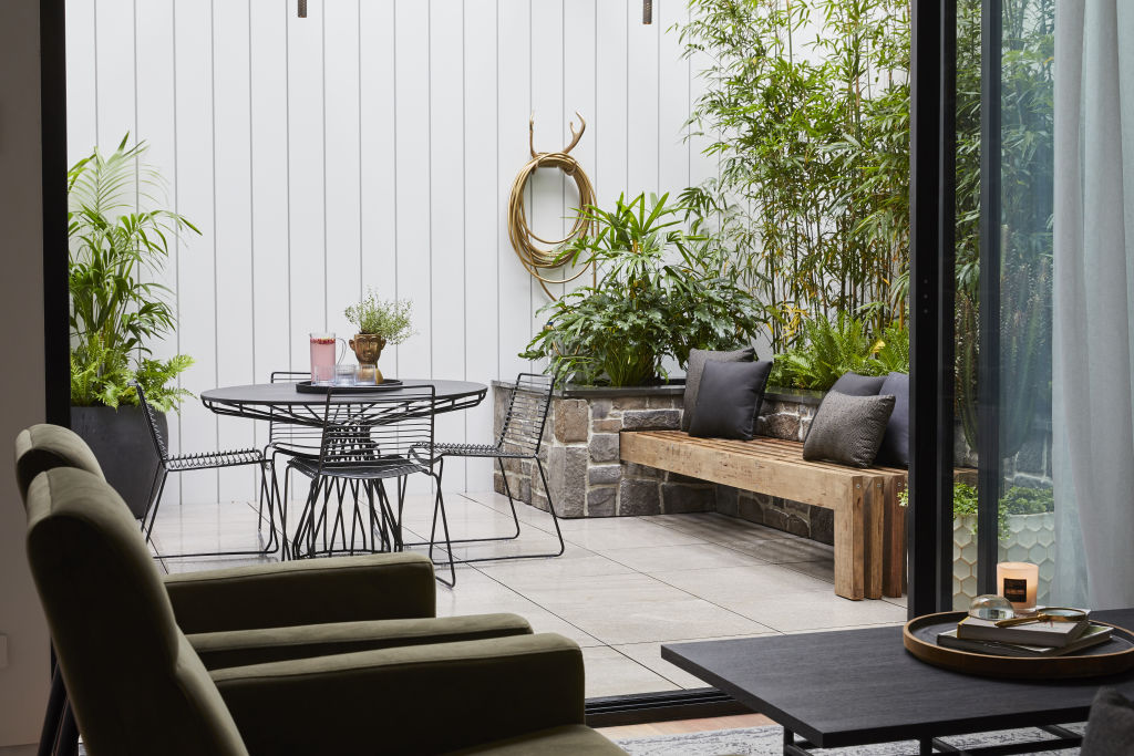
Styling: Li says the inclusion of natural materials is a winner. “I especially love the inclusion of natural stone,“ she says. “It links to the fireplace inside, which allows a nice connection between the indoors and outside.”
Functionality: An effective living space requires multiple zones, and this outdoor area only includes one. “It’s great to have a small dining area and a generous bench seat, but a comfortable cushion is missing, so it doesn’t look like an inviting spot to sit and relax,” says Li.
Texture: “The bamboo is the real winner here,” says Li. “It is authentic and adds lushness and greenery. The space it takes up is well worth it.”
We recommend
We thought you might like
States
Capital Cities
Capital Cities - Rentals
Popular Areas
Allhomes
More
