The Block 2019: Interior experts critique the formal living room reveals
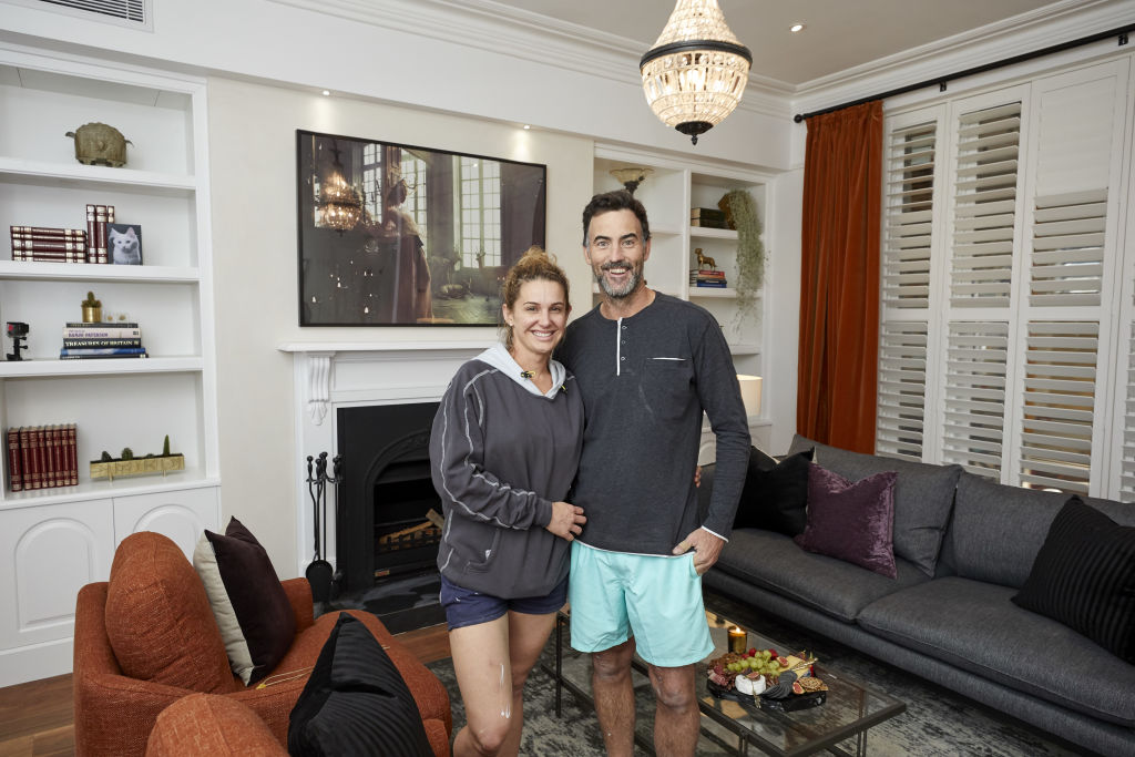
Arguably one of the most challenging spaces to design, the formal living room should include all the foundations of style – from a stylish sofa to sink into to a coffee table that pulls the whole space together.
“It should look elegant and inviting,” says designer Lauren Li from Sisalla. “It should be cosy enough for one, yet have the ability to facilitate easy conversations when entertaining.”
So were The Block couples successful in ticking all the boxes with theirs? The experts give us their take.
Listen to episode seven of Domain’s podcast Somewhere Else:
El’ise and Matt (Winners)
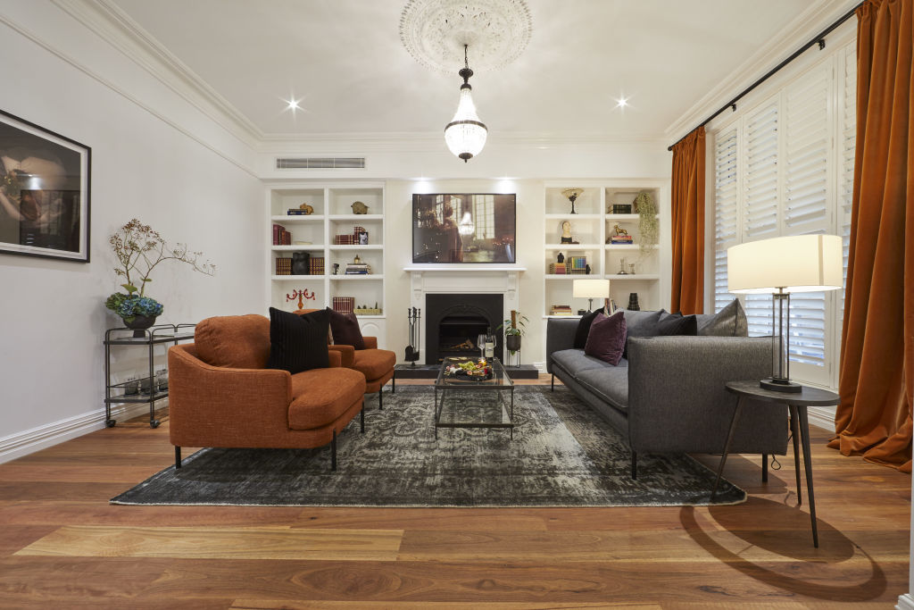
Finishes: With its exquisite heritage detailing, Li says all the ingredients are here for a winning space. “It’s beautiful. However if the room was darker, it would add more ambience and luxury.”
Scale: “The fireplace with its mantle shelf suits the scale of the room perfectly,” she says. “However the shelving and cupboards look too generic. If they were backed in timber or grass cloth wallpaper, they would look more bespoke.”
Detail: Li says the distressed Persian rug is perfect in this setting. “There is a sense of the traditional coming through, but in a contemporary way. The colouring grounds the space and furniture look great against it.”
Tess and Luke
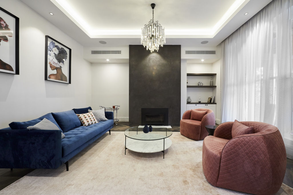
Layout: Designer Nina Maya says Tess and Luke’s layout is perfection. “The furniture arrangement looks balanced against the joinery, and I like their mix of curved forms and straight lines.”
Materials: “The dark flooring grounds the setting,” she says. “The textured finish around the fireplace adds warmth, and the sheer curtains soften the space beautifully.”
Fixtures and fittings: “Great choice of lighting and furnishings here,” says Maya. “However I would have liked to see a statement-making coffee table and sculptural side tables for impact.”
Deb and Andy
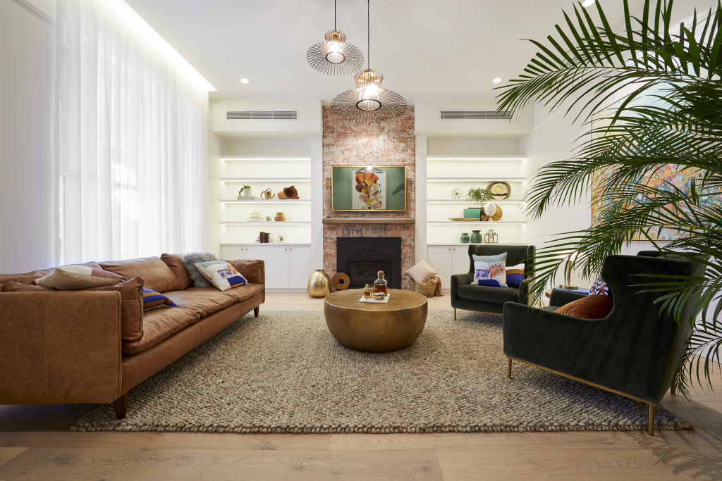
Layout: “The layout could be improved by bringing the sofa and armchairs closer to the coffee table to allow for easy conversation,” says Li. “When furniture is arranged around the perimeter of the room, it feels like a doctor’s waiting room.”
Materials: For Li, the brick fireplace is in conflict with the era of the house. “It needs a sympathetic design. The fireplace used here belongs in a suburban brick house, not a grand 1850s formal room in St Kilda.”
Furniture: “There are too many styles,” she says. “The armchairs are traditional and the sofa is mid-century. They are also too generic for the formal space. A neutral linen sofa in a unique shape would have been more fitting.”
Mitch and Mark
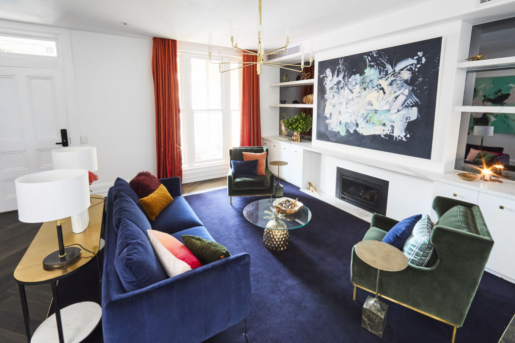
Layout: “Mitch and Mark’s choice of chairs with a higher back and fine legs are a good scale choice,” says designer Camilla Molders. “It tells me they understand scale and balance, which is essential to designing a layout in a space like this.”
Finishes: “The concealed curtain track is clever,” she says. “By concealing, it becomes a shot of colour in stunning contrast with the navy.”
Fixtures and fittings: “The fireplace lets this space down,” she says. “It needed to be raised off the ground slightly for better visual balance. The continued marble mantel shelf closes in the fireplace visually. However, it does make a more interesting shelving outcome that works well with their design.”
Materials: Molders loves the couple’s choice of sophisticated materials. “The herringbone floors and the several tones in the timber add visual depth where needed, and the carpet inlay is clever. The dark rich navy anchors the room and is in beautiful contrast with the orange drapes.”
Jesse and Mel
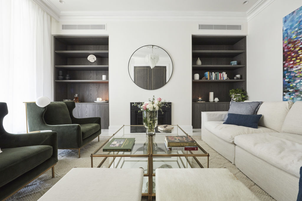
Layout: Designer Lisa Koehler loves the room’s layout with its symmetrical arrangement of furniture. “The circulation and traffic flow could be improved with the removal of the two small ottomans,” she says. “With both overlapping, the sofa and armchairs visually make the room appear smaller.”
Materials: “The base colour palette, textures and brass suggest true luxury,” says Koehler. “Calacatta marble, warm veneer and rich jewel tones are all the right ingredients here.”
Lighting: Koehler says the couple’s lighting plan is spot-on. “The layers of illumination create ambience and the statement pendant creates general lighting, while the combination of lamps add beautiful accent lighting.”
We recommend
We thought you might like
States
Capital Cities
Capital Cities - Rentals
Popular Areas
Allhomes
More

