The Block 2019: The Block kitchens that interior designers loved and hated
When it comes to creating the perfect kitchen, there are essential boxes to tick. From a functional layout and luxurious yet practical surfaces to a well-considered lighting plan, each component has the ability to make or break a high-functioning space.
This week, The Block couples embarked on their kitchens. Here is how some experts think they fared.
Jesse and Mel
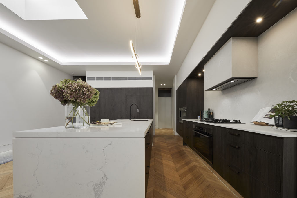
Layout: “This kitchen looks luxurious,” says Jayne Graham from Cranmore Home & Co. “I love the simple, stylish design with warm colour palette. The extensive bench space is a winner, and with the cooktop located directly adjacent to it will make cooking a dream.”
Styling: “The black accessories blend in nicely making them a feature which ensures the bench, pendant, flooring and cabinetry remain key focus,” says Graham. “The black bar stools add real style and with the round seat and lower element, the shape softens the overall appearance of the kitchen while adding a layer of visual texture.”
Finishes: “This kitchen looks slick thanks to the integrated fridge,” she says. “The rangehood enclosed by the same Caesarstone as the splashback is a great design element, and integrating the rangehood provides a clean elegant look.”
El’ise and Matt
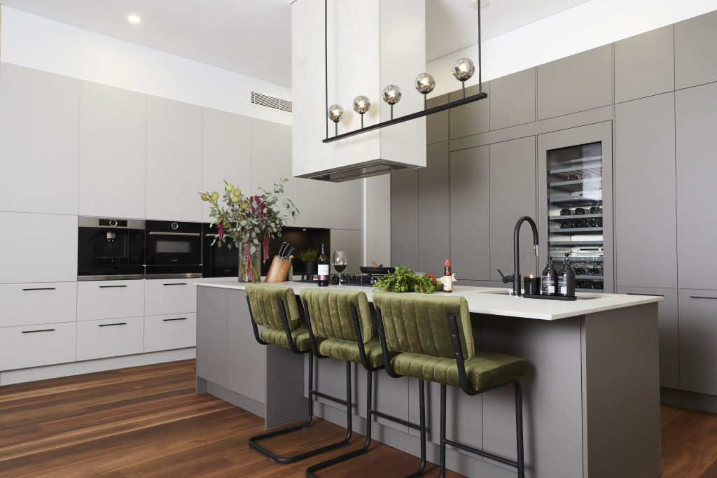
Palette: Amy Chamberlain from The Real Estate Stylist says El’ise and Matt’s colour combinations look outdated.
“Maybe it’s the darker honey floors?” she says. “The green velvet chairs look too retro. Classic contemporary black would have been a better fit here.”
Lighting: “I love the choice of lighting, just not the positioning,” she says. “The rangehood looks like an afterthought. If you are going to feature a rangehood then two slick drop pendants over the bench would have achieved perfect balance.”
Styling: “I love they have played with colour, but there are too many elements here to include retro-inspired green velvet stools!” she says. “Is the sesame oil a styling prop for reveal? I can’t stop seeing that red lid!”
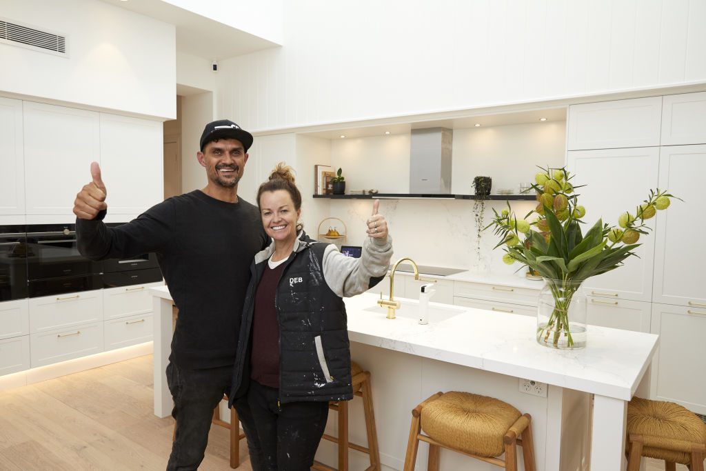
Deb and Andy (Winners)
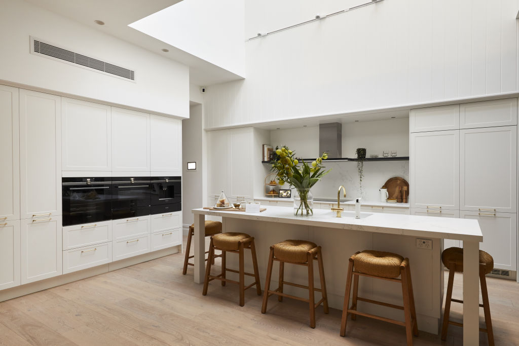
Layout: Lauren Li from Sisalla says Deb and Andy’s void over the kitchen and island bench was a great move.
“It allows plenty of natural light in and creates a space that will entice everyone to gather together. The open shelf rather than overhead shelving adds to the airy feel and is the perfect place to display beautiful objects.”
Styling: “The thoughtful styling is what makes this space feel like a place you want to spend time in,” says Li. “A well-deserved win for this kitchen. It’s gorgeous.”
Mitch and Mark
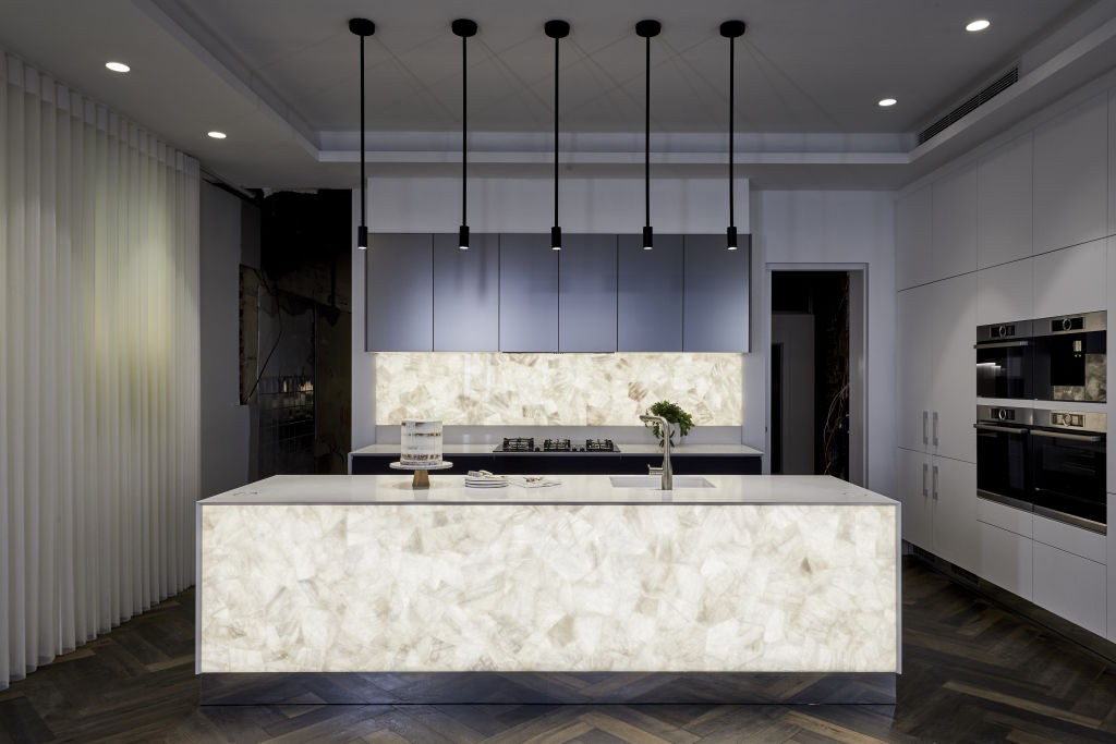
Design: “It’s a good idea to design a neutral kitchen which is minimal compared to the rest of the property,” says Li. “Yet this one is lacking. A stunning metallic cupboard handle somewhere would add interest.”
Styling: “Virtual windows work in a display suite but are ridiculous in a home!” says Li. “An oversized artwork would have worked much better.”
Light: “There’s a pendant or wall light missing here, and the back-lit island bench looks very commercial,” she says. “It definitely looks overdone and too much for everyday life!”
Tess and Luke
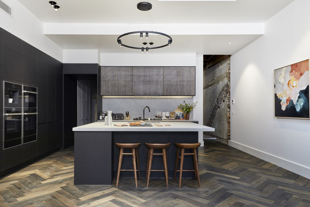
Layout: Li says Tess and Luke’s island bench is too big, making it impractical for the space. “Its size makes it impossible to reach to wipe clean in the centre or access the middle for storage,” she says. “A long shape would have worked better.”
Texture: “There are only two surfaces here – brown laminate and white man-made stone,” says Li. “It doesn’t look minimalist, just boring. A kitchen really needs a range of interesting textures to give it life.”
Styling: “The styling is very generic,” says Li. “It’s also very dated. Sixty-millimetre thick benchtops were phased out five years ago in favour of fine profiles. A kitchen should be aspirational not cluttered with everyday objects. It doesn’t feel like the ‘heart of the home’. This kitchen feels depressing and closed-in.”
We recommend
States
Capital Cities
Capital Cities - Rentals
Popular Areas
Allhomes
More
