The Block 2019: Experts weigh in on the master bedroom reveals
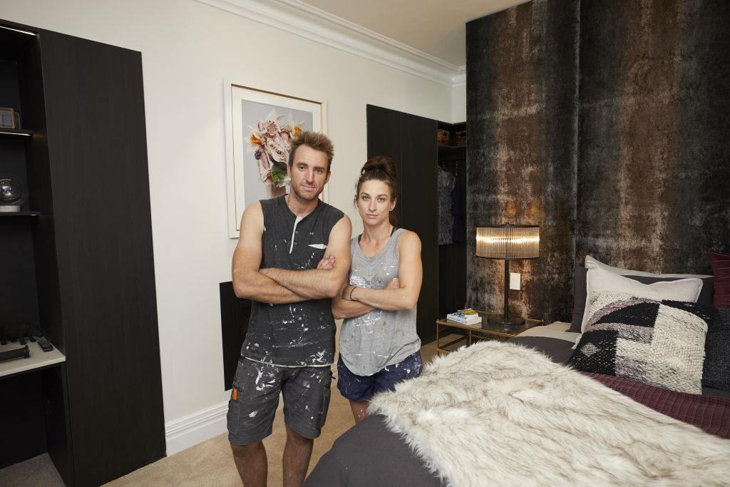
Cosy, comforting, and imbued with style, a master bedroom should tick many boxes – from a soothing colour palette and careful layering of textures, to a well-dressed bed.
This week, The Block couples were briefed to create a bedroom that was all this, and more.
Here’s how industry experts think they managed.
Listen to episode seven of Domain’s podcast Somewhere Else :
El’ise and Matt
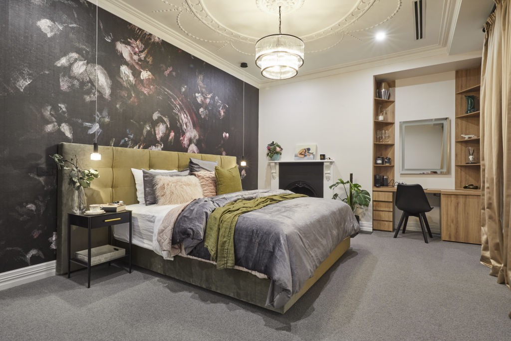
Layout: “With the feature wall behind the bed and view out the window, the room’s orientation is spot-on,” says Sarah Elshaug from Maitland Street Interiors. “I don’t like the built-in desk, though. An elegant free-standing dressing table would have been a better fit here.”
Materials: Elshaug says the wallpaper is a standout feature. “With its abstract florals, it’s an interesting complement to the period ceiling rose and plasterwork. It provides contrast between old and new with refined elegance.”
Styling: Big ticks from Elshaug this week for Matt and Elise’s styling. “The bed beautifully complements the artwork, and their colour palette of chartreuse, olive, grey and pink with a hint of white imparts freshness while the colours work harmoniously with the art.”
Andy and Deb
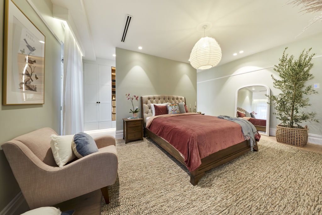
Layout: “This might horrify real estate agents everywhere, but bigger is not always better for bedrooms,” says Sonia Simpfendorfer from Nexus Designs. “Laying out a bedroom so that the first object you see is a beautifully inviting bed is ideal. The view as you walk down the corridor should draw you in. The idea of an armchair in the view-line is good, but it would look better in a corner with a floor lamp and side table so it looks inviting and as if you would actually use it.”
Lighting plan: “The bedside lighting is mysteriously absent,” says Simpfendorfer. “Adding great lamps on the bedside tables looks aesthetically desirable because it creates a warm, welcoming glow. It’s practical too.”
Accessories: Mirrors in the bedroom require careful consideration, says Simpfendorfer. “Reflections and hard surfaces can be the opposite of calming. It’s lovely to have a full-length mirror near a wardrobe, but I’d hang it on the wall so you aren’t looking at the underside of the bed.”
Jesse and Mel
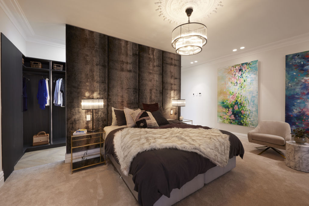
Layout: “A simple spacious layout feels luxurious,” says designer Lisa Koehler. “The furniture arrangement works well and it’s the right balance between function and comfort.”
Materials and finishes: Koehler says Jesse and Mel’s mirror beautifully combines aesthetics and function. “I like their choice of textures too. The carpet and joinery in rich chocolate veneer feels luxurious, and the bedhead fabric makes a dynamic statement.”
Fixtures, fittings and accessories: “Small details and more luxurious textures are needed here,” she says. “Perhaps overstuffed European pillows and a larger bedcover that spills over the sides to emulate that luxury hotel feel.”
Mitch and Mark (winners)
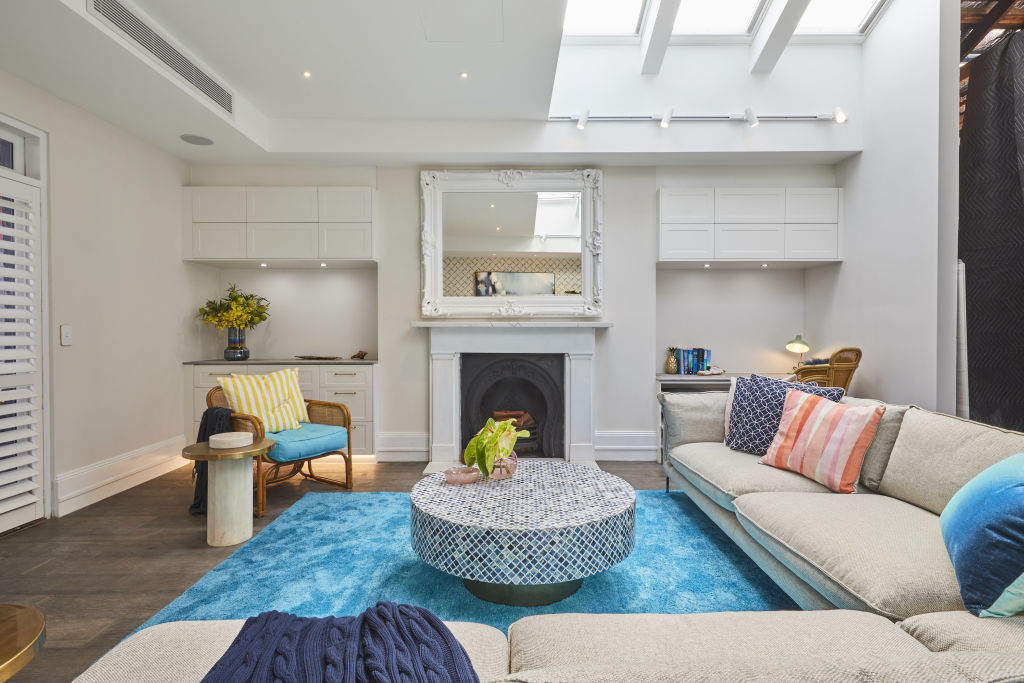
Layout: “I don’t know where to look,” says designer Camilla Molders. “There is so much going on, and all the proportions are out of whack. With no visual balance, it just doesn’t work. The rug could have brought it all together, but its colour and shiny texture dominate the space instead.”
Lighting plan: While the lighting is generous, it’s too much says Molders. “Lamps, cabinetry, desk, track and down lights – it’s a lot for one room. My eye is drawn to the track lighting that serves no purpose under the cabinet lighting, which I also don’t see the point of given there isn’t a balancing low light on the other side of the room.”
Styling: Molders says the boys’ choice of colour palette looks out-dated. “The blue and yellow feels very Gold Coast circa 1980s,” she says. “I don’t understand the connection with the wallpaper’s design or scale either. Another ’80s reference?”
Tess and Luke
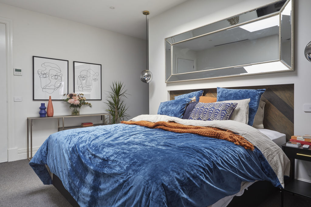
Colour palette: Designer Suzanne Gorman applauds Tess and Luke’s choice of paint. “The robe looks subtle and warm, and relates harmoniously with the timber veneer,” she says.
Lighting: “Bedside lights should be hung low so they form part of a vignette with the bedside tables,” says Gorman. “They have installed both functional down lights and feature bedside lights. This layering is important in a master suite so that soft lighting can be used in the evening. It’s even better if they are on dimmers.”
Fixtures and fittings: Gorman says curtains are an essential finishing touch. “They add a softness to the white-walled bedroom and make the space feel luxurious,” she says. “Unfortunately Tess and Luke have surrounded the television with small wall-hung shelves styled with under-scaled vases and objects that highlight rather than conceal the TV – it would have looked more elegant without.”
We recommend
States
Capital Cities
Capital Cities - Rentals
Popular Areas
Allhomes
More

