The Block 2019: Interior experts share their thoughts on the verandahs
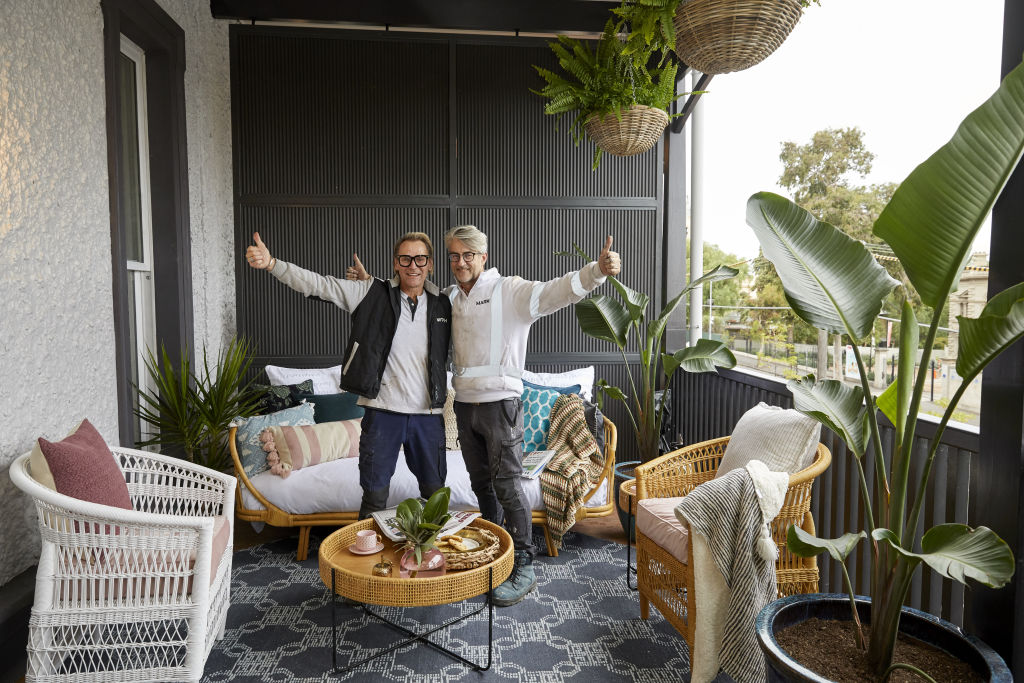
The great Australian verandah is an extension of our home’s interior living spaces. When well designed, it creates a sense of liveable space and adds a dose of style and luxury.
Last week on The Block, the couples worked on their verandahs with varying results. We asked the experts how they think they fared.
Tess and Luke
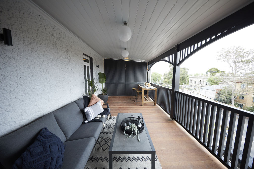
Styling: Designer Nickolas Gurtler says Tess and Luke’s space feels like it’s “trying too hard”.
“Given the limited budget, fewer quality pieces instead of lots of generic items would have looked better,” he says. “A trip to a local op-shop for interesting ceramics that can be styled with coffee table books would have made a huge difference.”
Layout: “It just feels under-furnished,” he says. “A sofa would have improved the space’s usability, and a rug correctly scaled to zone would have pulled it together.”
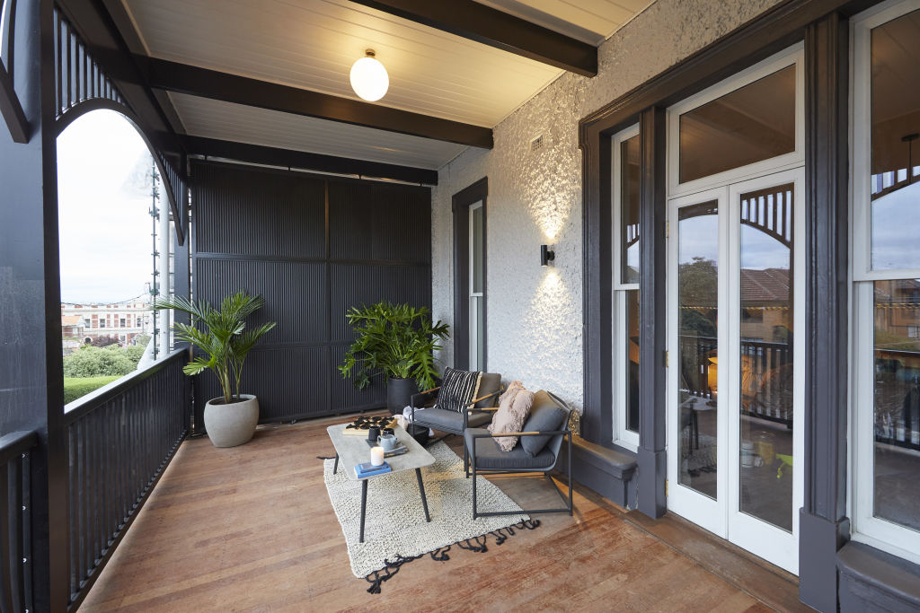
Lighting: “The wall sconces have a very project-home look – they don’t feel high end,” says Gurtler. “Statement lighting would have provided visual interest as well as being functional.”
Mitch and Mark (winners)
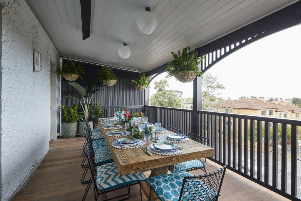
Layout: Lauren Li from Sisalla commends Mitch and Mark for understanding what buyers might want from this space.
“They haven’t just thrown in the furniture,” she says. “Including soft furnishings, a set table and floor rugs, they have decorated their verandahs as if they are interior rooms. Creating a dining area and outdoor lounge area is a smart move. It’s an excellent use of the space and inspiring for buyers.”
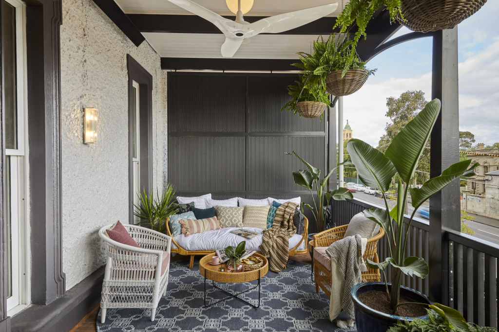
Lighting: “It’s great to see some glass ball ceiling lights, but some outdoor pendants in the dining area would have provided a real sense of occasion,” she says.
Styling: “They have used more natural materials in the verandah than the ‘blingy’ interior furnishings inside,” says Li. “The rattan, though, works well with the concept of a verandah space.”
El’ise and Matt
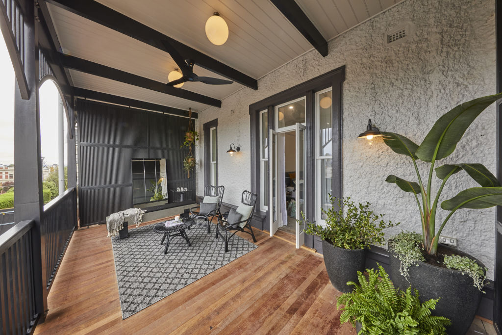
Layout: El’ise and Matt’s verandah is far too simplistic, says Li.
“There’s nothing memorable here,” she says. “They haven’t considered how the spaces might be used and have missed an opportunity to inspire the buyer. Instead they have just thrown in nice furniture.”
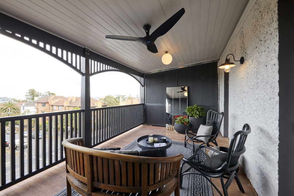
Lighting: “The wall lights are traditional and the perfect selection for this style of space,” she says. “Some floor lamps though would add to it, and allow buyers to imagine this space in the evenings.”
Styling: Li say while the space has great potential, it doesn’t feel comfortable. “The verandahs are too similar,” she says. “There should be a sense of purpose; one space designed for two people with lounges for relaxing, and the other for entertaining with space to dine. Decor like an outdoor screen, plants and books would bring help bring it to life.”
Deb and Andy
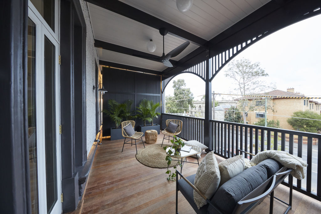
Layout: “This space looks strange,” says Gurtler. “The small scale furniture is placed too far apart, making it impossible for someone sitting to put their drink on the coffee table. It needs to be pulled together into an actual arrangement with the sofa facing the view and a chair on either side. Considering its location off the master bedroom, a comfortable chair that you can sink into is a must-have. You’re not going to invite your guests through your bedroom to sit on the balcony.”
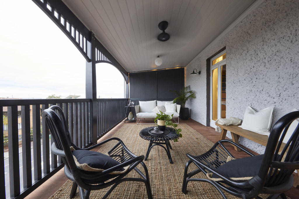
Lighting: “This lighting is woeful,” he says. “It looks so dated. Some more greenery is definitely needed, and more sculptural planter pots rather than dark troughs would have look better.”
Jesse and Mel
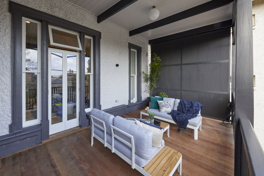
Materials: “These verandahs are unfinished and uninspiring,” says Li. “The sofas and throws allow the buyer to imagine curling up on a cool evening, yet it needs more – an armchair, lounge, side tables and hammock would fill the space and provide a memorable impression of the space.”
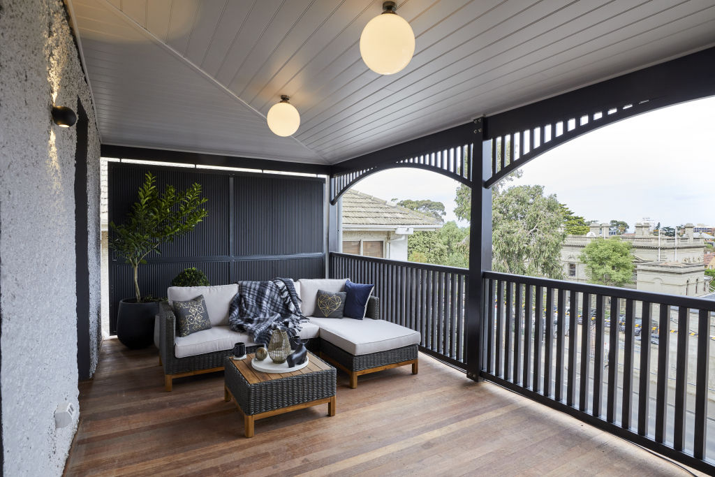
Styling: “They could have chosen better styling elements here,” comments Li. “Little things like arms on the sofas that face each other would allow you to lounge with a cup of tea in the morning and enjoy the view. Further planting would enhance the view from the rooms too.”
We recommend
States
Capital Cities
Capital Cities - Rentals
Popular Areas
Allhomes
More


