The Block 2020: Are the kitchens just too big?
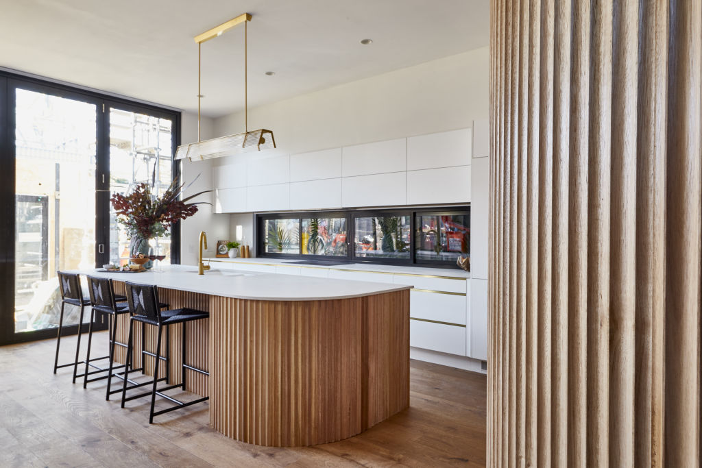
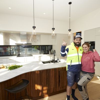
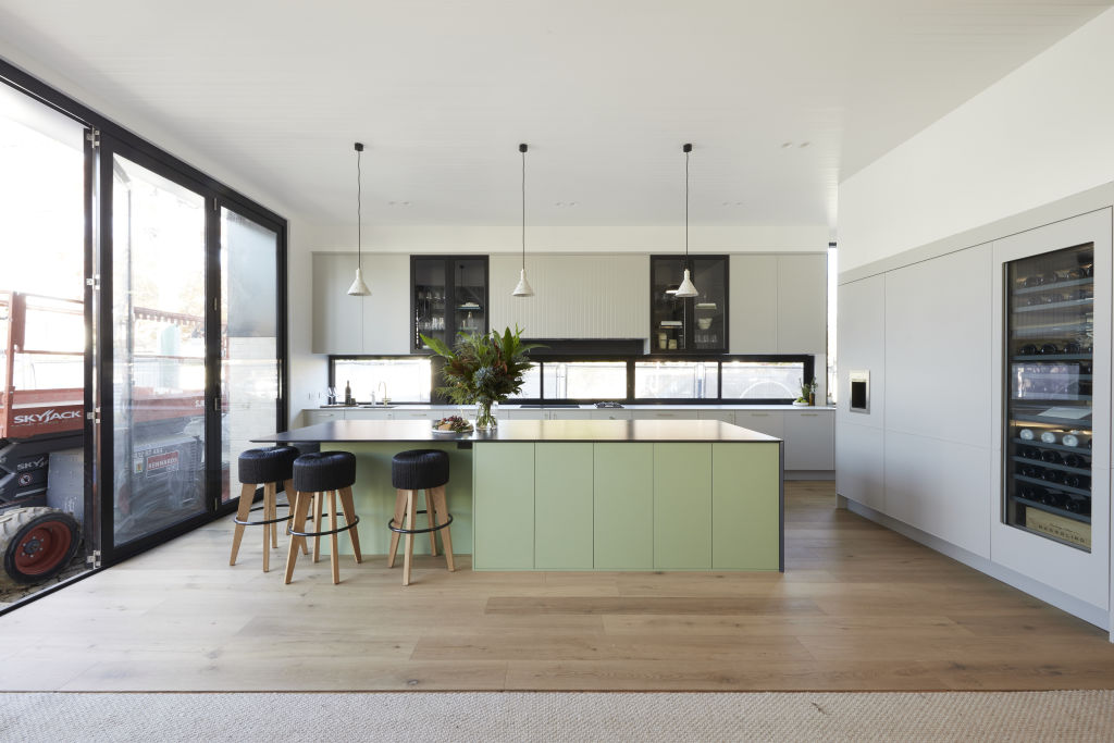
They say “kitchens sell houses”, but what happens when it’s large enough to feed a crowd, but there’s no space for them to sit and enjoy it? This is the criticism four out of five couples on The Block faced this week.
“What we are seeing are examples of poor space planning,” says designer Camilla Molders. “The spaces they’ve created are more suited to an apartment than a five-bedroom house. Large kitchens are great, but only in houses with similarly sized living areas. It’s not one or the other.”
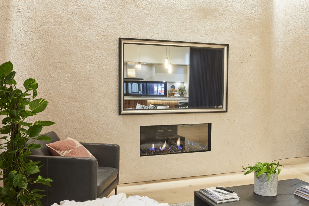
Designer Nickolas Gurtler agrees, and says internal floor configurations are often after-thoughts, rather than key considerations.
“In the case of The Block, there’s been added pressure to include popular elements like a butler’s pantry, which is great if there’s room for it,” he says. “Ultimately, the kitchen needs to be large enough to accommodate it without sacrificing living space. It’s vital to work within the floor space you have.”
While the butler’s pantry is the ideal space to stow bulky appliances, wash up, and hide mess from guests, Lauren Li from Sisalla Interiors believes it is a trend that has been largely translated as “two kitchens”. The result is an excessively large second kitchen, rather than a smaller work and storage area.
View The Block properties for sale
House 1, Harry and Tash: 364 New Street, Brighton
House 2, Sarah and George: 362B New Street, Brighton
House 3, Daniel and Jade: 362A New Street, Brighton
House 4, Luke and Jasmin: 360B New Street, Brighton
House 5, Jimmy and Tam: 360A New Street, Brighton
“We are seeing a show kitchen plus a hidden kitchen, which are two kitchens side-by-side at the expense of actual living and dining space,” she says. “It’s the common mistake renovators are making, and unfortunately the huge butler’s pantry is to blame.”
Molders says it’s an error that can be resolved simply by opting for a generous pantry instead.
“A decent pantry opens up floor space and allows more room for dining and living,” she says. “Not every house needs a butler’s pantry. When [it’s] at the expense of liveable space, it’s a decision that could turn away potential buyers.”
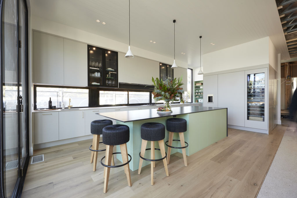
It’s a problem indeed as the Brighton properties are being designed to sell and, given their size and price point, are targeted at families.
“Buyers will want to resolve this issue, but need to spend money to do so,” Gurtler says. “A family of four or more will wonder how they’re going to make daily life work, not to mention entertain.”
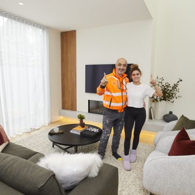
Apart from an excessively long island bench, Li believes Harry and Tash achieved the most successful layout this week. The other couples, according to our experts, didn’t fare quite so well.
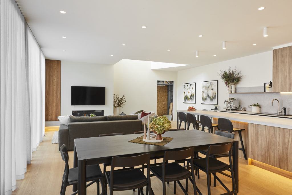
Daniel and Jade
“The wasted space we see here is the walkway between the living and kitchen, which is dictated by the hallway and accentuated by the long kitchen and butler’s pantry,” says Molders.
“If this space wasn’t used up with the butler’s pantry and the kitchen was moved up, there would be space for a dining table at the end of the kitchen and larger living space. It would still be narrow, but at least there would be length.”
Sarah and George
Gurtler suggests that by reducing the island dining space, there would be more kitchen area.
“Accommodating more than three people at an island bench is overkill,” he says. “I’d also remove the scullery and turn it into a semi-formal dining space with a beautiful pendant light, and access from the hallway and kitchen.”
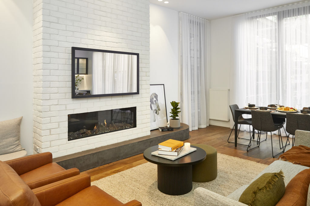
Luke and Jasmin
“Again, far too much room is dedicated to the butler’s pantry!” says Molders. “Without it, there would be room for a dining table at the end of the kitchen. This would allow more lounging space and a better location for the fireplace which has been sadly delegated to a corner.”
Tam and Jimmy
Extending the living room so it mirrors the length of the kitchen would allow furniture to be rearranged into a more liveable space. “It would also free up space for a larger, luxurious, and lower profiled sofa that would allow both entertaining and television viewing,” says Gurtler.
Or to maintain the scullery, he suggests replacing the sofa above, and pulling everything out into the void between the kitchen and living spaces.
“It would create a real sense of airiness,” he says. “A dining table could be placed at the end, where it was intended, and a pendant light would beautifully connect it to the space.”
We recommend
We thought you might like
States
Capital Cities
Capital Cities - Rentals
Popular Areas
Allhomes
More
- © 2025, CoStar Group Inc.
