The Block 2020: Design experts critique backyard and pool reveals
It’s been a tough slog for contestants on this season of The Block, but the finish line is now in sight.
In the final week of reveals, the teams rallied for one final push to complete courtyards, backyards and pools. How do the design experts think they fared this week?
Sarah and George – winners
Design and layout
Judge Neale Whitaker called Sarah and George’s pool and backyard “beyond beautiful”, while Darren Palmer dubbed it as “magical”.
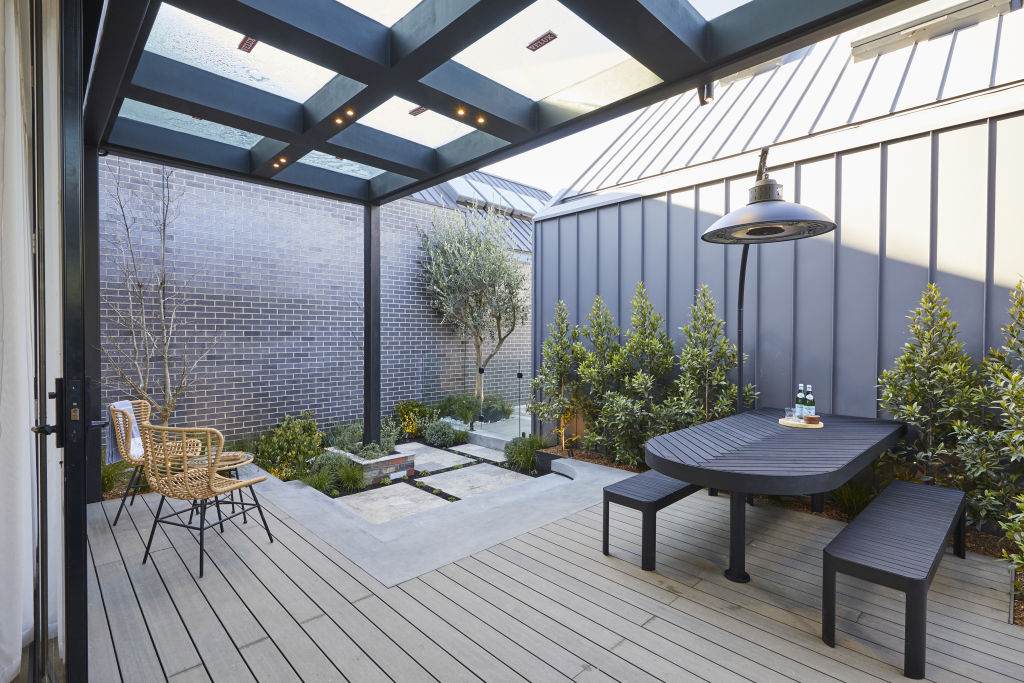
Interior designer Nickolas Gurtler shares the on-air judges’ sentiments, adding: “This is a really well thought out and beautiful backyard.
“There are some fantastic design elements which show real finesse, like the bench seat and round limestone planter, as well as the rounded edge of the dining table.
“Overall the layout is really fantastic. It’s conducive to lots of different uses and incredibly practical. Whether it’s sipping morning coffee, barbecuing for friends or pool parties – it all works.”
Materials
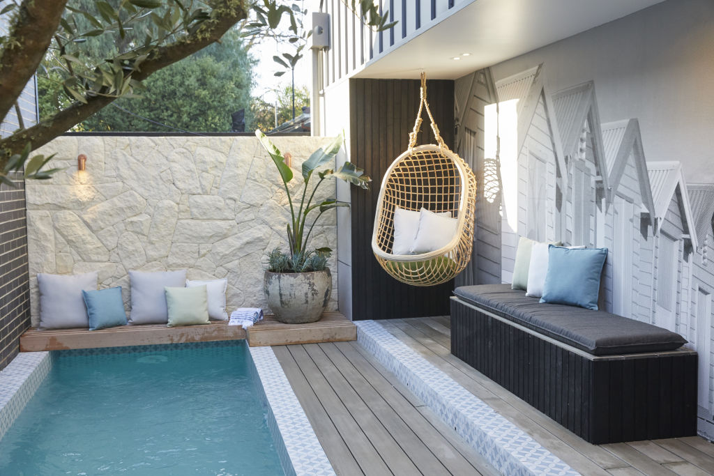
While Gurtler is not a fan of tiles on the pool, he does applaud the team for doing something different and adds that the couple have used “beautiful materials all round”.
“I like the brickwork carried around from the front of the house, which is a really clever nod and creates some unity and harmony between the spaces,” he says.
“The plants this week are stunning and exactly what I’d expect in a home at this price point.”
Lighting
Gurtler was impressed with the uplighting on the Japanese maple and describes the lamp over the outdoor dining table as “lovely”.
“The downlights are well placed and it’s nice to see this couple continuing to embrace some good lighting planning again.”
Colours
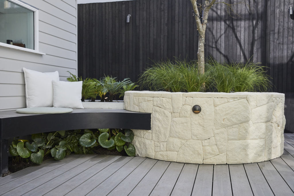
In true Melbourne style, black featured heavily in Sarah and George’s outdoor space.
“It’s so nice to see black being embraced outdoors,” Gurler says. “If there’s anywhere it works, it’s Melbourne. Overall the tones are really warm and harmonious.”
Styling
“The styling was almost spot-on this week – it’s all about the architecture and landscape,” Gurtler says.
“The cushions by the pool could have been a little more sophisticated, but overall, it looks great.”
Luke and Jasmin
Design and layout
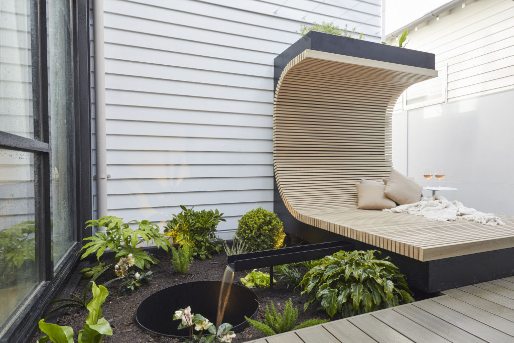
Although she’s not a fan of the daybed in Luke and Jasmin’s courtyard, interior designer Camilla Molders does praise the couple for what they achieved in the space.
“This is a space that will really come into its own once the vines have grown and provide shade and privacy,” she says. “It will be a space that is really special.
“The [backyard] garden is smart, but feels overdone to me.”
Molders notes the large deck has no covering, “leaving it exposed to the elements and with furniture that will very quickly weather”.
Lighting
“Garden lighting has been used well throughout their spaces,” Molders says. She praises the team for lighting plants and creating atmosphere, but was left searching for functional lighting around the barbecue and dining and lounge areas.
Colours
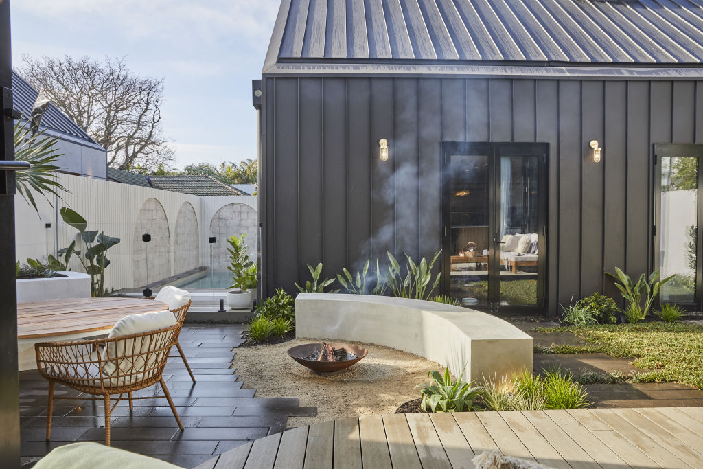
“The two-tone black and white works well,” Molders says.
“Keeping the fence in a light colour is a nice balance against the heavy black of the garage and creates a feeling of lightness to the whole area.”
Styling
“I like all of the added plants in large pots breaking up the planted garden,” Molders says.
“The furniture styling is a little overdone with all the scatter cushions, however, the cushions do work to create a connected ‘feel’ to the interior of the house.”
Jimmy and Tam
Design and layout
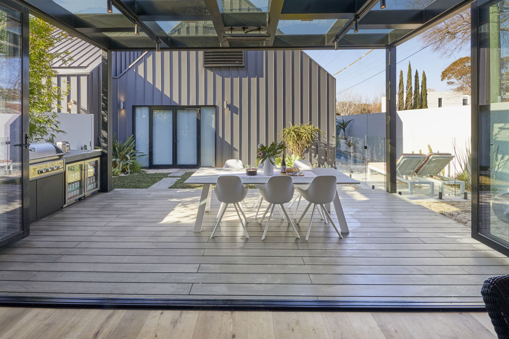
Jimmy and Tam missed the mark in their backyard this week according to the on-air judges, and Gurtler agrees.
“I’ll give this couple points for sticking to their guns on their ideas, but I’m not a fan this week,” he says.
“The cabana would have worked without the door, perhaps – a really silly concept there.”
Lighting
“I like the inclusion of wall lights and the inclusion of the heater was very smart.”
Colours
Gurtler says he found the colours “drab overall” but admits that he likes the striped fabric on the sun loungers, adding that “it feels fun”.
Fixtures and fittings
“The built-in barbecue and fridge is highly desired by our clients, so I know it will appeal to other high-end buyers,” Gurtler says.
- View The Block properties for sale
- House 1, Harry and Tash: 364 New Street, Brighton
- House 2, Sarah and George: 362B New Street, Brighton
- House 3, Daniel and Jade: 362A New Street, Brighton
- House 4, Luke and Jasmin: 360B New Street, Brighton
- House 5, Jimmy and Tam: 360A New Street, Brighton
Daniel and Jade
Design and layout
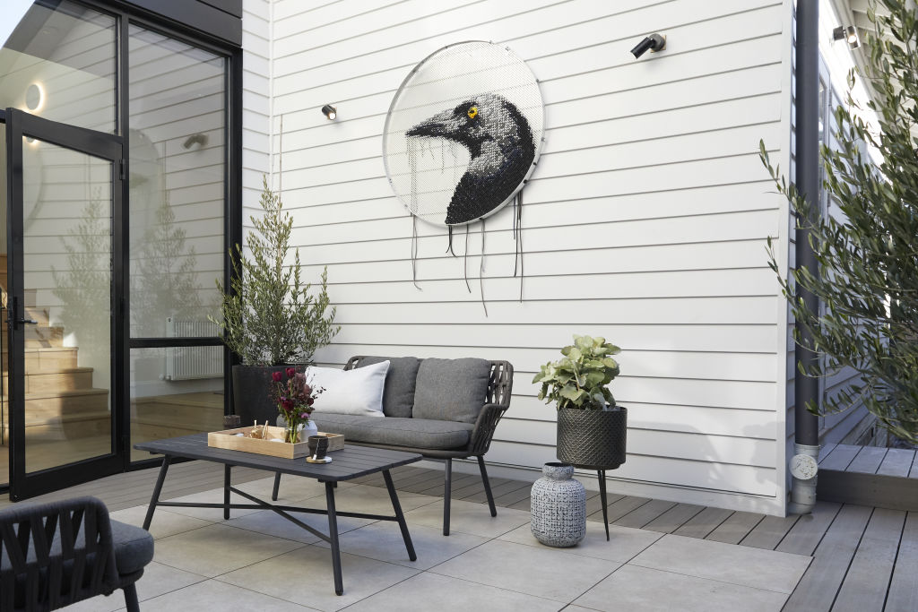
Molders agrees with Neale, Shaynna and Darren on Daniel and Jade’s courtyard, noting that it doesn’t look enticing, but says: “I like the magpie art, but I’d rather see that somewhere else than where they have used it.”
She’s also a fan of the sculpture in the backyard. “I love the Lump sculpture, but the placement doesn’t show it for the special piece it is. The sculpture should have had feature lighting upon it.”
Molders praised the barbecue area, saying: “The barbecue design is nice with its open area underneath, creating an airy, open feel that is welcomed.”
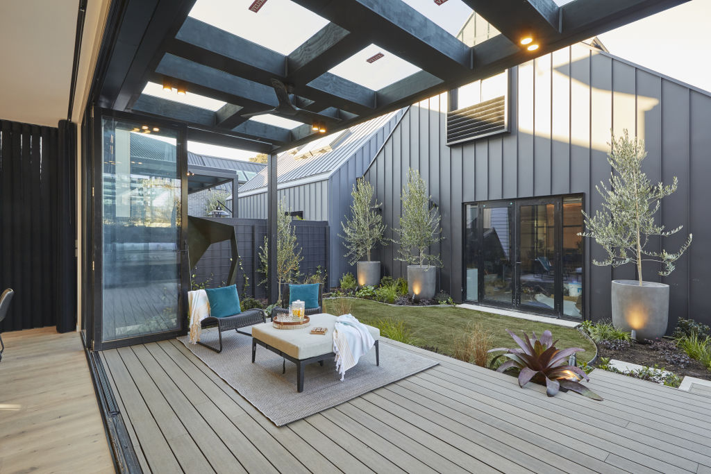
Colours
“The black fence will come into its own once the garden planting is more established,” Molders says.
Harry and Tash
Design and layout
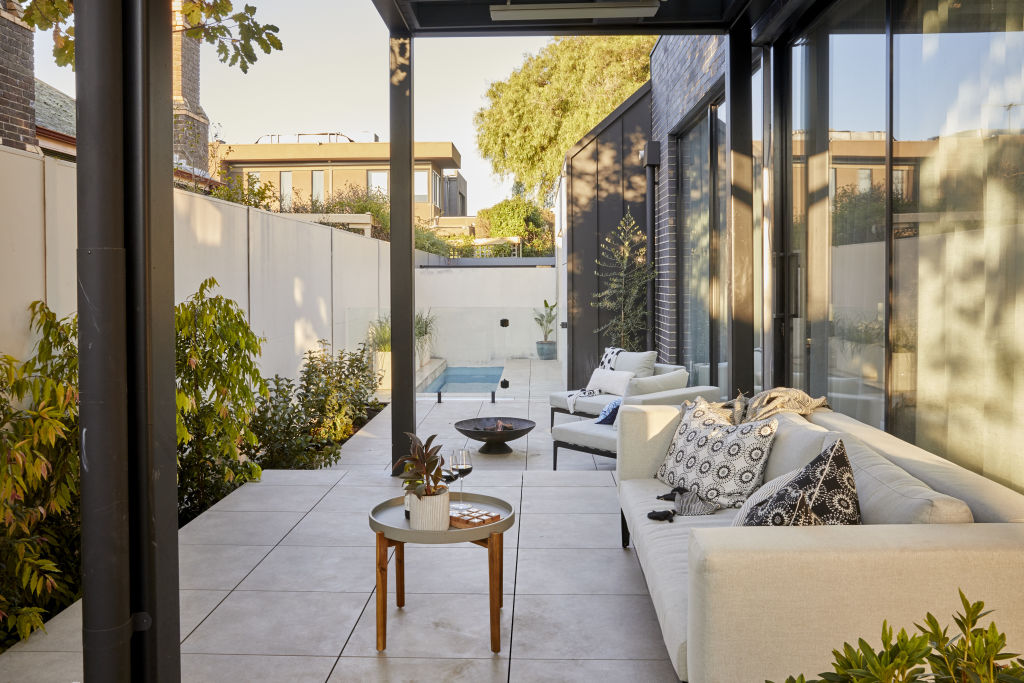
Budget woes and time constraints meant Harry and Tash couldn’t deliver the space they’d initially planned, but it wasn’t a complete disaster for the father-daughter duo.
“Harry and Tash’s backyard is a lovely, simple layout that doesn’t rely on a novelty feature or gimmick, instead it has a lovely simplicity and nature provides the ‘hero’,” says Lauren Li, creative director at Sisalla.
“Sure the pool is compact but it leaves room for entertaining, too.”
Materials
Li again praised the team for their simple material palette. “The warm grey pavers are a beautifully simple solution – the buyer can add their own outdoor decor pieces if they wish and it will all work,” she says.
Colours
“The muted colours in the landscaping are perfect as they allow the green planting and oak tree to pop.”
Fixtures and fittings
Li notes the lone barbecue in the entertaining area and says this “would have been better as a built-in outdoor kitchen”.
We recommend
We thought you might like
States
Capital Cities
Capital Cities - Rentals
Popular Areas
Allhomes
More
