The Block 2020: Design experts critique front garden and facade reveals
Last week the Blockheads were tasked with a front garden renovation and, as usual, almost nothing went the way it was supposed to.
A thunderstorm didn’t help matters, and neither, it seems, did unnecessary water features. Here, our experts weigh in on what they believed worked, what didn’t (a $2500 cactus?) and what should never have seen the light of day.
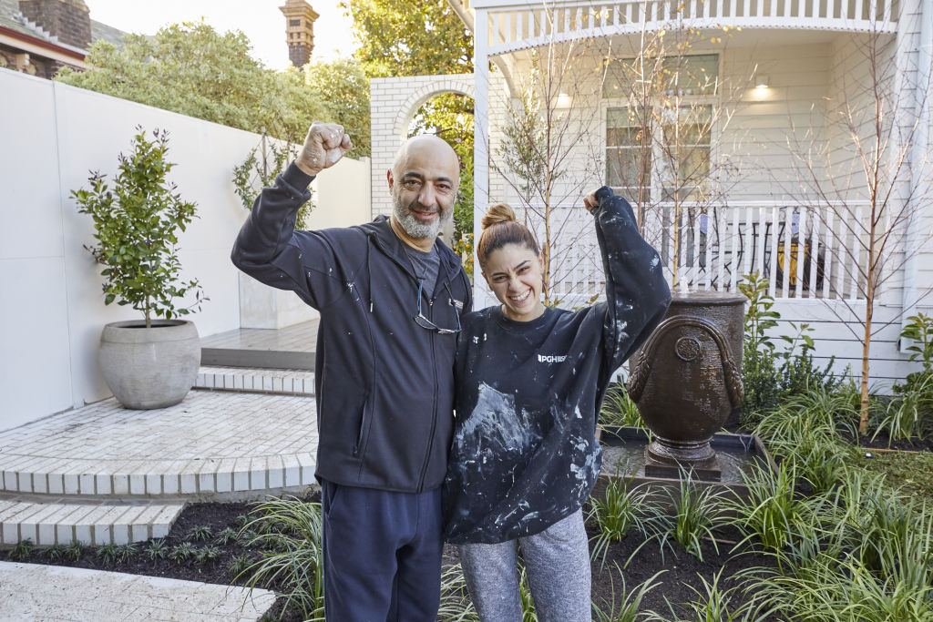
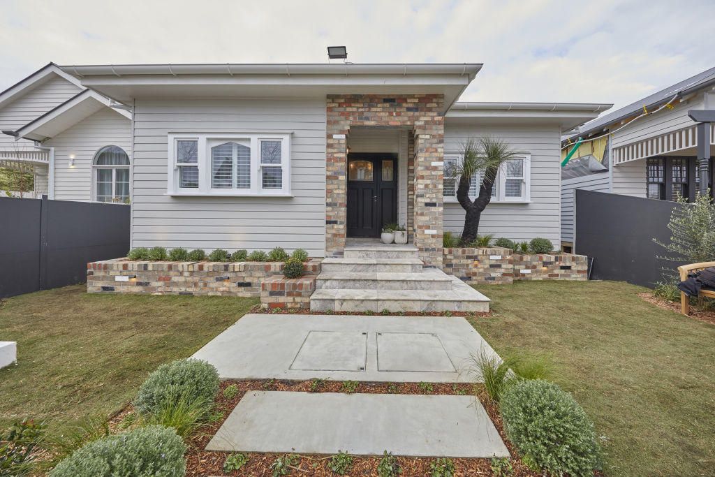
Sarah and George – co-winners
Design
“The layout is nice, and there’s plenty of grass for kids or dogs to play, but they needed to line the fence with more greenery to really boost the garden. The portico feels a bit out of place,” says Nickolas Gurtler from Nickolas Gurtler Interior Design.
Materials
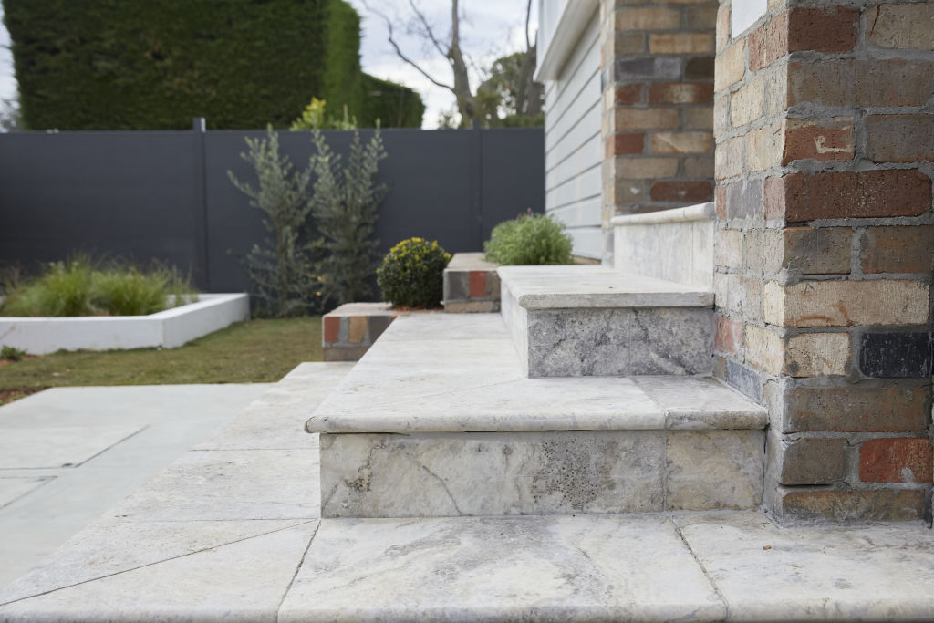
While Gurtler is not a fan of the brickwork, calling it “extremely chaotic visually”, he says the stone on the steps is “quite lovely”, adding, “I’d have liked to have seen that carried through the rest of the garden instead of the concrete.”
Colours
“They got the colour palette right here,” Gurtler says. “The greys are tonal and there’s a sort of gradient palette from the white details to the warm-toned greys to the darker greys to the black front door.”
Fixtures and fittings
Gurtler is not a fan of the front gate. “The cross feature made me think ‘Do not enter’.” But he liked the lettering and door handles.
Styling
“There wasn’t really any to comment on,” says Gurtler, “but I think that’s as it should be for a front yard.”

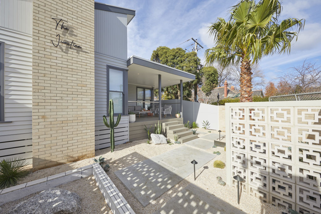
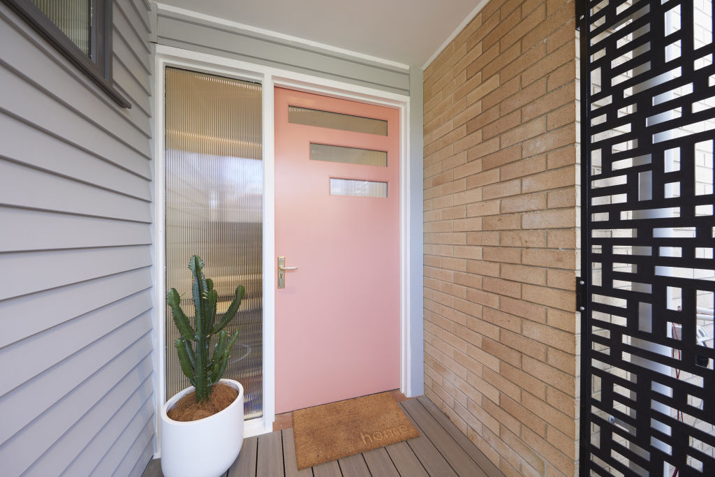
Jimmy and Tam – co-winners
Design
When it comes to the 1950s Palm Springs aesthetic, Gurtler is not mincing words.
“1950s Palm Springs architecture is a far cry from 1950s Melbourne architecture. This is another example of the couple jumping on Pinterest and reproducing.”
Materials
“This entire front yard feels hard,” says Gurtler.
“Swapping out the pebbles for some grass would instantly soften it and replacing the cacti with some succulents might have bridged the gap between their inspiration and reality.”
Lighting
Gurtler likes the standing lights they chose but hopes they are bright enough to light the side entrance.
Colours
Gurtler believes the multitude of different shades of grey is a mistake. “Greys can be very difficult to work with and I’d have liked to have seen a more cohesive and tone-matched palette.” He also thinks the pink front door will be the first thing buyers will want to change.
Fixtures and fittings
“The black screen at the entrance feels very out of place,” says Gurtler and says he would have preferred something more modern.
Styling
“Overall, the styling was quite appropriate for a front yard – it doesn’t need a lot, it’s about the landscape and the architecture, not the decoration here.”
- View The Block properties for sale
- House 1, Harry and Tash: 364 New Street, Brighton
- House 2, Sarah and George: 362B New Street, Brighton
- House 3, Daniel and Jade: 362A New Street, Brighton
- House 4, Luke and Jasmin: 360B New Street, Brighton
- House 5, Jimmy and Tam: 360A New Street, Brighton
Daniel and Jade
Design
“The facade and garden are very quaint and something Melburnians are used to seeing, which I think will put them in a good position,” says Gurtler. “It’s a nice mix of materials.”
Materials
“The timber path is lovely,” says Gurtler. “But it seems to be missing some siding which would have made it feel more high end. I like the stone pavers, and the aged brick border on the grassed area makes the house feel established.”
Colours
According to Gurtler, “the colours are great for the area, very bright and inviting” and the differing greys are in his opinion, “perfect”. Gurtler calls the garden “beautifully lush and appropriate to the area”.
Styling
“The styling is a bit too staged, but the furniture choices are good for where they are.”
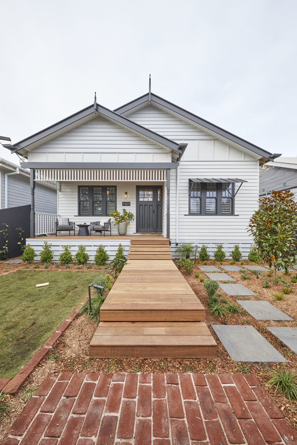
Harry and Tash
Design & Layout
“An all-white facade can sometimes look bland, however for this house, it works,” says Lauren Li, creative director of Sisalla. “The different textures of the weatherboard, windows, brick and fretwork all in white connect the elements together. The fretwork is lovely and simple and the arch window adds a contemporary edge. The petite porch has loads of charm.”
However, she was not a huge fan of the garden. “The layout is too busy and it overwhelms the house; there’s gravel, lawn, planting and various types of pathways – there isn’t enough space for kids to play or to sit on the grass and relax.”
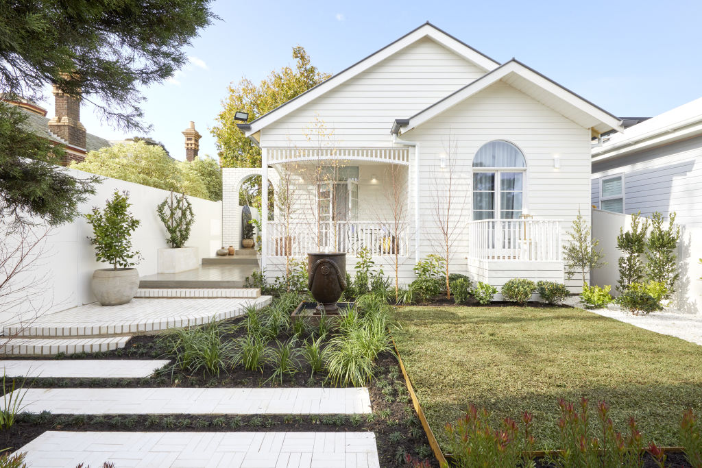
Materials
Li says the garden, while busy, has variety and would suit a green thumb. “It’s exciting and encourages you to walk in and spend time to explore each area.
“A garden isn’t designed to just be experienced in a one-dimensional way from the front gate; it is a space to spend time in, engage the senses and ‘smell the roses’. And on this, it delivers.”
Colours
“The eye doesn’t know where to go,” says Li. “The water feature urn, the offset pavers, curved brick path, the gravel, the brick arch, the trees and that’s before even looking at the house.” But, she concedes, it is at least interesting.
Styling (furniture)
“The outdoor furniture looks quite charming – it just doesn’t look comfortable.”
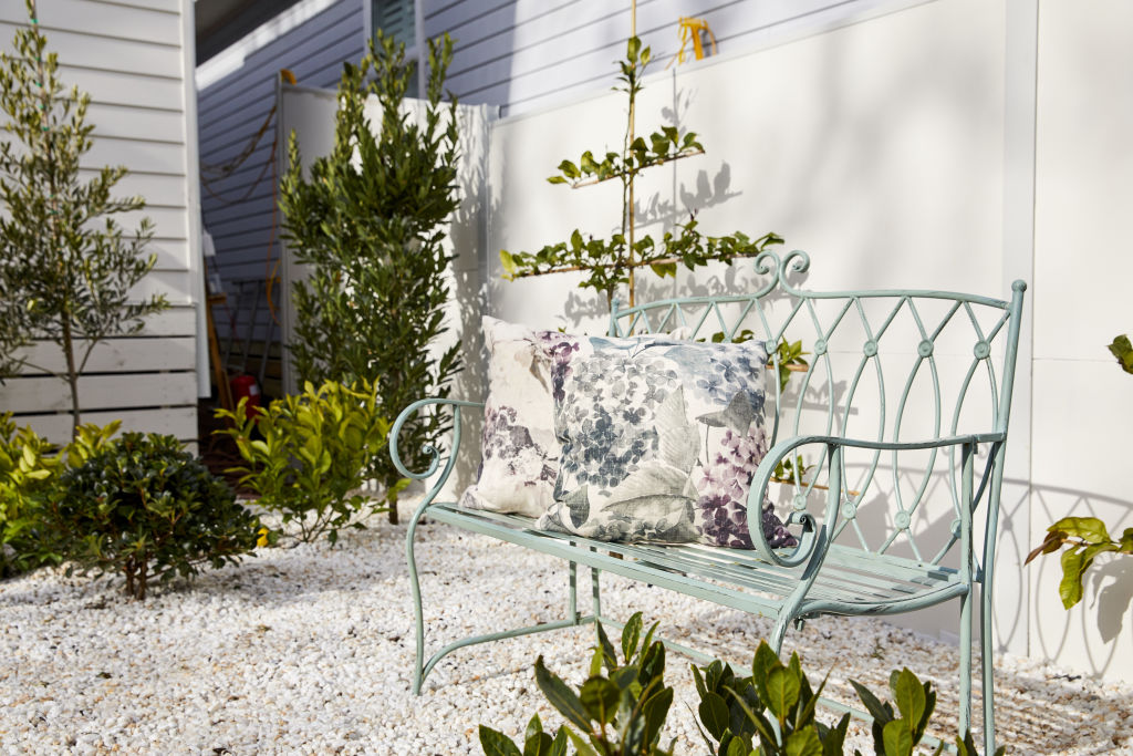
Luke and Jasmin
Design
“There are elements of the 1910s – such as the low shrubbery in front of the bay window – combined with contemporary styling that make this house charming without being twee or predictable,” says Li.
“An all-white facade with the timber battening painted beige helps accentuate this feature of a Federation house, in a contemporary way.”
But the curved bench doesn’t work in Li’s opinion, “It looks too jarring against the weatherboard of the house.”
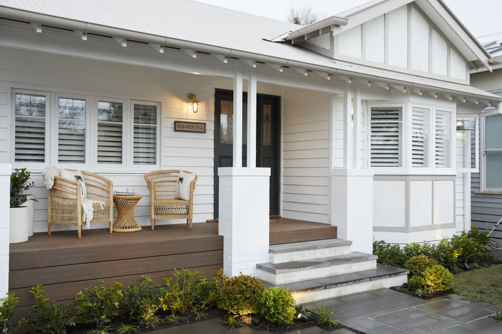
Materials
“The selection of pavers is simple and interest is created through the use of the rectilinear format.”
Styling (furniture)
Li is impressed. “The wicker outdoor furniture on the porch references the 1910s while also creating an inviting place to relax,” she says. “The name ‘Summer Hill’ on the house is a charming touch, and gives it instant personality.”


We thought you might like

States
Capital Cities
Capital Cities - Rentals
Popular Areas
Allhomes
More
