The Block 2020: Design experts critique garage and studio reveals
It was another tough week on The Block that wasn’t short of drama.
There were plenty of tears and meltdowns (not unusual), but in garage and studio reveal week, three teams limped to the finish line and did not deliver complete spaces – a first for this season.
Here’s what a panel of design experts made of the room reveals this week.
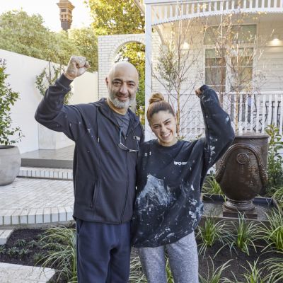
Sarah and George – winners
Design and layout
Multifunctional, flexible spaces scored the most points this week and much like Neale, Darren and Shaynna, Nickolas Gurtler from Nickolas Gurtler Interior Design believes adding a functional home office in the studio is a real masterstroke.
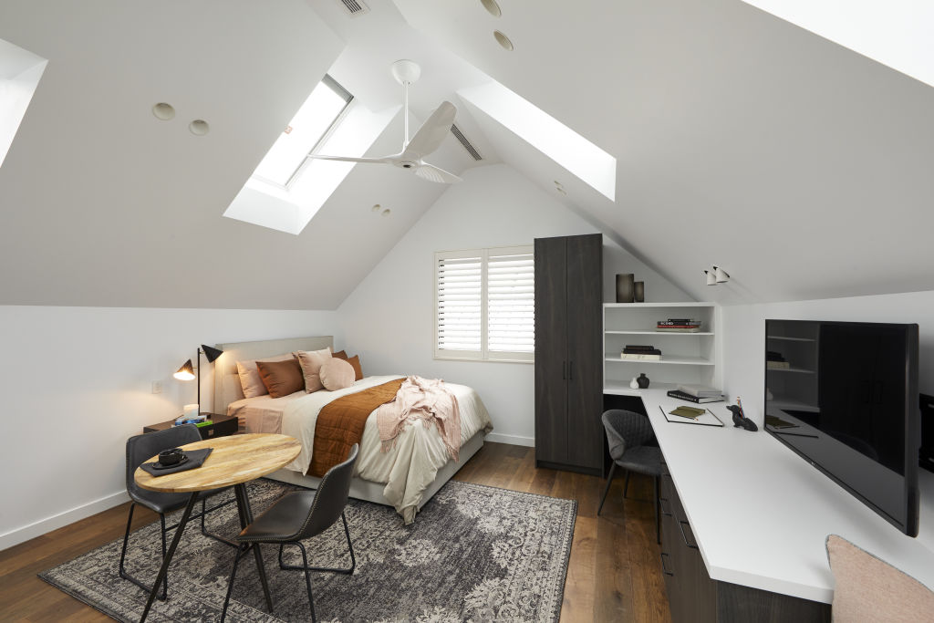
“Overall, the inclination to add a sixth bedroom to these homes seems like a real waste of space considering our new COVID future. A home office that was really well fitted out would have been invaluable in so many ways,” he says.
“The storage in the garage was a bit of a fail. While looking nice, garage storage is there for the oversized and bulky items that may not fit in normal cabinetry, like Eskies and such.”
Lighting
Gurtler awards points to Sarah and George for “their clever lighting plan”.
“It really is nice to see some finesse around placing of downlights and canister lights,” he says.
Colours
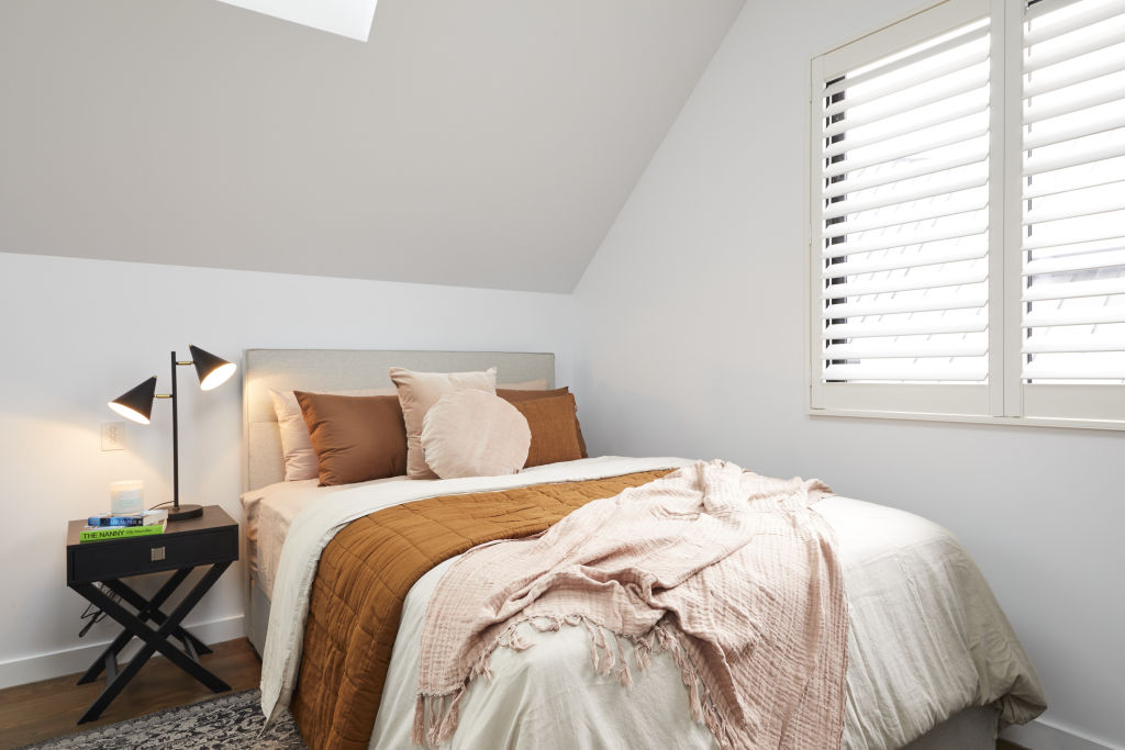
Gurtler found the neutral colour palette pleasant but added it felt “a little unremarkable”.
“I do think that will be a bonus here though, as I feel almost certainly whomever purchases the home will have a blank canvas to utilise this space as they see fit.”
Styling
Gurtler did praise the couple for their styling, saying that they’ve “come a long way with their ‘lived in’ styling approach. I think they’re getting better!”
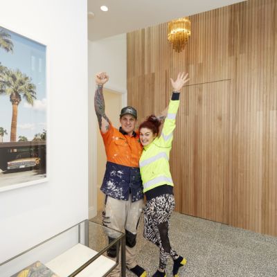
Jimmy and Tam
Design and layout
Like judge Neale Whittaker, Gurtler sees the inclusion of a home gym in the garage as a love it or hate it feature for potential buyers.
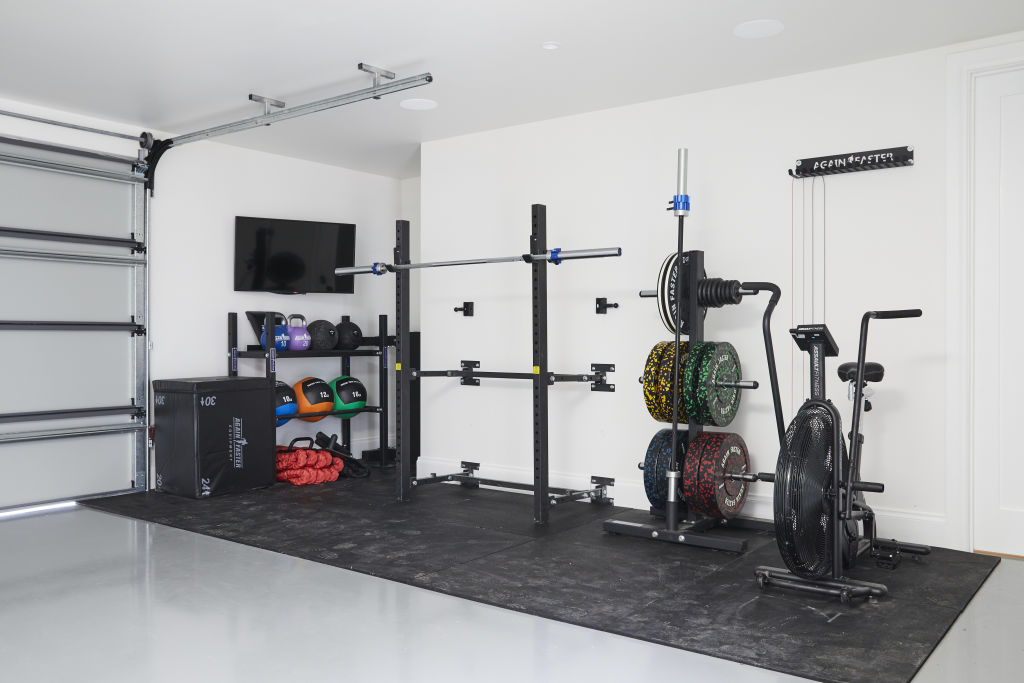
“Melburnians will see that gym as either super useful and clever, or a bonus to sell off on Gumtree – either way I think giving the buyer that facility was clever in these COVID times,” he says.
“The galley-style kitchen was clever, although I think a bit more space for the desk would have been welcome.
“It was smart not to put a bed in here which makes the space flexible for the end user … [but] there is definitely too much furniture in this room. They could have achieved a lot more with side tables rather than the coffee table.”
And, he says, it raises a very valid point – where will this coffee table go when you fold out the sofa bed?
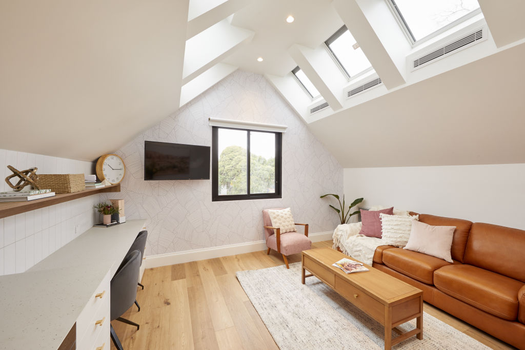
Gurtler says he feels the studios lacked identity and offers some words of wisdom. “When designing spaces, you need clear conviction for what they will be used as, and recognise that a room can’t be three or four different rooms at once.”
Colours
“Consistent with the rest of their home which is nice. I’d have liked to have seen them axe the pink, though.”
Fixtures and fittings
“The brass does feel expensive overall and it’s nice to see them continue the same fittings as the overall house. This was one space they could have feasibly done something else if they wanted, though.”
Styling
Gurtler believes the styling was “very overkill this week”, but adds that “styling is an art in itself that takes experience, a keen eye and skill. It’s not easily copied from Pinterest.”
- View The Block properties for sale
- House 1, Harry and Tash: 364 New Street, Brighton
- House 2, Sarah and George: 362B New Street, Brighton
- House 3, Daniel and Jade: 362A New Street, Brighton
- House 4, Luke and Jasmin: 360B New Street, Brighton
- House 5, Jimmy and Tam: 360A New Street, Brighton
Daniel and Jade
Design and layout
Interior designer Camilla Molders says you can’t really expect much from the garage. “I’m not looking for anything remarkable in a garage other than some storage and enough room to park a car – so check. Adding a powder room is a clever move with the swimming pool in the nearby garden.”
When it comes to the upstairs studio, Molders agrees with the judges. “It really is just a bit bland. It doesn’t quite hit the mark for either a studio living space as there’s no cooktop and not enough storage, or an office as the layout is awkward.”
Colours
“Neutral is a smart choice for such spaces. Essentially it allows the buyer to make their own mark in the space,” Molders says.
Fixtures and fittings
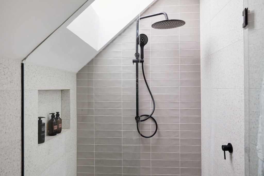
“The bathroom fittings are smart and the continuity of the black fixtures looks smart in this small space,” Molders adds.
Luke and Jasmin
Design and layout
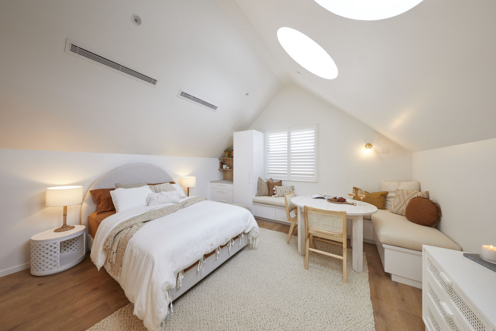
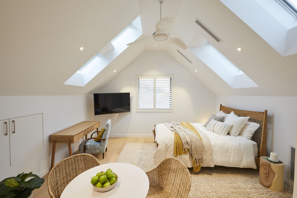
“The focus of the design in the studio space is the circular skylights. These look pretty, however they have no blind system for blocking the light, meaning this is an awkward living space,” Molders says.
Molders believes having no bathroom door is “a big mistake”, but adds that, overall, “the space hits the mark for either a living or working space”.
Lighting
“Very little overhead lighting will make the transition to an office awkward, but the wall light and bedside lamps add a nice ambience to the space,” Molders says.
Colours
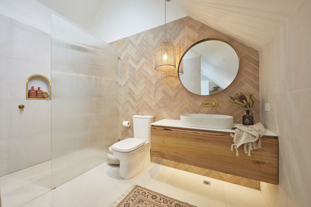
Molders says the neutral tones work well in such a small living space, adding that “the earthy tiles [in the bathroom] add character and are a welcome touch”.
Styling
“I appreciate the touch of adding rounded furnishings such as the bedhead, bedside tables, dining table and even a round cushion – it makes a nice connection to the rounded skylights overhead,” Molders says.
Harry and Tash
Design and layout
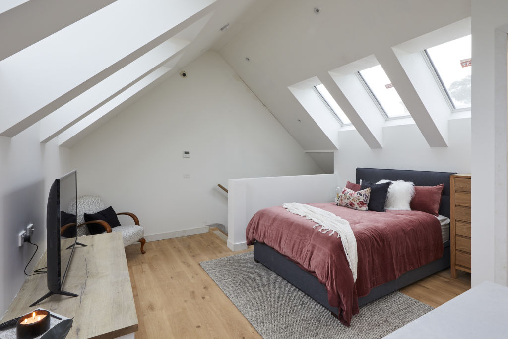
“The studio space, although compact, has loads of volume with the vaulted ceiling, which is further enhanced with the rows of skylights,” says Lauren Li, creative director of Sisalla.
“The kitchen and walls are all white and that gives the studio a blank-canvas look. Usually, it could be seen as bland, however, for this studio white lends itself to flexibility in this space for the buyer.”
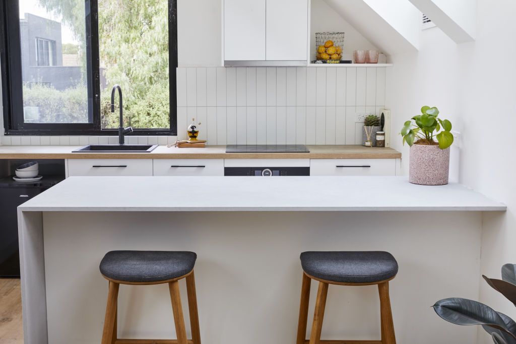
Li agrees with the judges, saying, “The kitchen island bench is too large for the space and that kitchen storage wouldn’t be needed.”
Colours
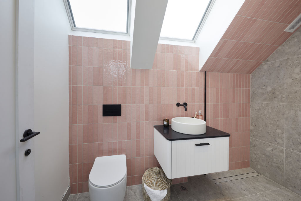
While Li believes that the pink trend is already on the way out, she adds, “The pink tile in the bathroom is a clever place to add colour, as it means that other decor in the studio doesn’t need to match it.”
Fixtures and fittings
Li says the storage in the studio is confusing. “There is too much storage in the kitchen, however no wardrobe at all.
“When designing the space, they need to really consider what the space will be used for, and design it to match.”
Styling
Li says that the styling is lacking in the studio but notes that, “the artwork that leads into the staircase sets the tone for a contemporary, fresh space with pink tones”.
“To spark imagination in the buyer, it would have been great to see this styled as something other than a bedroom, as a bed can always be easily added. This space could be styled as a small business or an art studio.”
We recommend
We thought you might like
States
Capital Cities
Capital Cities - Rentals
Popular Areas
Allhomes
More
