The Block 2020: Design experts critique kitchen week
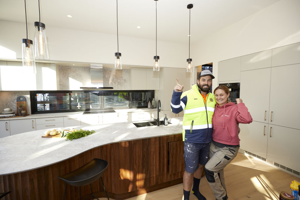
The heart of the home, a kitchen should be robust, beautiful and highly functional.
This week, the couples on The Block were tasked with creating theirs. How did they fare? We checked in with industry experts for their verdicts.
Daniel and Jade – winners
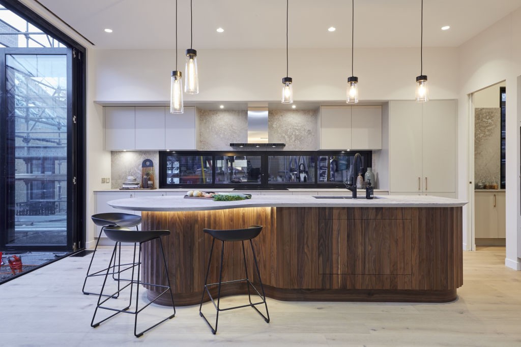
Design
“As usual, I’m shocked by the choice of winning room,” designer Camilla Molders says. “Despite one beautiful feature, the island bench, my eye is drawn to the tacky-looking rangehood and heavily patterned Caesarstone!”
Materials
The couple’s choice of walnut timber, however, scores points from Molders. “It’s stunning,” she says. “It adds character to what is otherwise a characterless space.”
Lighting
“The lighting over the island bench is distracting and looks cheap,” says Molders. “Generally, I wouldn’t like to see a light under an island bench top, however with so much texture and detail on the island base, I’m OK with it!”
Luke and Jasmin
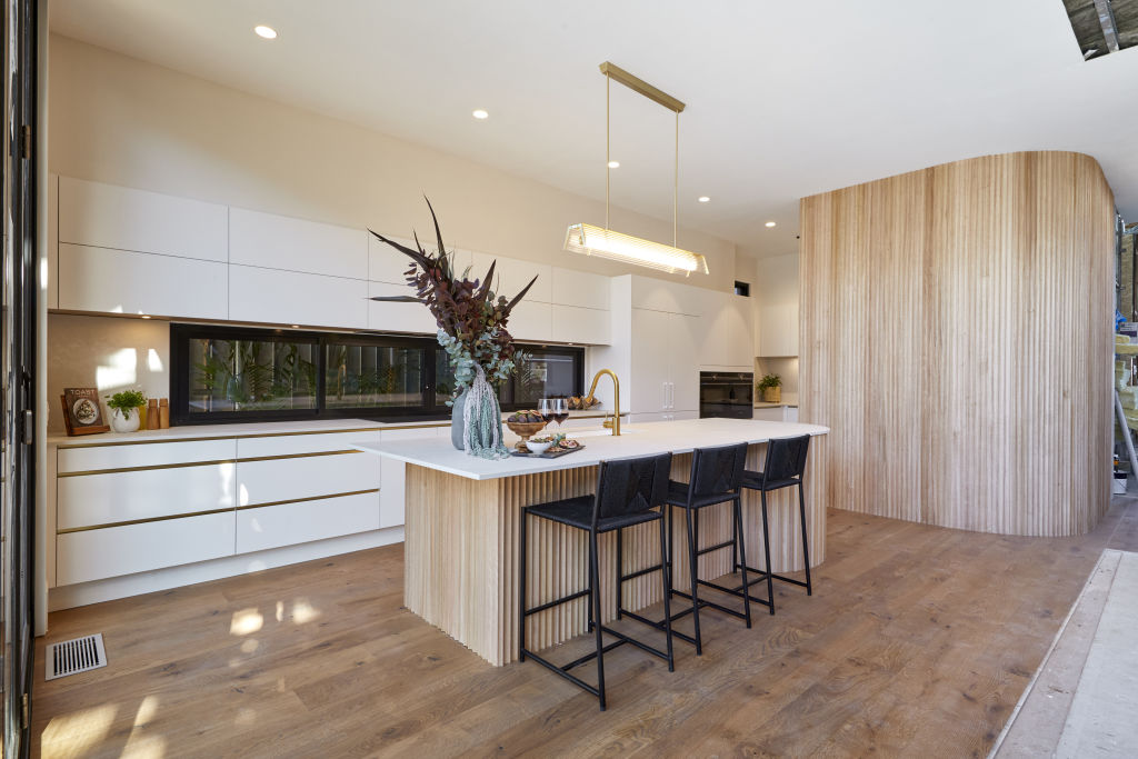
Design
Molders finds the couple’s kitchen design boringly predictable. “I’ve seen this so many times on The Block,” she says. “The island should be longer and without seating at the end – better balance could have been achieved.”
Lighting
Molders isn’t a fan of the couple’s lighting choice. “I liked the pendant to begin with,” she says, “but now I think it looks like an office light dressed up with a florescent tube.”
Colours
A neutral colour scheme is a smart choice for a house designed for market. “You can’t go wrong,” agrees Molders. “I like that the feature timber is different to the floor timber. The black barstools balance the heaviness of the window frames among all the lighter colours.”
View The Block properties for sale
House 1, Harry and Tash: 364 New Street, Brighton
House 2, Sarah and George: 362B New Street, Brighton
House 3, Daniel and Jade: 362A New Street, Brighton
House 4, Luke and Jasmin: 360B New Street, Brighton
House 5, Jimmy and Tam: 360A New Street, Brighton
Harry and Tash
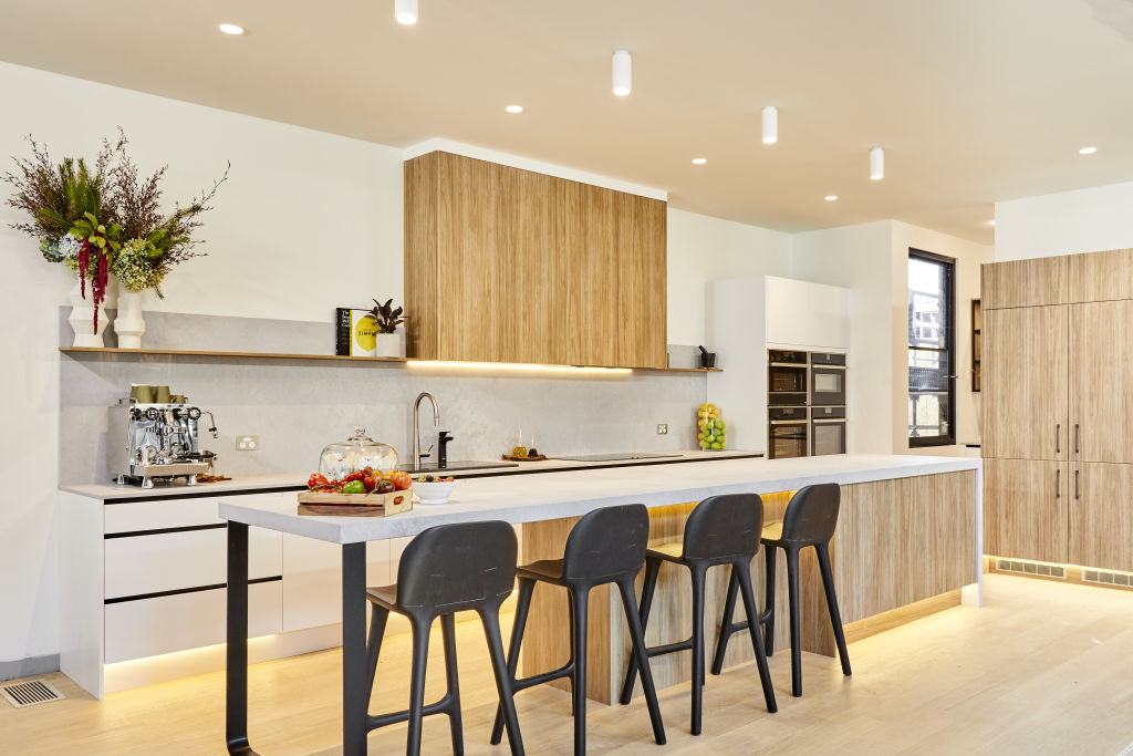
Design
“Harry and Tash have gone with a safe and slightly dated style, for a nice yet forgettable kitchen,” says Lauren Li from Sisalla. “The linear galley-style layout works well, but the aesthetic is so bland.”
Colours
Li commends the couple on their smart choice of palette. “The colours are neutral providing the space wide appeal,” she says. “The light timber floor works with the medium tone of the timber cabinetry, too.”
Styling
With styling that looks like an “after-thought”, Li says the space is in dire need of a lift. “It could do with some punchy pieces to elevate it,” she says. “There are too many small objects like books, decor, and lemons and limes – it looks cluttered. A selection of simple ceramic bowls and bunch of fresh foliage is all that’s needed.”
Sarah and George
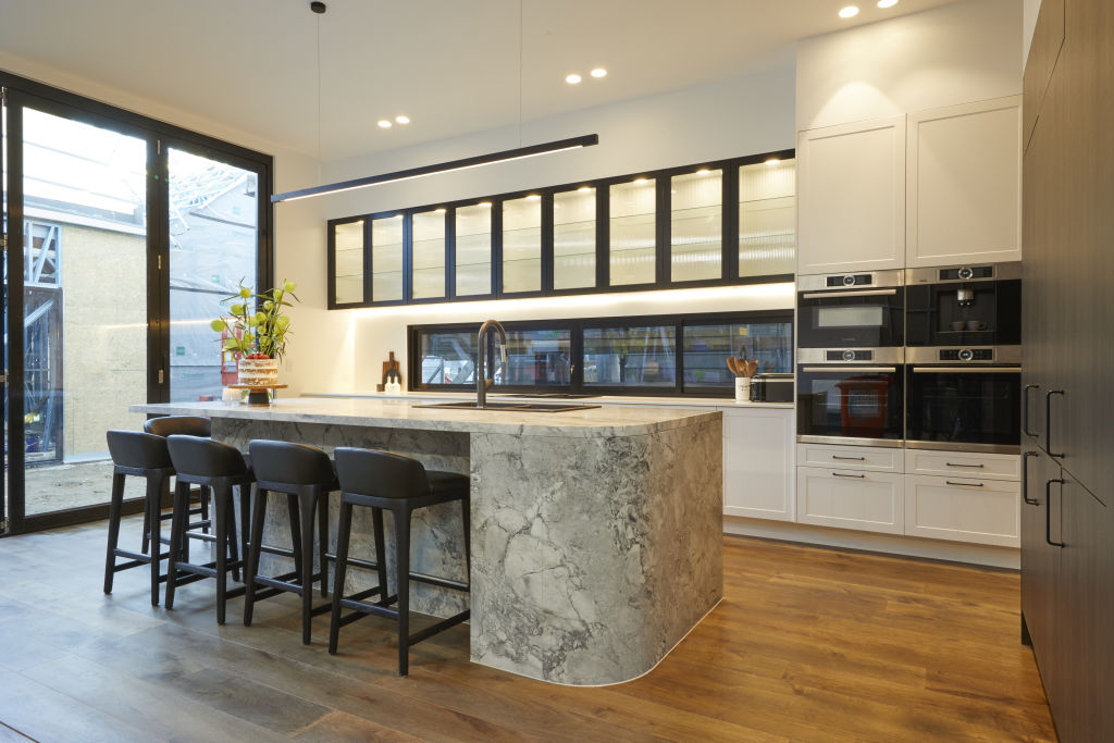
Design
“The curvature in the bench contributes to the custom feel of this kitchen,” says designer Nickolas Gurtler. “It’s a very well laid-out kitchen which is very functional for cooking and entertaining.”
Materials
Gurtler loves the choice of Dolomite stone for its natural beauty and durability. “It’s an excellent choice, and it’s nice to see an authentic material used rather than a man-made composite.”
Fixtures and fittings
“The shaker profile cupboard and dated door handles were a big mistake,” he says. “They don’t belong in a contemporary kitchen. The fluted glass was a great choice as it conceals what’s behind it. I’d have liked to see sexier tap and hardware choice, overall.”
Jimmy and Tam
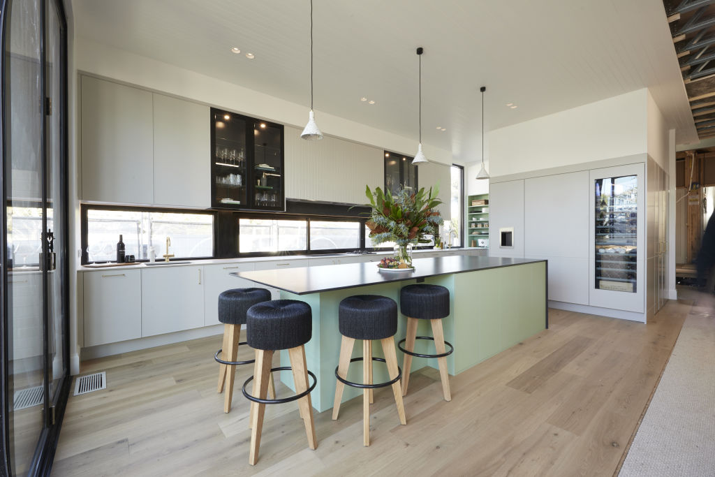
Design
“I hate everything about the aesthetics of this kitchen,” Gurtler says. “It’s confused, messy, and a ‘dog’s breakfast’ of ideas. There’s been no restraint or editing at all.”
Materials
Combining two different countertops requires expertise and finesse to execute successfully. “It looks really messy,” says Gurtler. “The Caesarstone on the island looks terrible, and the join line is super evident.”
Lighting
“The lighting is so unremarkable it may as well not even be there,” he says. “If you’re going to use pendants over a kitchen island, they need to act like jewellery for the space.”
Colours
The colour palette is confusing, says Gurtler. “Pastel green is dated even by contemporary standards, and it won’t age well,” he says. “The contrast with the dark countertop exacerbates the issue.”
Fixtures and fittings
While open glass cabinets look great in glossy magazines, in reality they are difficult to maintain. “They require regular styling, otherwise they look messy and unkept,” he says. “I hate the generic door handles, and the barstools are super ugly and make zero sense with what has been presented. Overall, though, the styling was the best I saw this week!”
We recommend
We thought you might like
States
Capital Cities
Capital Cities - Rentals
Popular Areas
Allhomes
More
