The Block 2020: Design experts critique laundry and hallway reveals
It was dubbed hell week for a reason – the contestants faced a monumental task to complete the entry, hallway, staircase and laundry. How did they fare? We spoke to three design experts for their take on the room reveals.
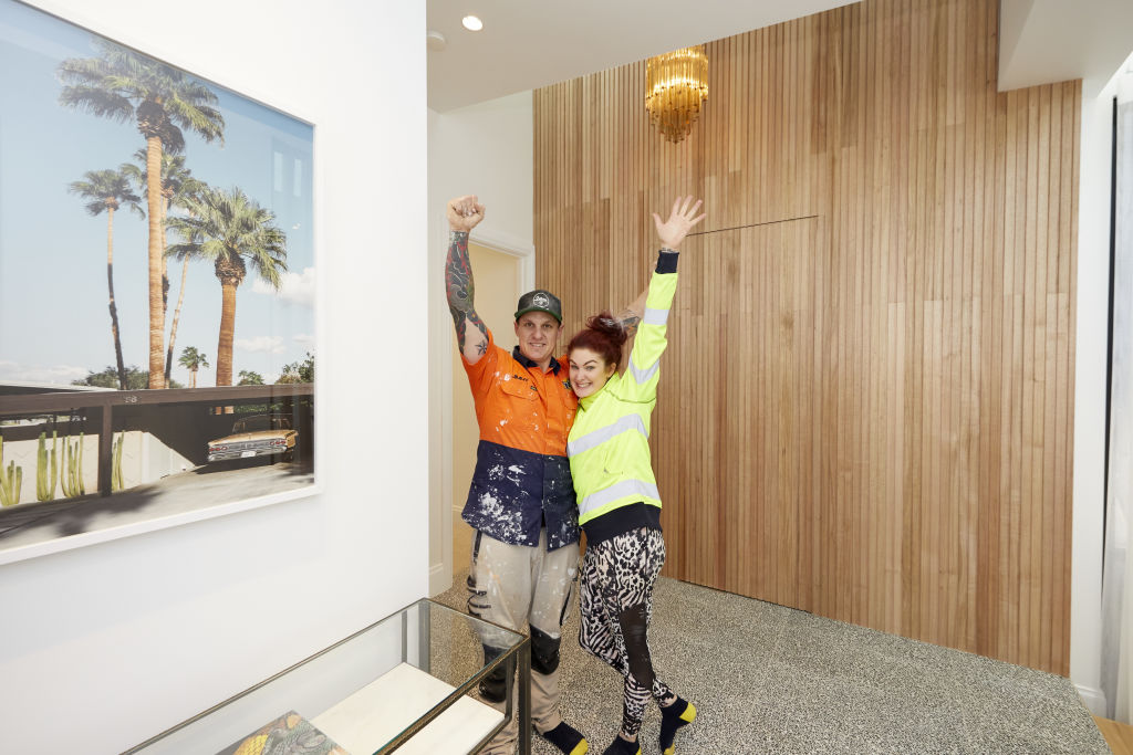
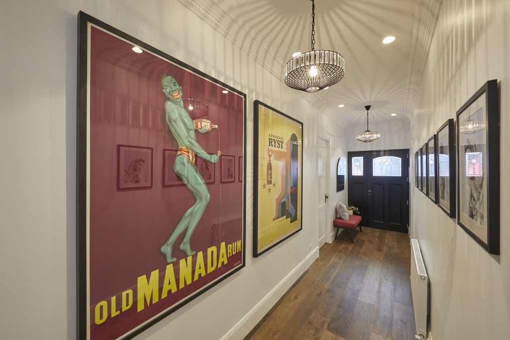
Jimmy and Tam – winners
Hallway and staircase
Design and layout
“The entrance feels incredibly period in the best way, but is missing some softness,” says designer Nickolas Gurtler. “Overall the mix of materials feels well considered, but a portrait piece of art opposite the entrance would have been great to layer over the panelling.”
Materials
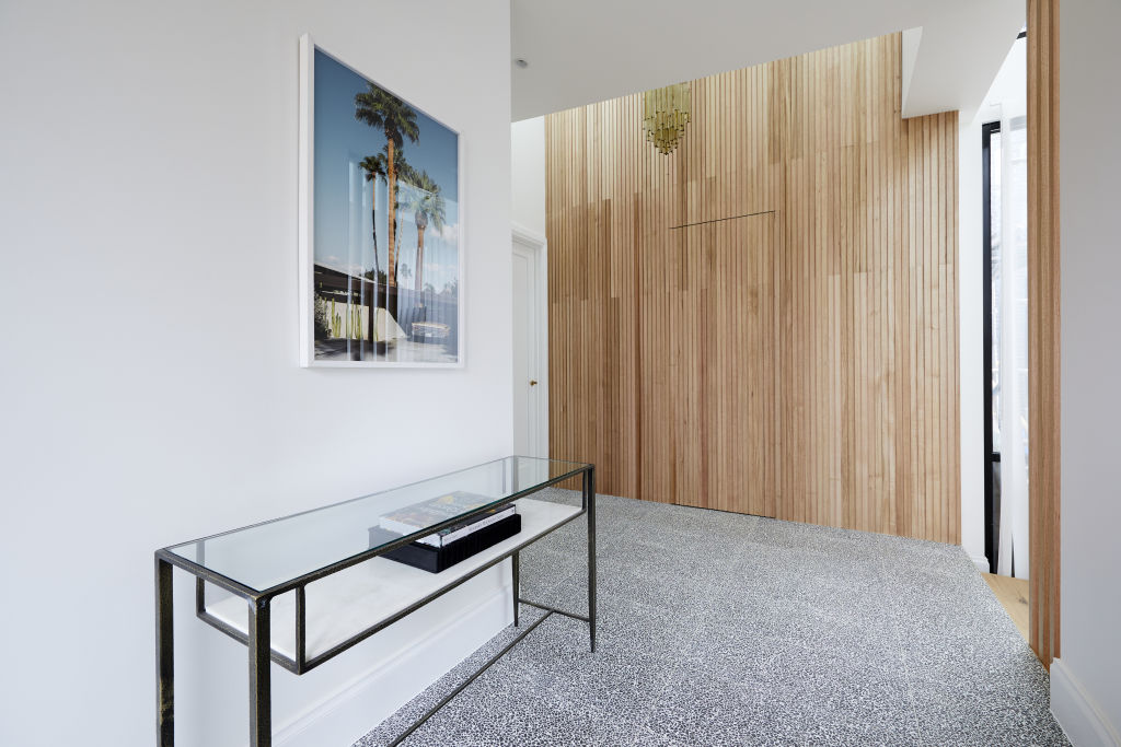
“The timber wall is gorgeous and really the only house to use materials to dress the space, which is incredibly smart,” Gurtler says. “I’d have liked to have seen a rug which would really soften the space and be very period-specific.”
Lighting
Gurtler praised Jimmy and Tam for using a vintage piece in the hallway.
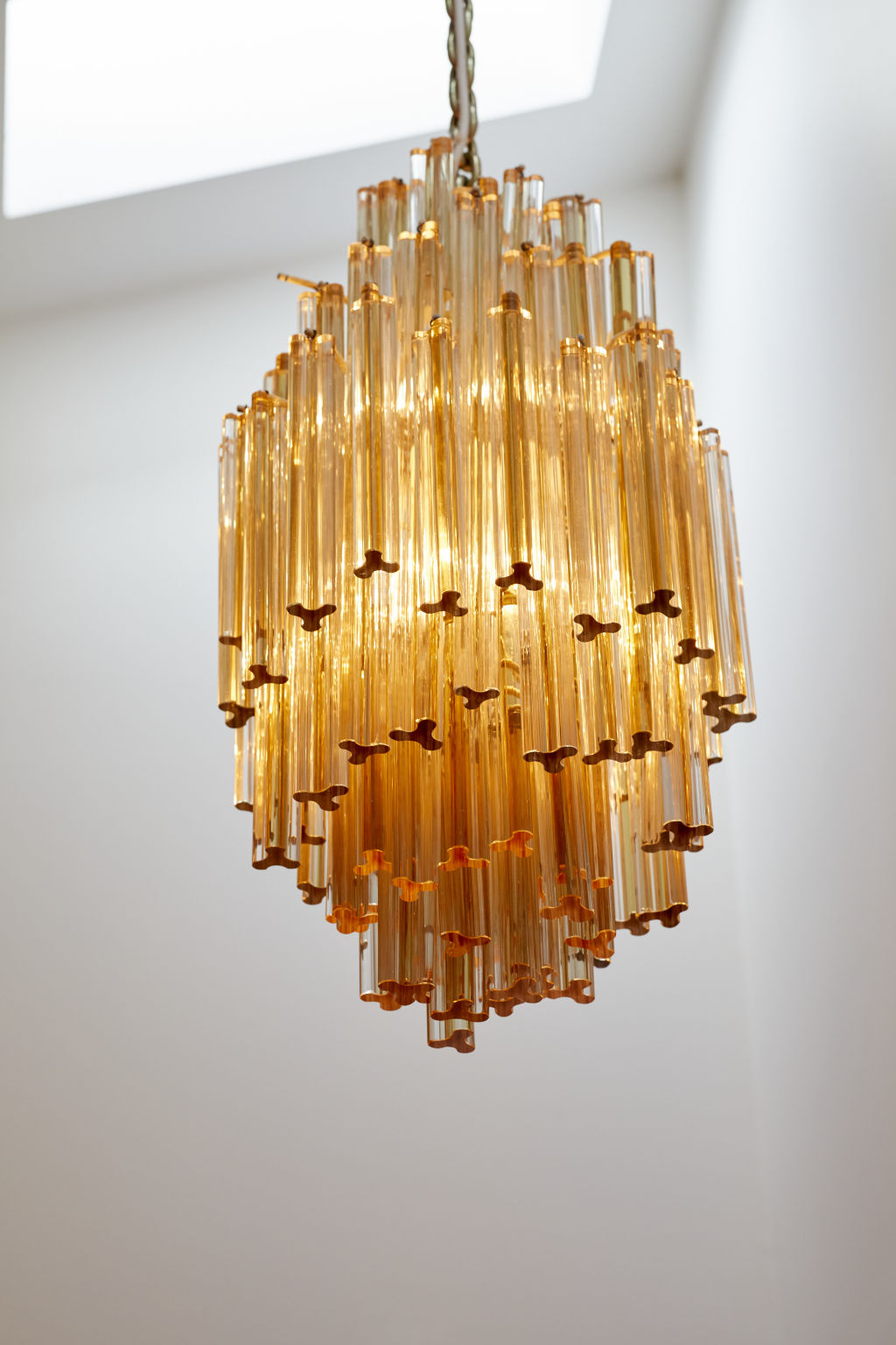
“It’s a gorgeous light. Not only is it a period fixture, it’s one of a kind and you can really tell,” he says.


Colours and styling
“The warmth of the timber and the light are gorgeous but it needed a little bit of colour to add some personality,” Gurtler says, adding that he found the styling to be “undercooked”.
“It was missing a gorgeous plant in the entrance and some other decorative flourishes to make the space sing.”
Laundry
Design and layout
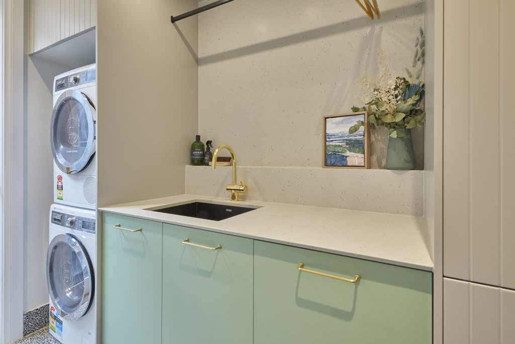
Gurlter says the laundry feels “fresh and fun”.
“I’m still not sold on the mint green but it does work the way it’s been implemented. It’s something easily swapped out by a potential buyer. I admire their commitment to it.”
Much like storage-obsessed judge Shaynna Blaze, Gurtler commends the couple on their “very functional storage”.
“The internal drying rack is a must in any laundry so it’s great to see this included.”
Fixtures and fittings
“The brass fixtures are nice, but I find in a laundry that recessed finger pulls sometimes work well when you’re flinging fabrics around, so they don’t get stuck.”
Powder room
Design and layout
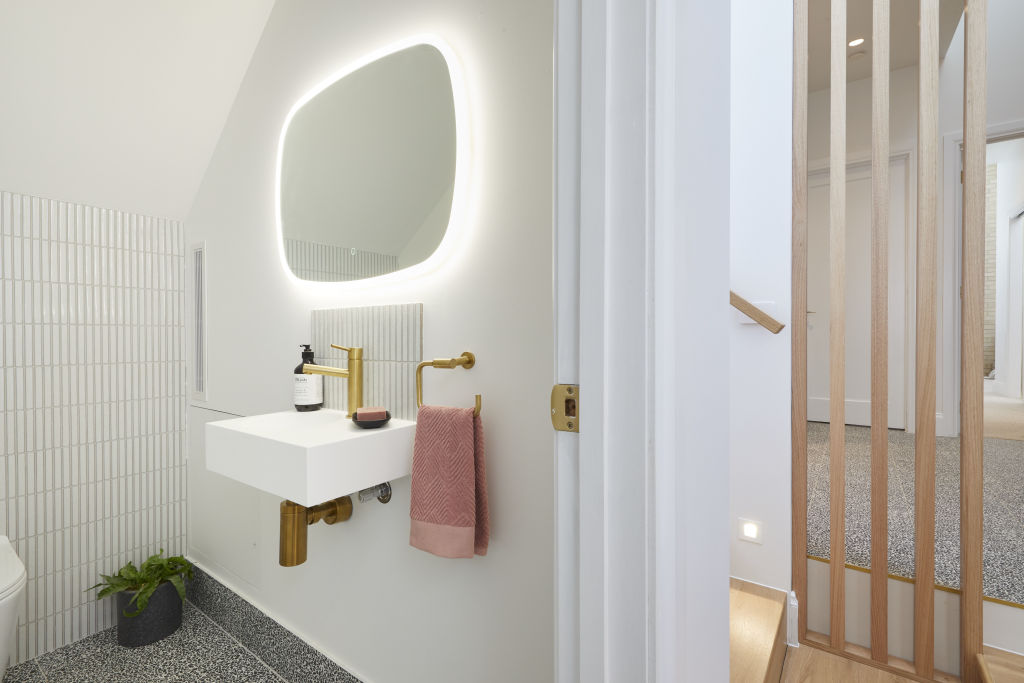
Gurtler says some taller buyers may find the powder room tucked under the stairs “a little irritating”, but adds that “overall, the layout is functional”.
“It’s a little stale for me for a powder room in a house with so much personality. A bit of warmth would have gone a long way.”
Lighting
“The cool white light is very unflattering in a powder room, and had they chosen a slimmer mirror they would have had space for a pair of sconces either side, which would have been lovely.”
Colours
Gutler finds the colours used in the powder room “a little bland”, especially for a house with mint green cabinetry.
“A powder room is a room to really push the design envelope and I think the opportunity was really missed here,” he says.
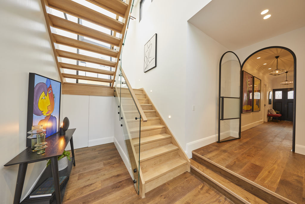
Luke and Jasmin
Hallway and staircase
Design and layout
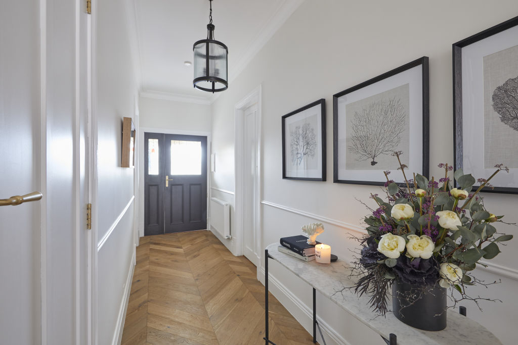
“I appreciate the period detailing they have used in the hallway with the period skirting and dado rail – it works well,” says designer Camilla Molders.
“The black steel balustrade is the feature of the space [stairs] and does tie into the window frames and new steel door. It could have been refined a little further to be an elegant addition in the space.
“I do like that they painted the rise of the stairs which gives an overall lighter feel to the space.”
Materials
“The herringbone floor is is an interesting choice for the hallway. It does add interest to the hallway design, however, with no other herringbone flooring used in the house, it feels unnecessary to me. [Although] it does have a defined finishing spot with the new steel door that clearly defines the old to the new,” Molders says.
Lighting
“An entrance light is a place to splurge and to make a real statement, welcoming you into the home. They could have used a pendant that tied in the design of the living space,” Molders says.
Although Molders may not be a fan of the pendant light used in the hallway, the team do score points for their use of low lighting that projects on to the floor.
“Nice touch with the low lighting throwing feature light on to the hallway floor – it adds atmosphere and functional night lighting.”
Colours
“Black and white is a classic combo and works well in this space. I like that the internal of the entrance door is painted black adding visual depth and makes a feature out of the beautiful original leadlighting,” Molders says.
Powder room
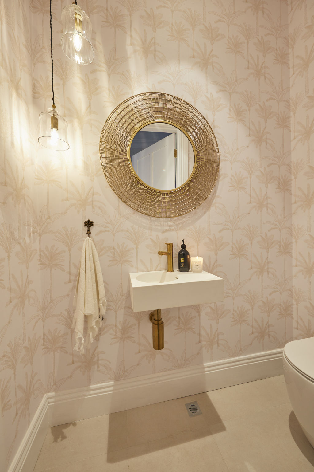
“This room made me question if I was in a different house,” Molders says. “It has a ’50s-style vibe with the palm tree wallpaper. But I’m all for the smallest room in the house having its own identity and not conforming!
“They are consistent with the brass fittings and the same tap design in all of their bathrooms, and I appreciate that for the overall flow of the house.”
Laundry
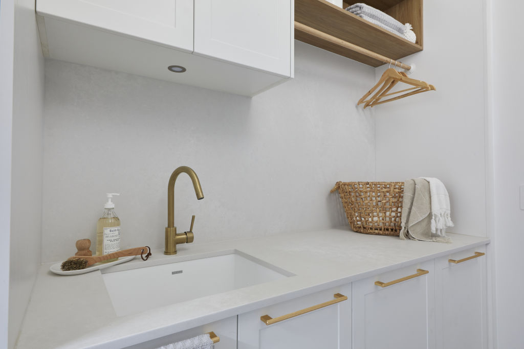
Molders says the laundry looks smart and it’s a good mix of materials with the tile floor, the white cabinetry and timber shelf for a bit of warmth and texture.
“Overall, they have created a laundry room that would make you feel that it’s not such a chore to be in!”
- View The Block properties for sale
- House 1, Harry and Tash: 364 New Street, Brighton
- House 2, Sarah and George: 362B New Street, Brighton
- House 3, Daniel and Jade: 362A New Street, Brighton
- House 4, Luke and Jasmin: 360B New Street, Brighton
- House 5, Jimmy and Tam: 360A New Street, Brighton
Harry and Tash
Hallway
Design and layout
“The hallway delivers beautiful natural light, which brings the space to life, however it doesn’t manage to bring any charm of the 1920s,” says designer Lauren Li from Sisalla.
Lighting
“The pendant light in in the entry is a mock-traditional style from no era in particular. It is at odds with the void ceiling with skylights. A more fitting option would be a contemporary pendant light that references the ideas from the 1920s; a fitting with streamline steel features with glass spheres.”
Styling
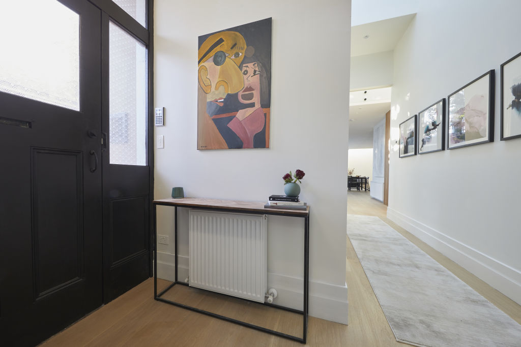
“The artwork in the entry has to go! The cartoon style doesn’t tie in with anything else in the house. A black and white photographic print from the 1920s of the Brighton area would tie in with the black door and elevate the entry,” Li says.
She adds: “More personality and atmosphere can be created with better artwork and styling selections.”
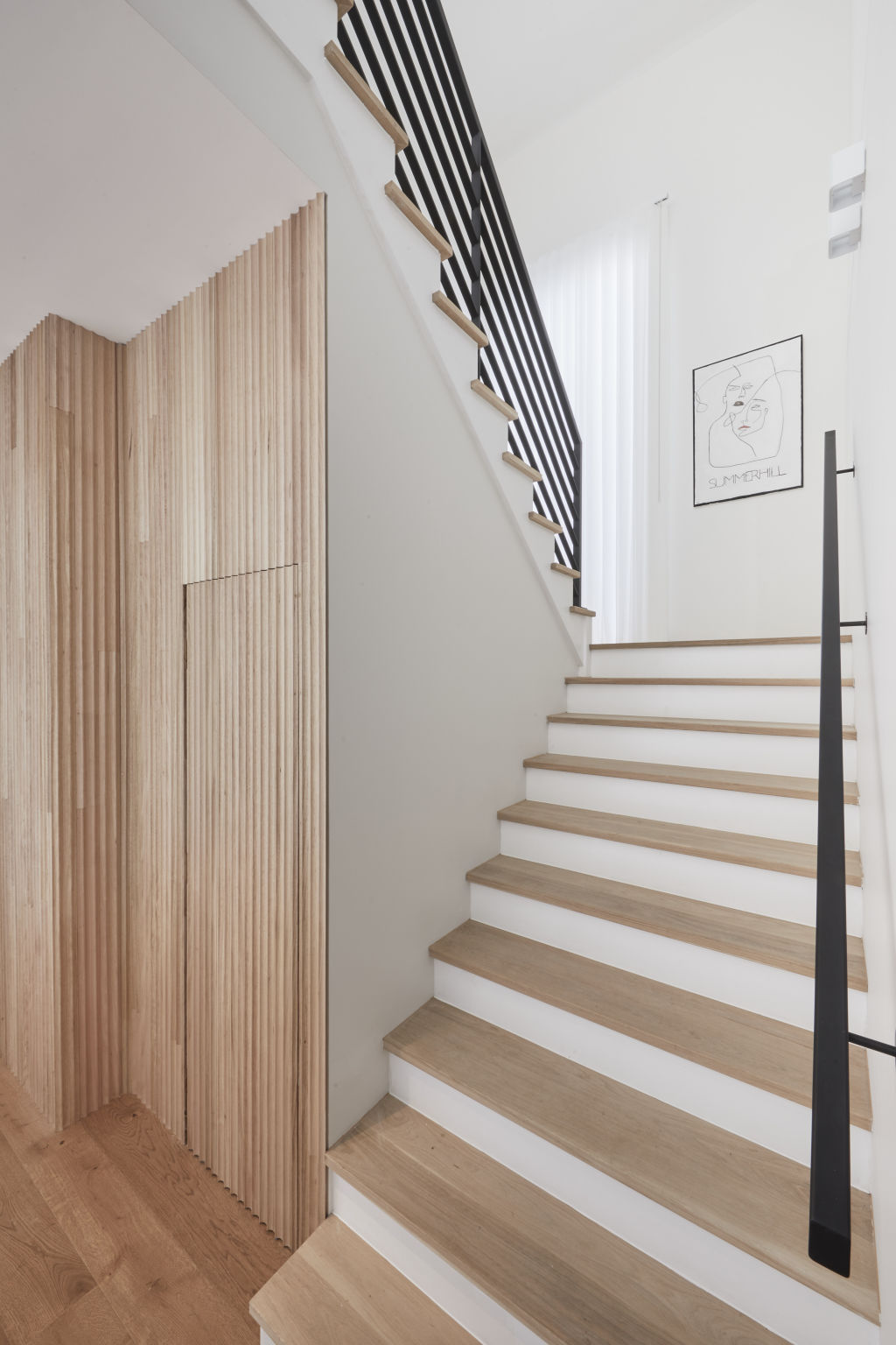
Staircase
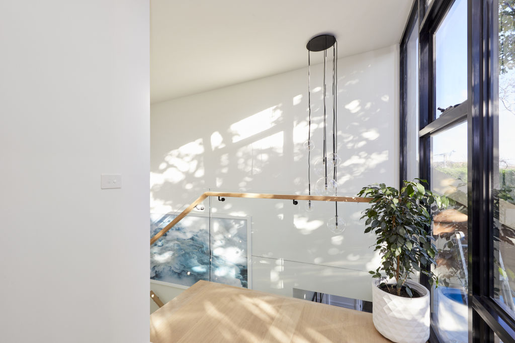
“The simplicity of the staircase allows the window with a view of the leafy tree to be the hero of the space,” Li says, but adds that the glass balustrade is “too commercial”.
“They have missed an opportunity to reference the 1920s in the design of the balustrade here. A fine black steel balustrade would have been perfect.”
Sarah and George
Hallway and staircase
Design and layout
“The arched door is beautiful and a real focal point, however the artwork was a real distraction,” says Gurtler. “These long entrance hallways can be hard to dress and I’d have liked to have seen beautiful texture instead of art on the walls.”
Gurtler adds: “The entrance furniture is not right for the space. A slimline console table would have been a better choice.”
Materials
“The staircase timber change feels a little bit amateur, particularly on the landing. It would have been nice to continue the walnut timber on the stairs. The use of black steel and fluted glass is a nice tie-in to their kitchen.”
Colours
Gurtler believes the art choices confused the overall colour palette, saying, “it needed one hue expressed in multiple tones in here. There’s also a lot of timber which is in itself a colour and I think was throwing off the balance.”
While Gurtler says the space feels very “unstyled”, he concedes that the contestants aren’t professional stylists and feels “they gave it their best shot”.
Powder room
Design and layout
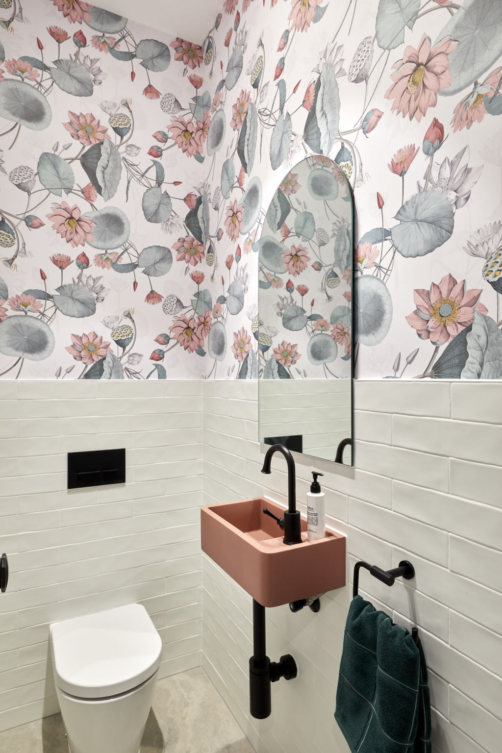
“While this isn’t my personal taste, it was relatively well executed overall. It’s nice to see some bold design happening, but there is a sense that the powder room doesn’t belong in the house because it is so bold.”
Lighting
“I think the space was missing some decorative lighting,” Gurtler says. “A soft wall light is always good to leave on when you’re entertaining so guests can find their way.”
Colours
“The colours were very sweet and feminine, but at odds with the harsh masculine tapware. The colour of the hand towel was a great choice to balance out the pink,” Gurtler says.
Fixtures and fittings
“I think the black tapware really confused the design,” Gurtler says.
“The wallpaper is delicate, as is the handmade tile – the black tapware is too aggressive for it, but I can see where they were going with it.”
Laundry
Design and layout
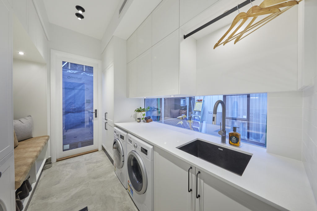
“The pet bed was genius and something that someone will really love. I really love the mini mudroom concept. A lot of people want a full mudroom, but this is a great compromise.”
Lighting
“It seems very bright which is great for a laundry,” says Gurtler. “I always find a soft LED strip works well for those very early morning/late evening runs to the laundry so you don’t need to turn on all the lights.”
Colours
Gurtler says the green used in the back corner is “gorgeous, but it wasn’t connected to anything else in the space which was disappointing”.
“After the bold powder room, I feel they could have pushed the envelope with cabinetry in that colour.”
Daniel and Jade
Design and layout
“Overall, the design of the hallway, laundry and powder room tick the boxes in achieving their functional purpose,” Molders says.
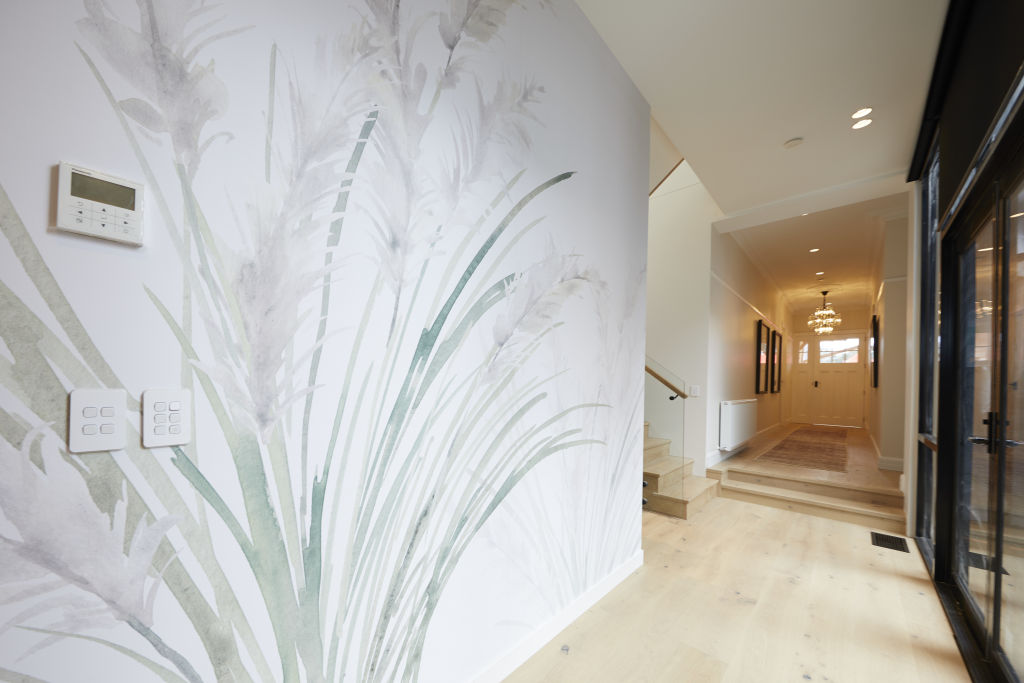
Materials
“The light oak timber floor is appealing and gives an overall airy feel,” Molders says, but adds that she find the wallpaper feature “unnecessary”.
Lighting
While Molders is not a fan of the pendant light in the hallway, she does note that the wall lights are very “of the moment” and will appeal to many.
Colours
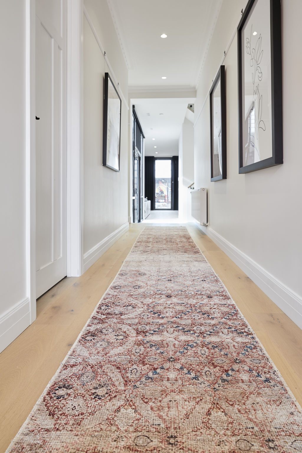
“The colours are simple and a warm white on the walls is a smart choice to take a house to market,” Molders says. “The neutral laundry isn’t going to be off-putting to anyone, either.
“The runner in the hallway adds a gentle pop of colour and the length works well in the space, but the design doesn’t reference anything else in the house stylistically,” Molders adds.
We recommend


We thought you might like

States
Capital Cities
Capital Cities - Rentals
Popular Areas
Allhomes
More
