The Block 2020: Designers react to the guest en suite reveals
With beautiful and functional lighting, luxurious touches and practical layout, a guest en suite should provide visitors with the feel and ambience of a 5-star hotel stay.
Last week, The Block couples were tasked to create just that – within budget and on time.
Did they succeed? We asked the experts.
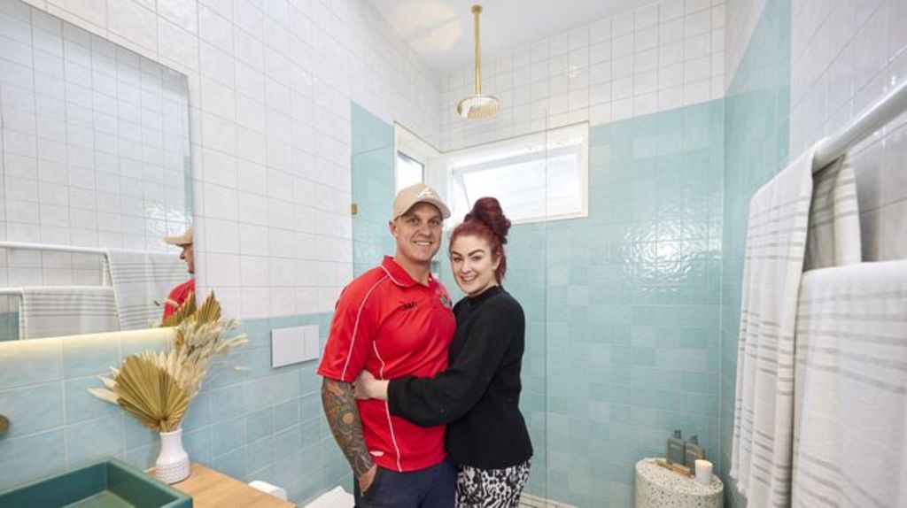
Harry and Tash
Design
While the floor plan is efficient, numerous competing design elements let this room down. “Mixing multiple colours, textures, shapes and patterns make this space confusing,” says designer Nickolas Gurtler. “There’s a real lack of editing here.”
Materials
The choice of the patterned floor is stylish, however there is a lack of finesse and restraint in the execution. “The floor tiles are more Moroccan-inspired than 1920s,” he says. “They’re dated, clash, and have no relevance to the period or architecture. Utilising the blue tile as a feature would have looked better.”
Fixtures and fittings


“There’s a reason you don’t put window treatments in bathrooms,” says Gurtler. “That venetian blind is going to be hard to clean and makes it look like a rental property. A frosted, reeded or patterned glass panel would have been a better choice.”
Styling
“There is so much visual chaos going on,” he says. “The red styling elements were a fatal mistake. Overall, it looks really garish.”
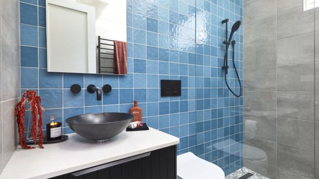
Sarah and George
Design
“The layout is well planned, and the size and scale of each element is well balanced,” says designer Sally Satriani. “The vanity, shower and hidden toilet area are well distributed for the large size of the room.”
Materials
A considered mix of design elements is well executed and highlights the key feature of the room – the vanity. “It works beautifully, and that vanity is the star!” says Satriani. “Framing the mirrored cabinet to match the vanity would’ve been a gorgeous addition.”
Lighting and colours
The couple have combined colour and light like professionals, says Satriani. “They’ve created beautiful contrast with the black and white, while the pink walls soften the space and are highlighted by the natural light from the skylight and recessed lighting.”
Styling
While they have done a good job, Satriani says simpler styling would have given them an edge. “Love the simple flowers, but daintier towels in one colour would’ve complemented this space beautifully,” she says.
View The Block properties for sale
House 1, Harry and Tash: 364 New Street, Brighton
House 2, Sarah and George: 362B New Street, Brighton
House 3, Daniel and Jade: 362A New Street, Brighton
House 4, Luke and Jasmin: 360B New Street, Brighton
House 5, Jimmy and Tam: 360A New Street, Brighton
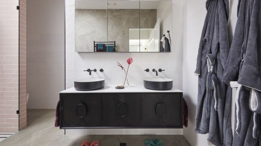
Jimmy and Tam (winners)
Design
“The design is very modern and a beautiful nod to the period of the house,” says Gurtler. “The layout is great, but I wish they had pulled the vanity out from the wall just a little. It would look more luxurious.”
Materials
Gurtler applauds the couple’s choice of tiles. “I love how they’ve used them,” he says. “They’re incredibly chic and the installation shows real finesse as it guides the eye throughout with ease.”
Styling
Bathrooms don’t require a lot of styling and should be more material and fixture-focused. “The dried flowers look really awkward,” says Gurtler. “They’re too tall and detract from the beauty of the finishes. A bolder towel choice would have worked better, too.”
Daniel and Jade
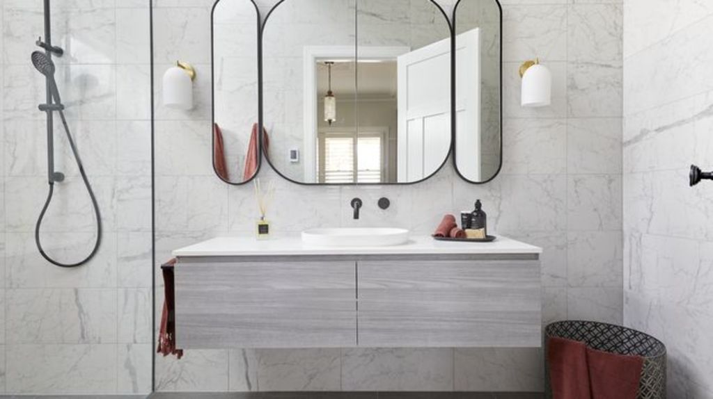
Design
“The only thing I like here is the door, and that’s original to the house,” says designer Camilla Molders. “The colour scheme is dreary, the toilet placement is awkward, and the brass wall lights look cheap and don’t relate to anything else. The lighting under the vanity is bizarre. All it does is highlight a dirty floor.”
Materials
Marble tiles look luxurious, however Molders warns that when used en masse the effect is clinical. “I do like the slightly deeper floor tiles which help balance the room,” she says. “I’m thankful they have only used two different tiles rather than more.”
Decor
“I have nothing positive to say here,” says Molders. “A bunch of smelly sticks is not luxury styling, and I hate the mirror. It looks like a cartoon block face with long ears and does nothing for the space.”
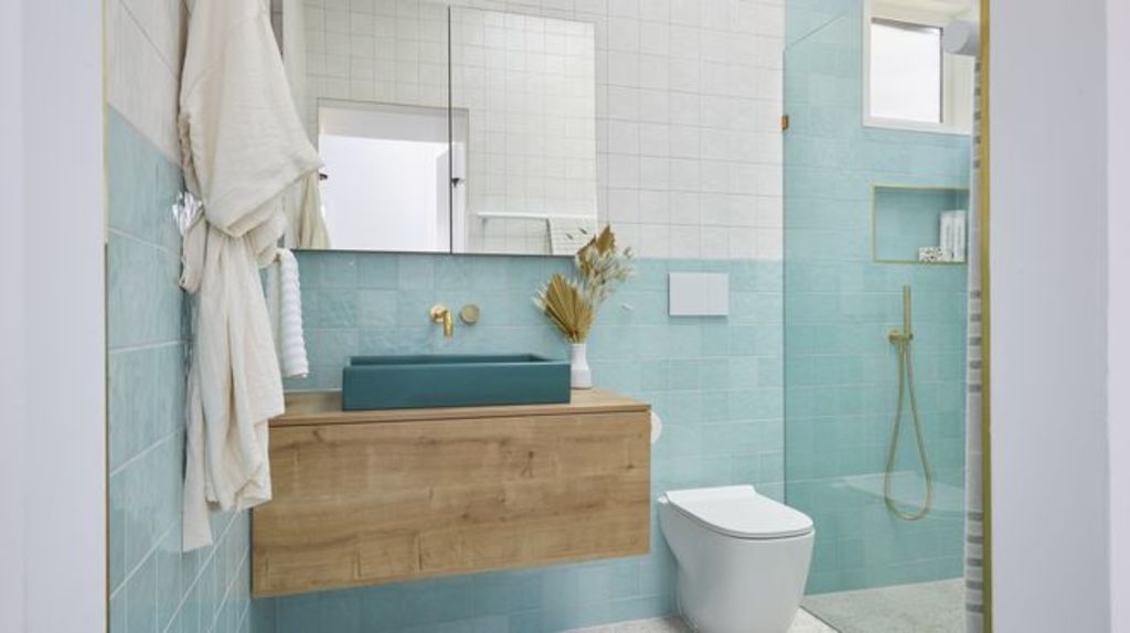
Luke and Jasmin
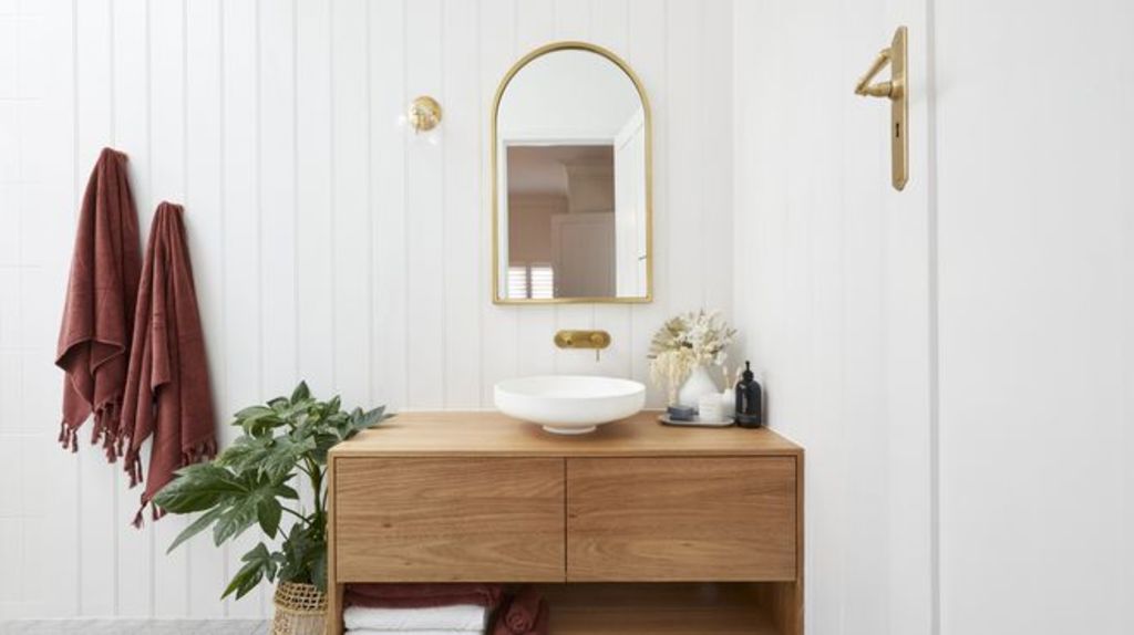
Design
Molders says the couple have achieved a functional design with choices that mesh well together. “The layout is realistic, and by opening onto the vanity provides a nice sightline from the hallway into the bathroom,” she says. “The colour scheme provides a calming feel and well-balanced space.”
Materials
The VJ panelling complements the couple’s choice of tiles for a contemporary and timeless look. “The timber vanity adds warmth to the space, but I’m not a fan of tile edge trim,” she says. “They have used a tile trim that matches the brass fixtures though, so points for continuity.”
Lighting
“Why add lighting to a shower recess?” says Molders. “Unless you are styling it with beautiful shampoo bottles, what’s to highlight? I don’t mind the small wall pendant beside the mirror, though. It helps with visual balance.”
Styling
“The cluster of items on the vanity is styled well,” says Molders. “The towels provide a nice pop and balance the neutral tones elsewhere. I don’t love the basket that the plant is in, but that’s just me being unnecessarily picky!”
We recommend


States
Capital Cities
Capital Cities - Rentals
Popular Areas
Allhomes
More
- © 2025, CoStar Group Inc.
