The Block 2020: Experts respond to the living and dining room reveals
A considered, well-rounded living and dining space has the ability to enhance the way we live every day. Last week on The Block, the couples were tasked with creating theirs. We asked a panel of experts if they believed they had met the mark.
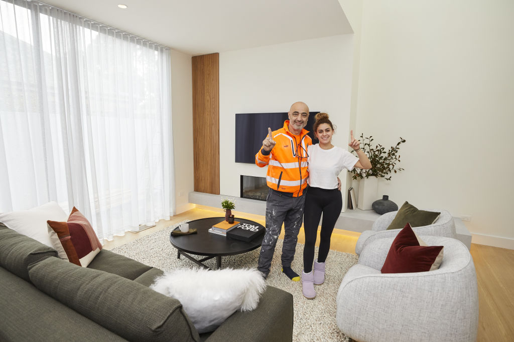
Harry and Tash – winners
Design
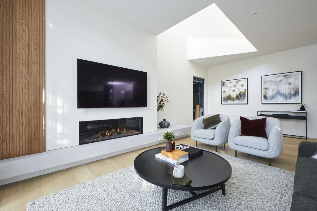
“This space works beautifully,” says designer Lauren Li from Sisalla on the couple’s layout. “It’s a spacious and functional space with a void that accentuates openness and natural light for a tranquil and comfortable room.”
Colours
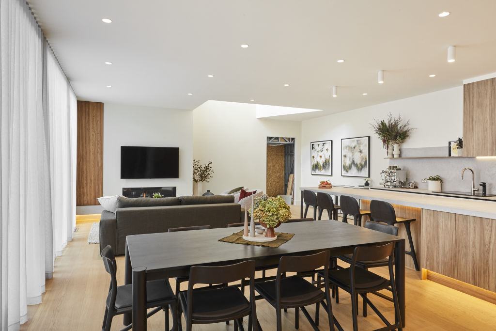
Li notes a “lack of colour” in the space, but awards points for a well-appointed neutral scheme. “The black, white, and timber palette creates a relaxing and harmonious space,” she says. “The focus is on natural light and contrasting textures that we see in the sheer curtains, timber floors, black painted finish, and wool rug. Well done.”
Styling
“The proportions and line-up of the fireplace and TV are perfect,” says Li. “Their furniture selections are beautifully understated and fit well within the space, alongside thoughtful styling with pared-back objects.”
Her only comment is on their choice of fashion tome. “The Tom Ford book is the most over-used styling prop around,” says Li, “and it can’t be confirmed that anyone has opened it, ever.”
Daniel and Jade
Materials
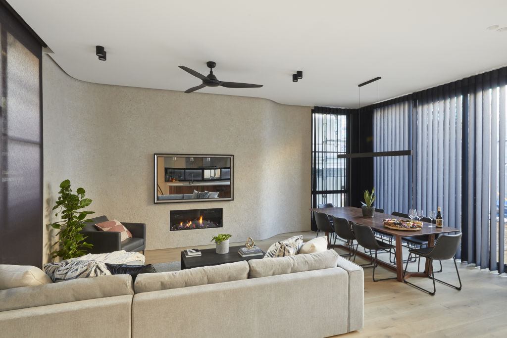
“I like their choice of black sheer curtains as a balance for the heavy window frames and black detailing throughout,” says designer Camilla Molders. “The execution, though, looks cheap and they resemble vertical blinds which is a big no! A less stiff curtain heading that allows the fabric to fall in a softer manner would have been better.”
Lighting
The couple win points from Molders for their choice of wall wash light. “I love how it sits in the curve and adds ambience,” she says. “The simple linear dining light shape works, but their actual choice looks cheap and should have been hung lower to provide intimacy.”
Styling
“The styling feels like an afterthought, but I don’t disagree with their simple choices,” Molders says. “I do agree with the judges that a lonely plant on the dining table could be improved upon. A better choice would be a piece of decor that subtly mirrors the line of the pendant above.”
View The Block properties for sale
House 1, Harry and Tash: 364 New Street, Brighton
House 2, Sarah and George: 362B New Street, Brighton
House 3, Daniel and Jade: 362A New Street, Brighton
House 4, Luke and Jasmin: 360B New Street, Brighton
House 5, Jimmy and Tam: 360A New Street, Brighton
Sarah and George
Design
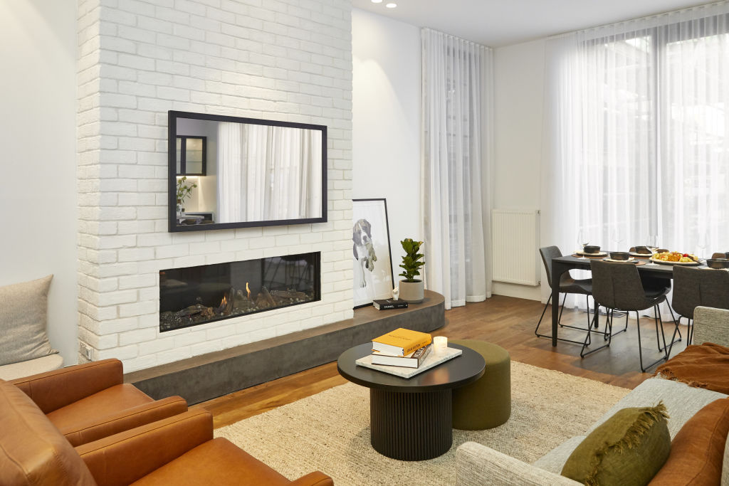
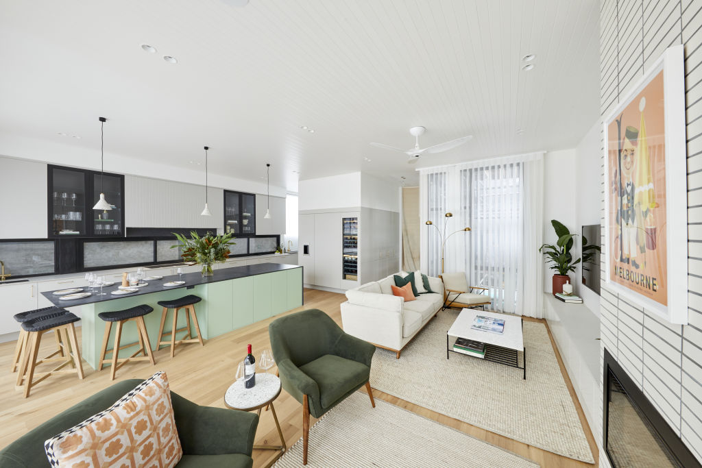
Designer Nickolas Gurtler says when it comes to design, the devil is in the detail. “I love their key detail – the curve at the end of the fireplace,” he says. “It makes all the difference and beautifully references the kitchen island.”
Materials
“The white brick will date quickly,” Gurtler says. “The location demands homes with a high-end finish. A natural stone or handmade tile would have looked more sophisticated.”
Lighting
Gurtler says the couple have gone overboard with downlights, a common mistake made by many renovators. “Decorative lighting is crucial in dressing a space and adding texture and ambience,” he says. “A fantastic wall sconce and statement pendant light over the dining table would have proved impactful.”
Furnishings
“I love the tan leather chairs for their warmth,” he says. “The coffee table should have been much longer though, and the dining table and chair combination looks unremarkable.”
Luke and Jasmin
Design
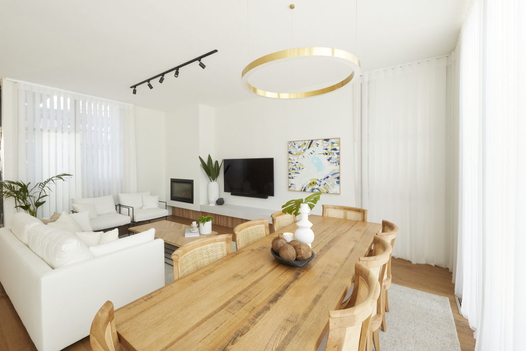
Molders says the couple’s layout doesn’t work. “Space taken up with a butler’s pantry and kitchen could have been better used for the living and dining space,” she says. “They have tied in the space to the kitchen well, but it’s really a nothingness kind of space.”
Furnishings
“I don’t like their furniture choices at all,” says Molders. “The coffee table looks like floorboards stuck on a metal base, and the dining chairs with their ‘country vibe’ look heavy in the space.”
A simple and more sophisticated approach, she says, would have resolved the couple’s space well. “An elegant chair would have transformed this room,” she says. “White upholstery is never a good idea unless you are happy to always sit on a throw rug.”
Materials
The couple’s timber tones get the tick from Molders. “They work well together,” she says. “I don’t love the dining table and coffee table individually or together, but tonally they work and bind a small space together. I also like that the back of the sofa is a clean line, that looks attractive when viewed from the kitchen.”
Jimmy and Tam
Design
“There’s no excuse for the most utilised room in the house to be this small!” exclaims Gurtler. “It feels boxed-in and is too small to entertain in. The sofa is too close to the TV and there’s so much space behind it. Not having a dining table is unforgivable, as is the odd sitting space jammed on at the end.”
Lighting
Gurtler says the couple’s lighting plan is wanting. “It’s nice to see a floor lamp, but it’s not enough ambient lighting for everyday use,” he says. “There’s enough space to add a table lamp on the entertainment joinery.”
Styling
With styling that looks “undercooked”, the couple’s space loses points for overall impact. “It needs beautiful objects placed on the entertainment joinery and coffee table,” he says. “The furniture choices look low budget and not what you would expect in a house of this price point.”
We recommend
We thought you might like
States
Capital Cities
Capital Cities - Rentals
Popular Areas
Allhomes
More
