The Block 2020: Industry experts critique the guest bedroom reveals

What makes a guest bedroom great? This was the question playing on the minds of the couples on The Block last week. Not only tasked with creating the ultimate guest bolt hole, they had the added pressure of ensuring every element complemented their home’s era.
How did they fare? We asked the experts.
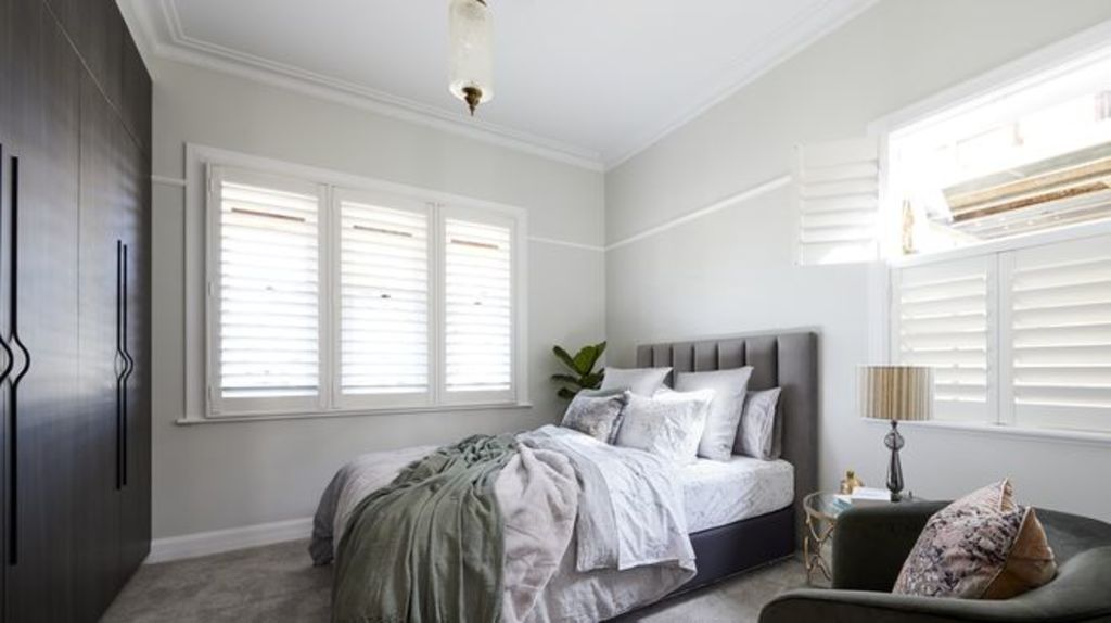
Harry and Tash
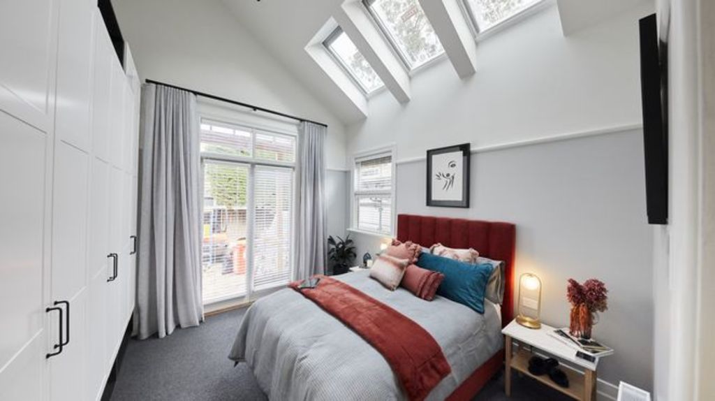
Designer Sally Satriani says the couple has captured the glamour of the 1920s beautifully. “It was a time known for striking geometric features and elegantly designed furniture. They found inspiration here but could’ve pushed it a little more.”
Design and layout
With windows and doors fixed, the placement of bed and wardrobe were obvious ones. “It works well,” she says. “There’s plenty of space to move around and a good flow throughout.”
Lighting
The gold bedside lamp is perfect and in tune with the pink and orange flower arrangement. “An art deco-style pendant would have added ambient light for evenings,” she says.
Styling


Satriani says the styling was “spot on”. “I love the simple lines of the bedhead and side tables that provide a base for the styling,” she says. “The strong colours, especially the electric blue velvet, are fantastic.”
Luke and Jasmin
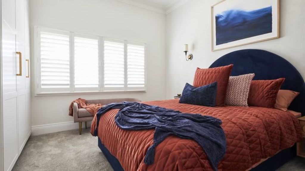
“The design here works well,” says Lauren Li, of Sisalla Interior Design. “There were some missed opportunities however that would have added calm and nostalgia to the room.”
Colours
The scheme of white, navy and burnt orange, is dynamic, says Li, but too bold for a bedroom. “It’s jarring and discordant rather than restful and welcoming.”
Materials
While Venetian plaster adds beautiful texture to walls, when executed in white, it can fall flat. “A light sand or warm grey is more effective,” says Li. “It provides real warmth and impact.”
Lighting
Lighting can transform a space, and this room sadly lacks it. “Their choices are generic and old-fashioned,” says Li. “A contemporary style, like a glass sphere on a black steel rod would have created atmosphere.”
Styling
The room’s exuberant styling, she says, is too much for a room that should feel calmly serene. “It feels juvenile and lacks sophistication. The arch bedhead is playful (for a teenager’s room) and the natural timber of the bedside tables are out of step with rest of the room.”
View The Block properties for sale
House 1, Harry and Tash: 364 New Street, Brighton
House 2, Sarah and George: 362B New Street, Brighton
House 3, Daniel and Jade: 362A New Street, Brighton
House 4, Luke and Jasmin: 360B New Street, Brighton
House 5, Jimmy and Tam: 360A New Street, Brighton
Sarah and George
“Unfortunately, they have fallen into a common trap when renovating period homes,” says designer Nickolas Gurtler. “It feels like a reproduction of something you find on Pinterest. Integrating vintage-style elements because the house is old doesn’t work. If you can’t source authentic fixtures, choose contemporary instead.”
Design and layout
While Gurtler applauds the wardrobe choice, the horizontal timber battening looks messy. “The picture hook throws the balance off,” he says. “It may look authentic, but there are too many different elements at play.”
Lighting
Gurtler questions the lighting installed beneath the wardrobe. “It’s unnecessary,” he says. “It’s important to edit. Just because you can add something, doesn’t mean that you should.”
Colour
A lack of connection between study and bedroom could have been rectified using unifying colours. “It would have made the difference here,“ says Gurtler.
Daniel and Jade
Of all the rooms this week, Gurtler says Daniel and Jade’s colour palette is the most sophisticated. A mix of warm tones and desaturated greens, it feels modern, fresh and is an authentic take on 1930s style.
Layout and design
With an odd, off-centre window, the overall floor plan required careful consideration. “It feels confused,” he says. “The bed should be centred under the window and the chair in the far corner under the window.”
Fixtures and fittings
The heavy dated shutters draw unwanted attention to the odd window placement. “A beautiful sheer curtain with thicker block out secondary curtain would have provided softness and lifted the space.”
Styling
Gurtler believes the couple will find their feet when it comes to styling. “I do think, however, the linen choices here are a little mass market and overly styled. When it comes to making a bed, less is more.”
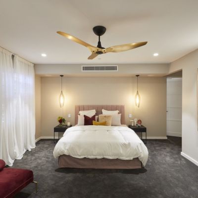
Jimmy and Tam (Winners)
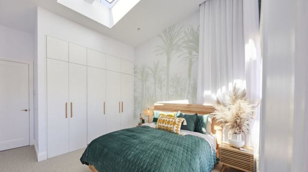
Encapsulating a light and breezy feel, Jimmy and Tam’s room captures the 1950s era perfectly. “It could have looked 1950s kitsch, but it’s the right balance of the era and now,” Li says.
Design and layout
The overall design feels cheerful yet sophisticated. “The wallpaper is subtle yet makes a statement,” she says. “It’s not too themed and would feel comfortable to spend time in.”
Lighting
An inspired use of materials, from natural timbers to soft billowing fabric, elevates this room, while the rattan lampshade references the 1950s without looking cheesy. “I love the skylights that let the sun in,” says Li. “It will remind buyers that the beach is close by.”
Colours
The couple’s approach of finding colour through pattern and texture has paid off, says Li. “The sheer curtains provide a freshness while the dark green bed linen grounds the room. The yellow accent cushion lifts the room and perfectly complements the warm timber tones.”
We recommend


We thought you might like

States
Capital Cities
Capital Cities - Rentals
Popular Areas
Allhomes
More
