The Block 2020: Interior experts critique the main bedroom reveals
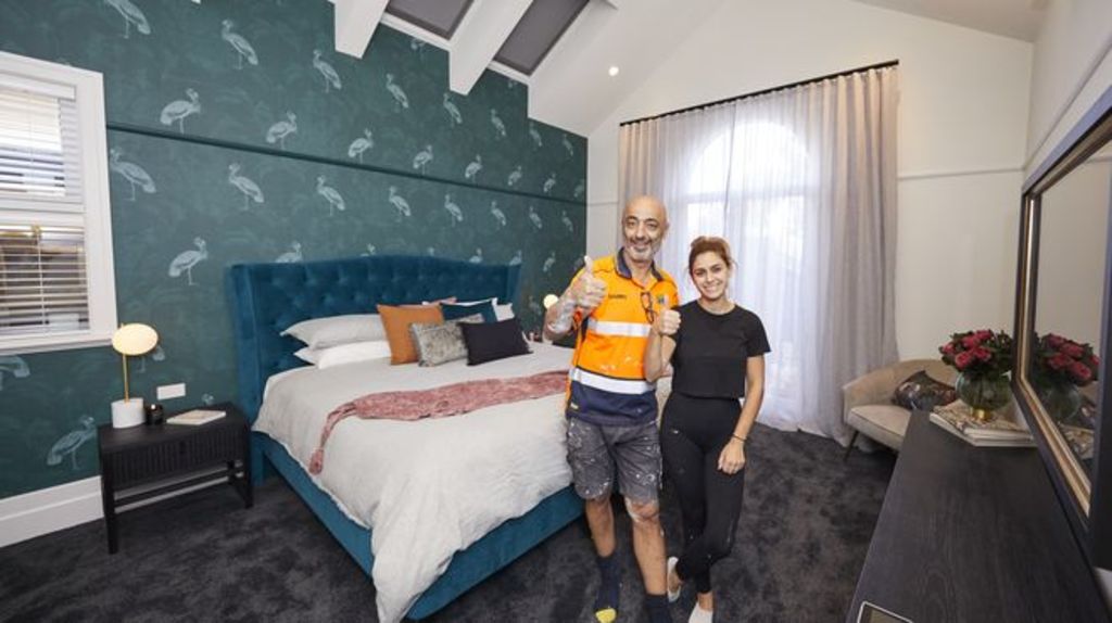
The perfect main bedroom should be steeped in luxury and impart a feeling of calm and serenity.
“It should provide a sense of escape,” says designer Lauren Li from Sisalla. “It also needs to capture the home’s era, while be absolutely functional on all levels.”
So were The Block couples successful in ticking the right boxes? We asked the experts.
Harry and Tash (Winners)
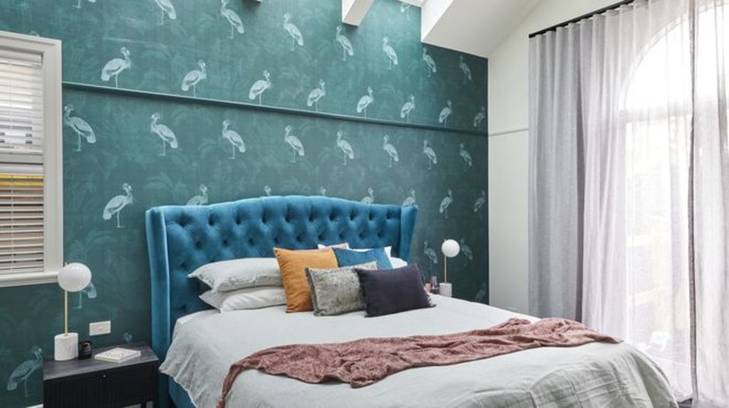
Design
While peacock blue provides a stylish nod to the history of their home, its overall design doesn’t hit the mark. “Oversized bedrooms are difficult to furnish, and they’ve struggled to fill the space well,” says designer Nickolas Gurtler. “A pair of ottomans at the end of the bed, instead of the chair, would have worked better.”
Materials
Wallpaper can make or break a room, and Gurtler says this time it’s a case of the latter. “I hate it,” he says. “It’s drab and an intense contrast to the room’s overall lightness. It was a poor choice for the awkward ceiling geometry and off-centre window, which is now highlighted by the light and dark contrast.”
Lighting
Despite the functional aspect of the pendant in the wardrobe, its style is dated. “The black fan was a mistake, too,” says Gurtler. “The eye is drawn upward to the ceiling and it wants to look at a chandelier! The bedside lamps are too small in scale for the room too.”
Sarah and George
Design
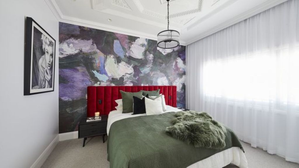
“The feature of this room is the stunning original ceiling panel, however the delicate period details are overpowered by the bold wall mural!” says Li. “Sarah referred to florals as a popular pattern in the 1940s and selected a mural with a flower motif. But this one misses the mark, because it lacks any connection to that era!”
Lighting
The ceiling pendant perfectly complements its panel, says Li. “It’s a simple cylindrical form yet has just right amount of glamour. Shame it’s too small. The next size up would have provided more impact.”
Colours
The couple’s use of colour is more “chaotic” than calm, says Li. “There’s no colour scheme, it’s just lilac, violet, red and olive set on a white backdrop. It looks randomly selected, and the red velvet bedhead doesn’t work with the purple. The Marilyn Monroe artwork gives the room a tacky ‘boudoir’ feel. It looks cheap.”
View The Block properties for sale
House 1, Harry and Tash: 364 New Street, Brighton
House 2, Sarah and George: 362B New Street, Brighton
House 3, Daniel and Jade: 362A New Street, Brighton
House 4, Luke and Jasmin: 360B New Street, Brighton
House 5, Jimmy and Tam: 360A New Street, Brighton
Jimmy and Tam
Design
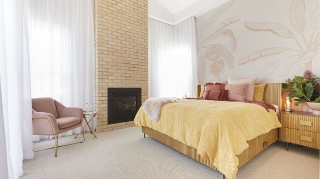
While the fireplace is impactful and the perfect choice for a 1950s space, walking through the bathroom to the wardrobe is a critical error, says Gurtler. “Bathrooms are cold, so there’s a lack of impact walking into a bathroom first. Glamrobes are fast becoming one of the most requested rooms, and this wardrobe misses out because it’s too small for the space.”
Materials
Gurtler approves of the couple’s mix of materials. “It feels modern and opulent,” he says. “The ribbed glass is delicious, although the join in the centre, which is due to glass sheet size, spoils its beauty.”
Styling
“I’m so excited to see their Slim Aarons artwork!” says Gurtler. “His work is prolific and their choice [is] perfection. I’d have loved a rug under the end of the bed to finish it off. I don’t like the matching bed and beside table combination despite them being individually lovely. It’s a generic way of decorating.”
Daniel and Jade
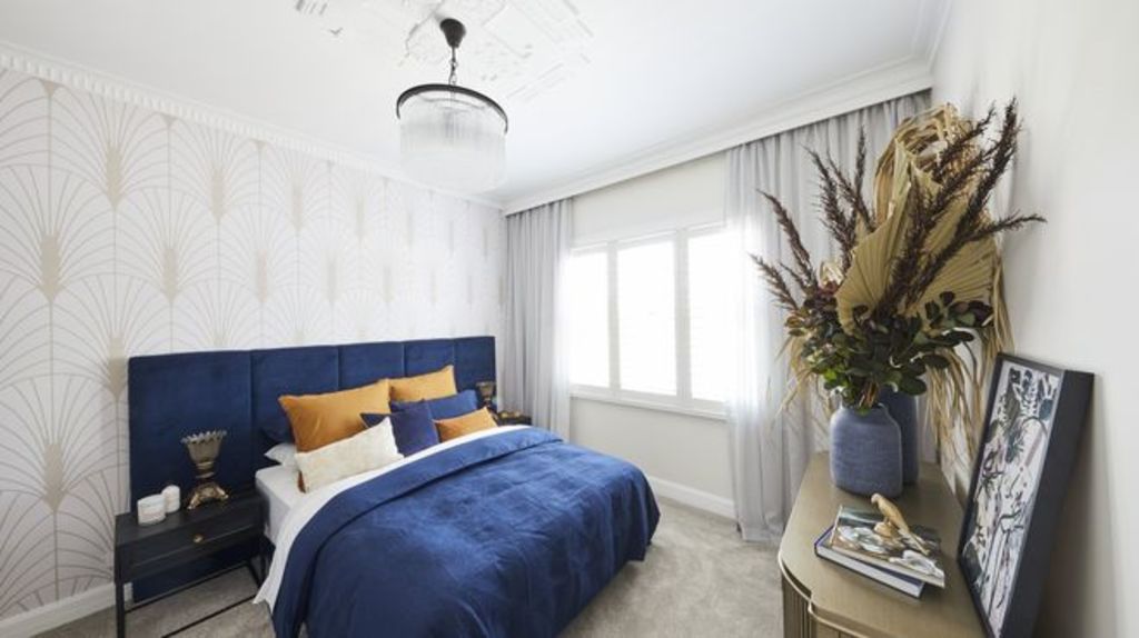
Design
“This room is a bit NQR [not quite right],” says designer Camilla Molders. “It gives me ‘old lady’s’ house vibes. The curtains over the shutters, giant bunch of dried flowers, and hand cream on the bedside table don’t say luxury.”
Walk-in wardrobe
While functional and visually interesting with its art deco vibe, the couple’s wardrobe just misses the mark, she says. “The laminate looks wrong for this era,” she says. “I do like the robe door handles though, and the black detailing looks smart.”
Lighting
For Molders, the overhead pendants featuring “busy” faux crystals lose points for style, as do the bedside lamps. “I understand the vintage touch, but they’re too small!” she says. “I hope the people who will live in this room don’t want to read in bed.”
Colours
The blue in the bedlinen is striking, however the overall lightness of the room makes it a visually confusing space. “The lightness draws my eye to the lopsided layout of the room, with the bed pushed too far to one side and huge void on the other,” she says. “There’s little else to balance the intense blue and it throws out the whole scale.”
Luke and Jasmin
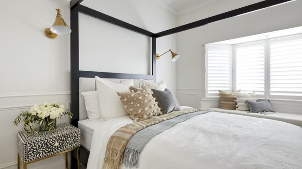
Design
A well-resolved space that incorporates smart design, Molders says they have achieved good scale throughout. “It’s a good mix of vintage and contemporary, and the window seat looks inviting,” she says. “The four-poster bed is imposing, but I like the black frame for visual depth against all the white.”
Lighting
While reading in bed will be achievable this time, Molders says the wall lights are poorly positioned. “They’re too high for a bedside lamp and the pendant is lost behind the bed,” she says.
Materials
“I like the mix of materials, especially the pattern of the bedside tables which adds interest to the room,” she says. “The wainscoting and ceiling strapping details add character while referencing the period of the house.”
We recommend
States
Capital Cities
Capital Cities - Rentals
Popular Areas
Allhomes
More
